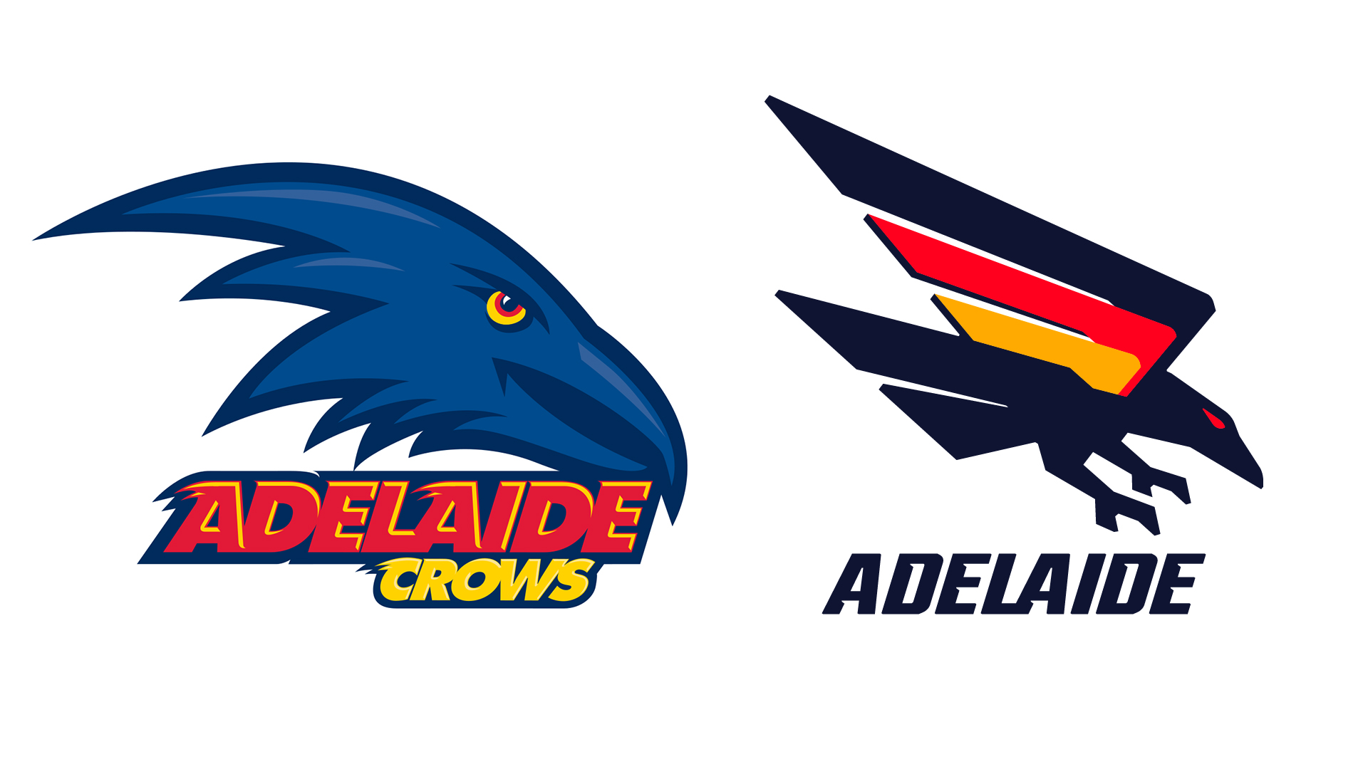
AFL team Adelaide Crows has unveiled a new logo, drawing on the team's '90s roots and throwing back to a previous design. The new look first leaked in September, where it drew a somewhat negative response from fans. And now that it's been officially unveiled, it's drawing even more ire.
The new logo drops the word 'Crows' from the branding, and does away with the cartoonish crow profile, replaced instead by a more minimal design with a swooping wring rendered in black, red and orange. And while yes, while it isn't one of the best logos of all time (and does somewhat resemble the German flag), the backlash to what's essentially a cleaner design does seem a little unwarranted.
"Well done to whoever's 10 year-old child put this together," one fan comments on Twitter (sorry, X), while another adds, "It's like going from Windows 10 to Windows 98."
Thought we stopped using Microsoft paint 15 years ago? https://t.co/SUCMK0taCfNovember 6, 2024
Don’t love it. Looks like an amateur Sunday league team. https://t.co/KvCPp60F89November 6, 2024
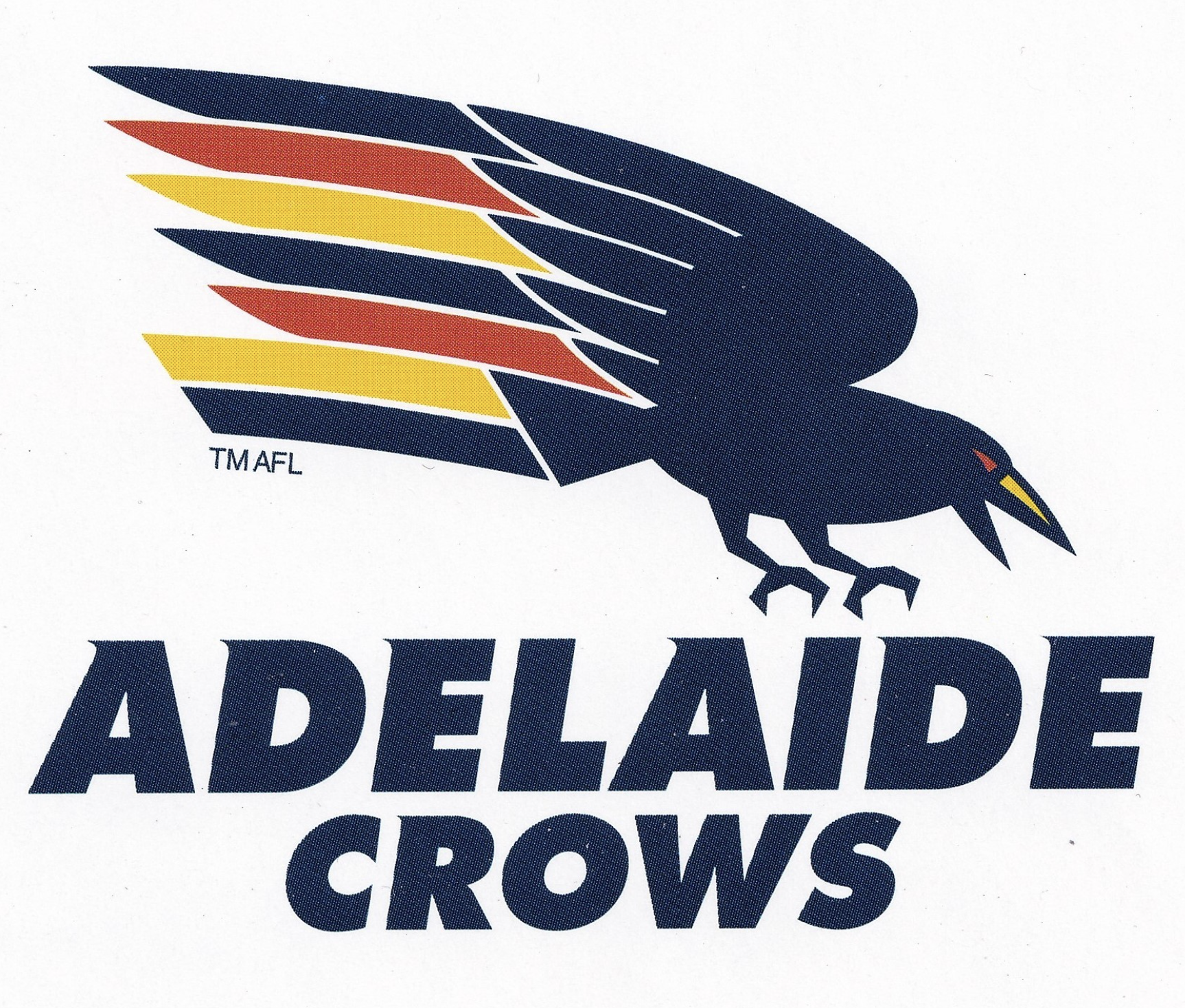
But didn't these fans get the memo? Heritage logos are in right now! Yes, it's a rather retro design, but that's the whole point – it's a pleasing nod to the colourful logo of the late 1990s (below), whilst still managing to bring in some contemporary minimalism.
Adelaide Crows CEO Tim Silvers recently defended the new logo in an interview with 9News. "We've got a rich footy heritage, so thought why not go back to the swooping crow, from 1991, but give it a modern feel," he said. "The people are really going to love it, it might take a bit of time, but we're really proud of it."

In my opinion, it was time to let that Sonic the Hedgehog-esque cartoon crow head go. But of course, it makes sense that sports fans are precious about their beloved team logos – although perhaps not quite as precious as heavy metal fans.


