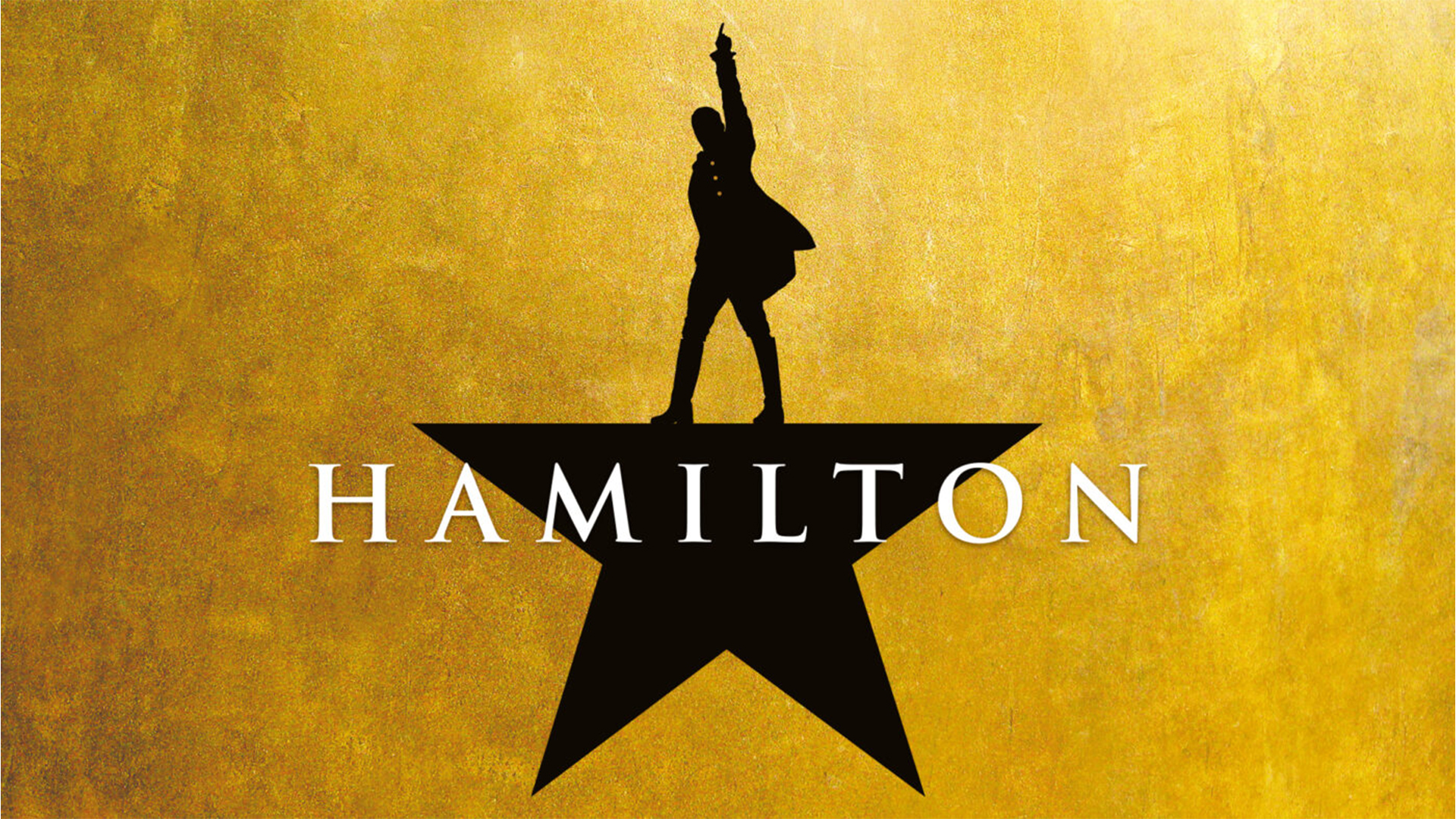
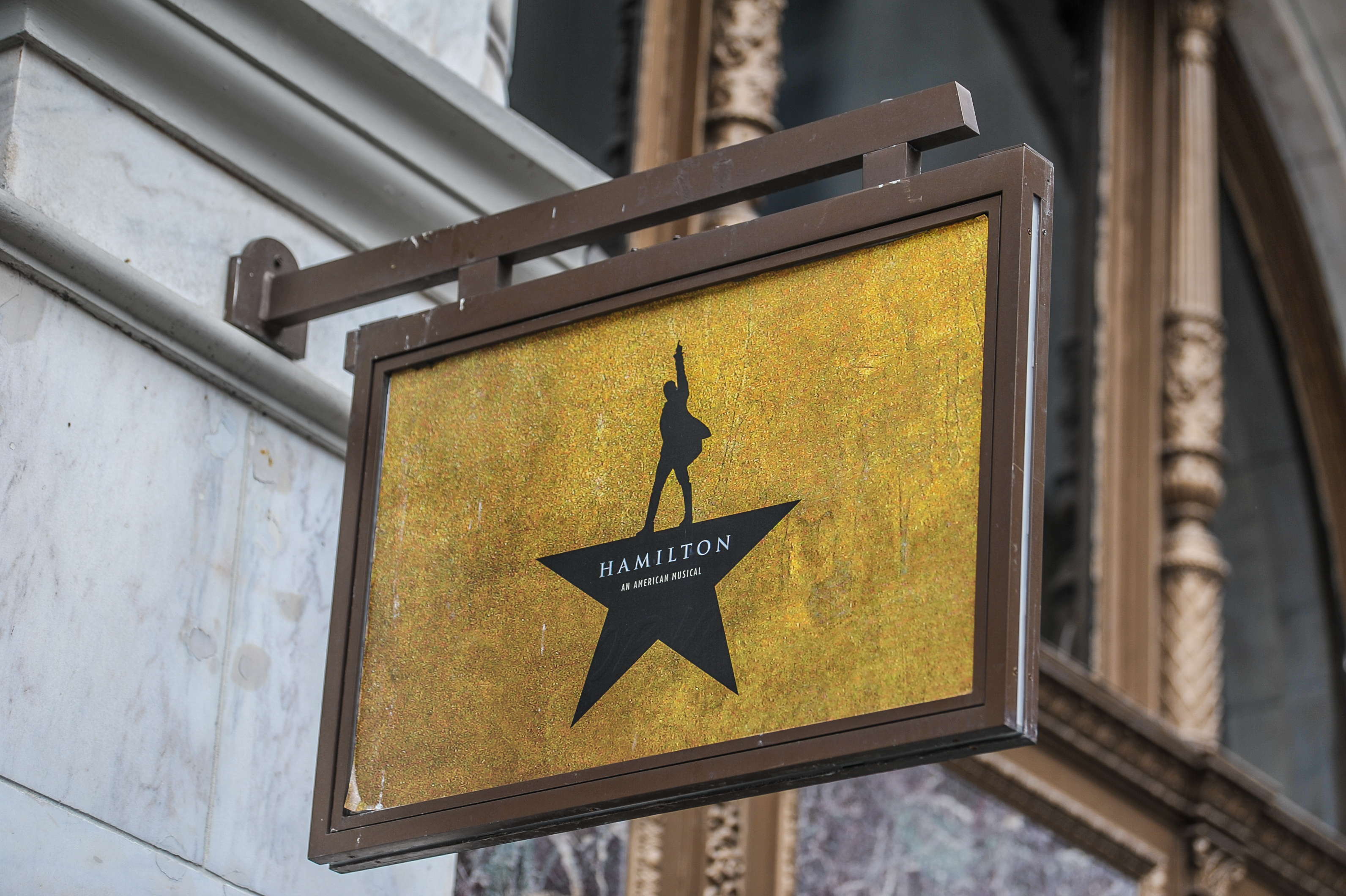
Ask a group of theatre fans what the most iconic musical logo is and one name in particular is likely to crop up – Hamilton. While we've become accustomed to the iconic star logo created by Spotco, Lin Manuel has shared some of the potential logo designs that didn't make the cut, each with its own unique spin on the American musical.
With each poster being visually captivating in its own right, it would've undoubtedly been a tough decision given the impressive array of shortlisted designs. While I love the alternatives I think they made the right call with the final logo design but regardless, it's fascinating to see what could've been.
Taking to Instagram, Lin shared the designs with Hamilton fans, explaining that he was tasked with the tricky challenge of narrowing down over 40+ poster designs. "A half hour later, these nine finalists and the one you know well (which took another quantum leap with the silhouette pics of our company by @murphymade) were still on the wall," Lin wrote.
"It’s amazing to hear how much thought and collaboration went into choosing the final artwork," one fan responded, while another added, "These are absolutely legendary." Despite the popularity of the alternative designs, most fans agreed that the original was the perfect choice. "If Wicked owns the color green, Hamilton will forever hold gold. It was a masterstroke to forgo inky blacks and star-spangled palettes and instead select rugged metallic gold," another fan commented.
For more poster design inspiration take a look at the unapologetically bold art of Soho Rep theatre. If youre after more stage news, check CO_LAB's people-first rebrand that celebrates inclusivity and accessibility.