IKEA trends are a key part of how we, as design editors, work out what the big decor trends are and are going to be. Each season, I look at what both the high-end Italian power brands are doing – and the ideas from them that will filter down to the wider world – and what megaliths like IKEA are up to.
IKEA knows exactly how people want to shop, what they want to put in their homes, and what they're responding well to. It both services existing interior design trends and introduces new ones that start in the Swedish superstore.
These 5 IKEA trends are pulled from its current catalog. Some are no surprise to me – I've seen chrome A LOT – but some were actually quite unexpected. Here's what IKEA predicts you will love in the coming year.
1. Lava lamp shapes
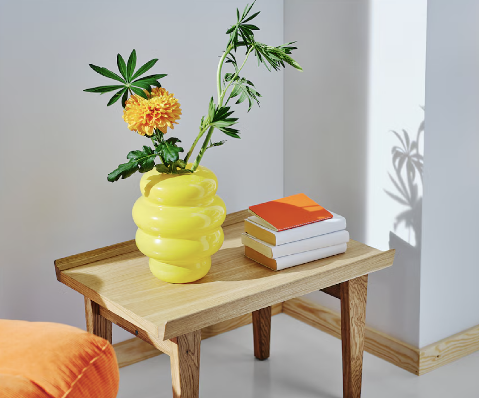
There is a definite embrace of waves at IKEA this season, a playful play on the 1970s retro decor trend that's taking over interiors more generally right now. Designers love it because it fits with how people want to live – creating spaces they can entertain and have fun in, that could be ready for a party at any moment.
And IKEA's shorthand to getting the look is to take inspiration from the globules in a lava lamp, from their glowing colors and soft edges. , and create pieces that soften even the sharpest of decor schemes.
When I say lava lamp shapes, I don't mean it all that literally. What IKEA is taking from this retro piece of decor is those very fluid curves and bolder colors that this armchair embodies.
If you just want to dip your toe into this bold IKEA trend, this vase would be a great way to bring some bold shape and color into your home without committing to a piece of furniture. Fill it with some pink tulips for a lovely spring color combo.
Presented as the "anti-stress armchair" in the 1967 IKEA catalog, this is a retro number that nails two trends, IKEA's love of bolder colors and the return of cord. This is also available in a more subtle black and equally bright orange.
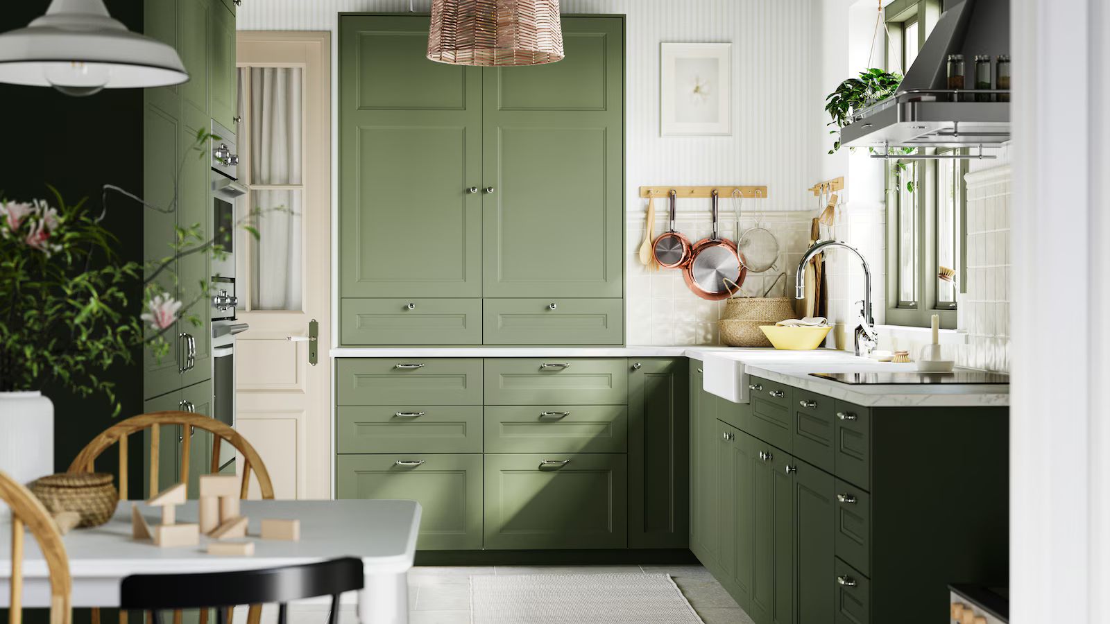
2. Natural weaves
Color trends are embracing sandy tones for 2025 – warm and dusky hints of yellow, pink, orange, set against a backdrop of beige. Yet IKEA is finding a new way to enliven neutrals. Instead of focusing on the pigment, the emphasis here is on the texture.
The new MÄVINN collection has all been made by social enterprises which create jobs for people who need them most and features jute, banana fiber, and hemp, woven into pleasingly tactile baskets and light fittings that give even the most pared back of schemes a little extra depth.
These handy baskets are perfect for keys, purses, and loose change, adding a rustic, yet colorful hit to an entryway console.
With the irregular small holes in the sides of this pendant lampshade, you get tiny pinpricks of light coming through, and a very pleasingly soft glow. This would be perfect hung above a kitchen table to create a soft pool of light.
Jute is a great leveler, working with every color, texture,and material you could possibly have in your home and bringing them all together. This rug could calm maximalist schemes or enliven minimalist ones. Amazing price for a rug too at under $30.
3. Unexpected Neons
If you were on Tiktok at all in 2024 you'll have come across the Unexpected Red Theory which held that a jolt of red was all you needed to energize your decor. The theory still stands, but designers are morphing it to include all shades of neon, an idea that IKEA has caught onto as well.
It has introduced side tables in bright orange, blankets in the same hue but with neon pink fringing, and even a computer monitor stand in bright yellow to jazz up your home office setup. Now that really is unexpected.
The slightly retro-futuristic shape of this coffee table (think The Jetsons vibes) is updated in zingy orange, its shape making it look like a slice of citrus just perfect for juicing up your decor.
Pairing fluro colors together makes for one very bold blanket. It's also available in softer shades like pistachio, but this version feels the most energizing and in keeping with IKEA's push for more neon.
Did you ever think that your WFH setup needed a sunshine-bright computer stand? No? Then you're missing a trick, a little lift for both your screen (literally) and your soul (figuratively).
4. Chrome finishes
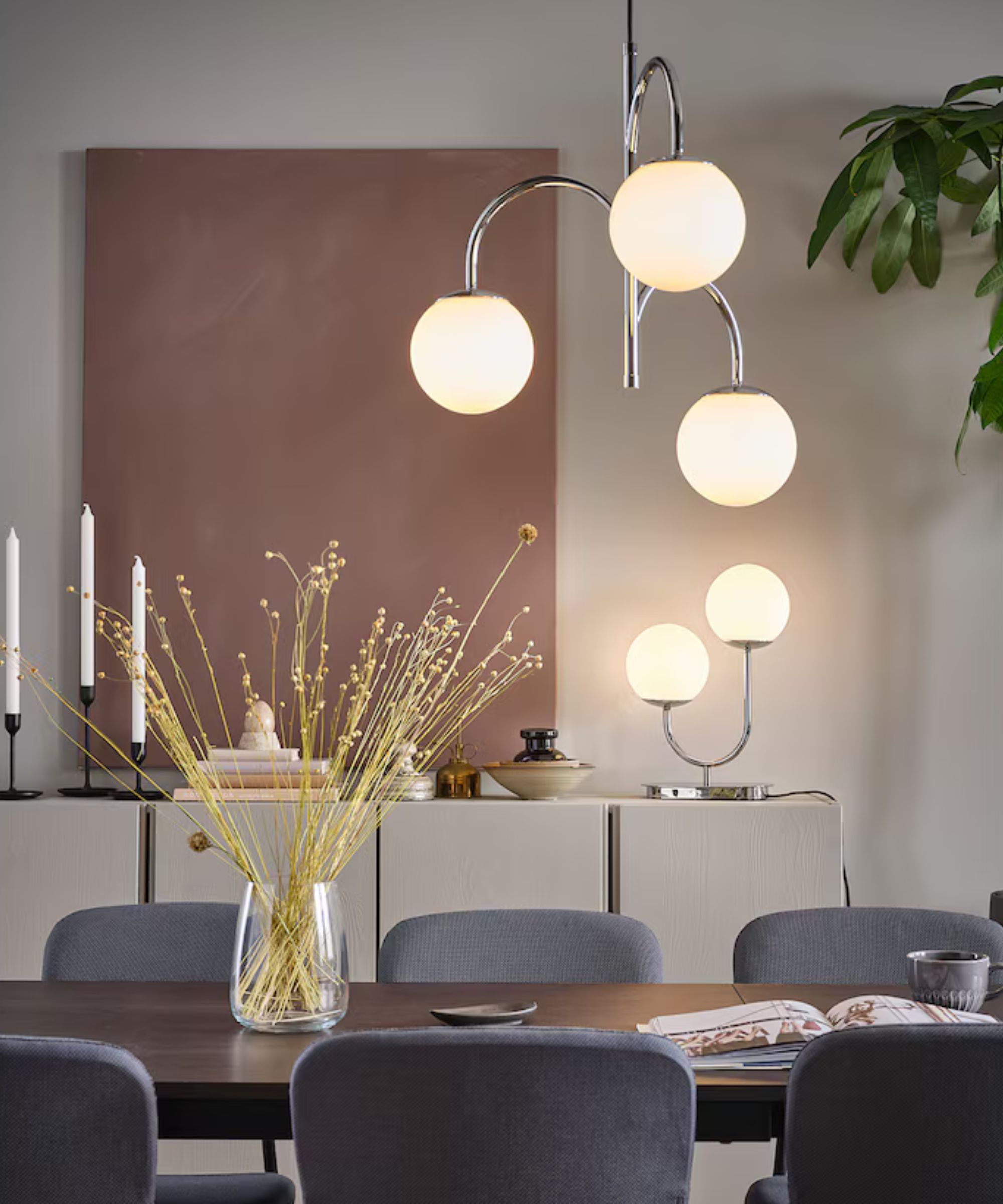
One of the biggest trends that emerged from the most recent holiday season was the reinvention of 1990s minimalism. This took the form of decorating with chrome – tables laid with pieces in chrome finishes, silver serveware, and a paring back of warmer tones and finishes.
IKEA released its FRÖJDA collection for the new year, and it has been so popular that it continues into this season, marking an aesthetic step away from warmer metals and into a cool new future.
Service with a shine – bringing a grouping of filled coupes to the table or living room on this chic little hostess tray adds an elevating moment of theater to the experience.
So much cooler than the bronze finishes that have been on trend for years, this light fitting is as sculptural as it is sleekly silver. Yes, it could be a holiday decoration, but also yes, has style to last all year.
This five-piece serving set continues the chrome detailing to the table, creating an overall cohesive look. It would work just as well with plain white serving dishes or to look grown up and cool next to patterned plates.
5. Electric blue
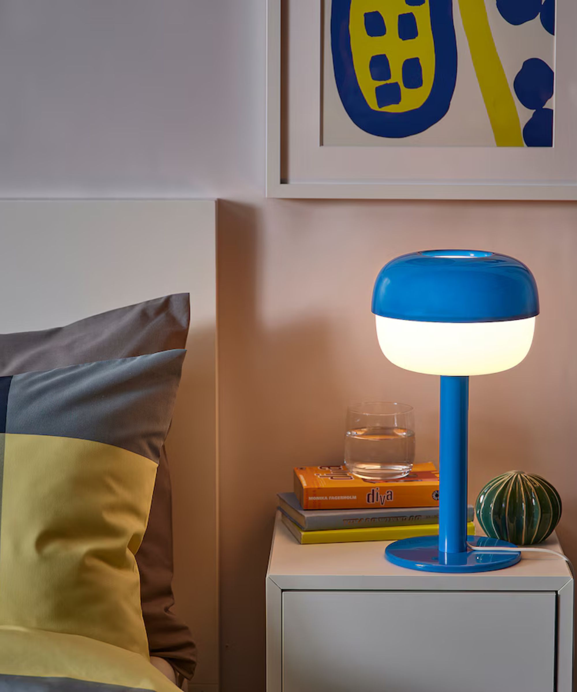
In among all the fairly neutral, soft, and earthy Colors of the Year we have seen in 2025, there's IKEA's contribution – an almost neon blue. As of right now, this isn't a color trend I am seeing designers take to right now, so think of Electric Blue as a true IKEA trend. Will it catch on? Will it take over from the warmer shades and richer pigments that decor is centering around right now? IKEA, at least, thinks it will.
It has embraced this jolt of a shade for pieces such as mirrors, lamps, chairs, and clocks, and is running with the decree to 'say yes to blue in 2025!' Admittedly, it's a color that works well with whites, with graphic shapes, and with a sense of modernity. Maybe I will be tempted to bring in a pop of blue.
Mushroom lights have been a mini-trend last year, and so now meet the toadstool lamp – slightly more elegant but no less retro and appealing. This is exactly how I would bring this bold shade into my own home.
The scallop trend is going nowhere in design for 2025, with those soft waves continuing to smooth out the hard edges of room design. IKEA's electric blue mirror is a perfect example of why this look works.
Is it a clock? Is it storage? Well, it's both - yes, the front if this 1970s-inspired clock opens up to reveal the perfect place to keep....well, something small and secret. A clue to where the treasure is buried?!
A lot of bold colors and funky shapes going on at IKEA so far this year. It's actually not unlike a lot of the pieces I used to see at IKEA back in the early 2000s, and I don't hate this revival of naughties IKEA. It's a nice break from all the soft colors and rustic styles that normally dominate design trends. Of course, all these looks are very shoppable too, it's super easy to bring them into your home easily and cheaply, so are very low-commitment ways to give your rooms a trendy update.