Interior designers can't help but analyze every room they step into - it comes with the job. So naturally, there is so much that is glaringly obvious to them, that goes unnoticed by others. But without interior designers on hand to point out the faults in our interiors, how will we ever know where we're going wrong?
To help narrow the problems you might be making in your home, we've spoken to the tastemakers to find their biggest design pet peeves and the interior design trends they actively dislike.
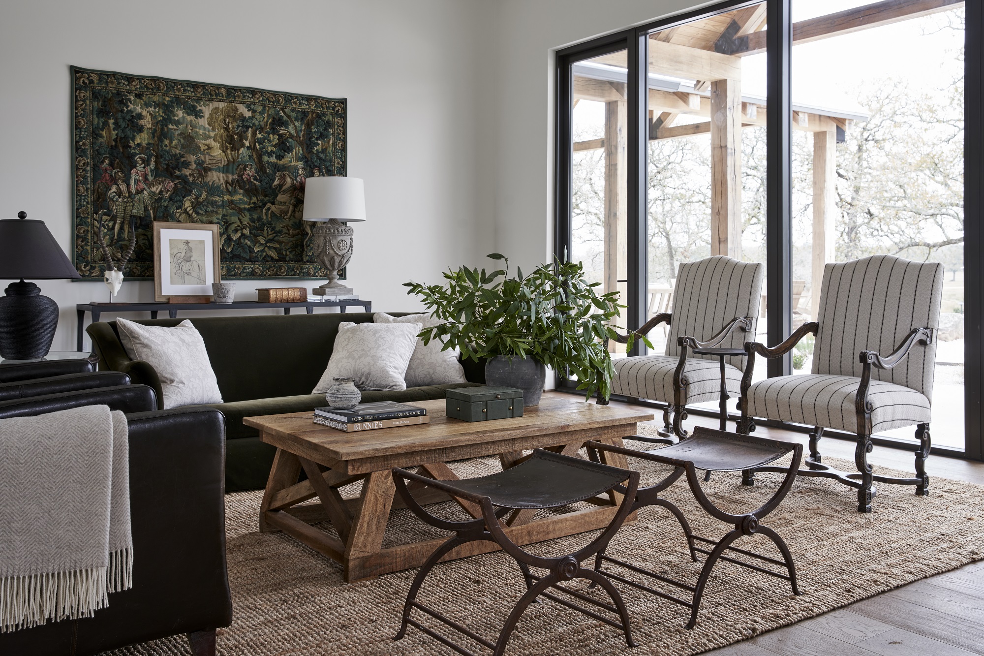
1. Furniture that isn't in proportion

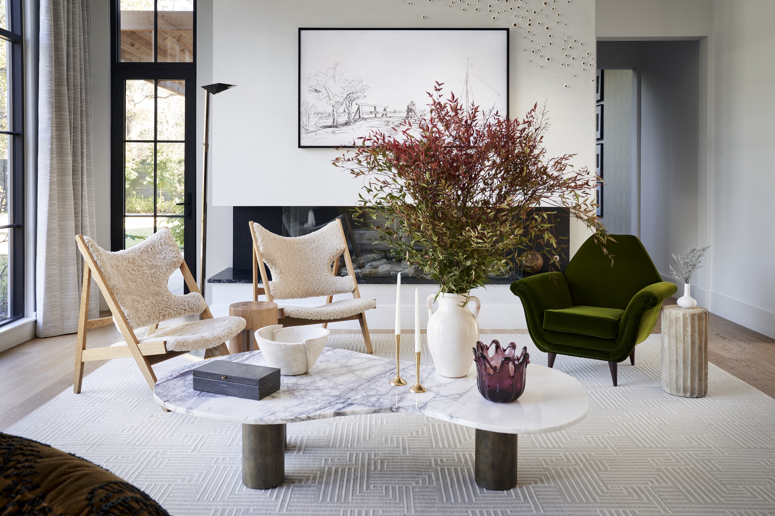
It's immediately clear to the interior designers when your furniture is badly proportioned, but not so obvious to the untrained eye. Thinking about the footprint of the room is intertwined with the role of an interior designer, so they know how to buy furniture that fills and fits the space to perfection. 'My number one design pet peeve for a living room is when a rug is too small,' says Alexandra Killion of Alexandra Killion Interiors.
'All the furniture should be touching the rug in some way. Just a small island rug will make a larger room feel smaller and not properly grounded.' To make sure you're getting your rug sizing right, always remember to either rest all furniture legs rest on the rug or just the front legs – the exception being a centerpiece coffee table, for example. This unifies a large space, bringing all elements of a living room together. If you want a large area rug that will fill your floor space, choose a rug that leaves around a 17 inch gap between the edges of the rug and the walls of the room.
Elsewhere, furniture like sofas and coffee tables should be approached with caution. 'A coffee table that is too small in scale is also an annoyance,' adds Alexandra. 'Everyone needs a place to put their drink and a tiny table in the middle of the room leaves too much open space.'
Interior designer, Julia Dempster agrees that a sense of proportion is important. 'Scale is so important in décor and so many people get this wrong,' she says. 'A lot of clients tend to buy everything to all be similar sizes, like vases, chairs, and tables. Varying the heights and the overall size of the different pieces is what creates movement and an experience in the space. Think about the furniture as music notes with variations in scale. Your eyes shouldn't rest upon a single object, but rather follow the focus and flow around the room by hopping from one piece to the next.'
2. Being too playful with paint
The trend for accent walls has come and gone, but most interior designers avoid the accent wall look, instead relying on décor to bring interest to your walls, instead of too much experimentation with paint. For Brittany Hakimfar of Philidelphia-based Far Studio, accent walls should be avoided at all costs. 'It's my biggest interior design pet peeve,' she says.
'I am a firm believer that if you paint a room, you should paint all the walls and the same with wallpapers or wallcovering - never just one accent wall.' For Brittany, going monochromatic is one step better. Monochromatic color schemes are all about layering the same color consistently throughout the room, color-drenching everything from trim to window treatments to the ceiling. 'To take it to the next level, if I paint a room dark or in a dramatic color I will paint all walls, ceiling, and trim to make it feel like a little jewel box.'
3. Badly hung curtains
Measuring curtains instills dread in even the most competent of designers, but it's worth taking the time to get the measurements right because badly hung curtains are something the designers notice straight away. 'I always notice when curtains are hung incorrectly,' says Julia. 'Usually, they're covering the window and not hung high enough. I like to hang curtains 10 to 12 inches higher and wider than the actual window opening.'
You also want to make sure you extend the rod past the windows horizontally so that the curtains are open, they aren't bunching up in the corners and spoiling the view. 'To help, a general rule I follow is that curtains when laid out flat should be two and a half times the width of the window ensuring proper coverage. For me, a skinny curtain is a sign of a cheap option,' says Julia.
Think about the length of curtains too, Curtains that are too short feel incomplete, and curtains that are too puddled on the floor look untidy. 'They should fall to the floor and no longer, and never be too short,' says Julia.
When it comes to measuring for bay or arched windows, designer Nina Magon suggests getting to grips with your tape measurer. 'Begin by measuring the width of the window at the top, bottom, and middle,' she says. 'Then, measure the length of the window from the top of the arch to the bottom of the window sill. If the window is a bay window, measure the length of each section separately. Once the measurements have been taken, use the longest width and the longest length to determine the size of the curtains needed.'
4. Art that is hung too high or too low
Finding the right height for your bedroom, entryway or living room wall art is tricky. There are no hard or fast rules as to what is right or wrong, and art that is hung unexpectedly low, high, or at varying levels can add interest to a room. But if it's been badly hung, it's something the professionals will notice straight away.
'My absolute number one pet peeve is when I notice art that is hung too high or too low and never straight,' says Julia. 'The general rule of thumb is that the center of the piece should be roughly 60 inches from the floor.
'I always add either museum putty to hold artwork in place or security fixings to make sure the artwork stays in place.' If in doubt about how to hang a picture, the general rule is that your eye line should be about one-third of the way down the frame.
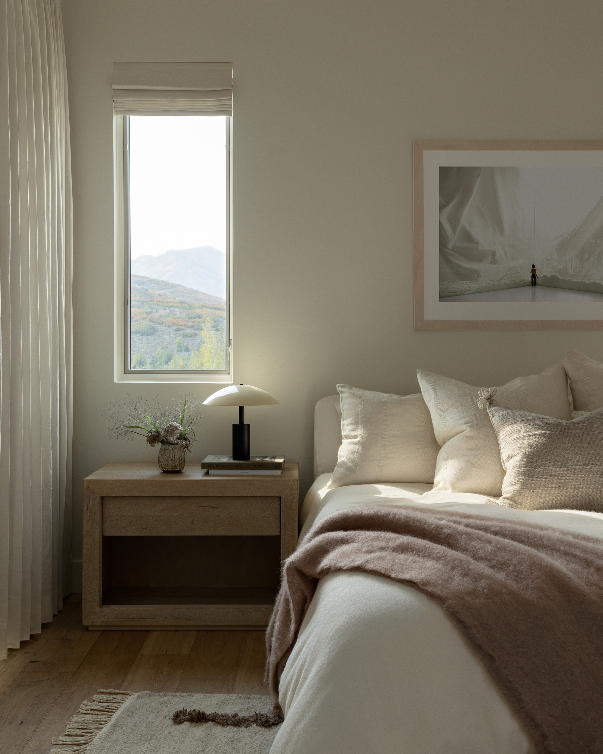
5. A room that lacks lamps
Lighting is one thing that interior designers agree upon unanimously, no matter their individual style. A well-lit space has atmosphere in abundance, and crucially, feels cozy and welcoming. Meanwhile, a poorly lit room can feel cold and stark.
For this reason, a room that lacks adequate lamps is one of Alexandra's biggest pet peeves. 'I dislike it whenever a space has no lamps,' she says. 'If my house had no canned lights, I would be fine. I am a lamp girl through and through!' she says. 'When a room only has one light source, like canned lighting, it's a total mood killer.'
Julia agrees. 'Nothing spoils the ambiance of a room faster than bad bedroom, kitchen or living room lighting, so it’s crucial to be strategic about how you employ various light fixtures,' she says. 'I always notice when there is not enough accent lighting, too much overhead lighting, and the light bulbs emit a white light, perfect for an operating theatre but not a home.' (A safe bet is to go for a 3000k or 2700k bulb.)
'It's important to spread light around your room too,' says Julia. 'Think table lamps, picture lights, and floor lamps are great ways to add soft, layered lighting throughout. Lamps create a mood and an atmosphere, something that is usually overlooked.'