Benjamin Moore is the enduringly popular paint brand, chosen by interior designers the world over for its high quality and color depth, providing excellent coverage and durability. And if it’s good enough for the designers, it’s good enough for us.
Among the brand’s wide range of color choices, blues across the spectrum are some of the best-selling paints at Benjamin Moore. In all shades, blues are selected for their timeless and classic quality, bringing myriad atmospheres to every room in the home.
But with such a broad selection, it can be hard to know where to start. So we asked the designers and paint experts for their favorites and the most popular Benjamin Moore paint colors to help you make the right decision for your home.
Best-Selling Benjamin Moore Blues
Don’t get overwhelmed by choice — let’s look closer at the brand’s best-sellers to help you pick the best blue paint for your home. We speak to Hannah Yeo, senior manager of color marketing at Benjamin Moore, for a deeper insight.

Price: £2.95/peel and stick sample
"Hale Navy is our classic navy blue, exuding a sense of balance, stability, and reassurance," says Hannah. "This gorgeous hue has been a bestseller for decades, seamlessly complementing any decor while adding a sleek, sophisticated touch. A great alternative to a traditional neutral, this deep, stunning blue offers just the right amount of blue without overwhelming the space."

Price: £2.95/peel and stick sample
"Like a soothing sky or clear water, Palladian Blue evokes both calmness and sophistication. It feels fresh yet timeless, effortlessly blending with a variety of decor styles. Whether you're aiming for a light, ocean-inspired room with creamy off-whites and sandy hues, or a cozy, traditional look with deeper navy, charcoals, and warm pops of color, Palladian Blue adapts beautifully to any space."

Price: £2.95/peel and stick sample
"An intriguing blue-green with a hint of gray, this mid-tone brings color in a modest, approachable way. Its versatility makes it ideal for any space, from bedroom walls and kitchen cabinets to front doors. This adaptable hue adds a touch of depth and tranquility, wherever it is applied. As a former Color of the Year, its popularity endures today with its captivating appeal."
Designers’ Pick Their Best Benjamin Moore Blues
So those were the customer favorites, but what do the designers like best? Here are 10 Benjamin Moore blues, from soft pale pastels to deep, electric shades that the interior designers will always go back to, time and time again.
Wales Gray
Wales Gray by Benjamin Moore is known for its soft, watery undertones that bring an unexpected hint of color to a light and bright space.
"There’s a lovely balance in this hue," says designer Marie Flanigan. "It reads as a gentle blue‐gray in some lights and leans more neutral in others, making it the perfect pop of personality without overwhelming the room."
The light blue kitchen idea in this guest house [above] instantly lifts the mood — particularly against crisp white walls or neutral upholstery — while preserving that airy, welcoming feel that’s so important for guests.
"One of the reasons I chose Wales Gray is because it’s an easy hue to layer in for a cohesive palette," explains Marie. "The color also looks stunning when accented by unlacquered brass hardware, bringing out its subtle warmth."
Ultimately, Wales Gray delivers a little spark of character and depth, giving the space an inviting energy that feels curated yet relaxed.

Price: £2.95/peel and stick sample
Mysterious AF-565
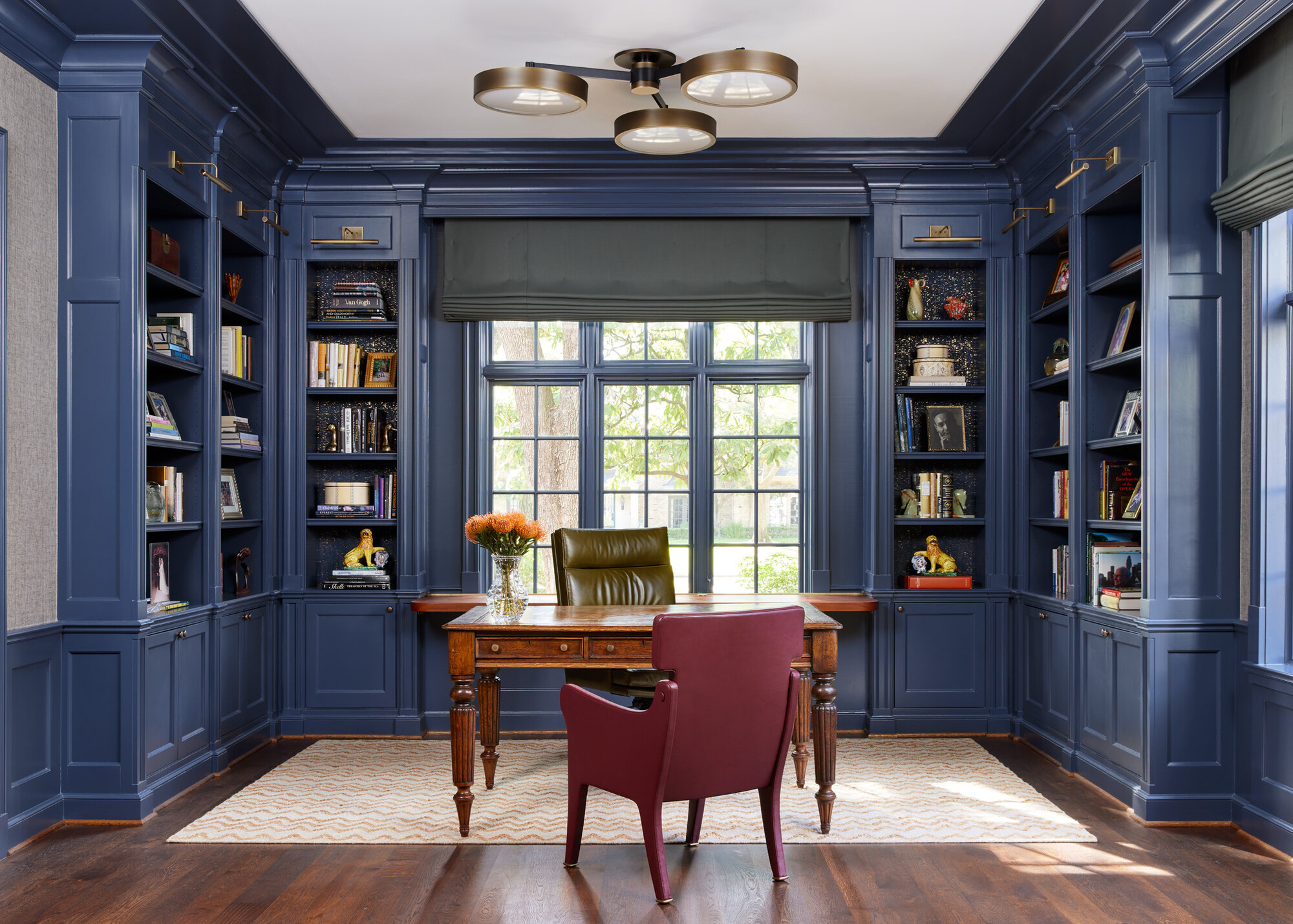
For the team at Brad Krefman Interior Design, Mysterious from Benjamin Moore is a dark, inky blue tone that often looks gray in some lights and blue in others. Its ambiguity is part of its charm. For Brad, its timeless appeal is also a star quality.
"A beautiful blue from Benjamin Moore is ‘Mysterious’ #AF-565," says Brad. "We chose this rich and enveloping color for our project Heritage Classic to create a stately home library aesthetic. Its deep tone not only adds sophistication but also serves as a neutral backdrop, allowing other colors and tones in the room to stand out beautifully."

Price: £2.95/peel and stick sample
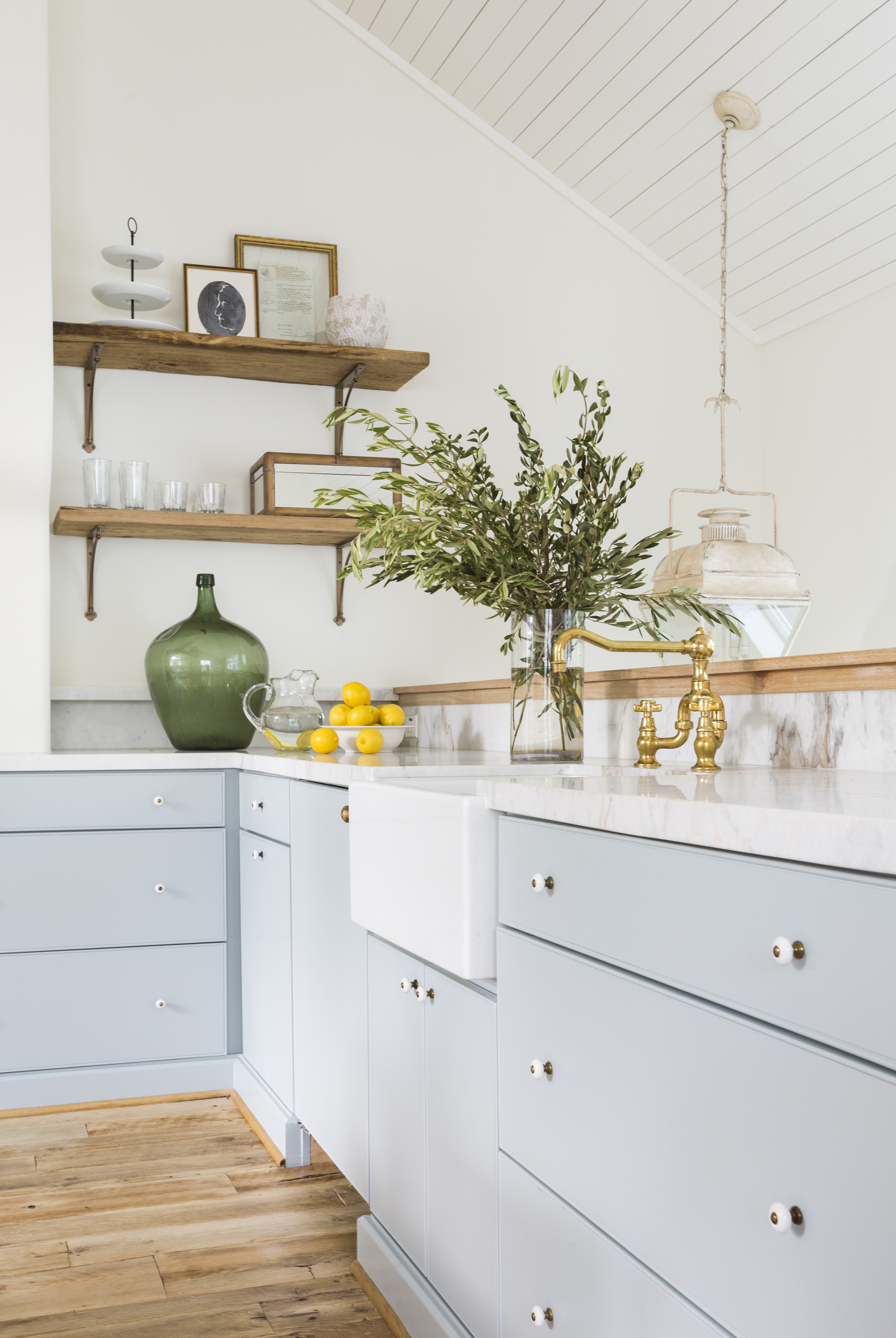
HC-145 Van Courtland Blue
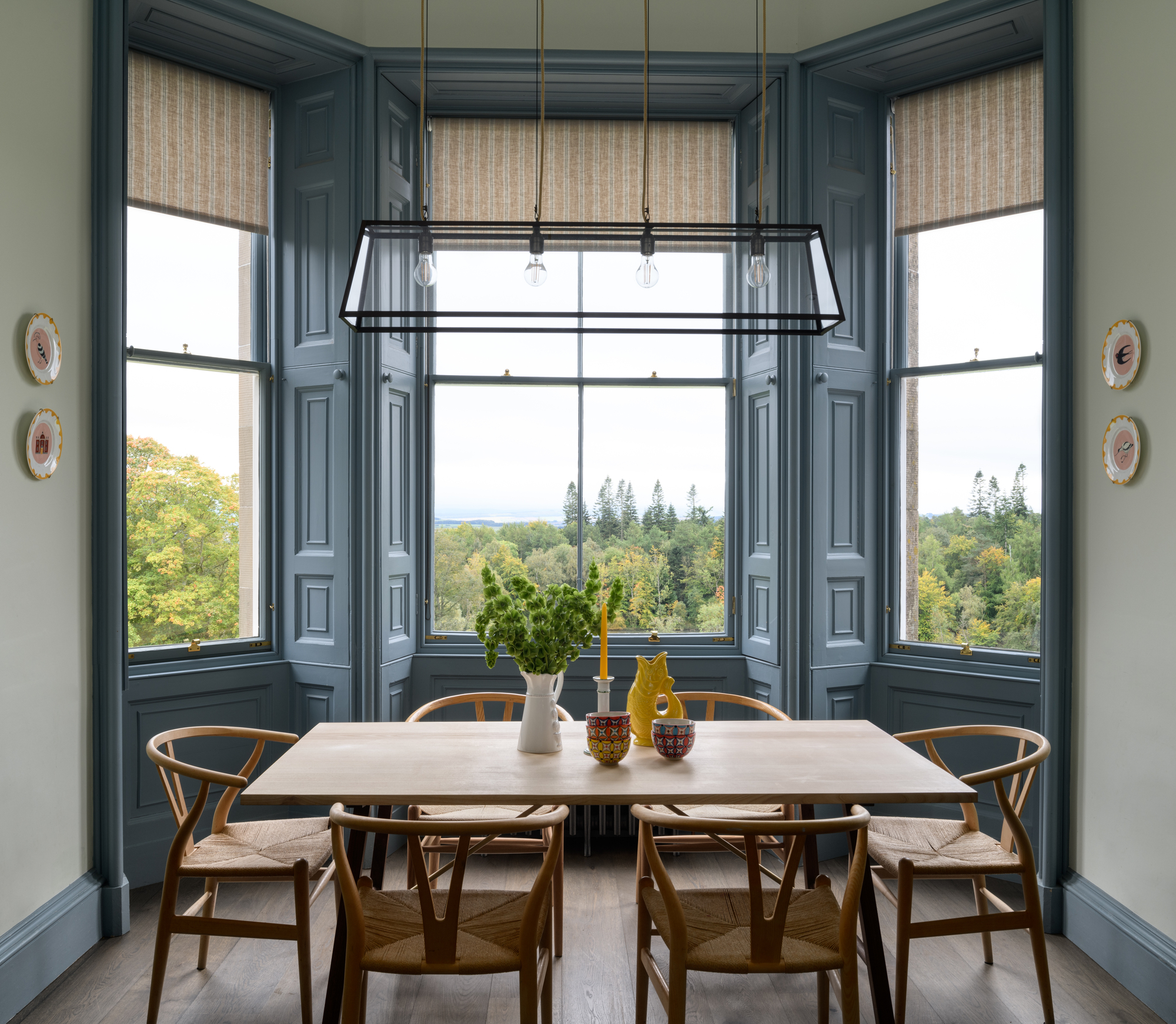
Another subtle shade that could pass as a beautiful neutral is Van Courtland Blue, a color that designer Olivia Emery always picks out when painting trim. "It is a wonderful, elegant, and timeless blue which we chose to use on the original window trim and paneling to breathe new life and boldness into it," says Olivia.
"The windows in this home overlook the most beautiful Scottish landscape and I wanted to use a color that draws your eye outside and frames the lovely exterior view," adds Olivia. The soft blue contrasts delicately with the lighter walls and warm neutral wood floor creating a classic feel to this modern farmhouse kitchen.

Price: £2.95/peel and stick sample
Deep Ocean
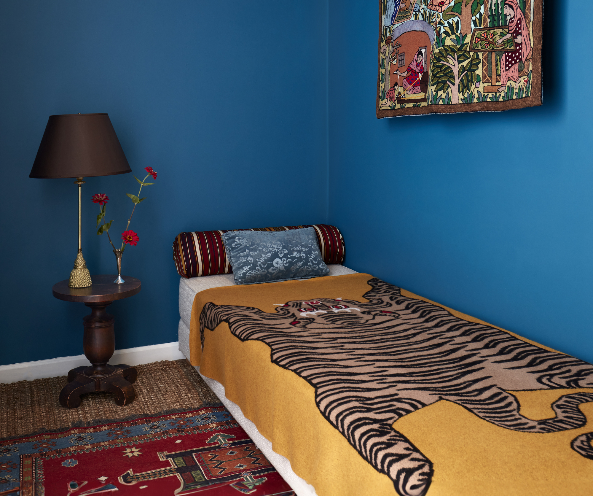
Deep Ocean is a richly saturated blue which has a beautiful sense of depth to it. "What's great about Deep Ocean is that it adapts well to different sources of light, whether natural or artificial," says interior designer Tara McCauley.
"I love it for small jewel box spaces — it creates an enveloping atmosphere and is soothing without being muted in tone," adds Tara. Given its cool undertones, Deep Ocean serves as a particularly beautiful backdrop for warmer colors, like yellow and red. Here, it pops in this small bedroom against the brighter shades of the soft furnishings.

Price: £2.95/peel and stick sample
Nimbus Gray
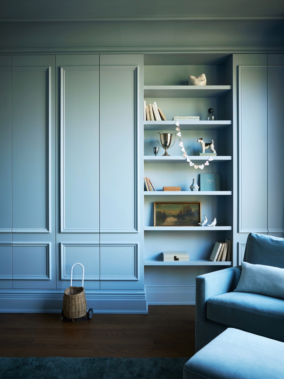
Nimbus Gray by Benjamin Moore is a cool blue, with a very calming tone, working perfectly for a space such as the nursery featured above. "The client wanted a comforting shade of blue," says Crystal Sinclair, founder of Crystal Sinclair Design.
"It pairs beautifully with the dark wooden floor, and the simplicity of the room being one color brings focus to the architectural details in the space."

Price: £2.95/peel and stick sample
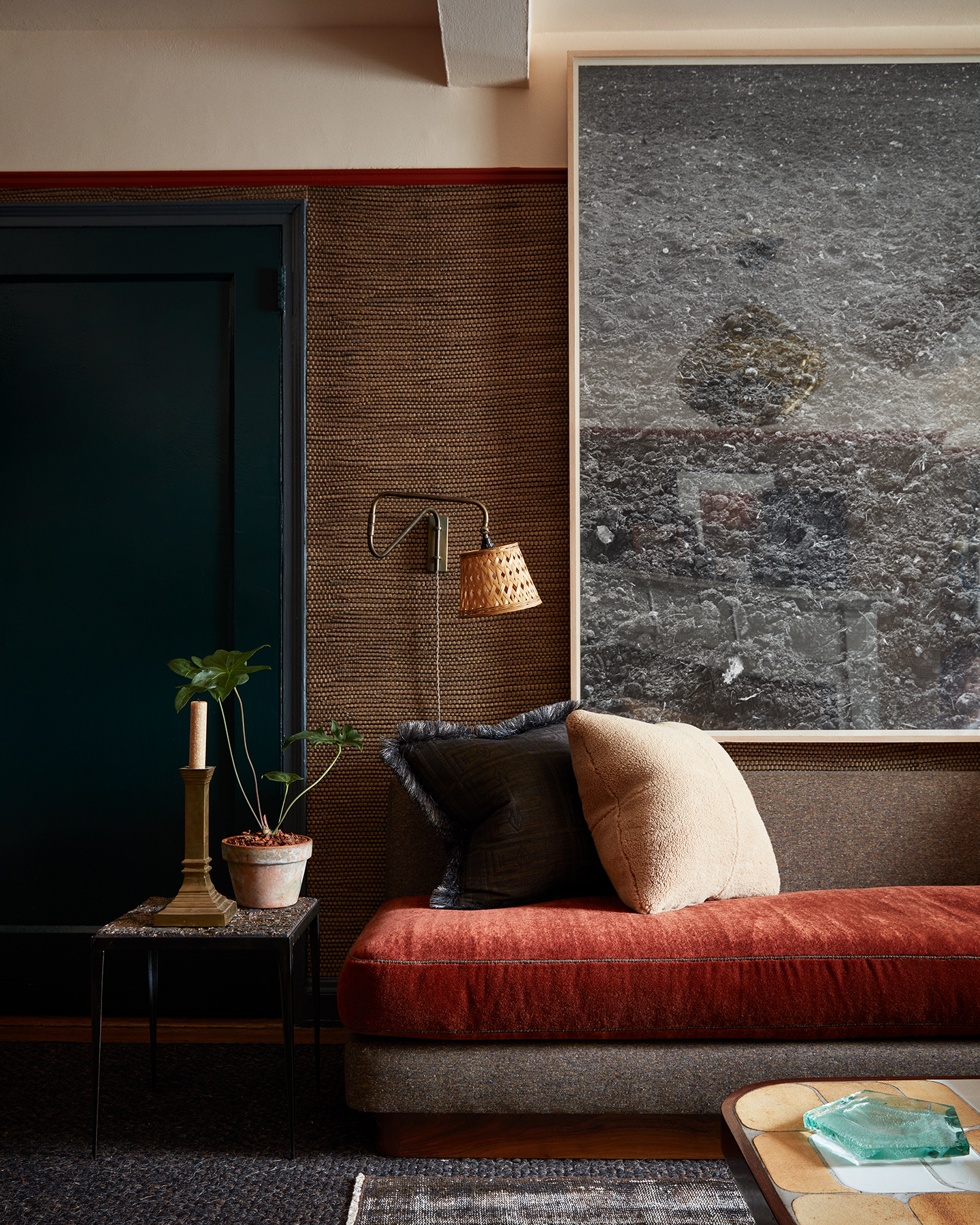
Temptation 1609
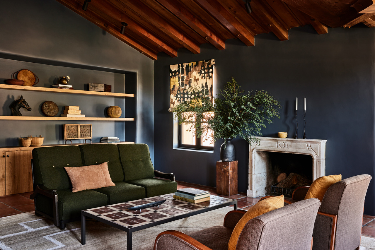
There is something luxurious about a deep and smoky color that is close to black. It feels deliberate and when confidently executed, it has a luxurious quality to it.
This example by Corinne Mathern perfectly exhibits the near-black wall color trend which highlights the rustic wood incorporated into the palette. It gives the room an atmospheric quality but is still classified by Benjamin Moore as a blue shade.
"The color is Benjamin Moore Temptation, which plays with light to create a space that feels rich in its charcoal quality," explains Corinne. "In some lights, a hint of blue shines through this living room color. I love Benjamin Moore’s Temptation which we used at La Tarantella’s bar. We wanted to create a moody, cozy space to enjoy a glass of red wine."

Price: £2.95/peel and stick sample
Patriot Blue 2064-20
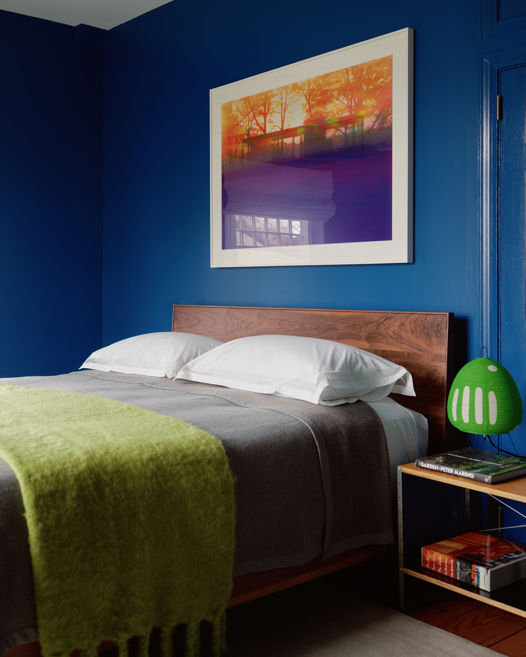
Patriot Blue is favored by designers, including Clive Lonstein, because it brings a jolt of electricity to any room, as exhibited in this blue bedroom. It is a classic dark blue that brings a versatile anchor to the room.
"I love Benjamin Moore Patriot Blue because it has a depth and richness that brings both drama and tranquility to a room," says Clive. "It creates a grounding sense of place while allowing other elements, like art and furniture, to shine. It pairs beautifully with warm neutrals like soft beiges and creamy whites, as well as with pops of colors like dusty pink, mustard yellow, or even chartreuse." These color combinations bring out the blue’s warmth and versatility, making it a perfect choice for any space.

Price: £2.95/peel and stick sample
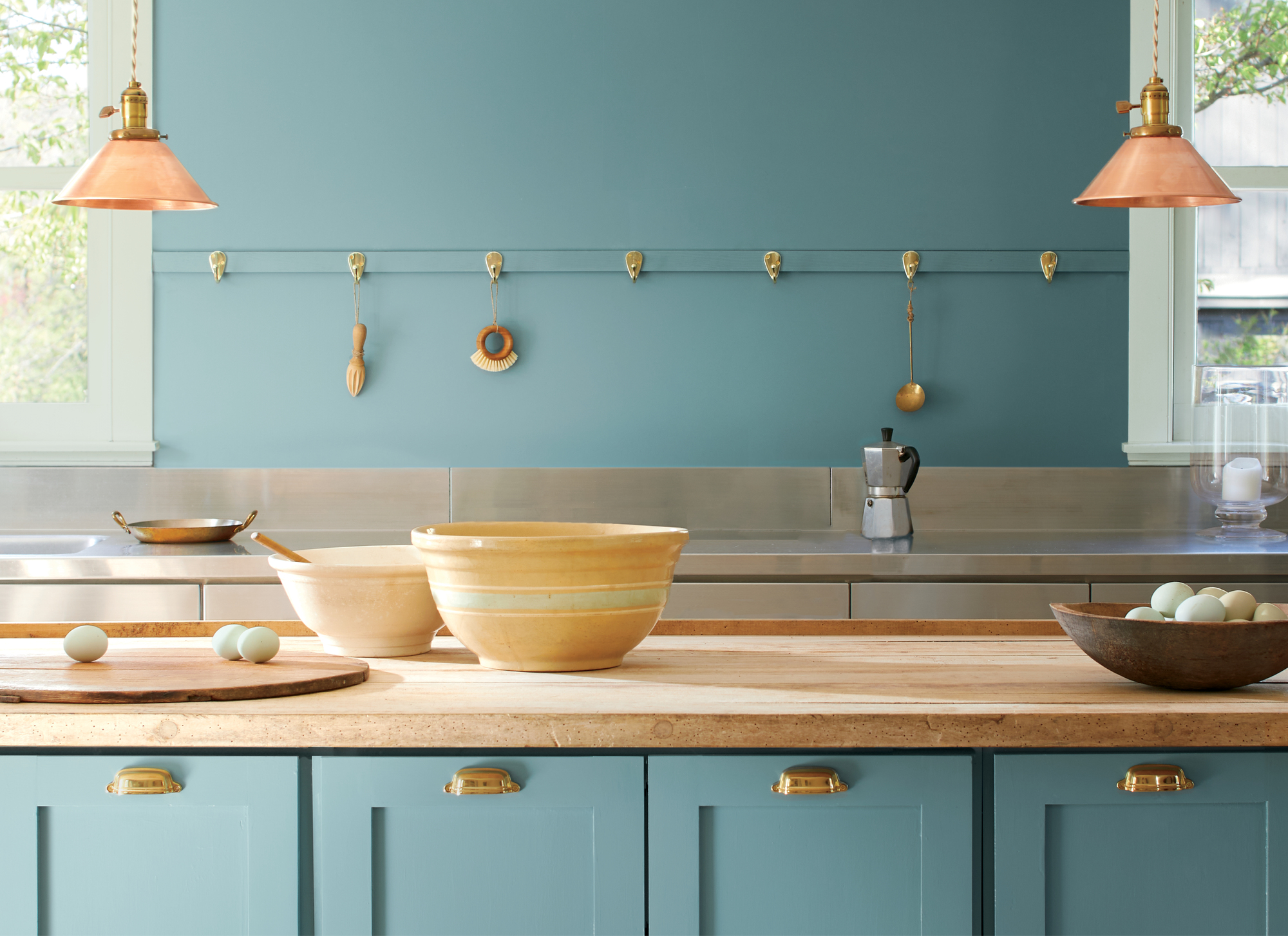
Yarmouth Blue HC-150
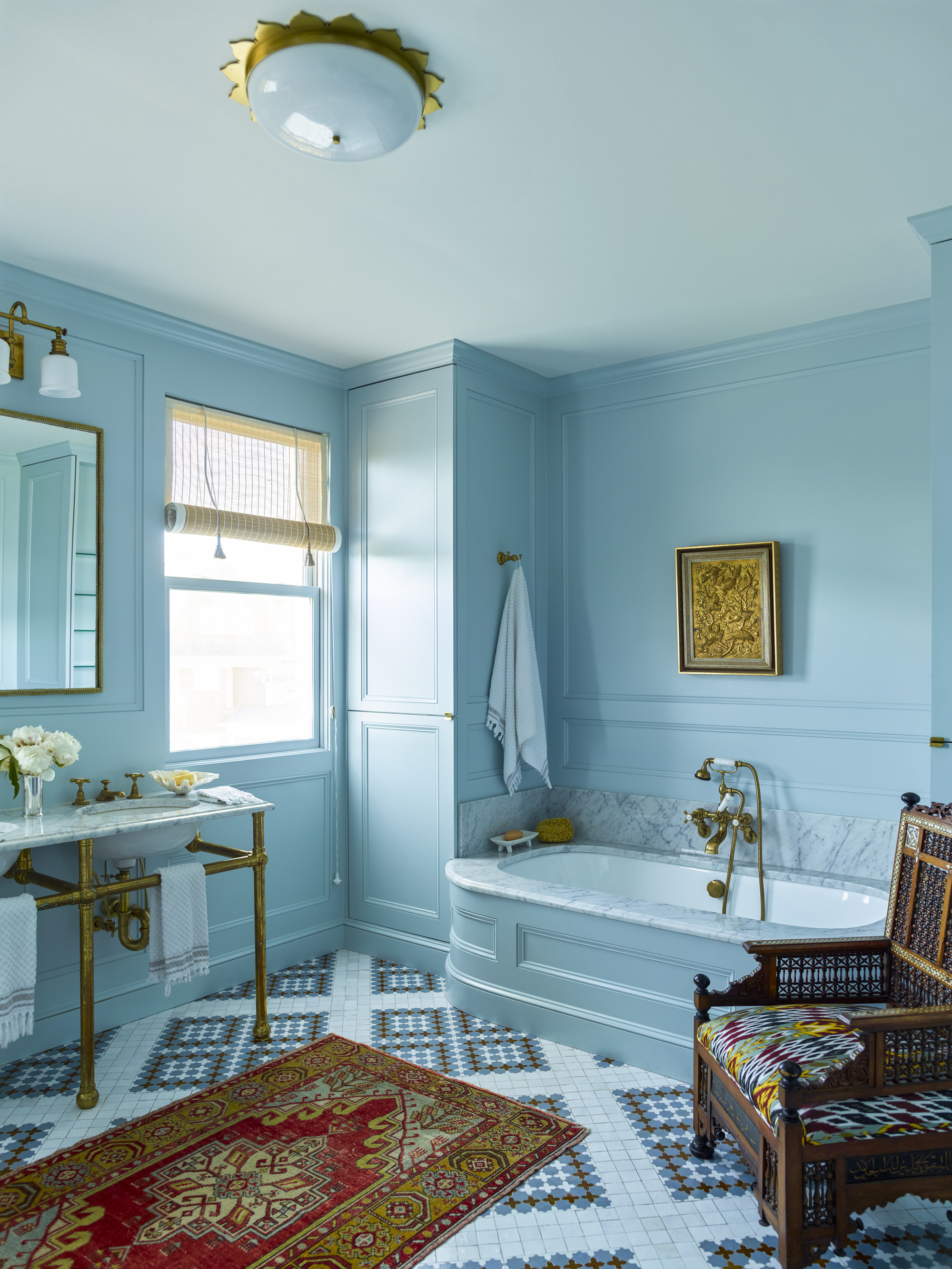
Yarmouth blue is a timeless shade of gray-blue that is airy and fresh but also soothing and not too bright or fluorescent, so it works perfectly in an all-over application like this blue bathroom.
"We had sourced the beautiful Moroccan zellige tile floor and felt like a single color everywhere else would be strong and clarifying," says Robin Henry from Robin Henry Studio.
"A separate color on woodwork and walls would have felt busy and disjointed; this is both soothing and powerful."

Price: £2.95/peel and stick sample
Woodlawn Blue HC-147
"The best Benjamin Moore shade of blue is Woodlawn Blue, HC-147," insists interior designer, Ali Mahon.
"It is subtle and soft and calming, so perfect in a bedroom, but I love using it on ceilings, especially on a front porch. It changes with the light, so it can read pale blue or gray or green."
The power of Woodlawn Blue is that it is sophisticated and refined and, although part of the Historical Collection, Woodlawn Blue can be modern — though it shines when used with classical interiors, explains Ali.
"I love the way it plays with antique painted furniture. It doesn’t compete with the furniture surfaces, but rather, the muted blue complements and brings out the beauty of the old chalky, and mottled paints. I would pair it with White Dove OC-17 and Chestertown Buff HC-9 for a chic earthy palette that can enhance both rustic and modern rooms," says Ali.

Price: £2.95/peel and stick sample
Hale Navy HC-154
For Matt McKay, much like the best-selling paints, he can’t get enough of Hale Navy, but not for full walls, so as not to overwhelm the space.
"I love Benjamin Moore Hale Navy for doors and door trim and have used it in my own home [as pictured here]. It's deep and rich, and I find that it's easily paired with other colors, like rich red, and even a contrasting green," says Matt McKay.

Price: £2.95/peel and stick sample
What is the difference between Wythe Blue and Woodlawn Blue?
Some Benjamin Moore shades look super similar, but it all depends on the light and shade in your room, whether you are painting a north or south-facing space and the accessories that warm up and balance the paint choice.
Wythe Blue HC-143 and Woodlawn Blue are two shades that might appear similar, but there are actually key differences that you should spot before purchasing.
Wythe Blue HC-143 is an attractive blue hue that adds personality while maintaining sophistication. Similarly, Woodlawn Blue HC-147 also brings a sense of tranquility and sophistication to any space. "Wythe Blue is perfect for accents, like a charming front door, built-ins, or paneled walls, this versatile shade provides elegance with ease," says Hannah Yeo of Benjamin Moore.
"Meanwhile, [Woodlawn Blue] is slightly lighter, bluer, and grayer than Wythe Blue. This hue is a popular choice for ceilings, evoking the feel of a clear blue sky, as well as for kitchens and bathrooms," adds Hannah.
There are so many colors that go with blue, so are you going to start your next decorating project with one of the best Benjamin Moore blues?