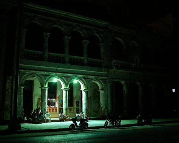
Originally built in 1938, this LA home held so much potential but required a full remodeling to bring it into the present day. 'The homeowners are a young family who wanted their home to feel like a sanctuary that would resonate with their personalities,' explains Shawn Taylor, one half of husband and wife design duo, Dacotah Studio. 'They wanted a home that would accommodate their growing family while capturing the artistic essence of the eclectic Silver Lake neighborhood.'
Shawn and Christina of Dacotah Studio beautifully breathed new life into the 1930s interiors, creating a serene and tailored environment with a revamped floor plan that boasts a chef’s kitchen, a brand-new primary suite, and lots of new windows and doors that modernized the home while also infusing it with much-need natural light.
The home blends style, and comfort, and has been brought well and truly into the modern day. To find out how they did it, I've spoken to the designers of this modern home.
The living room
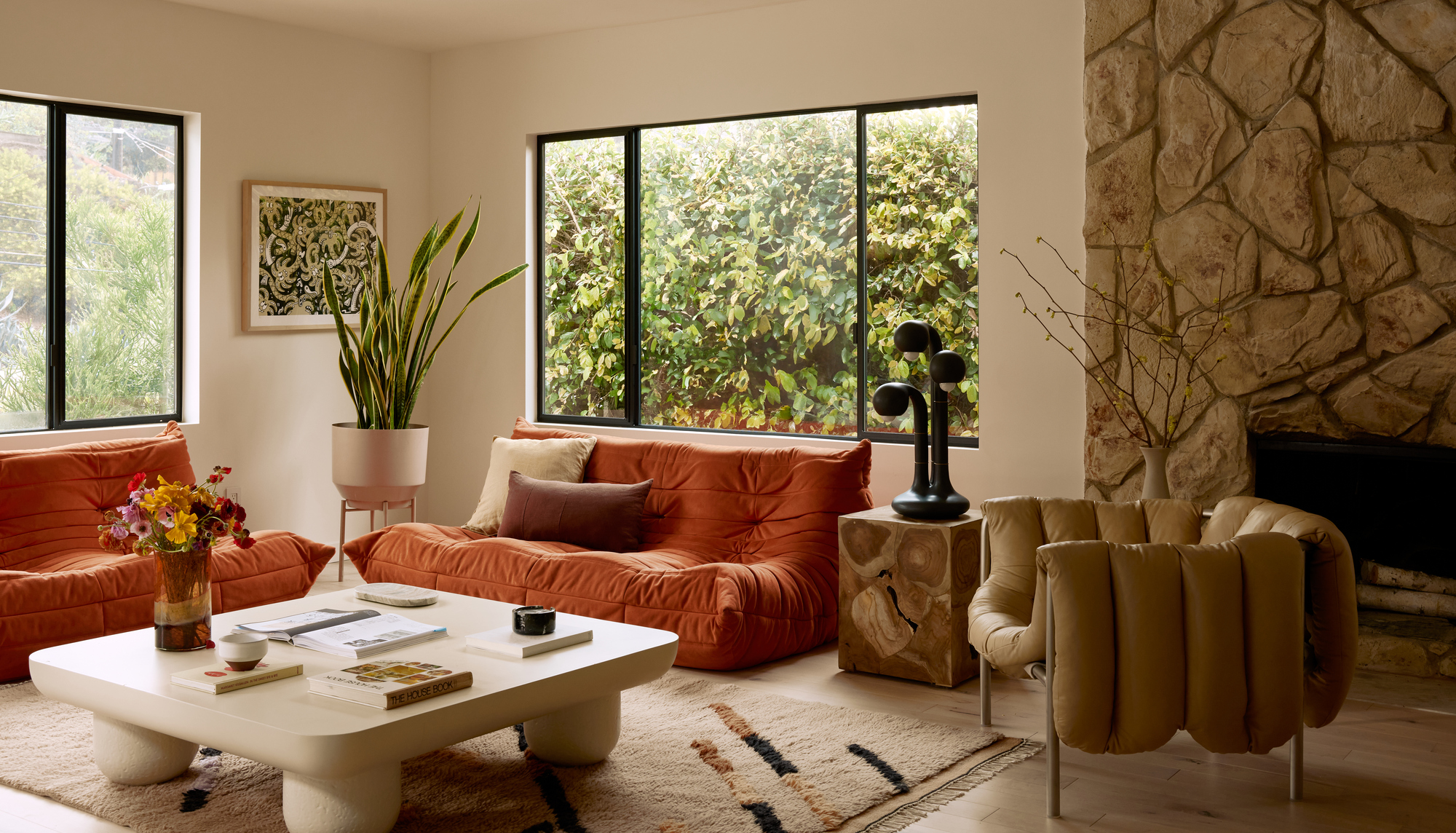
The heart of the home, the living room is one space where the 1930s architecture of the space needed to be brought into the modern day. To do that, Shawn and Christina required a total overhaul.
This room had a lot of incredible natural light and the team wanted to bring the outdoors in through an earthy and warm color scheme.
'The colors are heavily inspired by the Yucatan/Tulum region of Mexico, which features a lot of burnt reds, oranges, and warm tones,' says Shawn Taylor of Dacotah Studio. 'We added lots of unique furnishings and accessories that enliven the space and make it eclectic and functional.'
'Now, the living room is inviting and friendly, which is what you want a major common room in the home to be. It’s perfect for entertaining, hosting, and lounging, while also feeling elevated and durable.'
The space feels cocooned by the view of the backyard. In place of curtains covering the living room windows, the designers decided to leave the views uninterrupted, with a glimpse of garden walls clad in plants. This helps the space feel enclosed, cozy and effortlessly connected to the outdoors.
The fireplace
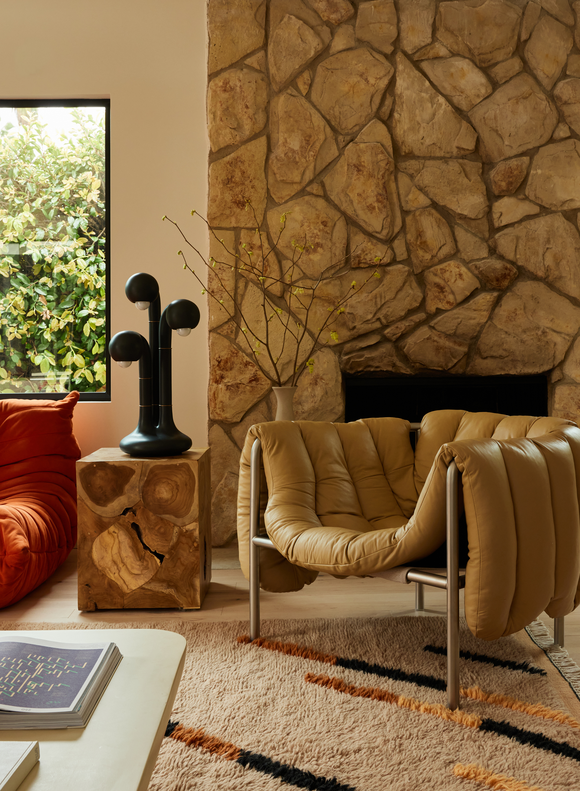
At the heart of the room is the fireplace, a key architectural lynchpin to the room that provides such character. Instead of a feature that had the potential to feel and look outdated, the designers wholeheartedly embraced the fireplace, catapulting the home into the present day.
'The fireplace was original to the home, and something that we wanted to embrace,' says Shawn. 'It ultimately fell in line with the Tulum-inspired look and feel of the newly designed room.'
'The fireplace plays perfectly into the design of the home. We wanted to have an earthy look to the home, and the stone facade makes a statement and pairs well with the natural living room.'
We mixed contemporary accessories with vintage pieces for an eclectic look that our client’s wanted, while also grounding the design with warm natural tones.'
The color scheme
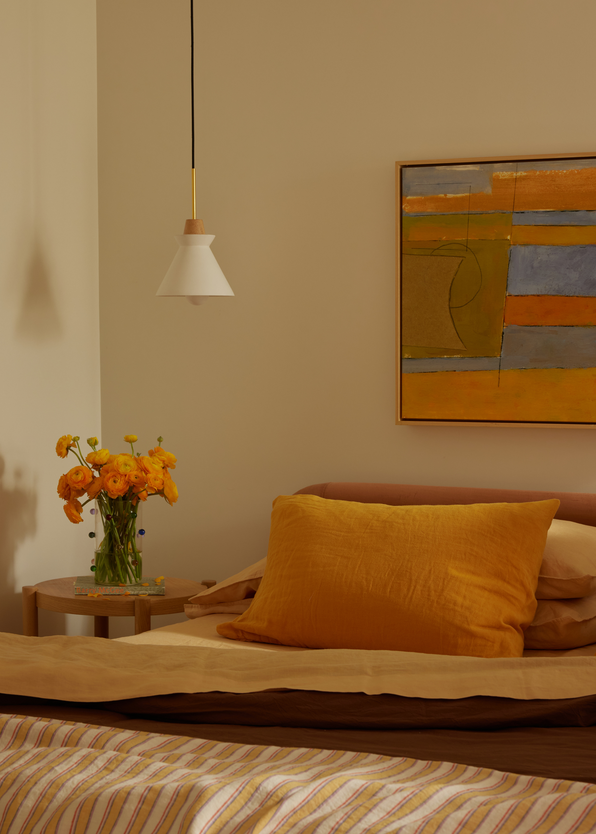
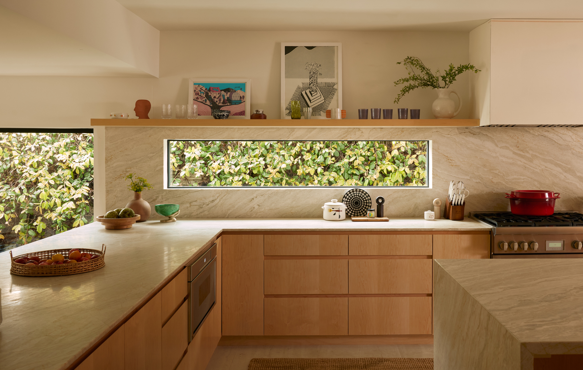
Leaning into the mid-century feel, the color scheme incorporated warming tones, featuring oranges and a distinct rust color used on the Togo sofas in the living room. In the kitchen, wood is relied on to create a soft, organic aesthetic. The look plays off the Tulum aesthetic while calling to the home's mid-century heritage.
'You can’t go wrong with a rust-colored sofa, and these ones have such an unexpected shape and style,' says Shawn of the living room. 'Since it is a bit of a bold color, we love to pair a rust-colored sofa with neutral accessories and accents in whites, tans, and creams. Our clients love the playful materials and contemporary fixtures that we weaved into the design.'
In the bedroom, the theme of earthy paint colors mixed with sunshine pops continues. The neutrality of the wall pairs so beautifully with the orange bedding and the colors work against the artwork used above the bed.
'We wanted to pay homage to the home’s original character and quality, and focused on creating a space that was refined, airy, and elegant with contemporary touches,' says Shawn. 'The palette is neutral and timeless, and we used a lot of warm woods and natural materials to create an inviting atmosphere.'
The bathroom
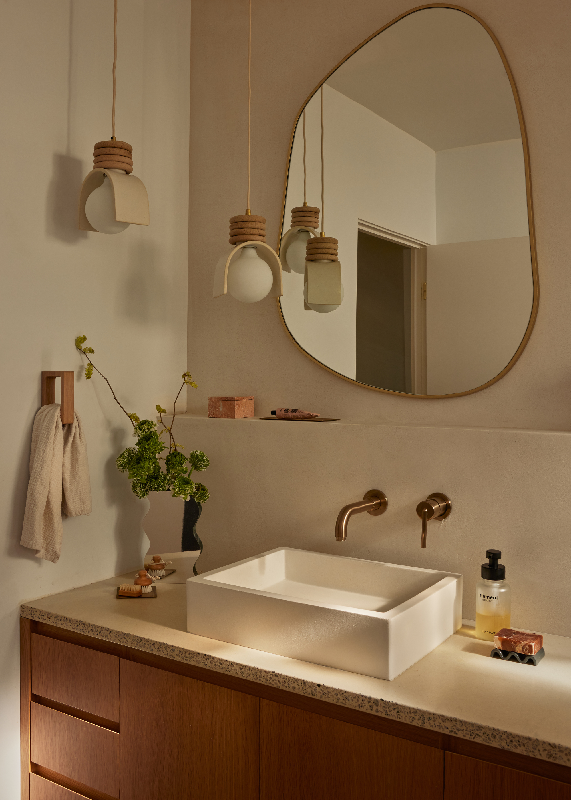
The primary bathroom, formerly a smaller and bland space, has undergone a remarkable transformation too and evokes a spa-like quality that weaves seamlessly into the broader Tulum theme.
'The transformation is a true testament to creative and thoughtful design,' says Shawn. 'We implemented a strategic layout to expand the room’s footprint and maximize functionality. After our renovation, the modern bathroom now features an optimal layout adorned with modern fixtures, giving new life to the space,' says Shawn.
'The main goal of the bathroom renovation was to add square footage, create a better sense of flow and maximize functionality. We are very detail-oriented when it comes to designing and styling a home. We aim to maximize every part of the room, even the shower, so that our clients feel that each part of the home is special and thoughtful.'


