As a millennial, I have a complicated relationship with the fitness industry. Having grown up surrounded by the toxic images of super-skinny being the desired state of being, I'm cynical about any attempt to push messages in the fitness space. Sure, fitness branding is more inclusive now – but exercise is still usually pushed in conjunction with how we look, and the clean eating/lift heavy culture has had its own style of toxicity in recent years. Against the backdrop of all this, it’s hard for a brand to get it right in an authentic way.
But Sweaty Betty has rebranded, and the campaign genuinely strikes a chord with me. Centred around how exercise can shift your mindset, bring positivity and make you feel great, the new messaging feels authentic, not over the top or forced. I think it's among the best rebrands I've seen.
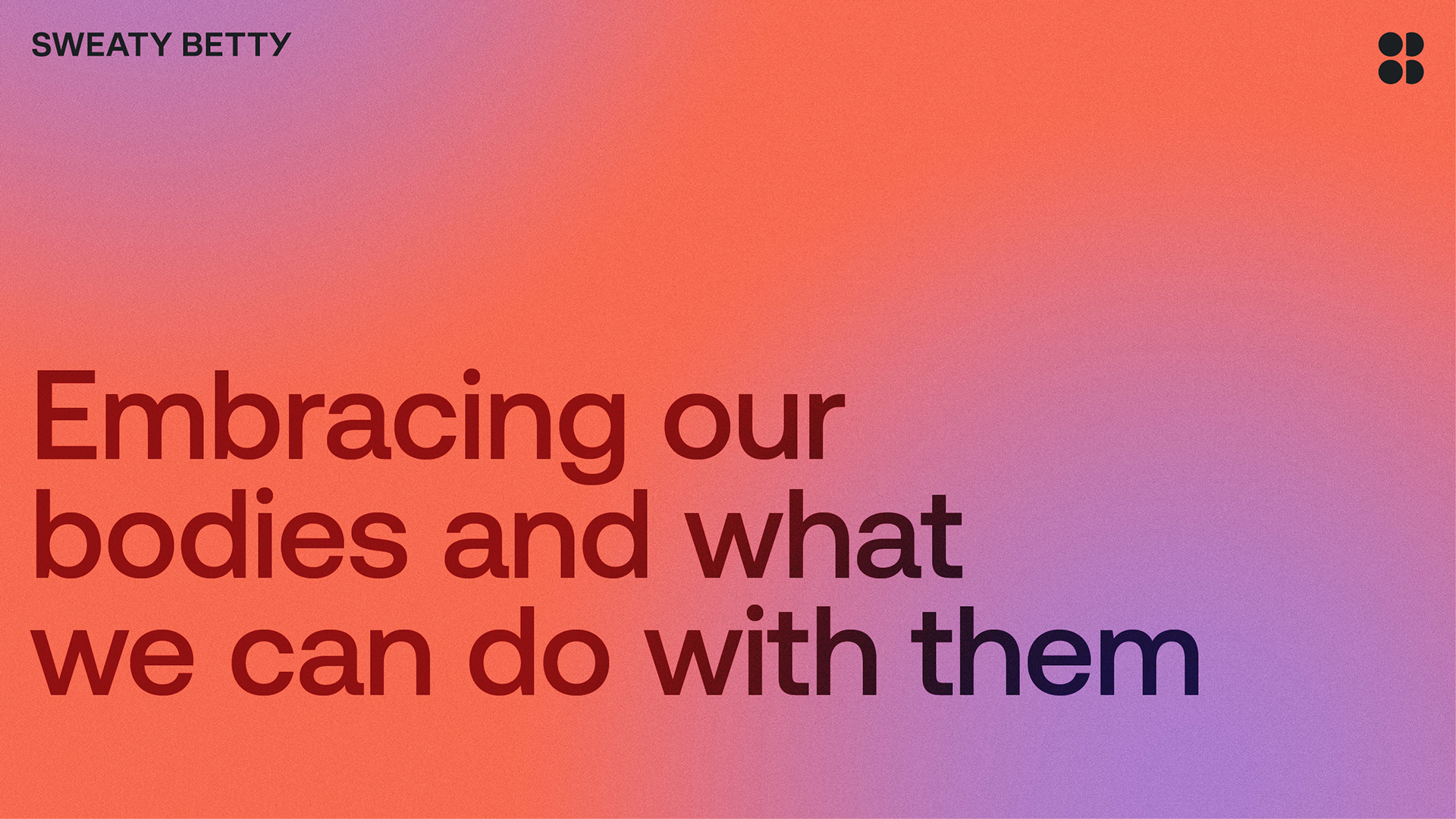
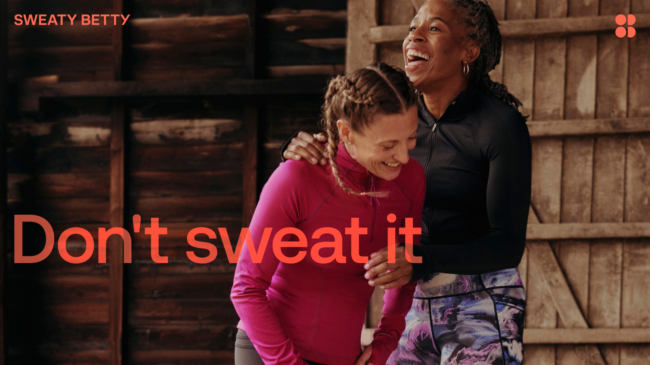
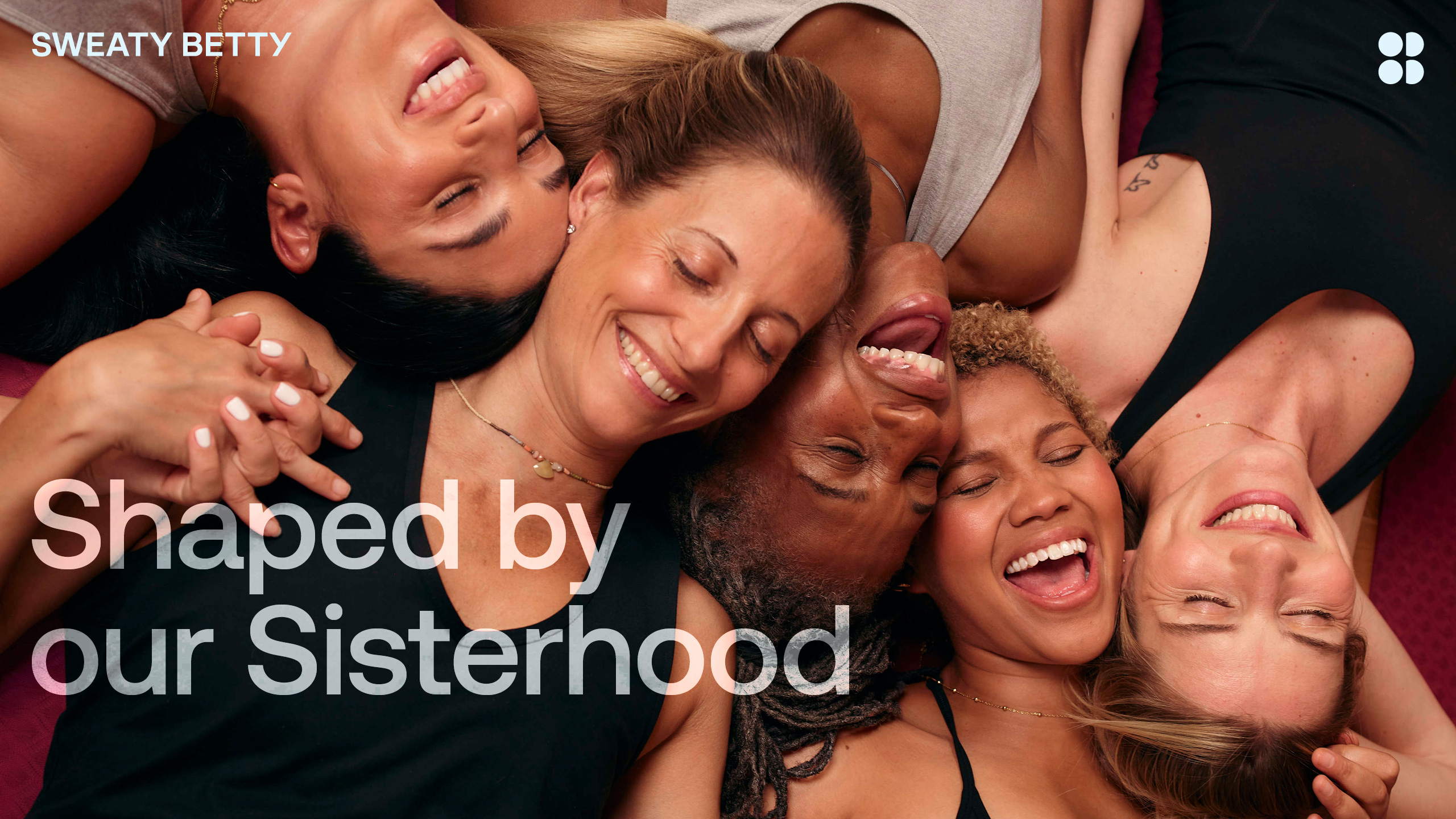
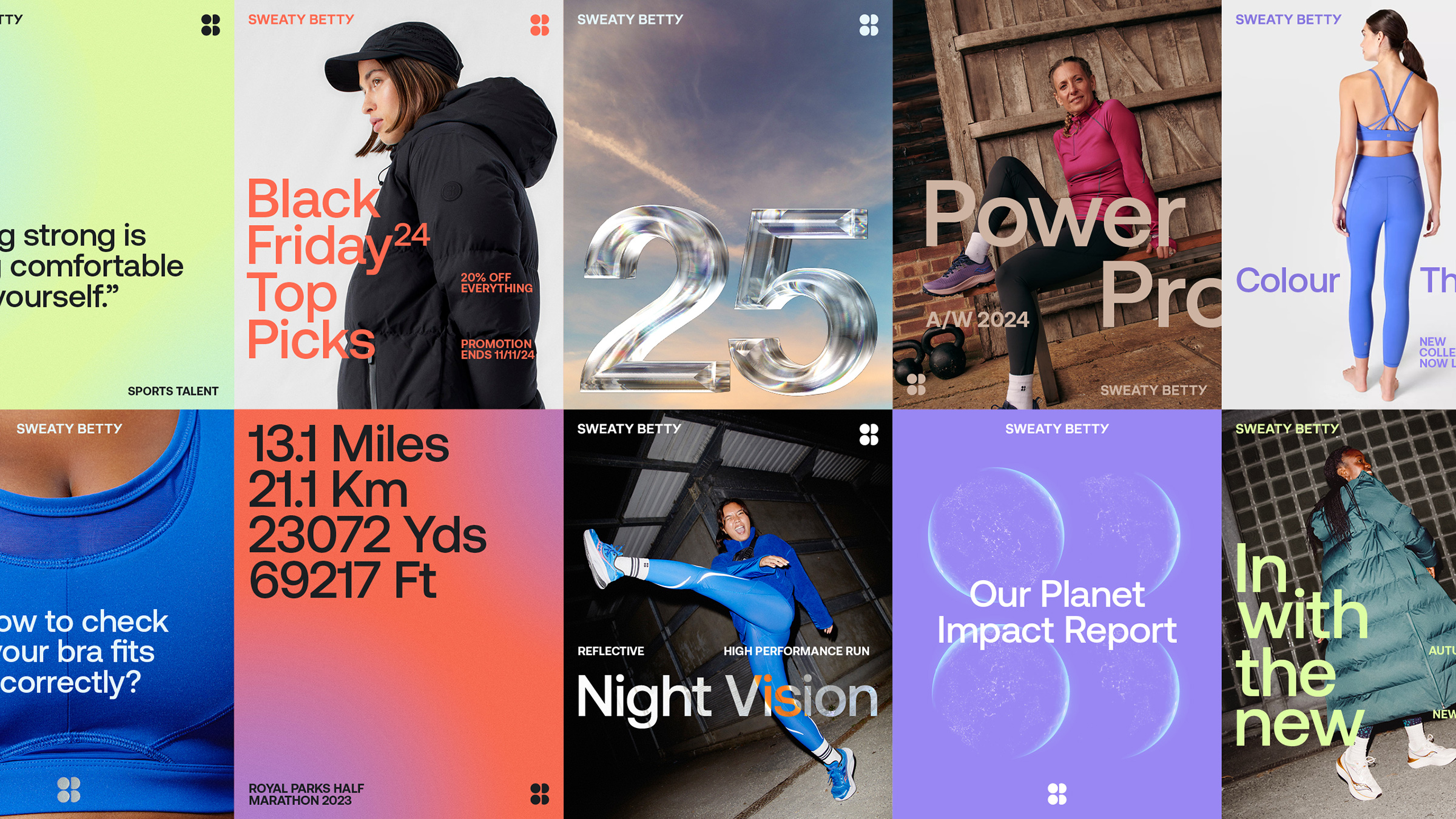
The campaign, created by Fluoro, features video shot in an DIY style (like it was shot by your mate) and are full of groups of women exercising together, with no real focus on their bodies. Images are accompanied by messages like "being strong is being comfortable with yourself", and "embracing our bodies and what we can do with them".
The campaign feels joyful and about more than exercising off the calories you did or didn't eat last night. Rather than being encouraged to "transform yourself", we're encouraged to "be yourself". It's a way of looking at fitness that's healthy for mind and body, it's the real way to motivate yourself to get moving, and I can get behind it.
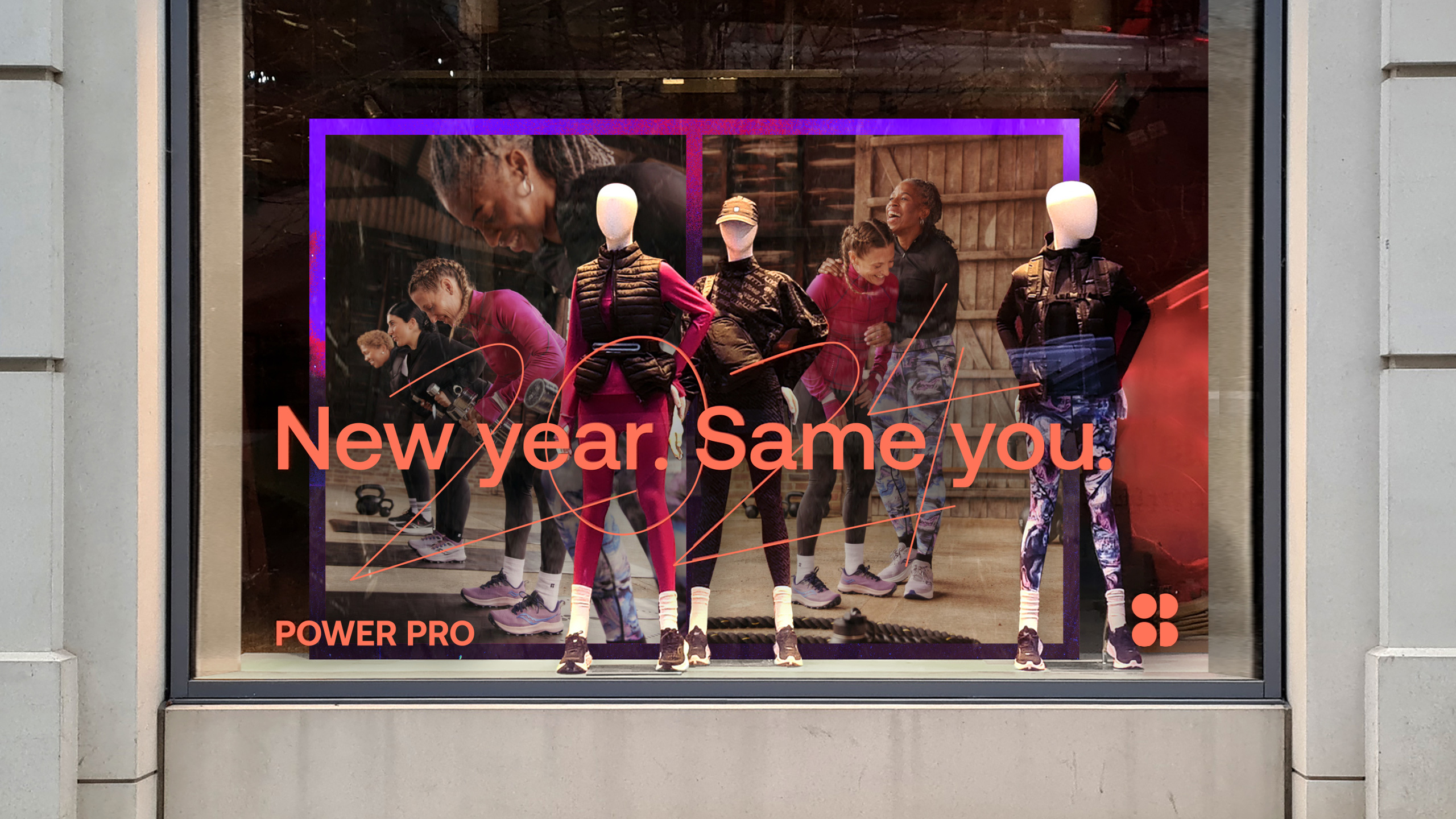
The logotype, created by F37 last year has been retained, but new rules on scale and positioning enhance consistency and brand recognition. There are also new 3D applications for the brand mark, giving it more flexibility across campaigns.
Elsewhere, the OG Sweaty Betty orange we know and love is back, alongside a fresh new primary colour palette and secondary palette of vibrant pastel tones, which feel just the right amount of feminine. There's also a new brand typeface, bringing the brand bang up to date and giving it a 'matey' and 'fun' feel that feels in line with the overall brand refresh.
“It’s important for us to ensure the message we’re putting out into the world isn’t about how exercise can make your body look, but how it makes us feel and what it can help us do. Women are subject to enough pressures without someone else defining the ‘right’ way to exercise," says Melissa Mullen, Global Brand President of Sweaty Betty.
“Thankfully, a reckoning is starting to happen surrounding health and actualisation vs aesthetics. We want to be at the forefront of that movement. Fluoro understood our mission from the beginning and we’re thrilled with the way they’ve brought it to life with a new brand vision that we know will inspire and resonate with our global community.”
You can see the campaign in action on the Sweaty Betty website.