Just as the game itself, the logos for the Super Bowl have changed greatly over the years. From straightforward simplicity to sleek and modern, the logos for the Super Bowl are incredibly recognizable.
From the NFL’s perspective, that’s precisely the point. One glance is all it takes to recognize that you’re looking at the biggest sporting event in the nation … and perhaps the world.
Of course, some criticize these modern logos as being copy-and-paste, minimalist and unoriginal. Those yearn to return to the unique logos of the 1990s and early 2000s, where the NFL used elements from the host city to create a new logo each year.
But some disliked those logos, too, claiming they were too busy.
In this post we’re going to review the logos for the Super Bowl over the last six decades, highlighting the significant themes and changes over the years.
The Early Years: Minimalist Beginnings
Obviously, one thing that stands out from the early designs is that it wasn’t “The Super Bowl,” but rather the “First World Championship Game AFL vs NFL.” We didn’t start using the term “Super Bowl” officially until the third championship game in 1969.
As far as design aesthetics are concerned, the early logos were very straightforward. Each was “Super Bowl” followed by the appropriate Roman numerals. The font and colors changed each year, in an attempt to match the vibe of the host city and popular culture at the time.
For the most part, the logos were fairly similar until the 1980s, where we began to see a design change.
Here's your annual reminder that Super Bowl logos were much better before the NFL decided to kill all creativity and standardized the design. pic.twitter.com/pexfSiNjkF
— Joe Pompliano (@JoePompliano) February 12, 2023
A New Creative Liberty: The 1980s
The NFL really leaned into the Roman numerals in the 1980s, putting them front and center, typically in a bold and powerful font.
While the design changed each year, there was one major constant: the red, white and blue color scheme.
This was done for two reasons. First, it provided some brand synergy. The NFL’s logo features red, white and blue, so getting those colors into the Super Bowl logo every year was great for branding purposes.
Second, it provided a zing of patriotism to a sport that is quintessentially American and was in the process of surpassing baseball as the most popular sport in the country.
It’s worth mentioning that the logo used in 1993 for Super Bowl XXVII is considered an all-time great. This appeared before the NFL shifted to city-centric designs, but it instantly lets you know the game was being played in the Rose Bowl.
Regional Flair: When Host Cities Inspired the Designs
For many, this era is considered the best. The NFL broke away from the patterns it had established throughout the 1980s in 1994.
The logo for Super Bowl XXVIII featured a peach in the center (as the game would be played in Georgia). Super Bowl XXX was played in Arizona and the logo featured the iconic southwestern colors red and turquoise. The Mardi Gras theme of the Super Bowl XXXI logo is still a fan favorite.
Super Bowl logos were much cooler when they were unique. Also, after 9/11, I believe, they scrapped the SB 36 logo and went with their best of all. https://t.co/l3ISNBenOK pic.twitter.com/1Ya6YthUG4
— FitzyGFY 🍺 (brew checkmark) (@FitzyGFY) February 1, 2024
After the 9/11 terrorist attacks, the NFL switched Super Bowl XXXVI’s logo from a New Orleans-inspired design to a red, white and blue America-themed one. The decision was a hit as many fans consider it to be one of the best logo designs in football history.
A “Space City” motif was front and center for the Super Bowl XXXVIII logo, complete with a knockoff NASA font, Houston Astros colors and hidden planet Saturn.
Super Bowl XXXIX’s logo prominently featured the Dames Point Bridge, an iconic structure in Jacksonville, Fla.
These logos continued until 2010, when the NFL shifted its design philosophy again. Beginning in 2011, creativity and customization took a backseat to standardization.
The Corporate Shift: Standardization in the 2010s
For Super Bowl 50, the NFL ditched the Roman numerals and the more creative designs. Fans didn’t know it at the time, but this would become a pseudo-template for Super Bowl logos moving forward.
There’s little deviation from year to year, the Lombardi Trophy is featured prominently and the color scheme remains largely the same.
Although it’s worth noting that the NFL did opt for more color and design elements recently. The style is basically the same, but the Roman numerals are now colored with an area-specific color scheme.
Perhaps this is the league’s way of appeasing fans of both newer and older designs.
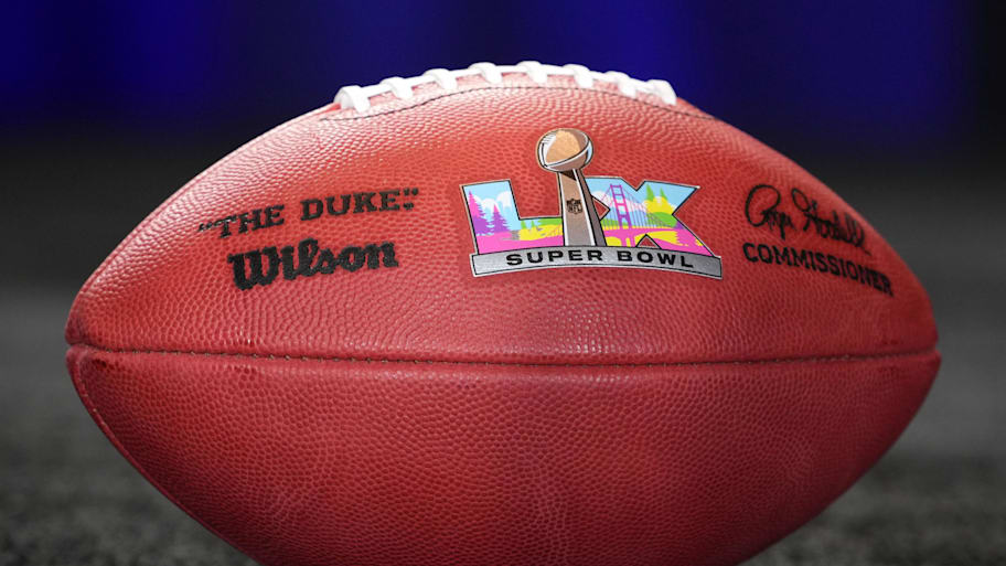
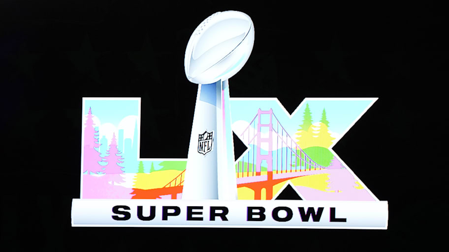
Super Bowl 2026 Logo
The 2026 Super Bowl will be Super Bowl LX. It’s slated to be held in Santa Clara, Calif., on Feb. 8, 2026. The logo follows a similar fashion as previous years, with a color scheme and design that reflects the host city.

Read More About the Super Bowl
- Super Bowl Winners, Scores & Champions of Every NFL Season
- Which Team Has the Most Super Bowl Wins in History?
- Super Bowl Gatorade Color History & Everything You Need to Know
- Has There Ever Been a Shutout in the Super Bowl?
- 10 Longest Field Goals in Super Bowl History
- Super Bowl Records: Most Passing, Rushing, Receiving Yards and TDs in History
- Every Non-Quarterback to Win Super Bowl MVP
- Biggest Upsets in Super Bowl History
This article was originally published on www.si.com as Super Bowl Logos Through the Years: A Look at How They’ve Evolved.


