New logo designs in recent years have generally tended towards simplification. Brand identities are often reduced to their core elements to make them quicker and easier to interpret. That makes the new Mozilla logo a little surprising at first glance.
The existing design from the internet browser make was so simple and easy to read. The new logo is a little... abstract.
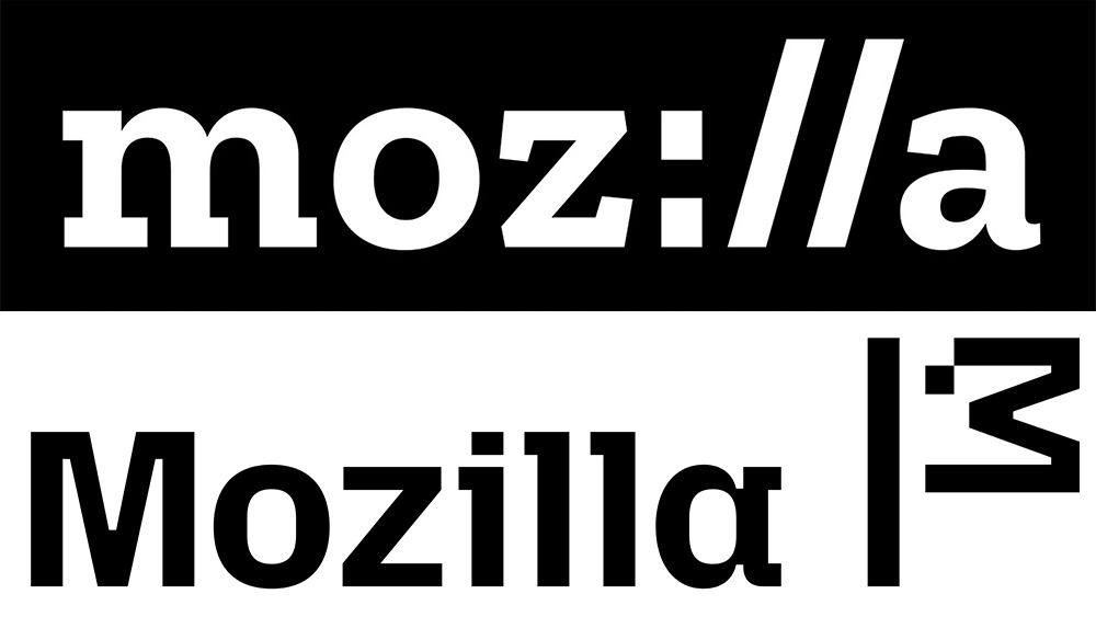
Since 2017, Mozilla has been using the moz://a logo in its Zilla Slab Highlight typeface. Applied on a rectangular background, the design incorporates the symbols used in internet protocols like 'https://' to form the 'ill' in the name. It's neat, and the pun makes sense for a foundation that's best known for making the Firefox browser.
However, the Mozilla shop is now selling merchandise that features an intriguing lockup with a new typeface and an abstract mark that looks like a pixel art flag. The new logotype (without the flag thing) also appears under the Firefox logo on the landing page for Mozilla's Nothing Personal campaign. The German blogger Sören Hentzschel has done some digging on Github and found that the new logo design also appears in patches for a refresh of the Mozilla website. The new code is controlled by a variable entitled 'brand-refresh'.
So while there's been no official announcement, everything seems to indicate that a full-blown Mozilla rebrand is on the way. The big question is, what is it? The new design could be intended to comprise one of the Ls from the brand name followed by the dot of the 'i' and the 'M' tipped on its side. Maybe. Or it could be a reference to the company's ancient past.
Sören notes that the new logo reminds him of the company's namesake: the old dinosaur mascot of what was originally the Netscape Communications Corporation. Mozilla the dinosaur, a portmanteau of Mosaic (the original name for the Netscape Navigator) and Godzilla gave the Mozilla Foundation its name but was retired from active service back in 2012.

Mozilla went through various forms over the years. Originally green and purple, he was given a fiercer red Tyrannosaurus rex-inspired look in 1998 for mozilla.org. That redesign was the work of Shepard Fairey, the founder of Obey Clothing and the designer of the Barack Obama "Hope" poster (incidentally, Fairey just revisited his Obama poster to create a similarly iconic Kamala Harris poster with a new message).
It's a nice theory, but I can't help thinking that Mozilla could probably have made a design that looks more obviously like a dinosaur if that's what it was going for. It will be interesting to see it confirms the theory if it makes an official announcement of the rebrand.
For more branding news, see the new KitKat logo.