Starlink, SpaceX's internet connectivity constellation, is gradually coming to life.
A new video released Monday shows just how quickly this proposed group of satellites is coming together, as proposals suggest it could one day number in the tens of thousands.
The video was produced by Elias Eccli, a physics student from Innsbruck, Austria. It shows how SpaceX is gradually filling the night sky with enough satellites to provide internet coverage. These satellites operate at a relatively lower altitude compared to other constellations. SpaceX has also applied for permission to launch up to 42,000, far more than the few thousand total satellites in space. These two factors mean the firm can provide up to gigabit internet with latency in the tens of milliseconds, far better results than other satellite services.
SpaceX launched the first batch of 60 satellites in May 2019. It has since expanded to 420 craft in operation over seven launches, ranking as the world's largest satellite constellation. CEO Elon Musk has outlined plans to launch a beta test for northern regions this year. Eccli's graph shows how this emergent constellation – which could get rural communities online and help fund ambitious missions like a city on Mars – is coming to life.

The visualization is a little complicated, but it essentially shows how the constellation would look from the perspective of a single fictional satellite in Starlink's operational orbit. It's not from the perspective of Earth, as the creator reasoned it "could look overwhelming" with all the satellites flying across the screen and overlapping.
As the graph fills, it means more of the Earth has been covered by Starlink satellites. A fuller graph means a more complete service.
Eccli explained to Inverse how the graph works. When it comes to satellites' position in space, there are four measurements worth thinking about:
- The tilt of the satellite's orbit relative to the equator. This is 53 degrees for every Starlink satellite, so this can be ignored.
- The altitude above the ground. This is represented in the graph by color saturation: darker colors represent higher altitude. Starlink satellites are designed to operate 550 kilometers above the Earth's surface.
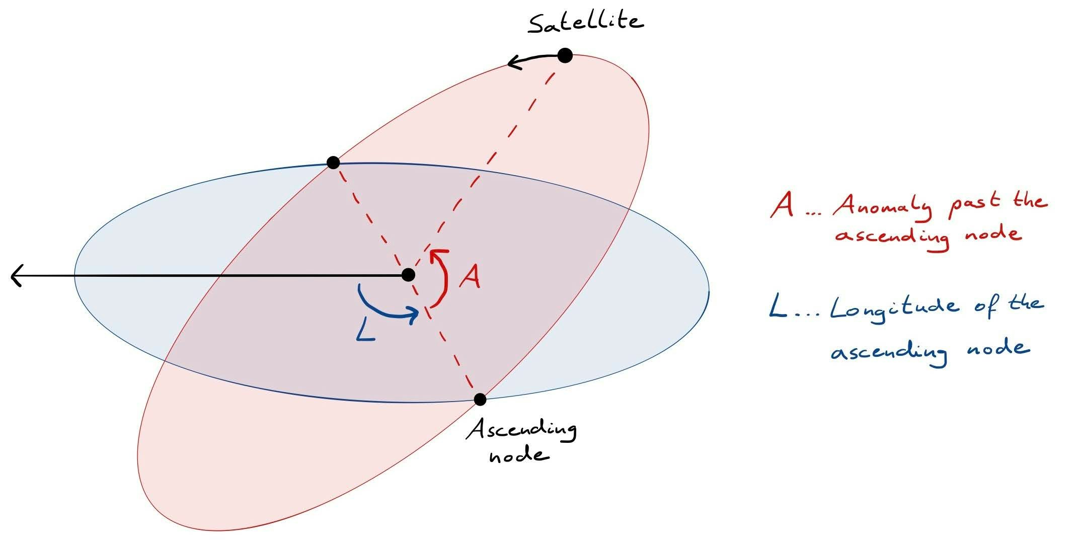
- The angle of the satellite's orbit in relation to a fixed direction in space. This is technically known as the "longitude of the Ascending Node," and it's shown with the graph's y-axis going up the side.
- The angle of the satellite on its path in relation to a fixed direction in space. This is the "anomaly past the Ascending Node," and it's shown on the x-axis going across.
These last two are quite hard to visualize, so Eccli supplied a sketch of how these last two look in space, where the blue disc shows the Earth's equator and the red disc shows the satellite's orbit:

As seen in the graph, the "Ascending Node" is the term for the point where the satellite crosses the equator as it heads north. The opposite point, where it's moving south, is the "Descending Node." That means the x-axis is plotting that red angle marked with an "A," while the y-axis is plotting that blue angle marked with an "L."
So far so good, but eagle-eyed readers may spot that the blue disc represents the equator, and not a fictional satellite as stated earlier. So why the switch?
"This would suffice for a single plot, but if you want to show the progress in an animation, there are two problems," Eccli explains.
The first is that the satellite is moving all the time, which means if the graph was plotted in relation to the equator, it would end out a big blurry mess. The angles of "A" and "L" would be constantly changing. Using a fictional satellite, which is racing around in operation just like the others, helps to keep those "A" and "L" values more stable.
The second reason is a bit more complicated, but it's because the Earth isn't actually a perfect sphere – though it's not a flat Earth as some believe. Because the Earth is not a perfectly circular ball in space, the orbit of the satellites themselves are also moving over time. This effect is known as "nodal precession." Using a reference satellite also corrects this effect, and stops the lines from gradually drifting upwards on the graph.
All this means that as the graph fills, SpaceX covers more of the Earth's surface with satellite coverage. More coverage means people can access Starlink from more places, and that takes SpaceX one step closer to offering a high-speed, low-latency satellite internet service.

The graph shows how each launch further fills out the sky. Each new color represents a different launch:
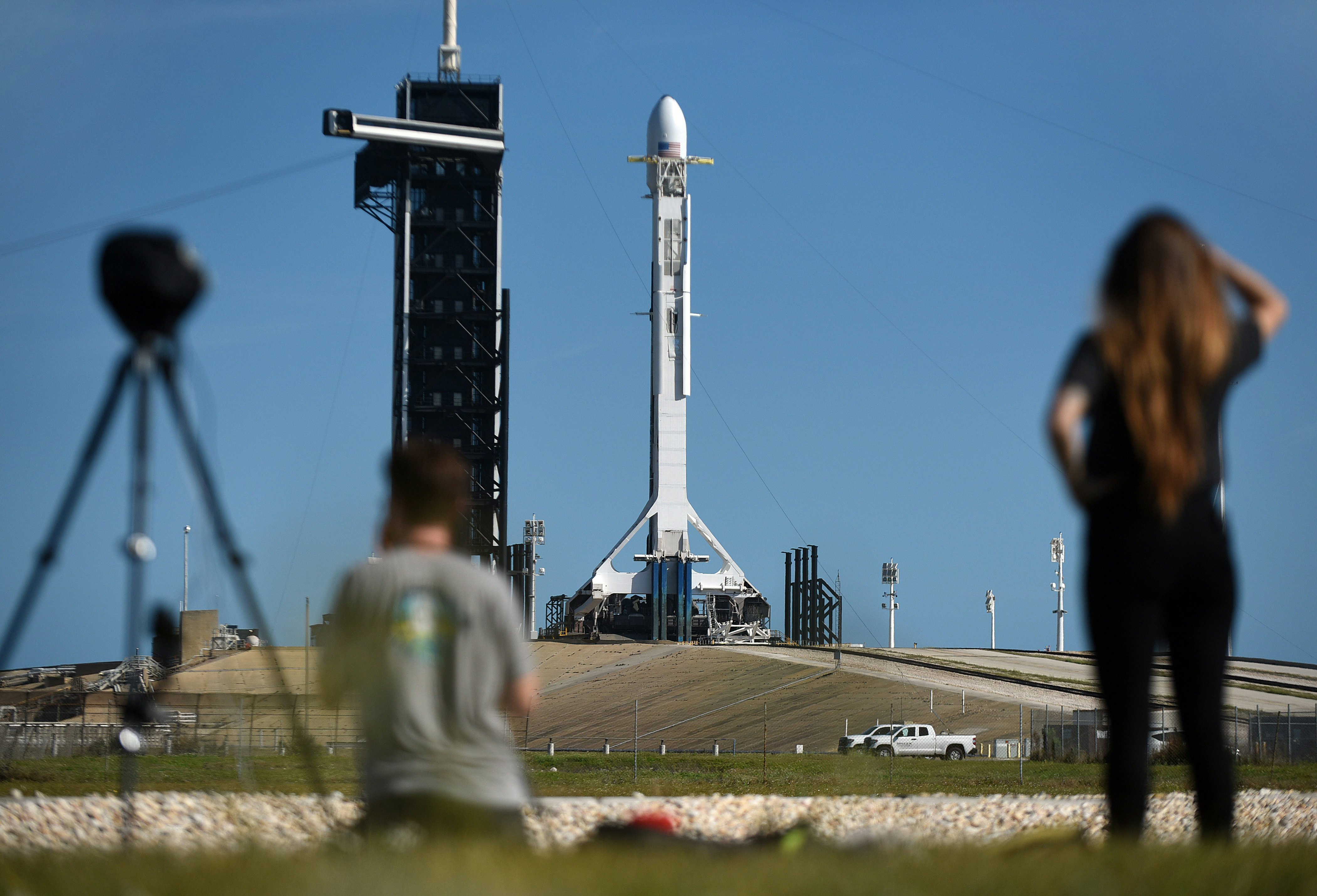
- The first launch was on May 24, 2019, from Space Launch Complex 40 at the Cape Canaveral Air Force Station in Florida.
- The second was on November 11, 2019. Lauren Lyons, an engineer with the Starlink team, said during the launch that the new satellites “will make Starlink one of, if not the largest, satellite constellation to date.”
- The third was on January 6, 2020. This launch tested out a non-reflective coating.
- The fourth was on January 29, 2020.
- The fifth was on February 17, 2020.
- The sixth was on March 18, 2020. Unlike the previous five missions, this one launched from Launch Complex 39A at the Kennedy Space Center in Florida.
- The seventh was on April 22, 2020, at the Kennedy Space Center again.
- An eighth and ninth mission is expected in June 2020.

As the satellites launch, Eccli tells Inverse the graph also highlights some other interesting effects:
"You can see satellites being launched into a low orbit, where they orbit faster than the reference satellite and therefore move to the right on the x-axis. As they stay in this 'parking orbit' their orbit precesses faster than that of the reference satellite, so they move upwards on the y-axis. SpaceX uses this natural process to divide the satellites into different planes without using any fuel. As the satellites start raising their altitude using their ion thrusters, their orbital velocity decreases. Once they reach the operational orbit, their velocity exactly matches that of the imaginary reference satellite, so they seem to stop. Some satellites rise even higher for a short period of time. Those are the ones that suddenly start moving to the left. As they reach their correct position in orbit they drop their altitude and again 'stop.'"
Starlink could become the first example of a mega-constellation, as communication firms seek to bring high speed access to broader areas on Earth. With the new visualization, viewers can witness this massive project emerge before their eyes.


