After weeks of getting yelled at from all corners of the internet, Sonos finally relented and is making changes to the recently overhauled mobile app.
If you haven’t been following along, in April, Sonos announced a complete redesign of the Sonos mobile app that customers must use to control their Sonos speakers, sound bars and home theater sets.
The thinking from Sonos on the refresh was to streamline the app, “bringing services, content, and system controls to one customizable homescreen.”
When the overhauled app update launched on May 7, there was near immediate backlash, which has continued unabated since then. The biggest complaint was that Sonos sliced off a number of features and slimmed down others.
As a Sonos user, I never found local music libraries great, but they’ve gotten stupendously worse. Somehow, the search feels less intuitive than the previous S2 version. This is especially egregious since Sonos took away the ability to edit playlists and upcoming song queues.
Apparently, accessibility features were completely broken or severely reduced, as well.
Other features, like Sleep timers and alarms, were completely dropped. Users took to Reddit, Sonos’ contact email and X to issue complaints.
Sonos’ initial response was not great. Chief product officer Maxime Bouvat-Merlin told The Verge in a statement, "Redesigning the Sonos app is an ambitious undertaking that represents just how seriously we are committed to invention and re-invention. It takes courage to rebuild a brand’s core product from the ground up, and to do so knowing it may require taking a few steps back to ultimately leap into the future."
Once again, Sonos’ courage was not taken well. It tried to answer questions about the process of designing the new app and why they rolled it out with missing features and accessibility. In an AMA on the Sonos forum last week, multiple Sonos personnel tried to explain the decision.
“This is a new app - we started from an empty project file. As the project progressed, we stopped investing our time in the old app code. Over time we “cross-faded” our engineering attention into the new app. We need to make the new app be the app going forward so we stop splitting our attention,” said Tucker Severson, director of product management.
This week, Sonos announced updates and improvements to a number of affected features. Accessibility features like VoiceOver and TalkBack are said to be improved. It also added alarms back in.
The company announced that Sleep-timers, adding to queue and playlist changes, won’t be arriving until June.
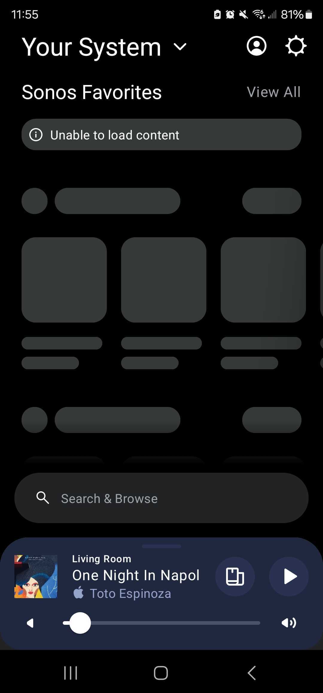
As a Sonos user, the updated Android app has become supremely slower. Searches or even telling speakers to play a song takes multiple seconds to even load. Here’s how my home screen in the Sonos app looks right now.

It may be some time before Sonos customers trust the company. Multiple threads in the main subreddit are about rolling back the update, which iOS users can’t actually do, but Android users can work around it.


