Slack is getting a much-needed redesign. The messaging service is popular among office workers worldwide, but it isn’t always the most user-friendly. With this upcoming overhaul, the company hopes to streamline the application to make it easier to use.
According to Slack chief product officer, Noah Weiss (via The Verge), the redesign exists to streamline the experience for Slack power users. Weiss says “for end users, you end up having to switch to all these different workspaces just to see channel activity, the mentions you have, the threads you’re part of, and so on.”

Weiss told TechCrunch that the company has “added a lot more tools and capabilities into the core Slack product that really has evolved from being a collaboration tool to a full-fledged productivity platform.” In short, Slack is about to become less messy.
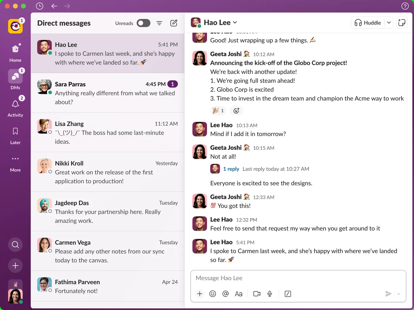
Like the current version of Slack, the new Home section contains your channels, DMs and apps. However, there will be a sidebar on the left with a new DMs section that’s visually similar to Microsoft Teams.

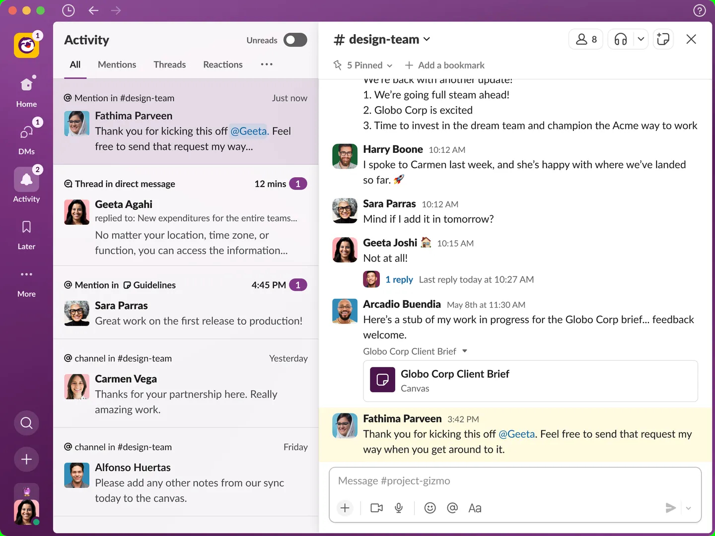
There’s also a new Activity window that displays all your messages, mentions and reactions from all of your Slack workspaces. If you need to save something for later, you can mark it and get back to it via the Later page.
The “More” tab underneath Later has workflows, canvases and integrated enterprise applications. You can search for things by clicking on the magnifying glass icon and add new messages, canvases and more via the + button.
Outlook
As a frequent Slack user myself, I can attest that it’s not always easy to navigate, especially if you’re juggling many (and often too many) channels and DMs, as I am. Without having tried it myself, the updated interface appears like it will declutter your Slack — but I'll need to give it a test drive to see if the updated version is more user-friendly.
The updated Slack will begin rolling out to users in the coming months, so you might not see the changes for a while. We'll bring you an update once we've tried the new Slack ourselves.


