Your workplace chats could soon look a lot different as Slack has revealed a major redesign as it looks to help users across the world boost their productivity.
The online collaboration platform says its new look will help workers stay organized, focused and productive even in the face of mounting to-do lists and large numbers of chats.
Set to roll out over the next few months, the new-look Slack has a particular focus on productivity, with tweaks such as easier navigation around messages channels and conversations, as well as easier ways to find the tools you need.
What does the new Slack look like?
As customers increasingly use Slack for more than just messaging, the company is also looking to expand its capabilities to show off just what it can do.
Above a user's profile picture is a new "create" option that demonstrates the scale of this: clicking on it will allow users not just to send a message in a channel or DM, but also start a Huddle video or audio chat, collaborate in a document using Canvas, or create a new channel entirely.
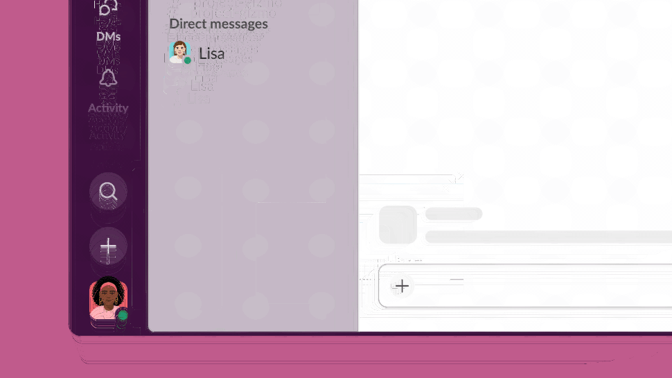
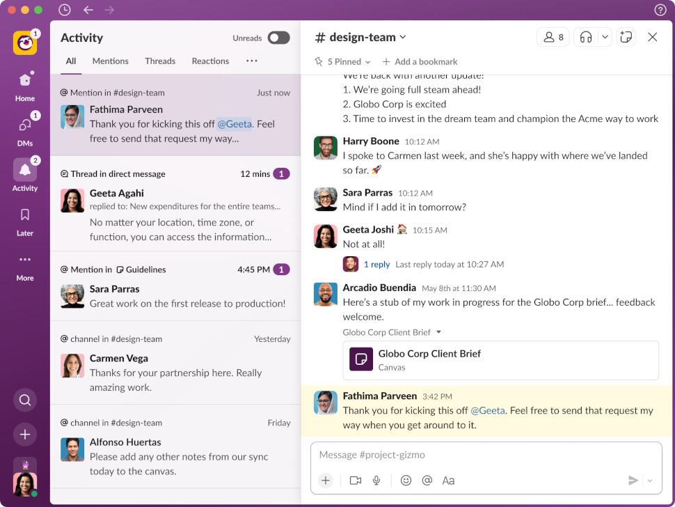
Another major addition to the redesigned Slack are new dedicated views for everything that needs your attention.
This includes those users who may be in multiple workspaces within an Enterprise Grid organization, as they will no longer need to keep switching between channels and messages across multiple workspaces. Instead, users will be able to view channels from every workspace in the Home menu, making for a much smoother user experience.
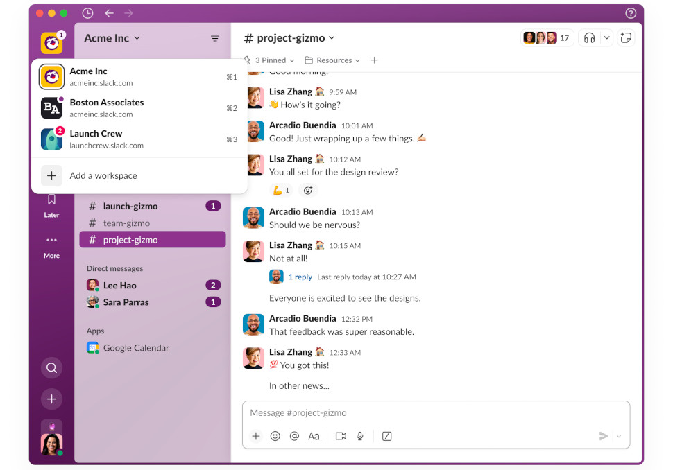
Designed to "help focus your attention and maintain momentum on your work", the new interface includes a dedicated space for all your direct messages that offers more of a preview (much like an email inbox).
The redesigned "Activity" menu offers a single location for mentions, threads, reactions and app notifications, which are now split into sub-menus rather than having these spread out across different menus, as well as an upgraded "Later" location to store conversations and notifications users want to return to, with the option of archiving completed tasks.
Finally, Slack has also upgraded its Search function to help users track down exactly the information they need, as they can now click into each result to see its full context, without needing to jump between menus as you look for what you need.
“We know millions of people start and end their workday in Slack, so we took great care to ensure these improvements make it a more productive and pleasant home. The new experience helps teams stay better organized, focus on what’s important, and quickly access a growing set of tools in Slack,” said Noah Weiss, Chief Product Officer at Slack.
We've not had a chance to get to grips with the new Slack just yet, with our preview limited to still images, but once we do, we'll feedback on our experience.
- Check out the best productivity tools around right now


