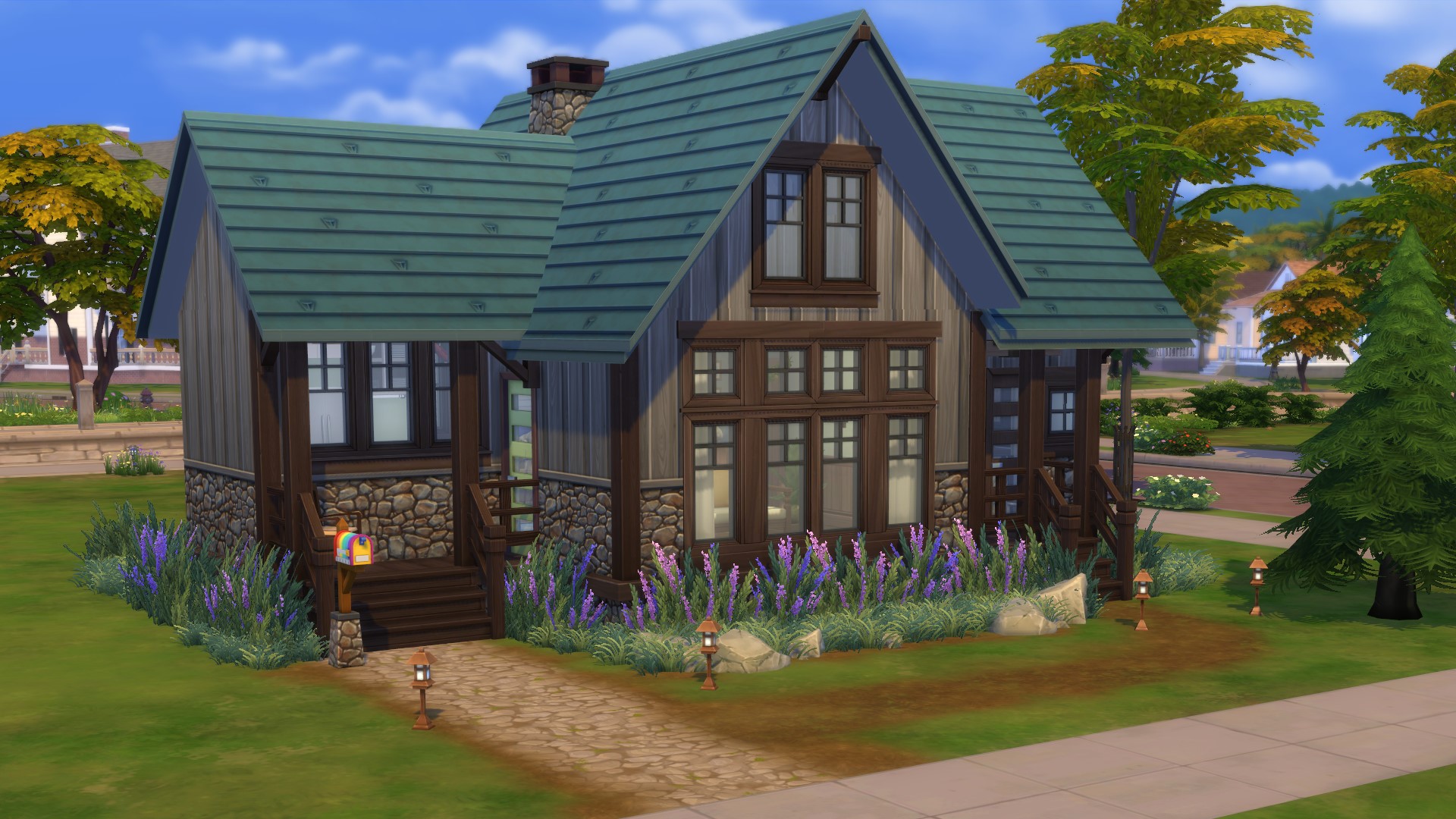
Every Sims player has, in their past, built a plain, box-shaped house with a single gabled roof and a weirdly empty-feeling living room inside and wondered "why does this look so wrong?" It's a canon event. But with some easy Sims 4 build tips, you don't have to scratch your head forever. I don't think I'll ever achieve the intricately staged interiors of speed build videos or aesthetic Insta posts, but my build skills have definitely gotten better after remembering all these tips.
First, here are some build mode hotkeys and cheats you should know:
- Press Ctrl+Shift+C and type the cheat bb.moveobjects to place objects closer together without conflicting, but be sure Sims can still use them!
- Hold Alt to freely move objects around without snapping to grid placement.
- Use keys [ and ] to shrink/enlarge objects, which is great for plants, paintings, and other decorative items.
- Use keys 9 and 0 to raise/lower objects off the floor, which is great for placing decorative doodads on top of cabinets or sinks or other surfaces that objects don't snap to.
- Use the cheat bb.showhiddenobjects to get access to "debug" items
Start with tiny houses
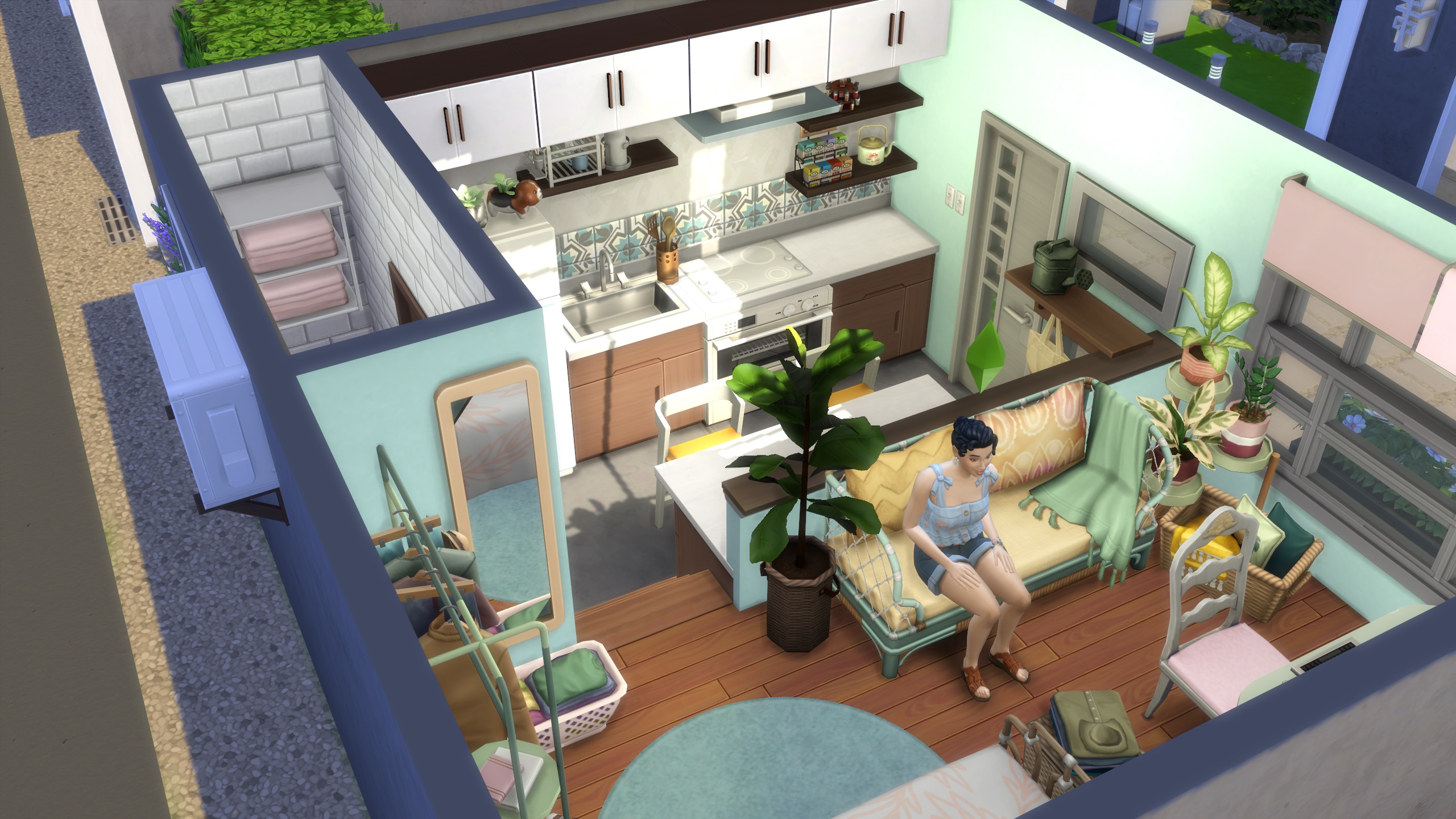
The best way to practice all the following tips is to try them on very small houses. I didn't believe how much this could improve my building skills until the Tiny Living game pack changed the way I think about Sims builds. Even if you don't have the Tiny Living pack and its space-saving appliances, try building and decorating houses that are approximately 50 tiles.
The limited space means you have less area to cover and are less likely to wind up with rooms that feel weirdly open. It turns floor plans into a puzzle where you've got to fit all the necessities in creative ways. Once you can start thinking about every build that way, it totally changes how you approach building.
Here's the trick to cluttering
Sims 4 clutter trick"
If you want to achieve the delightfully cluttered counters you've seen in so many Sims 4 speed builds, it's all about breaking out of the default surface spaces that objects snap to. There are two main ways to pull it off:
Place an item like a soap dispenser on the surface you want it to be on, like a kitchen counter. Then move the counter a few tiles away. While holding the Alt key, click your clutter object and move it over to the currently empty space where your counter should be. It will stay at the correct height but won't have any surface to snap to, so you're free to place it however you like. When you move the counter back to its correct position, your decor is in place.
You can achieve a similar effect by "filling" all the space on a surface. Place several objects on your counter until it's full and new objects won't snap to it. Grab your soap dispenser and press the 9 key several times to raise it to the correct height and then hold the Alt key to position it freely. After you've added all the objects you want to your surface, delete the spare items that were holding space for you.
Importantly, you only want to do this with purely decorative objects that Sims don't need to use. If you tuck away your coffee maker without properly snapping it to a kitchen counter, your Sim will complain that they can't use it.
How to build less ugly roofs
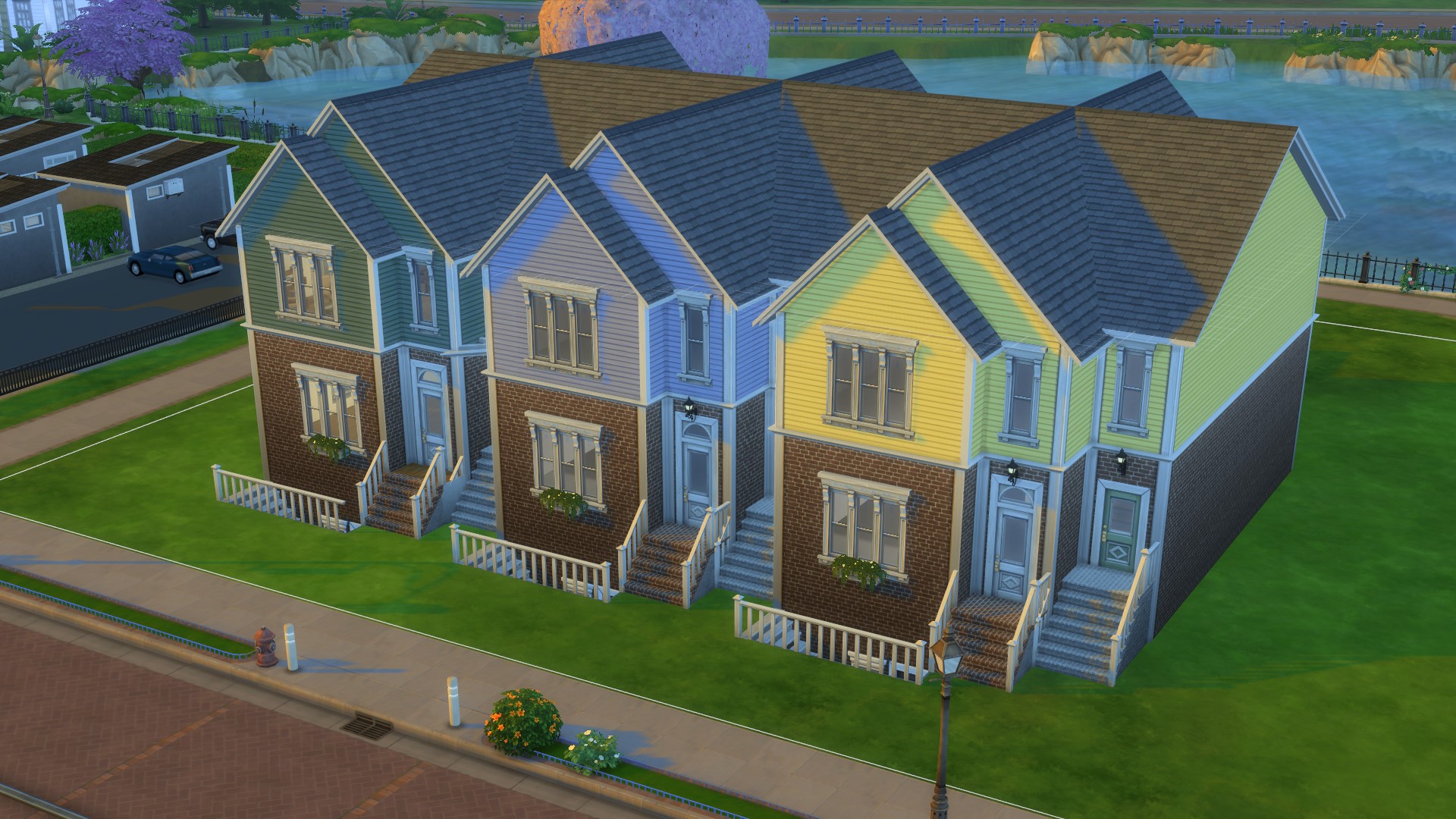
Roofs are the most difficult part of any build, no question. If you're struggling with roof design, remember that real roofs don't have valleys because you wouldn't want water to collect there. When adding roof pieces facing the same direction, try nesting them together. When they're perpendicular, go for varied sizes.
Here are some more hotkey tips on fine-tuning your roof:
- Hold the Alt key to feely raise/lower a roof instead of the normal increments
- Hold the Shift key while editing the edges of a roof to only change the overhang of one side
The real key to better roofs is a better house shape. Add dimension to your exterior with small extensions to your rooms and you'll naturally find yourself building slightly more interesting roofs to include them. One of my favorite Sims builders has done quite a few build tutorial videos—this particular Lilsimsie roof tutorial covers the basics, and if you want something even easier here's a very snappy 12 ways to roof a square.
Don't forget to customize counters and cabinets
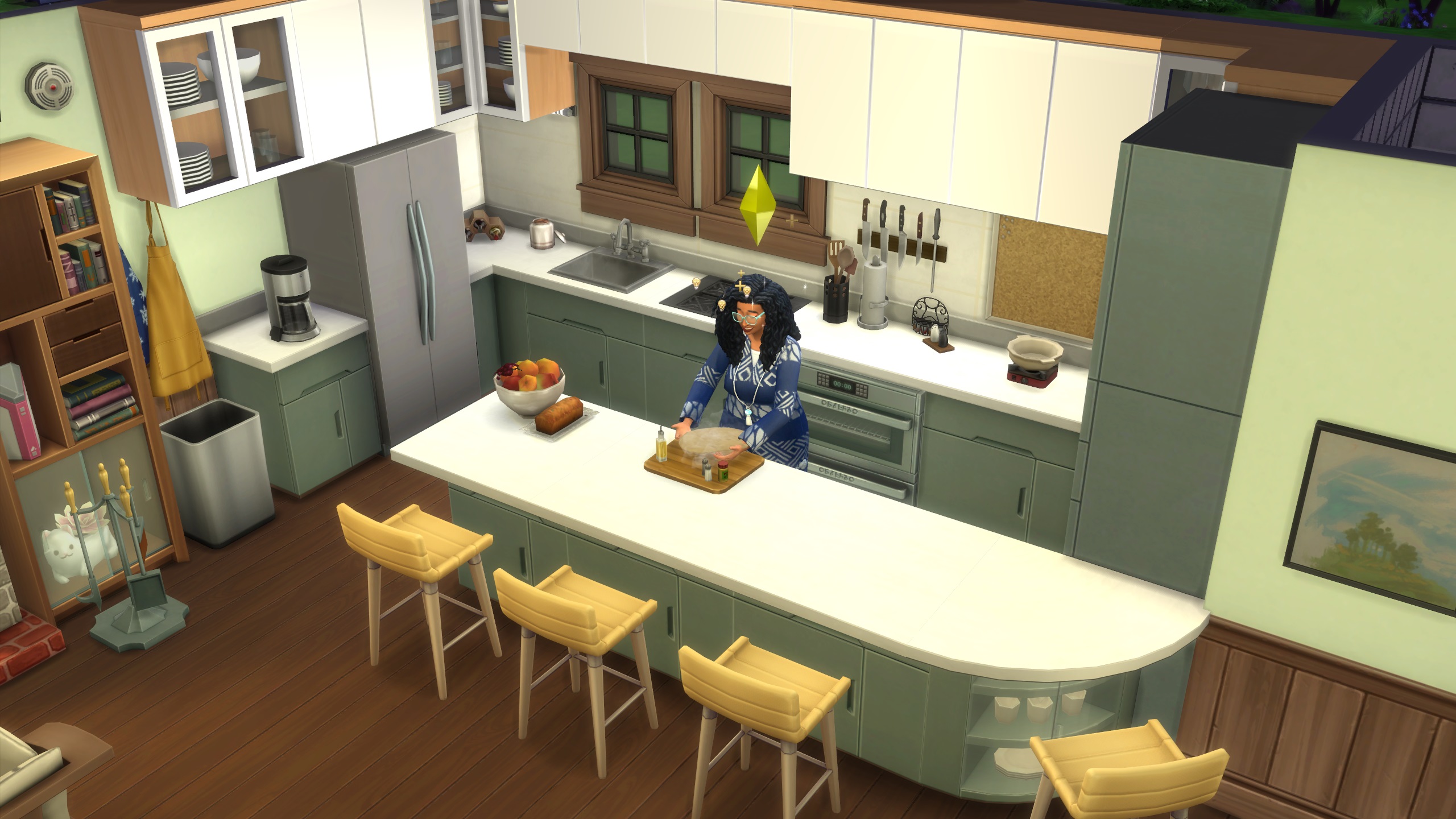
If your kitchen feels bland, click the wrench and gear symbol in your counter color selector to turn auto counters off—you can do the same for cabinets and sectional sofas. This is where you can find the most interesting shapes and variants for your counters. Try adding end pieces to your counters. Vary the look of overhead cabinets by weaving together full tile and half tile pieces. Don't forget those double tile cabinets make great pantries.
Go overboard with landscaping
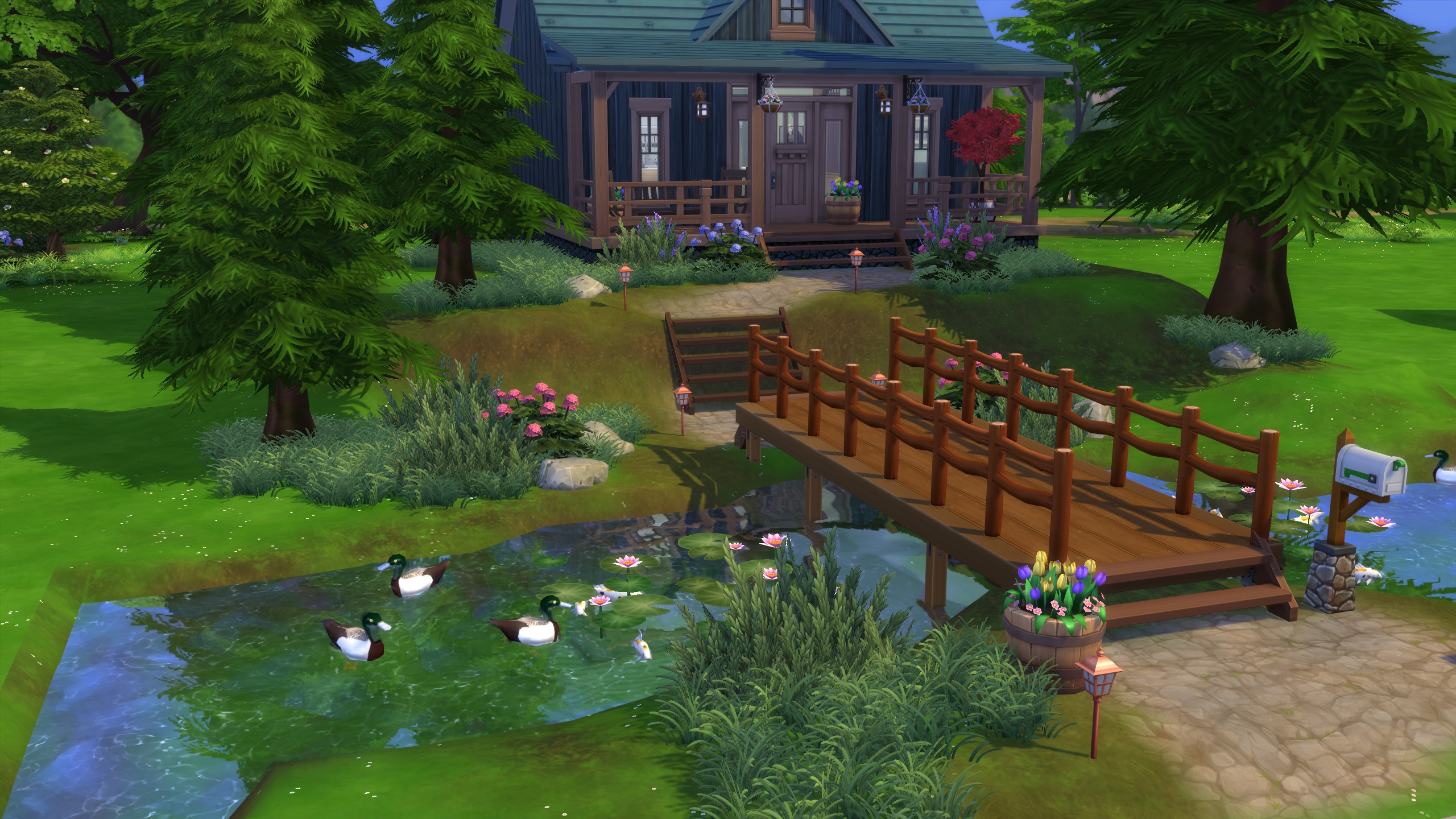
If the outside of your build is feeling bland, add some plants. Now add more plants. Now some terrain paint, rocks, and water features too. Some of the prettiest Sims builds out there look luscious because they go all in on the landscaping.
Here are some common themes that I've found really help my exteriors look great:
- Use rocks and size them down with the [ key and create a border for a flower bed
- Size down the Green, Green Grass patch and sprinkle it around the base of trees, fences, or porches to break up your flat lawn
- The Smooth Keeper fence style looks great as the border of a structured flower bed
- For trees, shrubs, and flowers, size them up or down with the [ and ] keys for some visual variation
- Pack your plants close together and don't be afraid of overlapping them to make it feel realistic
Use platforms to add interest
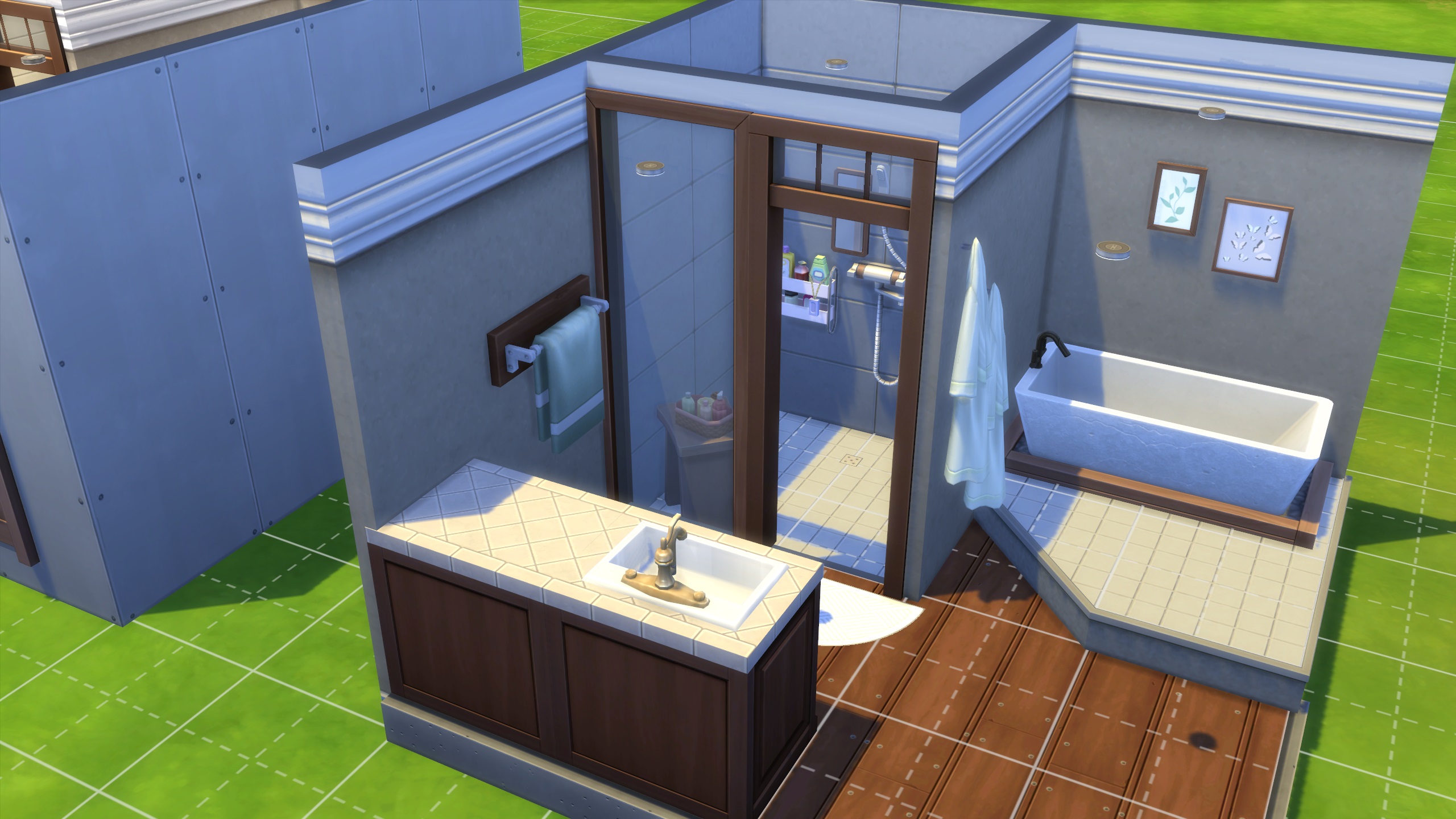
As a more recent feature in The Sims 4, I still find myself under-utilizing platforms. When selecting any room, click the up and down arrows in the popup (not the foundation arrows) to create a platform. You can do some obvious things like create a split-level home where the living room is a few steps beneath the kitchen or a ritzy in-home theater room with descending platforms, but here are some other great details you can achieve with platforms:
- Use a custom shaped platform in a bathroom for a luxury bathtub spot
- Create a lofted space for a bed and delete the walls to create a little sitting nook underneath
- Enclose a portion of a bathroom and lower it by a step to create a custom shower room
- Create a custom built-in look with platforms behind a bed
When in doubt, add a rug
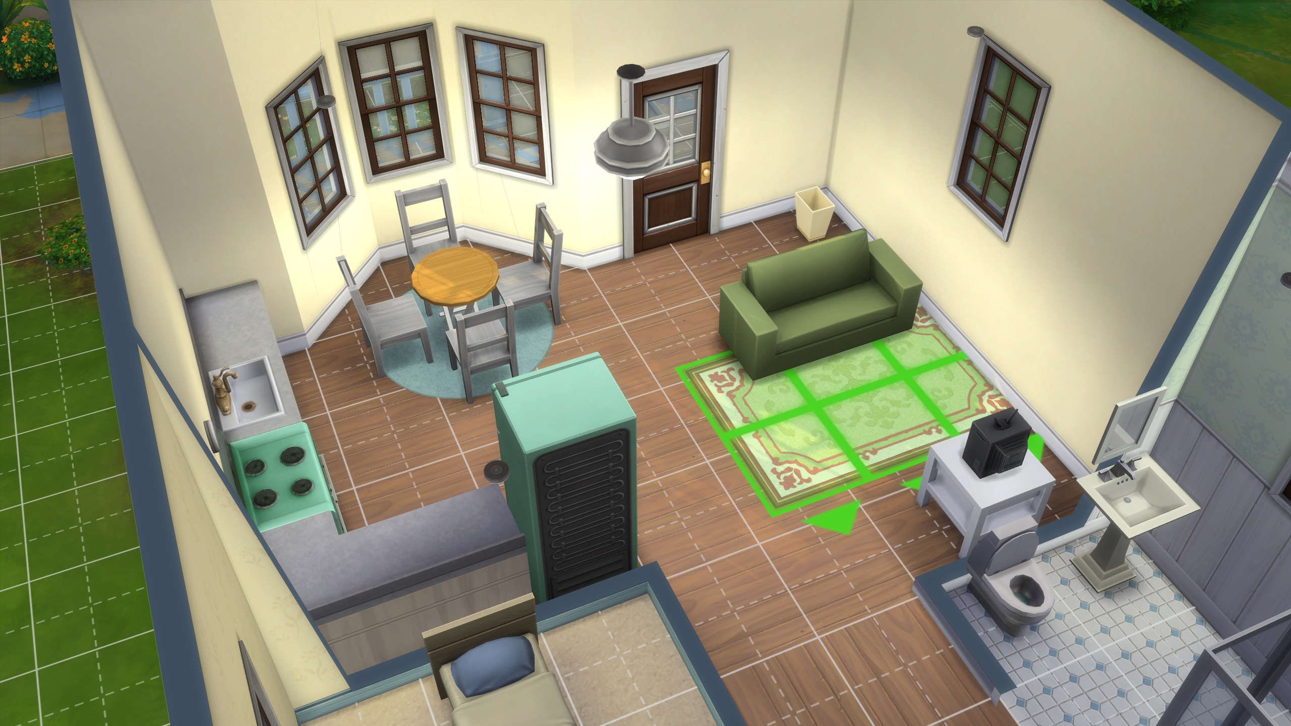
For real, just try adding a rug if you get stuck. Have a room that's too big? Denote different areas with a rug. Boring bathroom? Add at least one rug. Empty hallway? Needs a rug. Wood desk clashing with wood floors? Separate them with a rug. Don't forget to size them up or down with the [ and ] keys for even more possibilities.


