With March upon us, it's the perfect time to go a bit bolder with your color schemes as we begin to see the first, and much anticipated, signs of spring.
To do so, we're turning to Sherwin-Williams' March Color of the Month, an intense cobalt blue paint that doesn't shy away from making a statement. While this bold hue leans towards maximalist color ideas, it's a great choice if you're looking to add drama to your home this spring.
Below, we explain all you need to know about this vibrant blue paint, from the best places to use it and recommended paint color pairings.
What is Sherwin-Williams' Color of the Month for March?
'Frank Blue SW 6967 is a dynamic cobalt that allows homeowners' creativity to take center stage and celebrate their desire to be different,' explains Emily Kantz, Color Marketing Manager at Sherwin-Williams. 'It was chosen for March due to its vibrant intensity. After months of winter, what better way to welcome spring than with a bold hue like Frank Blue?'
'Inspired by the art world and various design projects, we noticed how designers were incorporating this blue in their work. It wasn't an overpowering use of color, but rather a deliberate and thoughtful application. Examples include a cobalt chair or an architectural detail, adding a creative and artistic touch to any space,' Emily adds.
While Sherwin-Williams' February Color of the Month, Slow Green SW 6456, makes a subtle nod to the promise of spring, Frank Blue offers a bolder take on color, ideal if you want to make a statement with your room color ideas.
How to decorate with Frank Blue SW 6967

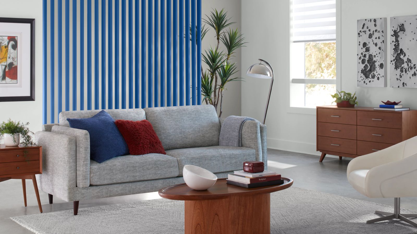
Since this blue paint is so rich, a little goes a long way. Using it as an accent color in an otherwise neutral room will add plenty of interest and an unexpected hit of color.
'Whether homeowners want to intensify cabinetry or highlight decorative features, this shade transforms any element into an instant focal point. Its stunning violet undertone creates a head-turning hue that adds streamlined style and eye-catching confidence to any room, instantly delivering the wow factor,' says Emily.
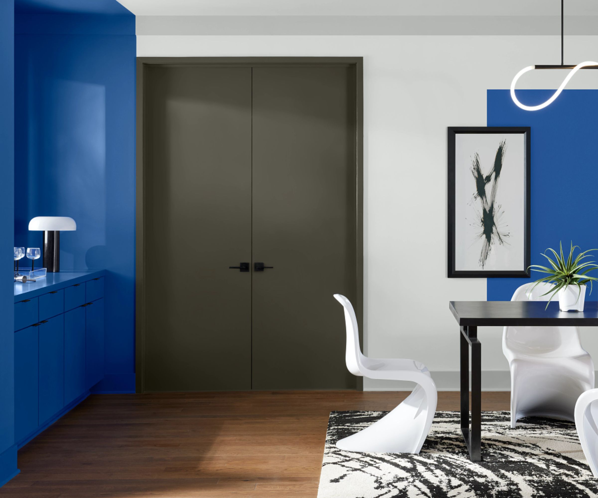
However, there's no reason why you can't go bolder with this rich blue and use it more liberally in a room. For example, it would work well color-drenched in a small room such as a powder room or small home office for a playful look.
'The versatility of Frank Blue lies in its ability to transcend typical uses – from color drenching to accent walls – speaking for itself with a powerful presence. It’s also perfect for open-concept spaces, filling negative areas with mood-boosting vibrancy,' explains Emily.
When decorating with such a bold shade, it's important to choose the right paint color pairings to complete the look. If you want to keep things grounded with neutrals, Emily recommends teaming it with Winsome Grey SW 9624, a delicate light gray paint, or Light French Gray SW 0055, a slightly richer gray.
Alternatively, Emily points to Rookwood Red SW 2802, a rich and warming red paint if you want to lean into a colorful and contrasting scheme; or alternatively Roycroft Bronze Green SW 2846, a muddy green hue for a darker look.
If you're feeling inspired to decorate with this vibrant paint color, make sure to sample it first so you can see how it appears as the light changes throughout the day. Its bold tones will be intense in well-lit rooms, whereas in lower-light rooms it may appear less saturated, but dark.


.png?w=600)