Pastels have long been the go-to color choice for the spring months, but their pale tones aren't for everyone. We're increasingly seeing richer and bolder hues take center stage for spring, and Sherwin-Williams demonstrates this perfectly with one of its latest paint palettes.
Named 'Eclectic Minimalism', the palettes feature five Sherwin-Williams paint colors which offer a grown-up take on spring color ideas. The pastel tones within the palette take on a moodier form, grounded by much darker paint colors and a cool-toned white paint color.
Below, we've rounded up all you need to know about the paint colors within the spring palette – bound to give your pastel room ideas a stylish and unexpected twist.
1. Slow Green SW 6456
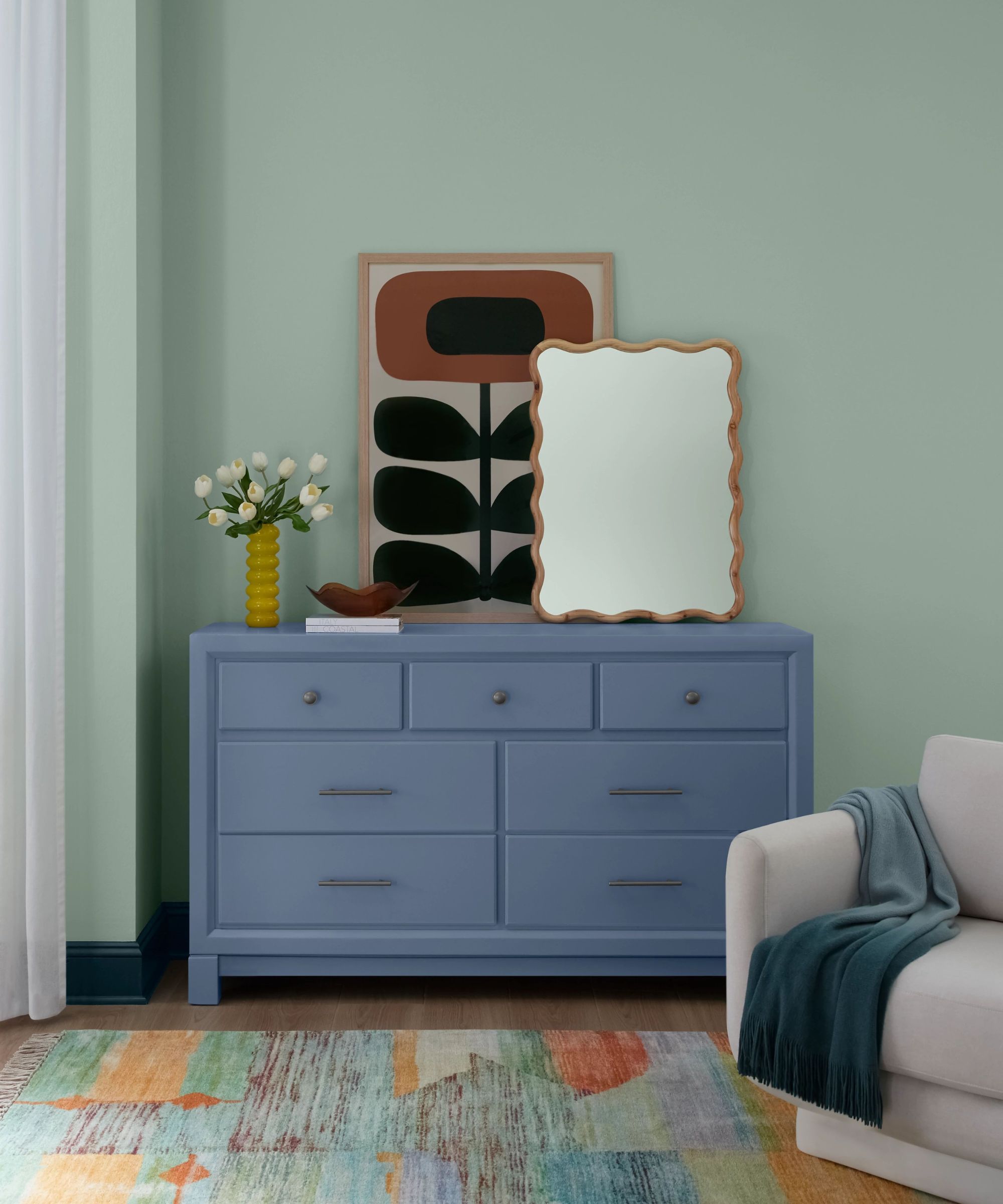
Slow Green was named Sherwin-Williams February Color of the Month – a soothing pastel green paint that brings a touch of color into the home while maintaining a soft and understated look.
'Slow Green breathes new life into any space, all while finding the balance between personality and poise,' says Emily Kantz, Color Marketing Manager at Sherwin-Williams, in the Instagram post above.
Since this is a light pastel color, it feels especially fitting for springtime. Use it in rooms that aim to feel calming such as bedrooms or bathrooms to promote a restful environment.
Slow Green is a light, pastel green paint that feels both calming and uplifting. Use it in place of neutrals to add more color to your home this spring.
2. White Sail SW 9622
White paints are a great way to balance a color scheme that includes bolder hues, but it's key to choose one with matching undertones. White Sail is cool-toned, meaning it will pair well with the blues and greens in the paint palette for a cool color scheme.
'White Sail is a gentle and breezy, cool-toned white that brings a sense of calm and simplicity to any space,' Emily tells Homes & Gardens. 'Its versatility makes it an ideal choice for areas where you want a clean, neutral backdrop to highlight a vintage collection. This serene hue creates a fresh and inviting atmosphere, allowing your cherished pieces to stand out beautifully.'
White Sail is a cool-toned white paint that adds balance and freshness to your color scheme.
3. Dried Lavender SW 9072
If you're looking for a slightly darker pastel to incorporate into your scheme, Dried Lavender makes a stylish choice. Tapping into the in-between color trend, this paint falls somewhere between purple and blue.
'Dried Lavender is a charming dusty purple with a soft, mid-toned hue that adds a touch of personality to any multi-functional space,' says Emily.
'This versatile shade is perfect for creating a welcoming backdrop in a home office, children's playroom, or spare bedroom. Its gentle color brings warmth and character, making it an excellent choice for areas where you want to infuse a bit of individuality and style,' adds Emily.
Although technically a purple paint, Dried Lavender appears as a purple-blue hybrid – a failsafe choice for spring.
4. Green Bay SW 6481
While Green Bay technically comes under the blue paint category, its green tones are prominent so it reads as a rich dark green paint. Since this is a bold choice, it would work especially well in small rooms to create a playful hit of color, especially with color-drenching ideas.
'This green-based blue is a deep, luxurious hue that captures the opulence of a jewel tone,' says Emily. 'This tone is an excellent choice for a small powder room, where it can create a dramatic and unexpected ambiance. The depth of this shade adds a sense of intimacy and elegance and can be used in a living room to create a chic and stylish environment.'
If you want to go darker with your spring colors, go for Green Bay, a sophisticated green paint that adds depth and drama.
5. Dark Night SW 6237
Lastly, Dark Night is the darkest shade within the palette, an intense blue paint that appears almost as black. While you may think of colors so dark to be overwhelming in the home, Emily explains that they can actually be relaxing:
'Dark Night is a captivating deep blue with subtle slate undertones. This rich sophisticated color creates a serene and calming atmosphere, making it an excellent choice for a bedroom. The depth of Dark Night promotes a sense of tranquility and aids in restful, restorative sleep.'
A dark and moody blue paint – Dark Night is a great alternative to black, appearing slightly softer.
Which of the paint colors within the Eclectic Minimalism palette is your favorite? Whether you go colorful with Slow Green or Dried Lavender or lean into a moodier color scheme with Green Bay, these shades cater to many interior design styles.