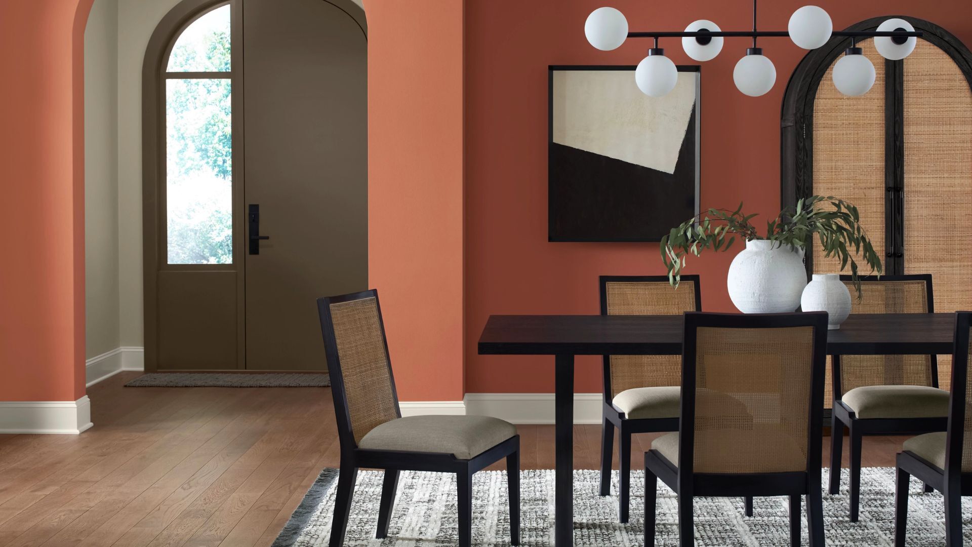
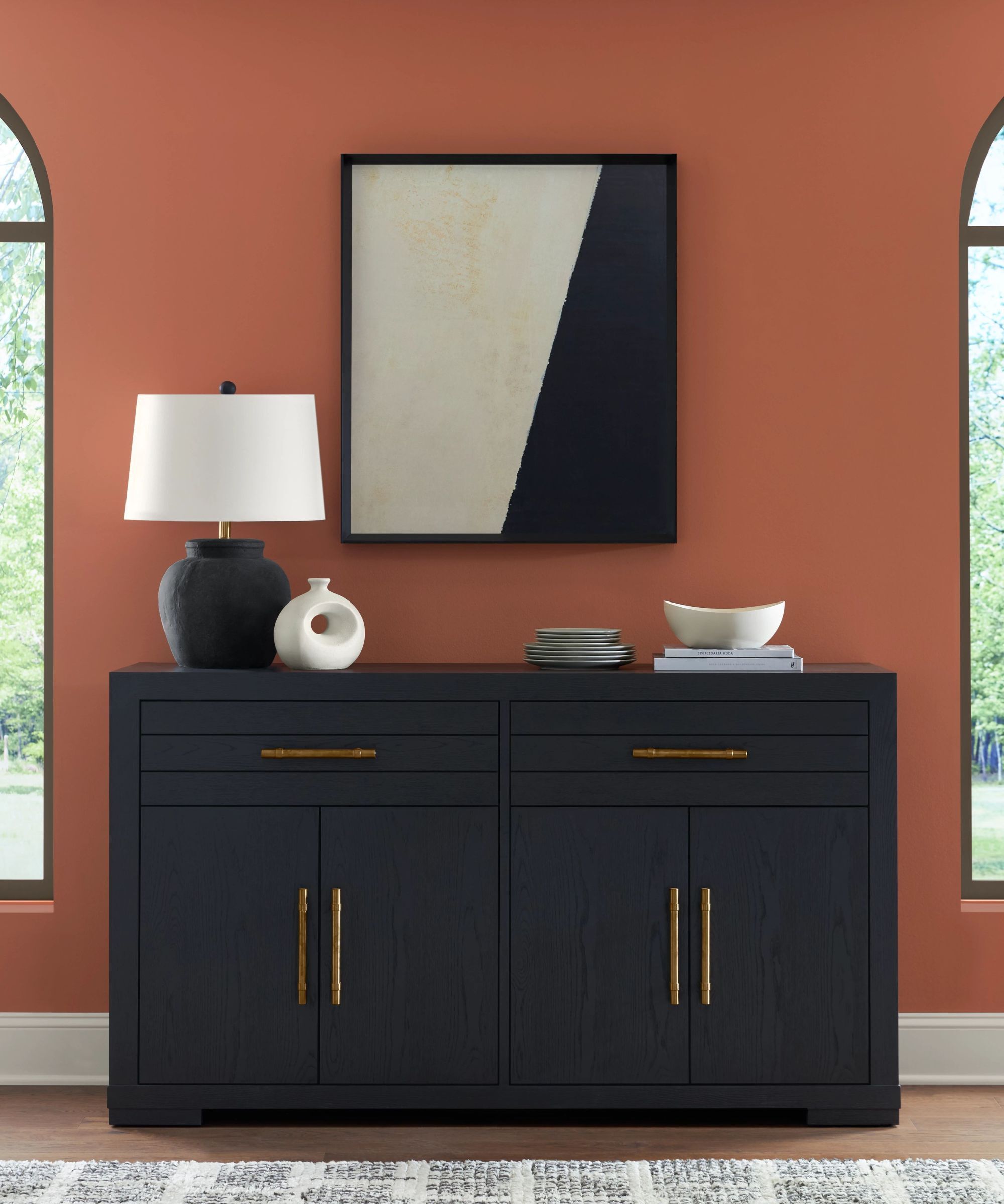
Sherwin Williams has unveiled April’s color of the month: an earthy, rich yet lively terracotta color that instantly evokes the relaxed, leisurely feeling of sun-soaked holidays.
The family of terracotta tones offers a vast variety, ranging from redder, spicier hues to sandier, cooler variants, and many shades in between. Because terracotta is a natural, easygoing tone, it is perfect for creating intimate, informal spaces that remain warmly inviting – even in north-facing rooms.
That said, there are many iterations of terracotta paints on the market, and picking out the best terracotta paints from the bunch can be a tricky task. A warming red ochre tone will add a cozy feel to your interiors, while a paler, dusky clay tone can act as a bold neutral. Caribbean Coral errs more on the bold, statement-making classic terracotta with peachy, pink undertones, making it an easy to use bold paint color that is refreshingly liveable. If the laidback, summer-day vibe is what you want to infuse into your room, this is the paint you need to buy.
If you are horticulturally minded, it’s likely your garden and home, like mine, will be brimming with terracotta pots. Earthy terracotta brings to mind for many of us an organic softness, conjuring up images of bucolic Mediterranean scenes – sun-soaked terracotta palazzos, whitewashed walls, orange pelargoniums, and scuttling sun-baked lizards. It is reminiscent, in that sense, of a laidback lifestyle and even has a slightly bohemian charm. But the rising popularity of terracotta colors in modern and traditional homes in recent years has led to many more earthy paints on our shelves.
‘Rich clay terracotta tones have such a beautiful, grounding quality, bringing a quiet warmth that feels both modern and timeless,’ explains Jaime Zehner, owner of California-based JZ Interior Designs. ‘I love how they echo the natural world: sun-baked earth, terracotta tiles, aged plaster. They pair effortlessly with natural materials like linen, stone, and wood, creating a layered, lived-in warmth.’
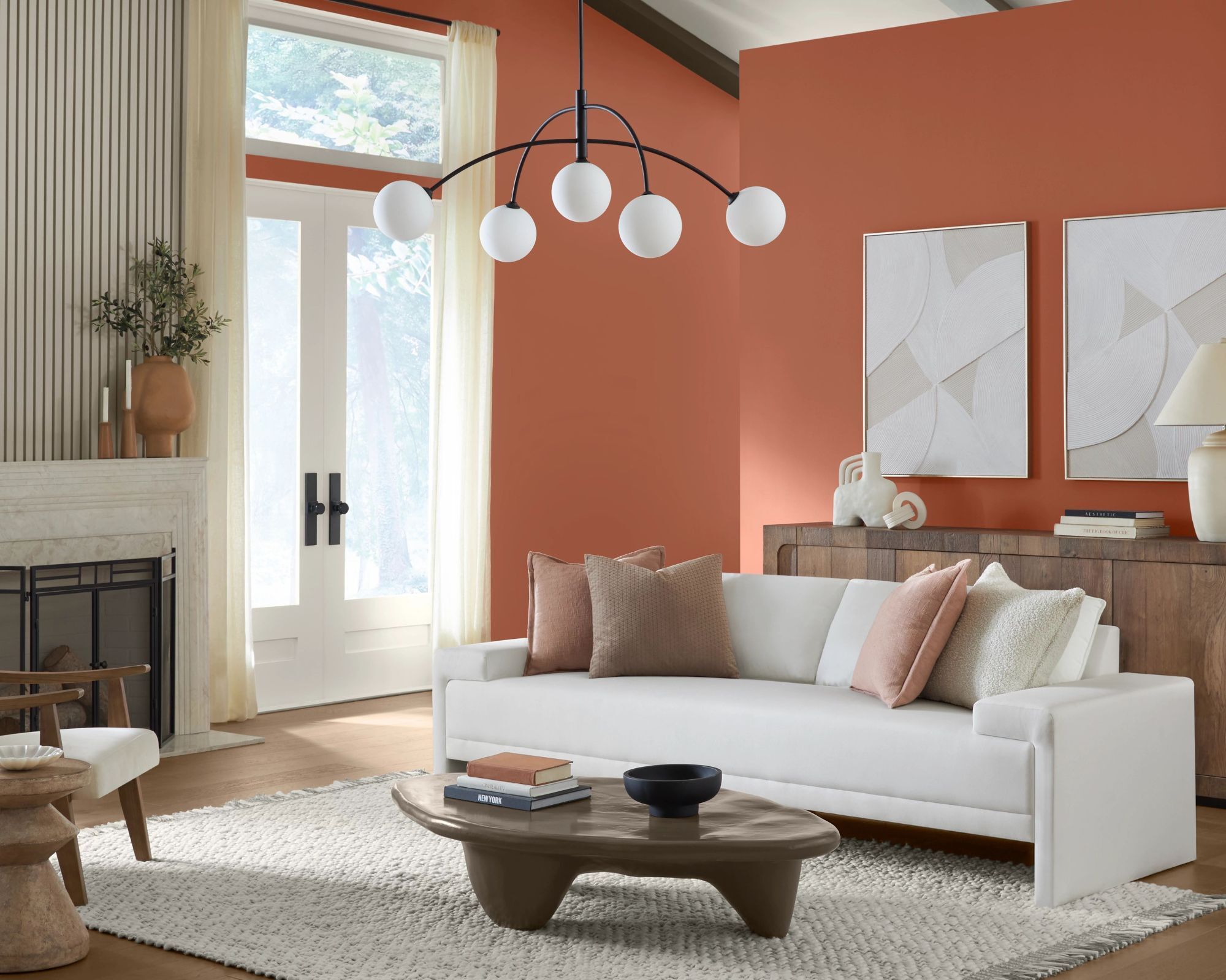
Caribbean Coral is a reassuringly simple terracotta shade. It is neither overly lively nor zesty, like Sherwin Williams' aptly named color Invigorate, nor very pink or sugary like Ravishing Coral. It’s worth noting, though, that this isn’t a very toasty, reddish-earth hue. Instead, Caribbean Coral is exactly what it says on the tin: a coral, so it does have a sun-blushed pinky undertone, albeit a subtle one.
That said, depending on the level of natural light in a room, it can look much more like a pink paint in some settings, a dark apricot in others, and if totally starved of light, it will present as a much moodier brown-ish color. Whichever tone comes through in your room, it will never feel cold or receding. As such, if you’re looking for color-drenching ideas, and you aim to imbue the room with warmth while steering clear of anything too cool and crisp, this is an ideal choice.
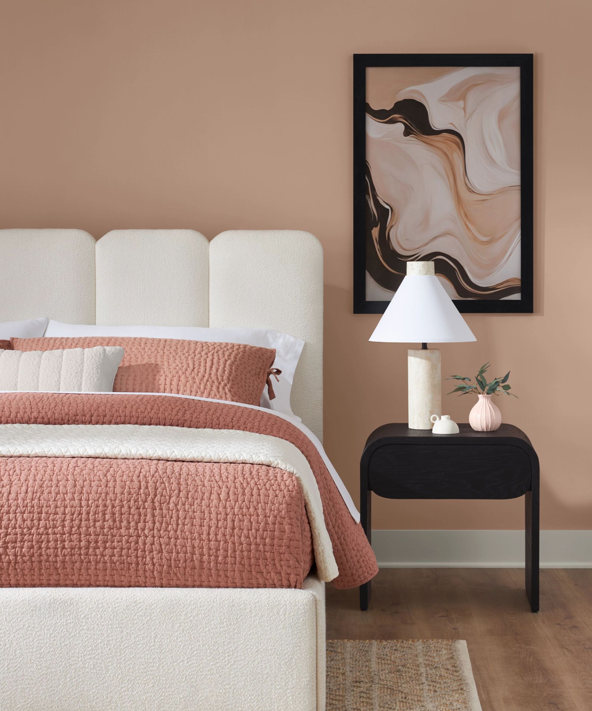
Generally speaking, deep tonal colors add a feeling of coziness to any space, but the peach and orange hues in this shade can also be activating. With that in mind, you may want to avoid this particular shade in the bedroom, where it may be too stimulating.
Leah Harmatz of Field Theory Design warns that, sometimes, if in the wrong room, terracotta can appear overly brown and somewhat of an '80s throwback.
‘I think the key is to make sure that the shade you select plays well with any existing finishes – i.e., natural wood floors and cabinetry. There’s a risk of it clashing or looking dated and drab if the shade is a bit off.’ Caribbean Coral is the perfect companion to warm off-whites, creams, and even powder blues. Bright white paint would almost definitely be an overpowering duo.
‘I like using clay-colored paints in rooms that have natural wood trim. Or in spaces where the trim is painted, I’ll color-drench the room and paint the walls in a matte finish, and paint the trim in the same clay-colored tone in a satin or semi-gloss finish.’ Leah explains.
If you’re in love with this color but not sure you’re ready to commit the paint roller to the wall, you may wish to incorporate this color through smaller accents. If so, we’ve gathered some of our favorite terracotta colored decor pieces for you to shop below.
A vintage-inspired dusky pink linen duvet cover, perfect for creating a relaxing retreat.
A beautiful rustic, honey hued table lamp with an earthy finish that looks elegant in both modern and traditional schemes
A brilliant addition to any decorating scheme, this rug is designed with lustrously rich, earthy tones
So, as you can see Sherwin Williams' color of the month for April brings both vibrancy and grounding to any space, whether used in subtle accents or as a statement-making accent wall idea, this color manages to enhance a room’s atmosphere almost effortlessly, providing modern, bang on-trend sophistication and inviting, sun-soaked energy.