Unless you're fluent in the best photo editing software on the market, there's a good chance you've avoided the saturation vs vibrance debate. After all, they both ostensibly do the same thing. Heck, you might use them interchangeably, depending on your mood or you might ignore one of them altogether.
If either scenario sounds at all familiar, chances are you've been favoring the saturation slider and leaving vibrance to its own devices. Fledgling image editors quickly learn to boost shadows, reduce highlights, add a drop of contrast and sparingly boost saturation. Vibrance is more of an intermediate tool, but it's an easy one to grasp.
The difference between the two sliders is relatively simple. And once you know it, you're almost certainly going to start adding vibrance into your editing regime...

You see, saturation boosts all of the colors within an image equally, whereas vibrance favors boosting the saturation of less-dominant colors within an image. Say – for example – you have a photo of a person holding a bright red umbrella in an otherwise dull street and you want to boost that dull street. Boost the saturation slider and the red umbrella may clip long before you reach the desired saturation levels in those duller areas of the image. This is the perfect time to use the vibrance slider, which will allow you to boost the dull surroundings much more intensely before the red umbrella eventually clips.
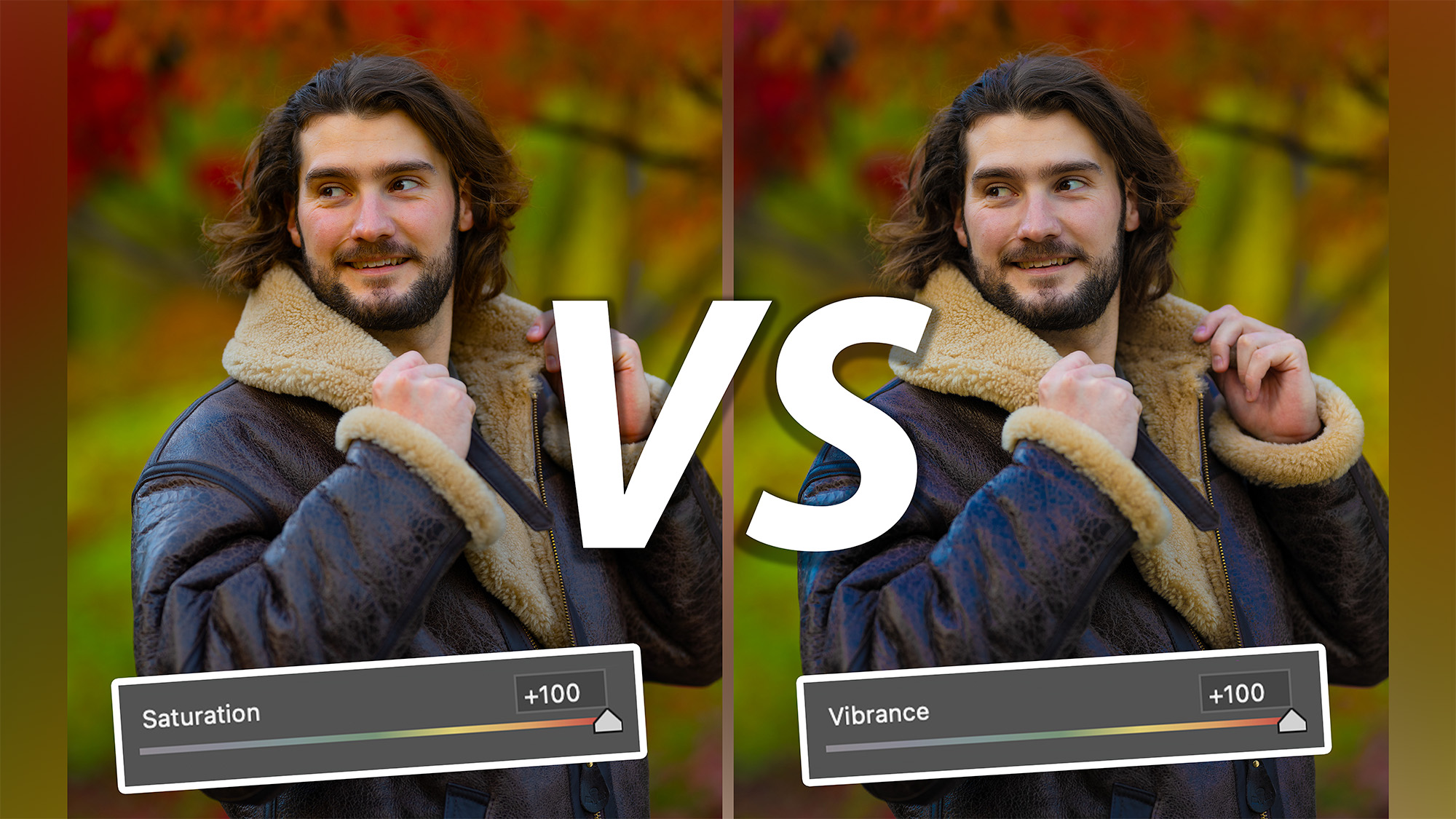
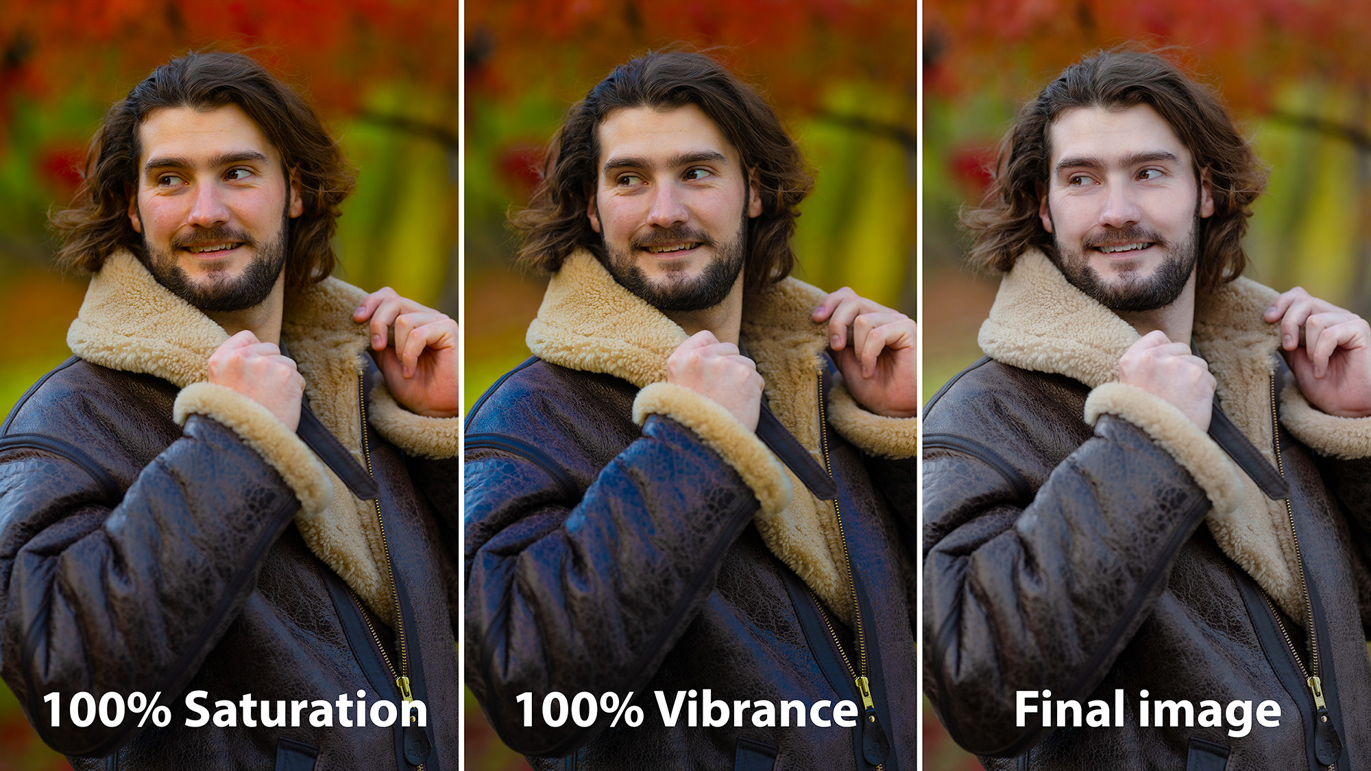
Vibrance is also much kinder on skin tones. The image at the top of this article illustrates this well. Even boosted to 100% the model's skin tone has been more or less preserved. However, with the saturation boosted to 100%, the skin tone has been pushed noticeably too far.

Of course, you can also use vibrance to desaturate an image. In this instance it will still prioritize less dominant colors and you may find that even at 0%, you can still see remnants of the punchiest hues.
But this isn't to say you should ditch the saturation slider altogether. Personally, I like to use the two sliders in tandem. If I want to boost punchier colors in an image, I’ll start by boosting the vibrance to bring the flatter colors into contention. Then, if I still think the overall image needs a boost, I'll bump up the saturation.
Vibrance sliders can be found in a variety of editing suites including Adobe Lightroom CC , Photoshop CC and Photoshop Express, as well as Affinity Photo 2.


