
10 US service members injured in Iranian attack on Saudi base
Iran's ambassador to the UN confirmed the nation would "facilitate and expedite" such movement
Texas Supreme Court ends lawsuits against power generators over 2021 winter storm
Tens of thousands of residents and small businesses sought damages from power generators after losing electricity during the storm that resulted in billions in losses and 246 deaths.
Hundreds of titles - just one subscription!

On sale for a limited time only, get 25% off for the first 3 months.
A Disney Fan Pointed Out A Side Narrative To This Bachelorette Cancellation Brouhaha, And I Think It's A Great Point

The stars really misaligned for somebody in this brouhaha.
‘Break your silence’: Jane Fonda leads rally against Trump crackdown on arts and media

Actor outside Kennedy Center urges Americans to ‘stand tall against authoritarianism’ and resist free-speech threats
Elon Musk joined Trump’s call with Modi on war in Iran, says report

It remains unclear what Musk, a private citizen, was doing on the phone call
Timeline of Tiger Woods’s Vehicle Incidents

Tiger Woods has had several incidents since 2009, the most recent on March 27, 2026 in Jupiter, Florida.
Middle East crisis live: Strike reportedly injures 12 American soldiers at US base in Saudi; Rubio expects war to end in weeks

Iran has kept firing missiles at Israel and Gulf nations, including a strike at a military base in Saudi Arabia that wounded US service members
Pizza and bread products sold in 10 states under recall for possible metal shards

Trader Joe’s Focaccia Bread with Roasted Tomato & Parmesan is part of the recall
Cancer patients and pregnant women face ‘life-threatening’ delays due to sonographer shortage

Sonographers conduct ultrasound scans which are essential to pregnancy care and are also used in the diagnosis of cancer
Are American VPN users at risk of 'warrantless' government surveillance? Lawmakers now demand answers

Six Democrats sent a letter to the Director of National Intelligence seeking clarity on whether using a commercial VPN could strip citizens of their privacy rights by exposing them to foreign surveillance laws.

What to do with a spider plant in April to stop brown tips and set it up for a season of healthy growth – it'll produce lots of spiderettes too
It'll produce lots of spiderettes too
‘How can a TV show make you feel such emotions?’ The Bluey composer shares the trick to music that ‘hits you in the feels’

As the new Bluey album, Up Here, arrives – complete with chamber orchestra – Joff Bush describes how he ‘seeds’ musical elements to draw out powerful emotions
Hundreds of titles - just one subscription!

On sale for a limited time only, get 25% off for the first 3 months.
Not sit-ups or planks — this 15-minute standing resistance band workout will help you carve out a stronger core

Two personal trainers and resistance band experts put together this 15-minute standing workout to help you boost your core strength and stability.
The Secrets of ‘Pata Negra’: acorn-fed 100% Iberian ham sets out to conquer the world

This is the fascinating story behind an icon of gourmet luxury. A symbol of Spanish and European culinary excellence, acorn-fed 100% Iberian ham brings the pasture to life, adds flavour to haute cuisine and is conquering new markets.
I’m a yoga teacher and I’ve been loving this dynamic bridge variation for strength and flexibility

The upgrade that delivers more than just a good stretch
How to Bond with Lovebirds: A Beginners Guide to Trust and Companionship

What are love birds ? <p>A clear sign of trust—your lovebird calmly perching on your hand without fear or hesitation.</p> Lovebirds are small parrots that measure five or six inches long and weigh about two ounces. They have rounded heads and their beaks are relatively large. There are nine different…
Nope, not planks or crunches: 4 moves a Pilates instructor wants you to try to sculpt a strong, solid core

Four exercises you can use to build a solid, strong core.
Macaw as a Pet: Beauty Vs Responsibility

Brief History of Macaws as Pets <p>Behind the striking appearance of a macaw lies a highly intelligent and demanding pet.</p> Macaws have shared a relationship with humans for thousands of years. Indigenous cultures throughout Central and South America revered these birds, valuing their brilliant feathers for ceremonial dress, symbolic art,…
No sit-ups, crunches, or planks — this is the staple Pilates exercise I use to build endurance in my core

Here's everything you need to know about Pilates hundreds.
Scientists captured female sperm whales on video working together during a birth to protect the calf

Scientists have captured rare footage of a sperm whale giving birth, offering a window into the large mammals' behavior

Texas Supreme Court ends lawsuits against power generators over 2021 winter storm
Tens of thousands of residents and small businesses sought damages from power generators after losing electricity during the storm that resulted in billions in losses and 246 deaths.
‘Break your silence’: Jane Fonda leads rally against Trump crackdown on arts and media

Actor outside Kennedy Center urges Americans to ‘stand tall against authoritarianism’ and resist free-speech threats
Hundreds of titles - just one subscription!

On sale for a limited time only, get 25% off for the first 3 months.
Timeline of Tiger Woods’s Vehicle Incidents

Tiger Woods has had several incidents since 2009, the most recent on March 27, 2026 in Jupiter, Florida.
A federal judge orders better attorney access at Florida's 'Alligator Alcatraz'

A federal judge has ruled that the immigration detention facility known as “Alligator Alcatraz” must provide people detained there with better access to their attorneys
Trump signs executive order instructing DHS to immediately pay TSA agents

Order comes after House Republicans rejected a Senate‑passed deal to fund key DHS subagencies, including the TSA
Colombia holds ceremony for 69 killed in military plane crash

Colombia has held a ceremony to honor 69 security force members killed in a military plane crash earlier this week
Mexico says a third of 130,000 missing people might be alive, fueling criticisms by families

Mexico’s government says that it has identified signs of life for as many as a third of the country’s 130,000 registered missing people
Reports: Iran soccer star Sardar Azmoun threatened with asset seizure by state

Iranian news agencies say the country's judiciary has threatened to seize the property of national soccer star Sardar Azmoun
US expects Iran operation to end in ‘weeks, not months’, says Marco Rubio

Secretary of state speaks as Israel threatens to expand attacks on Iran while Tehran keeps firing missiles at Israel
Fulton county accuses FBI of ‘callous disregard’ over ballot seizures

Lawyers say agency made misrepresentations in affidavit to obtain search warrant for January raid of election offices

Soybeans Sell the Fact Following RVO Release
Soybeans closed the Friday session with contracts down 5 to 14 ½ cents in most front months, as May was down 2 cents this week. The cmdtyView national average Cash Bean price as down 14 ¼ cents at $10.86. Soymeal futures posted Friday losses of $2.20 to $6.80, with May...
Sony suspends memory cards “due to the global shortage of semiconductors (memory) and other factors" in Japan. Is it a sign the memory crisis is worsening?

Worldwide memory crises force Sony to stop deliveries of mainstream memory card lines to Japanese retailers and customers
Hundreds of titles - just one subscription!

On sale for a limited time only, get 25% off for the first 3 months.
Dollar Advances as Iran War Rages

The dollar index (DXY00 ) rose to a 1-week high on Friday and finished up by +0.27%. The dollar moved higher on Friday as the risk of a protracted Iran war boosts safe-haven demand for the dollar. Also, Friday's +5% rally in crude oil prices is pushing inflation expectations higher,...
Google Just Unveiled TurboQuant: Should You Sell Sandisk Stock Now?
.jpg)
Could Google’s TurboQuant disrupt memory demand and shake Sandisk’s rally, or is this just noise? Should investors sell SNDK before momentum starts slipping?
Soybeans Selling the Fact Following RVO Announcement

Soybeans are trading with contracts 9 to 10 cents lower in the front months and deferreds down 3 to 5 cents, The cmdtyView national average Cash Bean price is down 9 cents at $10.91 1/4. Soymeal futures are showing $4 to $5 losses at midday, with Soy Oil futures 21...
Netflix Raises Prices Across All Plans — Again

Netflix has raised prices across all plans, adding to rising streaming costs. Here’s what each tier costs now.
US appeals court overturns $16 billion judgment over Argentina energy company nationalization

A New York appeals court has overturned a ruling that had ordered Argentina to pay more than $16 billion to former shareholders of YPF, the country’s largest energy company that was nationalized in 2012
What to Expect From Packaging Corporation of America's Q1 2026 Earnings Report

Packaging Corporation of America is ready to announce its fiscal first-quarter earnings later next month, and analysts project a slight earnings drop.
Why Did Gold Melt Down?

The April gold futures contract has lost as much as $1,528.80 since late January, all while the world seems to be falling apart at the seems. The question is why?
Earnings Preview: What To Expect From O'Reilly Automotive's Report

O'Reilly Automotive is scheduled to announce its first-quarter results soon, and analysts forecast a double-digit rise in the company’s bottom-line figure.

Are American VPN users at risk of 'warrantless' government surveillance? Lawmakers now demand answers
Six Democrats sent a letter to the Director of National Intelligence seeking clarity on whether using a commercial VPN could strip citizens of their privacy rights by exposing them to foreign surveillance laws.
Strengthening cybersecurity in education through private sector partnership

As schools are increasingly targeted by cybercriminals, private sector investment equips them with tools to mitigate attacks.
Hundreds of titles - just one subscription!

On sale for a limited time only, get 25% off for the first 3 months.
Iran, one month on – the numbers tell the terrible toll of war

THE INDEPENDENT VIEW: Editorial: If there was ever a plan behind the US-Israeli assault on Iran, it is not going well – instead, it has become Donald Trump’s great miscalculation
Khan v. Yale University #TheyLied Case Dismissed Because of Plaintiff's "Egregious" Litigation Misconduct
Not the misconduct itself, but noted in the court's opinion as one of the items plaintiff had sought to withhold from discovery: "During a separate text conversation on May 11, 2018, Plaintiff texted Mr. Roe: 'If I had 5 dollars for every gender, I would have 5 dollars coz women…
The Guardian view on social media in the dock: tech bros move fast – society is trying to catch up

Editorial: Two court cases have shown how companies can be forced to take responsibility for their impact on public health
I'm a Wealth Adviser: This Social Security Claiming Mistake Can Hurt Women the Most
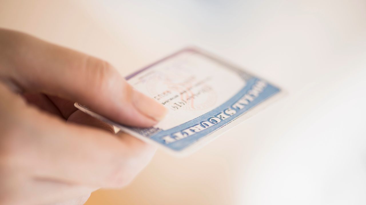
Women should personalize their Social Security claiming strategy and run the numbers after considering life expectancy, tax situation and existing assets.
I'm a Health Care Adviser: This Is the Long-Term Care Gap Women in Their 50s Can't Afford to Neglect

Women are the main providers of care — and will make up most of those needing it in future. Your 50s is when to start asking how you'll cover your own needs.
Analysis: 1 month into war, Iran is using insurgent tactics and holding the world economy hostage

One month into their war with Iran, the United States and Israel find themselves confronting an opponent that fights more like an insurgency than a nation
Shocking Iran's X Post Targets Trump Over Epstein Scandal During War Tensions

Explore how Iran's embassy in South Africa uses strategic messaging to link West Asia tensions with the Epstein case, influencing global perceptions.
Safety Experts Warn: The Common Key-Fob Grip That Increases Your Risk in an Attack

Walking toward your car in a dark parking lot often triggers a natural instinct to prepare for the worst. You have likely been told to weave your keys between your fingers to create a makeshift weapon for self-defense. This advice feels empowering in the moment of fear, but it actually…

Pizza and bread products sold in 10 states under recall for possible metal shards
Trader Joe’s Focaccia Bread with Roasted Tomato & Parmesan is part of the recall
Sony's Spider-Man 'cancellation' explained

Don't panic – it's not the end of the Spider-Verse.
Hundreds of titles - just one subscription!

On sale for a limited time only, get 25% off for the first 3 months.
Clavicular arrest: Who is the controversial influencer and what is ‘looksmaxxing’

The 20-year-old controversial social media star promotes the theory that maximizing male attractiveness — often through surgical intervention – is the key to success and superiority
Why Zendaya Is ‘Disappearing’ From Public Life After 2026

Why Zendaya Is ‘Disappearing’ From Public Life After 2026
“This Is Why She Can’t Keep A Man”: Jennifer Lopez, 56, Brutally Slammed Over Her Daring Stage Outfit

“When grandma won't accept that she's just embarrassing," wrote one user.
Las Vegas girl gets a random DM from a woman and finds out she’s being stalked by a rude regular at her gym: ‘There’s photos of you in his phone’

The safety of our digital footprints is a recurring anxiety in the age of social media. For Las Vegas gym creator Klair Elena (TikTok/@klaielena), that fear became a chilling reality after a stranger’s DM.
Astronaut’s spooky image aboard the ISS sparks fear with some convinced they’re looking at an alien

NASA astronaut Don Pettit has finally shared the real story behind a bizarre, tentacled object photographed aboard the International Space Station (ISS) that had many people online convinced it was an alien. This image, which quickly went viral, had social media users scratching their heads and even feeling a little…
Woman calls out Starbucks barista online for shooting his shot but soon finds out that the internet isn’t on her side

A woman who took to TikTok to call out a Starbucks barista for what she felt was an inappropriate “secret message” on her coffee cup has found that the internet isn’t quite on her side. Ari Chance shared her experience online, expecting widespread agreement, but instead, viewers offered a mixed…
People Are Trying to Uncancel Joss Whedon. Why?

Let's not do this!
Los Angeles woman meets her Hinge date at the Santa Monica farmer’s market. 15 minutes in, one question ends it all

Not worth the extra mile.

A painful ‘eye biting’ fly is invading part of Southern California
Black fly populations are appearing in higher numbers than usual for the season
AI's arrival complicates Big Tech climate goals, and some worry it's locking in more fossil fuels

Tech companies set ambitious climate goals at the start of the decade, promising to slash emissoins that contribute to global warming
Hundreds of titles - just one subscription!

On sale for a limited time only, get 25% off for the first 3 months.
Snow and stormy winds close schools and roads, and cut power in some Balkan countries

Stormy winds, rain and snow have closed schools and left thousands of people without electricity in some Balkan countries while snarling traffic throughout the region and pulling out trees and ripping off rooftops
Drought is fuelling antibiotic resistance worldwide, study finds

Drought concentrates antibiotic-resistant microorganisms in soil, raising concerns about the impact of climate change on public health, according to a new study.
Share prices, sports results … CO₂ levels? The case for reporting climate stats every day

In today’s CO₂ news, global atmospheric carbon is at 429.46 parts per million. That’s one point lower than yesterday and 79 above the recommended planetary boundary.
Mapping a mega storm: how Tropical Cyclone Narelle is tracking a historic path across Australia

Plus, visualising flows of oil and gas, the beauty of eucalyptus records and unravelling the mysteries of insect migrations
‘Suddenly energy independence feels practical’: Europeans are building mini solar farms at home
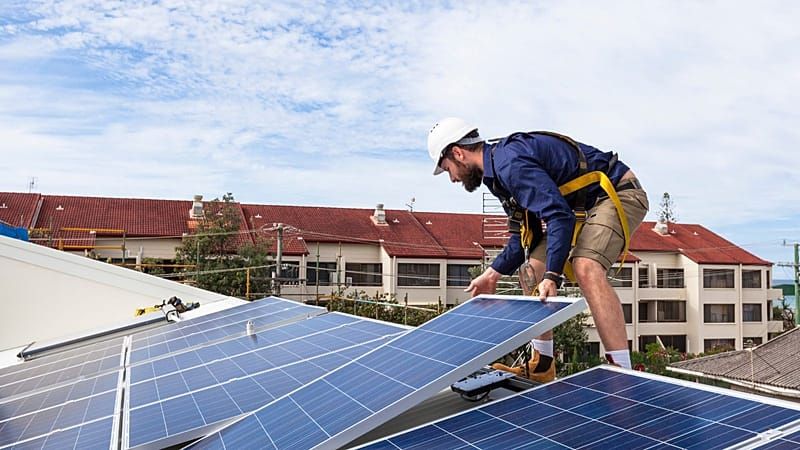
Many consumers want to know how long it will take them to make back the upfront costs of solar.
EPA approves sale of higher ethanol fuel to try to lower gas prices

The Environmental Protection Agency has announced it would allow gas stations to continue selling slightly cheaper E15 this summer in a move that may be good for drivers and corn growers but will likely contribute to air pollution
Climate change is altering Saharan dust – and Europe is downwind

In recent years, residents of Spain, France and the UK have looked up to see an eerie sight: deep orange sunrises and skies thick with a yellowish haze. These hazy skies often deposit “blood rain”, rust-colored precipitation that leaves a fine grit on cars and windows.
2026’s historic snow drought brings worries about water, wildfires and the future in the West

Across much of the Western United States, winter 2026 was the year the snow never came. Many ski resorts got by with snowmaking but shut down their winter operations early. Fire officials and water supply managers are worried about summer.

Texas Supreme Court ends lawsuits against power generators over 2021 winter storm
Tens of thousands of residents and small businesses sought damages from power generators after losing electricity during the storm that resulted in billions in losses and 246 deaths.
Dan Patrick adds data centers, prediction markets and THC to Senate priorities
Patrick’s Friday release of priorities calls on lawmakers to study the emerging issues ahead of the 2027 legislative session.
Hundreds of titles - just one subscription!

On sale for a limited time only, get 25% off for the first 3 months.
Long lines linger at Houston’s biggest airport as TSA agents miss work during partial government shutdown
Wait times at George Bush Intercontinental Airport are expected to worsen over the weekend as agents miss a second paycheck and increasingly call in sick.
At CPAC, Texas Railroad Commissioner candidate Bo French calls for deportation of 100 million people
French, a former Tarrant County GOP chair, also said Republicans should more openly embrace Islamophobia.
Texas Woman Detained After Attempting To Smuggle Dozens Of Pounds Of Meth Into The U.S.

A Texas woman was arrested this week after being caught trying to smuggle dozens of pounds of meth from Mexico into the U.S.
British GT champions amongst one-off entries for Silverstone 500

Darren Leung, Dan Harper, Ian Loggie and Phil Keen will form all-star line-ups in two Paradine BMWs for the 2026 British GT opener
Forced to sell medications at a loss, rural Texas pharmacies seek new survival tactics
Independent rural pharmacists are starting other businesses or selling baby shower gifts to keep their stores operating. Pharmacy deserts affect 4 million Texans.
How a 27-year-old upstart unseated longtime Texas House Democrat Chris Turner
Junior Ezeonu, a Grand Prairie City Council member, defeated Turner in the Democratic primary, becoming the representative-elect for the southeast Tarrant County House district.
After Minnesota scandal, Texas reviewed its child care spending. It found little fraud.
An investigation ordered by Gov. Greg Abbott found that less than half a percent of federal money spent on child care scholarships in Texas was considered “improper.”
U.S. Reportedly Able To Confirm It Has Destroyed a Third Of Iran's Missile Stockpile

The U.S. is able to confirm that it has effectively destroyed a third of Iran's vast missile stockpile, according to a new report.

Mexico Begins Search for Two Humanitarian Boats Reported Missing While en Route to Cuba
Their arrival in the Cuban capital was expected between March 24 and 25, but their whereabouts remain unknown. Mexico's Navy alerted regional naval commands and issued notices to the maritime community to expand search capabilities.
Scoop: Rubio and EU official had heated exchange on Russia at G7 meeting
"If you think you can do it better, go ahead. We will step aside," Rubio fired back.
Hundreds of titles - just one subscription!

On sale for a limited time only, get 25% off for the first 3 months.
Et Tu, Bro? The Podcasts Turn

Iran war costs Trump the love of Joe & Tucker
Stanford Student Claims Chinese Communist Party Spies Targeted Her—FBI Confirms Surveillance Fears

A Stanford student shares a chilling account of alleged Chinese surveillance, sparking a debate on espionage in universities.
Ground stops lifted at Washington DC area airports after ‘strong smell’ reported at air traffic control tower

A ‘strong smell’ was reported at a Virginia air traffic control center, an FAA spokesperson said
Middle East crisis live: Strike reportedly injures 12 American soldiers at US base in Saudi; Rubio expects war to end in weeks

Iran has kept firing missiles at Israel and Gulf nations, including a strike at a military base in Saudi Arabia that wounded US service members
Trump Tells Future Investment Initiative: 'I Like People That Like to Listen to My Success' — Why He Prefers 'Losers'

President Trump delivered an unexpected speech at the Future Investment Initiative in Miami, discussing leadership, personal preferences, and controversial figures.
UK MP says US report on rise in anti-Indian hate online ‘deeply concerning’

Blackman, who represents Harrow East, where Hindus were recently attacked celebrating Holi, said of the report: “This is a coordinated campaign driven by a small number of accounts deliberately targeting the Indian community, its culture, and its contribution to public life. It is racism, plain and simple. The Indian diaspora…
What to know about Iran's military as the U.S. weighs ground operations
The U.S. is developing military operations for a "final blow."
War to end in ‘weeks, not months’: Rubio says no need to send ground troops to Iran

US secretary of state Marco Rubio stated military operations against Iran are expected to conclude within weeks, not months, without ground troops. Despite ongoing conflict and disruptions to global energy supplies, Washington anticipates a response to its 15-point proposal aimed at ending the war, as Iran faces further strikes on…

House passes short-term DHS funding bill
Speaker Mike Johnson called the Senate-passed bill a "joke," noting the lack of border security funding.
Cuba Reportedly Asked Pope Leo To Convince The Trump Admin To Ease its Oil Embargo

Cuban officials have asked Pope Leo XIV to mediate between them and the United States to ease the oil blockade that has the island on the brink of collapse, according to a new report.
Hundreds of titles - just one subscription!

On sale for a limited time only, get 25% off for the first 3 months.
Marco Rubio Says 'People In Charge' Of Cuba Need To Be Changed: 'The Only Way Forward'

Secretary of State Marco Rubio said that the "people in charge" of Cuba need to be changed for the country to prosper, the latest remark related to Washington's eagerness to catalyze political and economic change in the island.
Johnson calls out GOP Senate over "joke" of a DHS plan
"This gambit that was done last night is a joke," Speaker Mike Johnson said.
White House Rejects Report About ICE Acting Head Being Hospitalized Twice Due To Stress-Related Issues: 'Inaccurate Trash'

The White House rejected a report claiming that acting ICE director Todd Lyons was hospitalized twice over the past months due to stress-related issues.
Acting ICE Head Reportedly Hospitalized Twice For Stress-Related Issues In The Past Seven Months

Acting ICE head Todd Lyons has been hospitalized twice in the past seven months for stress-related issues as he endures heavy pressure from top officials in the Trump administration to crack down on immigration.
Sheila Cherfilus McCormick's fellow Democrats demand her resignation or expulsion
"She has to consider her constituents and the House Democratic caucus," said one lawmaker.
Trump Likely Won't Endorse John Cornyn In Texas' Senate GOP Primary In The End, Giving a Boost To Ken Paxton: Report

President Donald Trump may not end up endorsing Senator John Cornyn in Texas' Senate GOP primary, according to a new report.
Why Democrats Should Talk About Trump's Tariffs as a 'Threat to the Rule of Law'
Rep. Jimmy Panetta says Democrats have "learned the hard way" that handing over so much tariff authority to the executive branch is a bad idea.
GOP Sen. John Kennedy Signals Openness to U.S. Withdrawal From Iran Conflict: 'Time to Come Home'

Republican Sen. John Kennedy said the United States should begin preparing to exit its military involvement in Iran, while acknowledging uncertainty about whether key objectives have been fully achieved.

Trump’s strategy to get his way: declare one fake ‘emergency’ after another
The US president’s tactic could put this fall’s elections at risk. A supreme court decision could go far to protect them
At last, David has landed a double punch on the tech Goliaths. Now to hit them even harder

The US court verdicts declaring Meta liable for getting people addicted and ruining lives must be just the start of a global fightback, says Guardian columnist Jonathan Freedland
Hundreds of titles - just one subscription!

On sale for a limited time only, get 25% off for the first 3 months.
The new Trump coin will have an eagle on the back. Here are some better options

The real defining image of this presidency should be the bank statement of the average American citizen
Trump’s horrors keep accumulating. We need the No Kings protests more than ever

Thousands of No Kings events will be fueled by anger over ICE violence, the Epstein files released and a war in Iran. These protests have power
Iran, one month on – the numbers tell the terrible toll of war

THE INDEPENDENT VIEW: Editorial: If there was ever a plan behind the US-Israeli assault on Iran, it is not going well – instead, it has become Donald Trump’s great miscalculation
The Guardian view on social media in the dock: tech bros move fast – society is trying to catch up

Editorial: Two court cases have shown how companies can be forced to take responsibility for their impact on public health
The Guardian view on new musicals: sex, drugs and song ‘n’ dance

Editorial: Adaptations of hit novels like One Day and Trainspotting help keep the genre in tune with the times
Girlguiding didn’t have to do this to its trans members. There was another way

Girlguiding’s response to last year’s supreme court ruling is not the humane option – and changes the organisation’s identity, says Guardian columnist Zoe Williams
OPINION - Almost anything is better than closing Tube stations – most of these so-called 'improvements' aren't necessary

If TfL asked users what they would prefer: cosmetic improvements or a working station – I think I could bet on the outcome, writes Melanie McDonagh
Governments controlling prices? It has long been unthinkable – but may now be inevitable

In Mexico and Spain, leaders who have capped public costs have been rewarded at the ballot box. As another cost of living surge arrives, it may be a policy our leaders are unable to resist, says Guardian columnist Andy Beckett

3 Sci-Fi Movies At SXSW Reveal A Surprising Storytelling Trend
Three movies at SXSW use their sci-fi premises to tell human stories, some more successfully than others.
Cozy Games PC That Deliver After-Work Relaxation: The Best Relaxing Games 2026 for Unwinding

Unwind after work with the best cozy games PC like "Stardew Valley" and "Coral Island." These top relaxing games 2026 offer soothing farms, crafts, and stories for instant calm on Steam.
Hundreds of titles - just one subscription!

On sale for a limited time only, get 25% off for the first 3 months.
10 Top Survival Crafting Games Like Palworld for Ultimate Adventures in 2026

Top 10 survival crafting games like Palworld deliver creature taming, base building, and open-world thrills. Dive into Ark, Minecraft, Rust & more for endless adventures.
25 Years Later, Star Trek Has Revealed The Hidden Reason Starfleet Actually Began

Why did Starfleet form in the Star Trek timeline? A new documentary for Star Trek Online suggests taht it might not be for the reason you think.
Chris Evans May Have Just Accidentally Spoiled The End Of 'Avengers: Doomsday'

We knew that Steve Rogers would return to the MCU, but apparently, he's returning twice. Here's what we know about Cap in 'Secret Wars.'
'Roblox Rider Defenders' Codes March 2026: Collect Powerful Riders to Destroy All Enemies

The latest "Rider Defenders Roblox" codes give free gems, shards, and potions. If you want to boost progress and avoid missing limited-time rewards, snag them right away.
'Life Is Strange Reunion' Release Date, Editions Explained: Max, Chloe's Final Chapter Arrives

"Life Is Strange Reunion" launches March 26, bringing Max and Chloe's final story with new gameplay, multiple editions, and time-bending choices.
The Directors of The Wildest Sci-Fi Epic Of The Decade Are Making A New Movie With Ryan Gosling

Three years after 'Everything Everywhere,' the Daniels are teaming up with Ryan Gosling to make what could be their biggest film yet.
A Horror Master Just Released An Eerie Psychological Thriller Like No Other

Kiyoshi Kurosawa's short film 'Chime,' released theatrically in the U.S. for the first time, observes the phantom vibrations of modernity.
'Borderlands 4' Mad Ellie DLC Guide: How to Start 'Vault of the Damned,' Unlock New Story Campaign Fast

Learn how to start "Borderlands 4" Mad Ellie DLC, unlock Vault of the Damned, and access Whispering Glacier through story progress or a new level 13 character.

7 Go-To Outfit Formulas for Spring 2026 Trends That Make Affordable Fashion Look Luxe
These 7 stylish outfit formulas capture spring 2026 trends while keeping your wardrobe rooted in affordable fashion essentials.
These Amazon Fashion Finds Actually Worth Buying From the Big Spring Sale 2026

Amazon Big Spring Sale 2026 deals are live and shopaholics already have their carts full. See the hottest Amazon finds worth buying right now.
Hundreds of titles - just one subscription!

On sale for a limited time only, get 25% off for the first 3 months.
Runway Beauty Trends to Know: What's In and Out for Fashion Makeup Styles This Season

Stay ahead with runway beauty trends that define what's in and out in fashion makeup styles right now.
67 First-World Anarchists Who Showed The World Who’s In Charge (New Pics)

It's the pup who rips off a "no dogs" sign and carries it down the road in an act of paw-fect protest, the person drinking Pepsi out of a Dr Pepper cup, or the worker who fills the "forks" draw with dozens of plastic spoons. These are the first-world anarchists…
Nobody Does Press Tour Fashion Like Anya Taylor-Joy Right Now and the 'Mario Movie' Proves It

Method dressing, flawless execution. Anya Taylor-Joy's press tour fashion for the 'Super Mario Galaxy Movie' is a clinic in celebrity style done right.
Hailey Bieber Reinvents Church Dressing With Effortless Celebrity Style for Spring

Hailey Bieber proves church style can feel current. See how her outfit reflects celebrity style and top spring trends.
New York's World Cup Housing Fight Could Shape Who Profits When the World Arrives

As the New York City area gears up to host the 2026 FIFA World Cup, including the final match, the debate over where fans will sleep has become a much bigger fight about who gets to benefit when one of the planet's biggest sporting events lands in a city already…
Matthieu Blazy’s hit Chanel look is heading for the high street

Prepare for bouclé jackets, quilted chain-link bags galore and an outfit formula that is proving to be consumer catnip
Zendaya's 'Something Old' Is a 2015 Oscars Gown and the Smartest Celebrity Red Carpet Move of 2026

An 11-year-old ivory gown, a real engagement ring, and a wedding film. See how Zendaya made bridal trends and celebrity red carpet style completely personal.
Less Is More Style Explained: Why a Minimalist Wardrobe Elevates Intentional Fashion Choices

Learn why a minimalist wardrobe leads to intentional fashion choices and a less is more style that feels polished and effortless.

Pregnant women and cancer patients ‘at risk’ because of sonographer shortage
Concerns have been raised about a shortfall in workers who help scan pregnant women and cancer patients.
Post-Workout Muscle Recovery Guide: Foam Rolling, Nutrition & Sleep for Faster Gains

Muscle recovery methods for DOMS relief using foam rolling, active recovery, nutrition, and sleep cycles to boost performance and reduce soreness.
Hundreds of titles - just one subscription!

On sale for a limited time only, get 25% off for the first 3 months.
Why the Way You Breathe at Night Changes Everything

Nasal vs. mouth breathing during sleep can significantly impact oxygen intake, airway resistance, and overall recovery. Learn the science behind better breathing for deeper, more restorative sleep.
Effectiveness Rates of Hormonal Pills and Oral Contraceptives and Common Birth Control Side Effects

Learn how oral contraceptives and hormonal pills work, their effectiveness rates, and common birth control side effects to make informed, safe contraception choices.
Aspirin Therapy and Daily Aspirin Use for Heart Health and Blood Thinner Benefits

Learn how aspirin therapy supports heart health, acts as a blood thinner, and when daily aspirin use can pose bleeding risks according to medical guidance.
Health chiefs urged to offer meningitis catch-up jabs to teens as true scale of worldwide death toll revealed

Although cases have declined since 1990, it’s not enough to meet WHO goals to reduce global deaths by 50 per cent
Cancer patients and pregnant women face ‘life-threatening’ delays due to sonographer shortage

Sonographers conduct ultrasound scans which are essential to pregnancy care and are also used in the diagnosis of cancer
BMI ‘misclassifying’ people as overweight or obese, new study warns

Researchers in Italy compared the tool to scans which provide an analysis of fat, muscle and bone in the body
A painful ‘eye biting’ fly is invading part of Southern California

Black fly populations are appearing in higher numbers than usual for the season
Kicking the habit: Smoking rate among Americans hits a historic low

Americans are continuing to shift away from cigarettes — but nearly 20% still used at least one tobacco product in 2024

Mexico vs. Portugal—International Friendly: Preview, Predictions and Lineups
El Tri will face Portugal in a landmark match at one of world soccer’s cathedrals.
Arizona’s Stability Is About to Be Tested by Tommy Lloyd’s Men’s Hoops Success

The Wildcats coach’s meteoric rise has made him one of the sport’s hottest names as blueblood programs open.
Hundreds of titles - just one subscription!

On sale for a limited time only, get 25% off for the first 3 months.
Suuure, 6-time WSBK champ Jonathan Rea Is Retired…

Cue the eye roll, as Jonthan Rea is back on a World Superbike, with Honda, again after supposedly retiring.
Transfer News, Rumors: Man Utd Receive Mega Fernandes Bid; Tonali Bombshell Drops

Marcus Rashford, Julián Alvarez, Elliot Anderson, Lautaro Martínez and many more feature in the gossip.
"Leno's Law" Emissions Bill Is Back, And Might Even Pass This Time

California Senate Bill 1392 aims to provide emissions exemptions for collector cars. If this sounds familiar, it's because SB1392 is a resurrected version of a prior bill dubbed Leno's Law. That prior bill failed to pass, but legislators apparently have higher hopes for this new version.
This New Rotax Engine Is The Real MVP Of Ski-Doo's 2027 Lineup

Ski-Doo’s 2027 snowmobiles get a major upgrade thanks to the new 600RR E-TEC engine and lighter platform.
The Most Expensive American Players in Soccer History—Ranked

There have been some blockbuster transfers involving USMNT stars.
Some Lunatics Put F1 Tires on a Can-Am Side-By-Side

The silly folks over at Grind Hard Plumbing Co. decided what a race-ready side-by-side needed was a set of Formula 1 rain tires. And, honestly, they may not be wrong.
Is Kawasaki Working on a Secret Supercharged Rock Bouncer UTV?
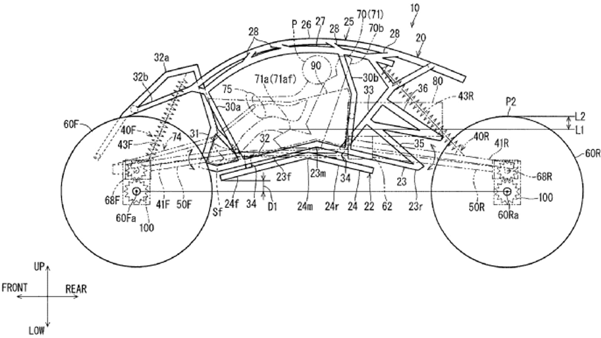
A recent patent application shows what appears to be a rock bouncer-style side-by-side from Kawasaki, which would be a first for the entire industry.
Why Man Utd’s Manuel Ugarte Received Two Yellow Cards But Wasn’t Sent Off vs. England

Ugarte escaped severe punishment for Uruguay during a controversial friendly at Wembley Stadium on Friday night.

2026 Toyota bZ Review: One Big Thing Missing
Toyota's updated bZ gets more range, more power and better charging. But one thing stops me from being able to recommend it.
I Can't Believe How Smooth The Porsche Cayenne Electric Is

We test out the Porsche Cayenne Turbo Electric's new Active Ride system and explore its ride and handling abilities.
Hundreds of titles - just one subscription!

On sale for a limited time only, get 25% off for the first 3 months.
'Unless Things Change, We Will Not Survive': Even Toyota Doesn't Feel Safe Right Now

In an overly-cautious message to suppliers, Toyota's outgoing CEO issues a stern warning that it hopes will usher change into the way the industry operates.
Jeep Recalls Over 11,000 Wagoneer S EVs Over Liftgate Issue

Model years 2024 through 2026 are affected, but it's an easy fix at the dealer.
26 Years Later, A New Star Wars RPG Is Blending The Best Of Both Eras

Star Wars: Zero Company, the upcoming tactical RPG from Bit Reactor, will allow for third-person exploration along with its demanding turn-based combat.
Home Charging Prices Are Going Up, But Charging At Home Is Still Cheaper
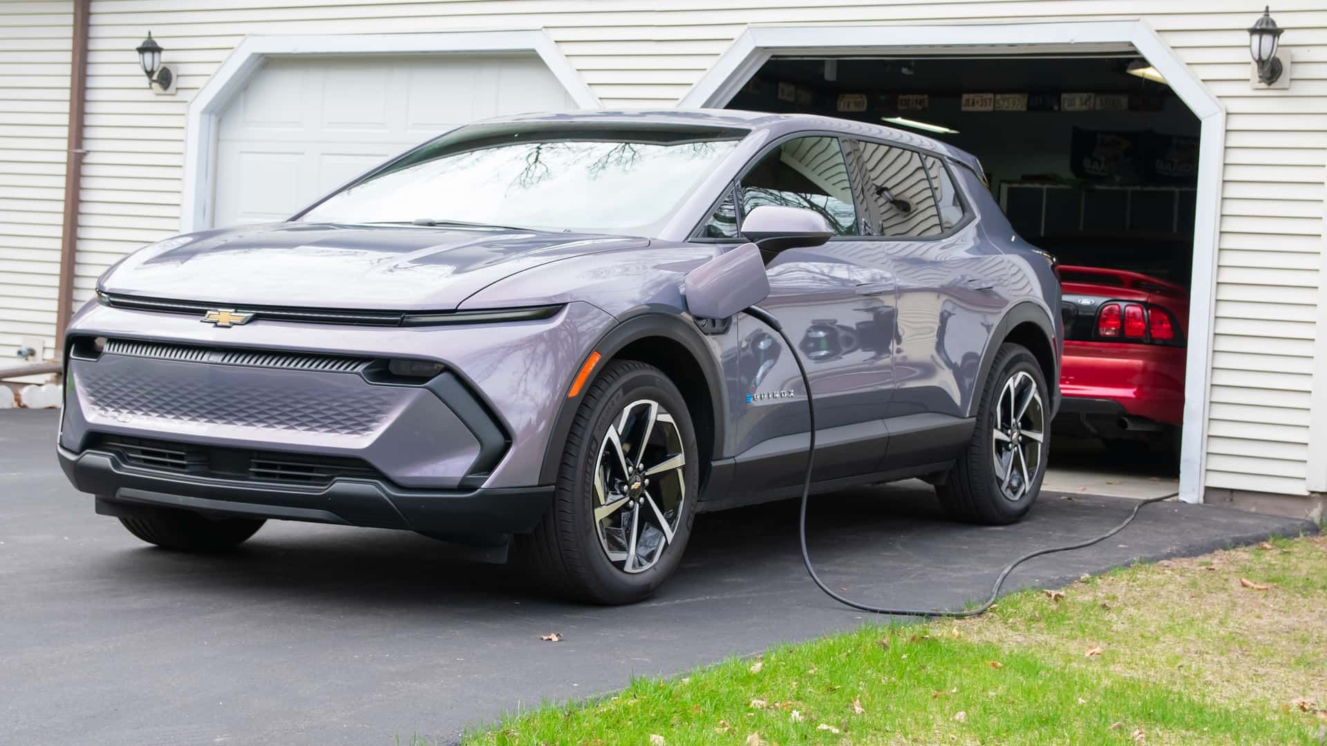
JD Power’s Electric Vehicle Experience (EVX) Home Charging Study revealed that energy costs are making EV owners less satisfied with home charging.
The New Ford Transit City Is A High-Tech Electric Van With Chinese Roots

Ford’s latest electric van looks modern, gets LFP batteries, and is designed for urban environments. Just don't expect a U.S. version.
White House AI rollout exposes widening rift
The administration's loose AI playbook for Congress is exposing cracks beneath the GOP's apparent consensus.
Tesla's New Folding Supercharger Units Cut Installation Time In Half

The company’s prefabricated stations now sit on a hinged base that can fit more stalls than before.
This Cheap EV With Semi-Solid Batteries Wants To Battle It Out With Europe's Best
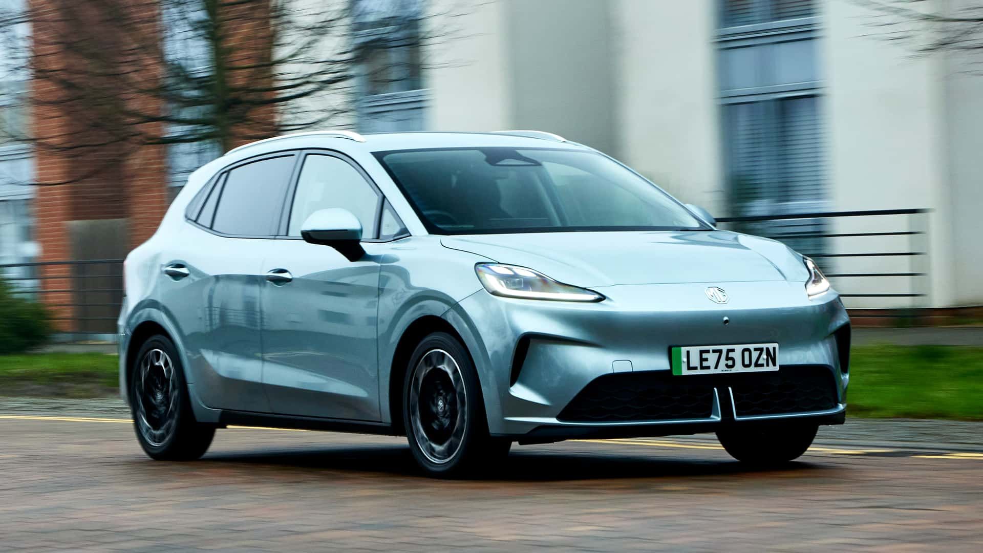
The affordable MG4 Urban is the world’s first small mass-market EV with a semi-solid-state battery, and it’s going to Europe.

Rare ‘Earthtongue’ fungus found in ancient woodland is new species for UK
Discovery fungus in West Sussex comes almost 20 years after species was first recognised in Spain
Can humans have babies in space? It may be harder than expected

Sperm struggles to find its way to an egg in microgravity, suggesting mammalian reproduction in space may not be possible.
Hundreds of titles - just one subscription!

On sale for a limited time only, get 25% off for the first 3 months.
Fireball sightings are surging across the US — here's what's really going on

With bright meteors sighted over Ohio, Texas, and Europe, you might wonder what's going on. Is meteor activity really increasing, or is there just a surge in reporting?
Are Saturn's rings made of a lost, shattered moon? New evidence arises for the case

New simulations suggest Saturn's rings formed from a shattered moon called Chrysalis, offering clues to the planet's tilt and surprisingly young rings.
'For All Mankind' season 5: Release date & how to watch Apple TV's alt-history space show

'We will not back down! It's high time we bring Mars back under control.'
Brian Cox says UK physics funding cuts are ‘destruction of the future’

Grant cuts of nearly 70% may force university departments to close and ‘annihilate’ research, scientists say
New portrait of the oldest-known supernova | Space photo of the day for March 27, 2026

A NASA X-ray telescope has captured a breathtaking portrait of a supernova remnant, revealing unseen features of the exploded star.
NASA's ambitious 'decade of Venus' exploration may bank on 1 probe: 'Not everything can move forward'

NASA may not be able to move forward with all three of its planned Venus missions as budget pressures force difficult trade-offs across its planetary science portfolio.
What time is NASA's Artemis 2 moon launch on April 1?
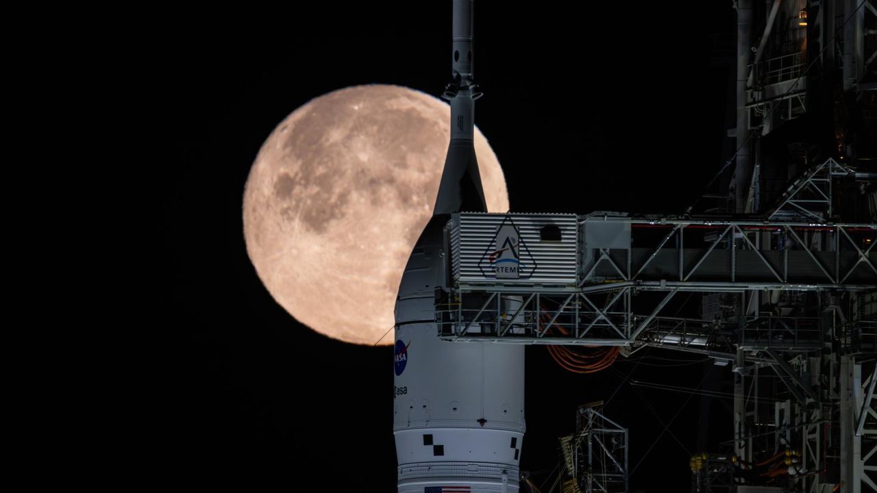
NASA's long-anticipated Artemis 2 mission — the first crewed flight to the moon in more than half a century — could lift off as soon as April 1. Here's how you can watch it live.
NASA is developing the '1st nuclear powered interplanetary spacecraft.' What about the Voyager probes?

What is nuclear electric propulsion and how is it different from radioisotope thermoelectric generators?

Climate Activists Confront Iran War Profiteering at Big Oil Confab in Houston
Meanwhile, the U.S. energy secretary tries to soothe an anxious American oil industry, urging them to ramp up production amid shock to global markets.
Trump EPA relied on industry science to weaken formaldehyde cancer rules, documents show

Papers reveal how chemical lobby influenced policy, reversing Biden-era limits on a common carcinogen
Hundreds of titles - just one subscription!

On sale for a limited time only, get 25% off for the first 3 months.
As high seas treaty takes shape, Galapagos proves that protection pays off

A global treaty designed to protect the high seas is entering a decisive phase, as countries meet in New York this week to work out how to turn it into action. At the same time, a real-world example in the Galapagos shows what effective ocean protection can look like –…
‘It helped me feed my six children’: how Africa’s first water fund supports farmers to protect Kenya’s biggest river

Conserving the watershed of the Tana and improving farming methods is securing water supplies and livelihoods alike in a changing climate
Cut the lights – and seven more ways to save Britain’s bats

Lots of us aren’t very keen on bats. But the more we find out about them, the more amazing they turn out to be
Antarctic whales’ remarkable comeback is threatened by krill fishing

Huge industrial trawlers are competing for krill – the main food source for whales – in the Southern Ocean, removing vital nutrients from the ecosystem
Beavers ‘breathe new life’ into Dorset as dams built and biodiversity returns

National Trust says one year after reintroduction they are enriching habitats and may be having kits this summer
Country diary: Look again at these unassuming spiky bundles – they’re firestarters

Deerness Valley, County Durham: Rushes were matches before matches were invented, vital to the rural poor for a little light in the dark. Time to give them a try myself
Earth hour turns 20 at pivotal moment in climate action

From the Sydney Opera House to the world, the 20th anniversary of Earth Hour comes at a critical time in the global response to climate change.
What does the Iran war mean for clean energy transition?

Here’s what to know about how the current crisis could shape the expansion of renewable energy

‘A kaleidoscope of colour and life’: readers’ favourite UK spring days out
Your top tips for seasonal outings from birdwatching to gorgeous gardens, amazing architecture and more• Tell us about a trip to Spain – the best tip wins a £200 holiday voucher
Tala Alamuddin's insider guide to Lamu

The accessories entrepreneur, and sister-in-law of George Clooney, sails a dhow through mangroves and soaks up the Swahili culture on Kenya’s paradise island
Hundreds of titles - just one subscription!

On sale for a limited time only, get 25% off for the first 3 months.
The perfect solo travel guide to Kuala Lumpur

Malaysia’s concrete jungle capital sees low-key food joints jostle with world-class hotels. Here’s how to make the most of it when travelling alone
United Airlines Launches 'Relax Row'—Economy Seats That Turn Into Couches For Long Flights

Discover United Airlines' new 'Relax Row' concept, transforming economy seats into couch-like spaces for added comfort on long-haul flights
Tell us: have you used AI to plan a holiday?

We would like to hear from holidaymakers about their experiences of using AI
Holy parades and earthly pleasures in Spain: Easter in Granada

The ancient city – with its gardens, hammams and Moorish architecture – comes alive in spring and its Holy Week processions are among the most authentic in Andalucía
This affordable new Cambridge hotel is the perfect weekend escape

The Hobson Cambridge offers apartment-style living with hotel polish
Tell us: are you travelling in the US during the TSA staff shortage?

How has your journey been? Have you been stuck in long lines or had to change your travel plans?
Walking with the weavers 200 years after the Lancashire uprising

Former mill towns in the West Pennine Moors tell the story of the workers’ rebellion against power looms, the new machines decimating their livelihoods
Share a tip on a trip to Spain

Tell us about your favourite break in Spain, whether it was by the beach, in the town or deep in the countryside – the best tip wins £200 towards a Coolstays break
