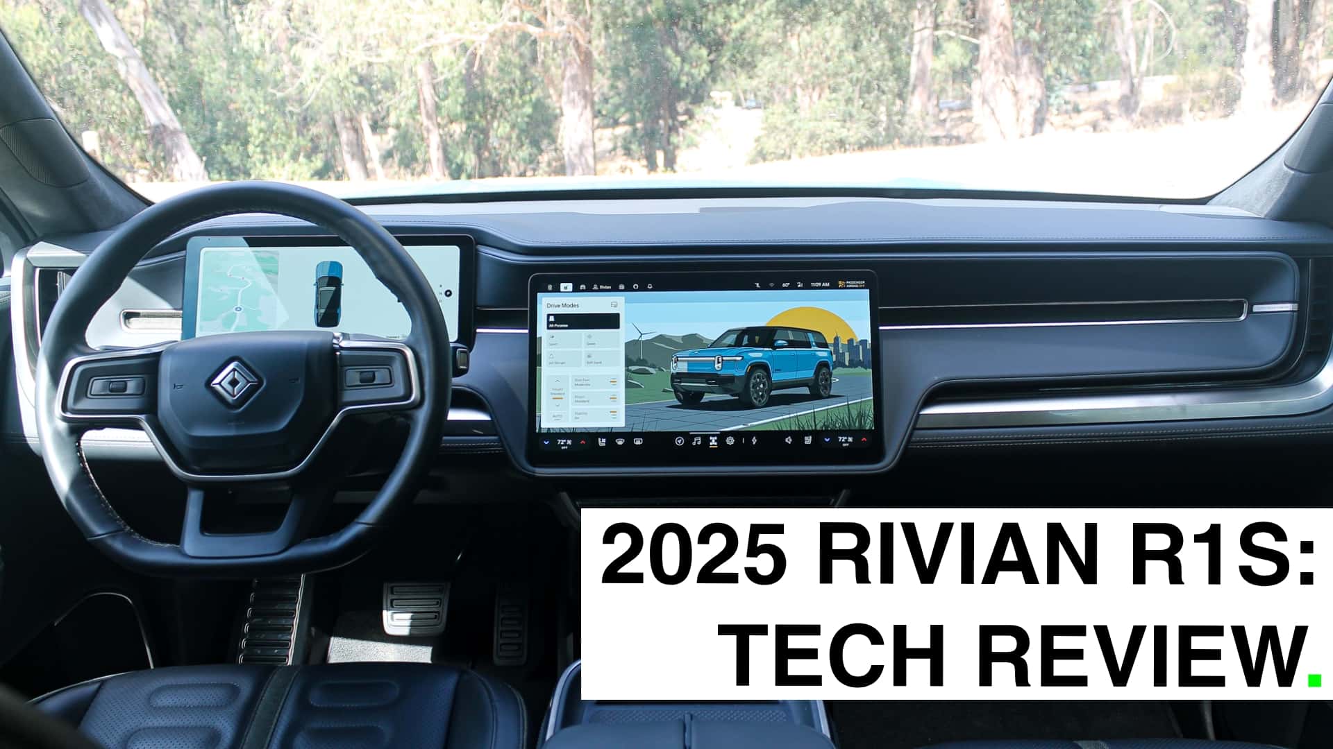
Lots of car buyers are appalled by the way touchscreens are taking over cars. And who can blame them? Bigger, more feature-stuffed screens tend to yield fewer easy-to-use buttons, more confusing submenus and, ultimately, the overcomplication of a user experience that used to be pretty straightforward. For anybody driving a 12-year-old car—the average age of a vehicle on U.S. roads—the thought of trading a simple volume knob for a big, complicated iPad just doesn’t make sense.
And I get it. I have a streak of that skepticism myself. Swiping a screen to direct your air vents? I mean, come on.
But I’m coming around to the benefits of a screen-filled future of cars. The user experience can actually be kind of awesome when executed well. One automaker nailing this better than most is Rivian, the California-based maker of the R1S SUV and R1T pickup.
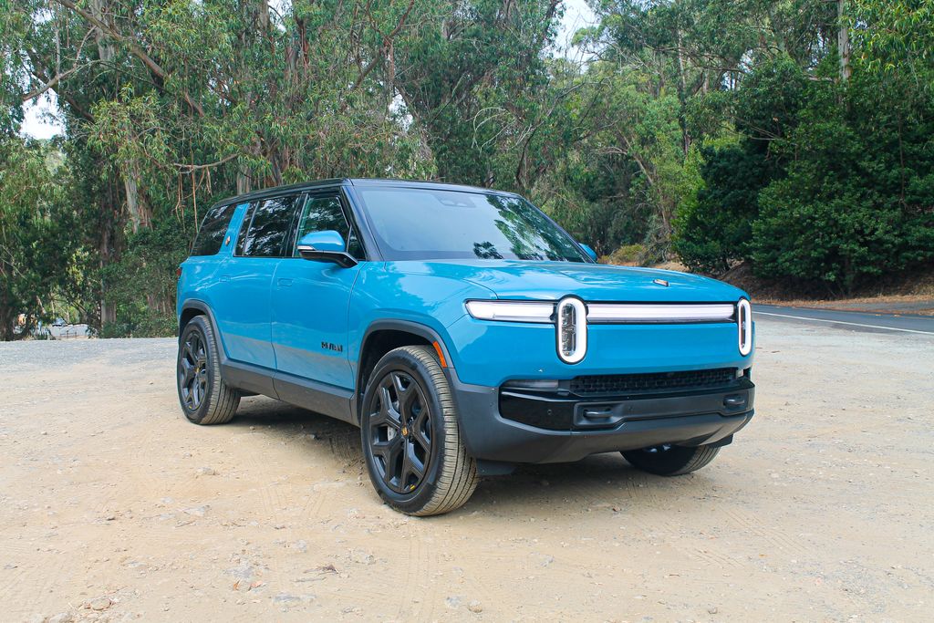
Rivians come equipped with a scant few physical buttons and a sprawling digital command center that does basically everything. During my recent 10-day stint with a 2025 R1S, I found most parts of the user experience delightful, which isn’t a feeling you’d generally associate with software created by the auto industry.
Rivian’s tech is smooth and satisfying enough that I didn’t even miss Apple CarPlay, the extremely popular smartphone-mirroring feature that Rivian famously—or perhaps notoriously—will never put in its cars.
That’s often a dealbreaker for anyone who compensated for terrible user experiences in cars—with buttons or without—by embracing a their phone’s familiar ecosystem. But Rivian shows that there just might be a way forward without it.
[Full disclosure: Rivian dropped off a fully charged 2025 R1S at my home for me to review. I drove it around for a little over a week.]
Rivian’s in-house infotainment: The basics
Climb into the R1S’s cockpit and you’ll find a centrally mounted, 15-inch, landscape-oriented touchscreen. Right off the bat, it comes off large and in charge but naturally integrated into the interior. It houses practically every key function apart from the throttle, brakes and steering wheel.
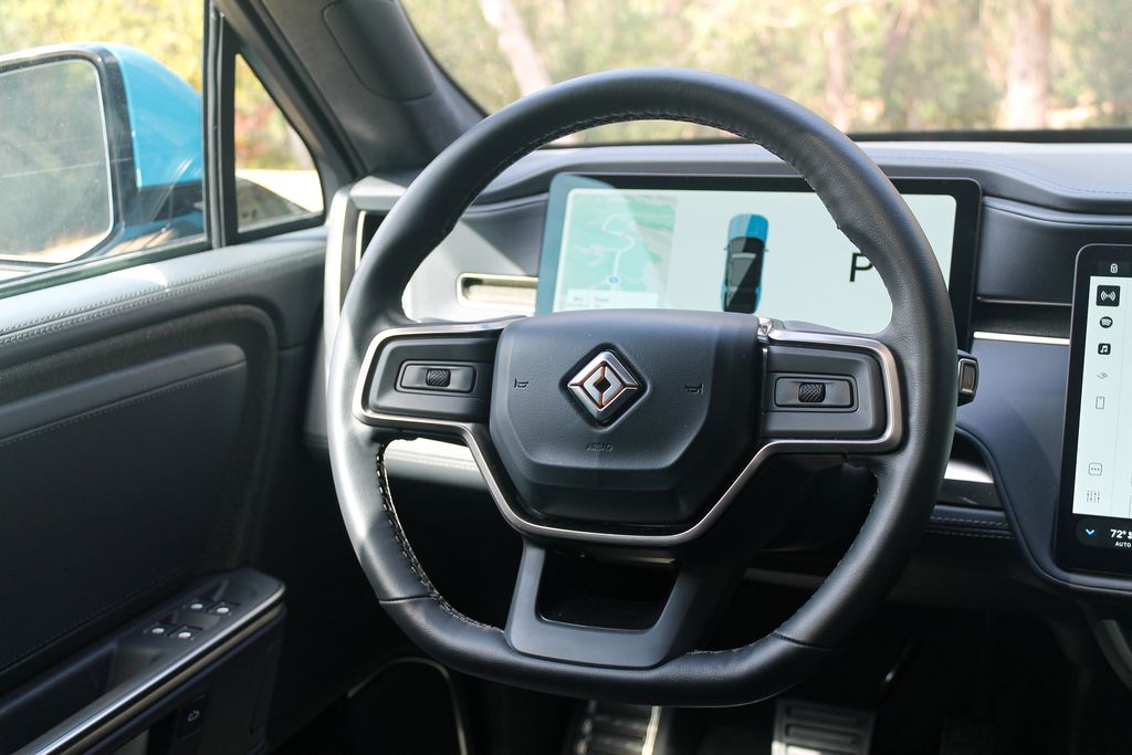
Behind the steering wheel is another 12-inch screen that crisply displays all the critical things you might want to see at a glance: speed, range, battery percentage, energy efficiency, turn-by-turn directions and cruise-control settings. As far as digital driver clusters go, it’s about medium-sized.
One of the big under-the-skin improvements Rivian brought to the 2025 R1 lineup is a new underlying electrical architecture that relies on a smaller number of more powerful computers. One of those seven computers runs the infotainment system. Both the electrical hardware and Rivian’s software are developed completely in-house. And, for reference, most cars made by legacy automakers have something like 100 or more computers running everything from the screens to the door locks.
What Are Rivian’s Menus And Graphics Like?
The interface not only looks amazing, but it’s full of thoughtful touches and is a joy to use most of the time.
Broadly speaking, the overall layout and functionality are refreshingly intuitive and, for lack of a better term, Apple-like. Some tasks take some getting used to, for sure. But if you can find your way around an iPhone or MacBook, you’ll have no issues here. The system reacts to swipes, pinches and taps with the smooth responsiveness of a tech product. Its whole aesthetic gives off minimalist, Apple-product vibes that I find appealing. And all the graphics and animations are really well-executed. Even if some aren’t strictly necessary, they’re fun.
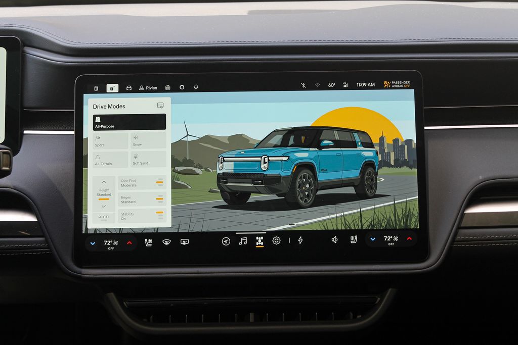
Take, for example, the vehicle settings page. Switch drive modes and a dazzling depiction of your Rivian will transform in kind. Sport mode puts it on a track, snow mode lands it in the snow and so forth. Tapping Camp Mode produces a tranquil tableau of a Rivian alongside a flickering fire. Dive into the Rivian’s less-used settings, and you’ll find helpful diagrams and animations that explain what they do. Rivian’s UX team clearly paid intense attention to the little things, and that shines through all over the R1S’s interface.
In a recent overhaul of its UI, Rivian swapped out realistic representations of the vehicle for more stylized ones, which look great.
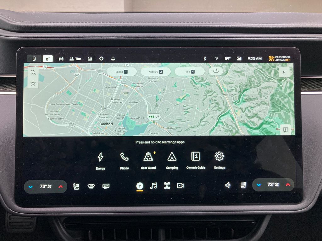
Now I’ll run through the basics of how the system works before diving deeper into the key features of navigation and music below. There isn’t a home screen. Instead, Rivian placed important functions around the perimeter of the screen. A toolbar along the bottom provides quick access to your four most-used features. It’s customizable, so you can add what’s important to you, which is nice.
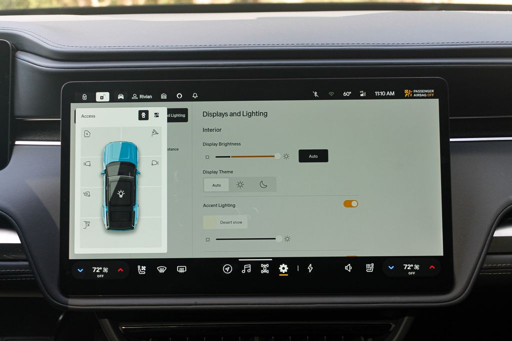
The door-lock toggle is found in the upper left, just beside a little icon of a Rivian. Tap that and you get a dropdown menu that takes the form of Rivian—a top-down view of your SUV or truck, with the same color paint and everything. There you can open the charge port, trunk or frunk and operate the exterior lighting.
In the bottom corners you’ll find the climate settings. You can change the temperature, turn on the defogger or fiddle with the seat heating and cooling right there without having to dive into a whole menu. Anything else, though, requires extra steps, which some analog-button diehards will find irritating.
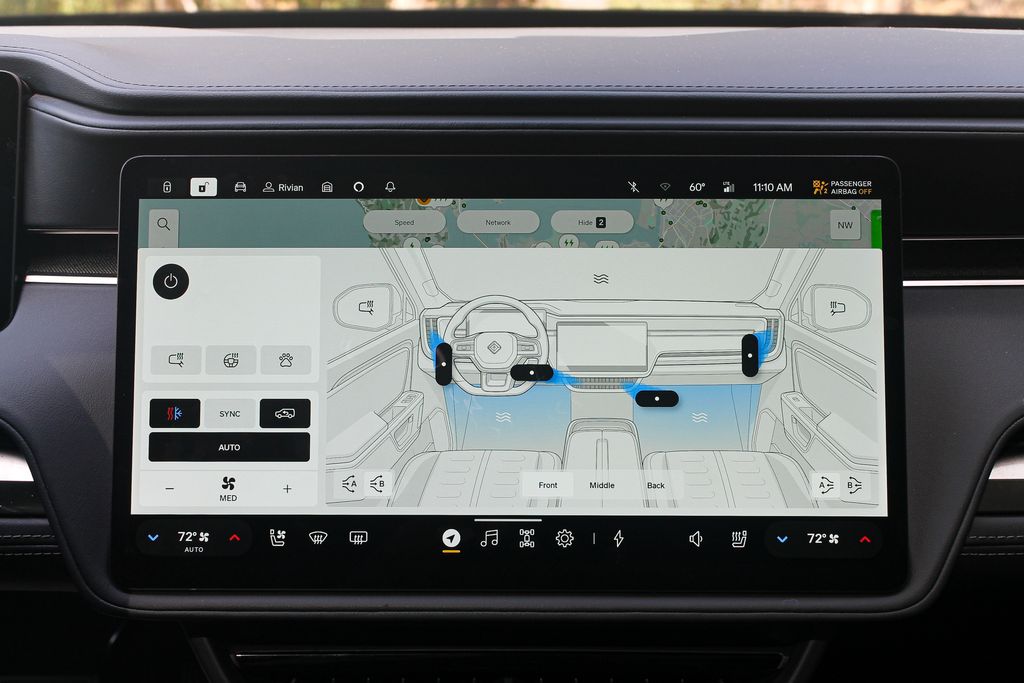
Still, Rivian makes up for the lack of physical switchgear in clever ways. For example, the mirror and steering-wheel controls are embedded in the screen. Yet, when you move your seat in any direction, those settings automatically pop up, because all of those adjustments go hand in hand.
There are many more settings and capabilities than I’ve just described, and yet the Rivian OS doesn’t come off cluttered. It’s pretty easy to find whatever you need, and I got the lay of the land in fairly short order.
What's The Driver Screen Like?
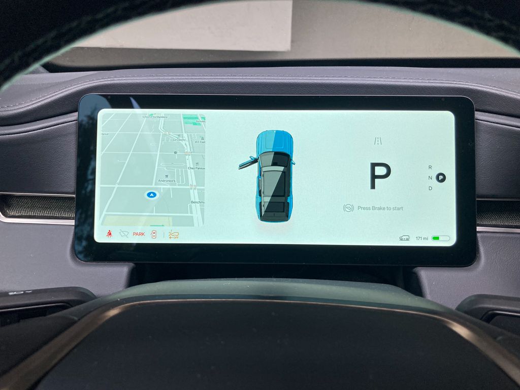
The driver-facing screen is a nice complement to the central display. It's functionality is much more limited, clearly, but it's easy on the eyes and still serves up some features of note.
When you flick either turn signal, a live camera view of the relevant blind spot pops up on the screen’s corresponding flank. This isn't a replacement for side mirrors, but it's helpful in certain situations and should probably be more widespread in the car market.
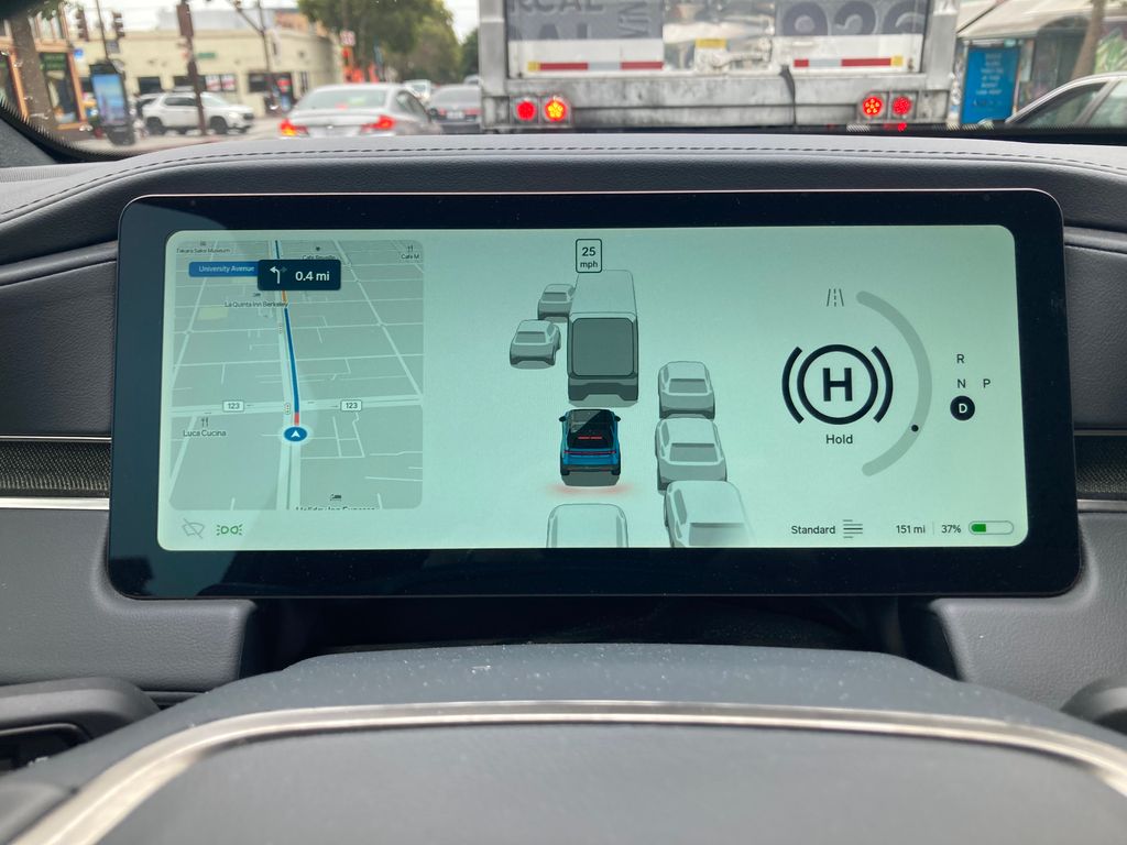
A mini-sized version of the map hangs out on the lefthand side of the screen, which I think beats more typical turn-by-turn directions. The display isn't as customizable as some, but you can swap out the map for energy-efficiency or tire-pressure information if you so choose.
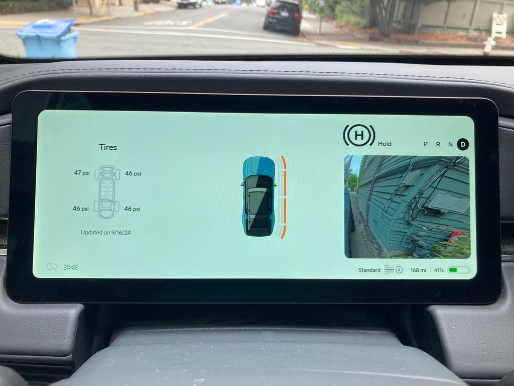
Front and center is another shrunken-down version of your R1S or R1T. When you're parked and open the doors or trunk, the same thing happens in the dash—another thoughtful touch. At slow speeds, little rings around the graphic indicate when you're getting too close to something. When you're driving, a visualization of surrounding traffic appears. It can be helpful during assisted highway driving, since it offers a sense of what the Rivian is "seeing." Around town, though, I could live without seeing parked cars whipping by. I know they're there.
Why I Didn’t Miss Apple CarPlay
Our software reviews typically include a section on smartphone integration—that is, Apple CarPlay and Android Auto. One little problem: Rivian rejects smartphone mirroring in favor of an in-house software ecosystem that it can control. Still, top-tier navigation and entertainment apps meant I didn’t long for CarPlay.
The navigation system is user-friendly and has a clean, Google Maps-like feel. You can toggle between a satellite and basic views, as well as between 3D and 2D. When you search for a point of interest, you can see that restaurant or store’s star rating.
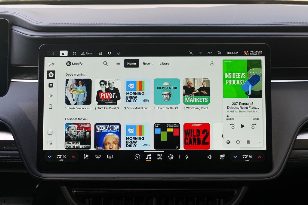
Most critically, it also nails the EV-specific stuff. When you route somewhere, the app indicates the estimated range you’ll have left upon arrival. That’s a no-brainer addition, and yet it still isn’t ubiquitous in EVs. You can dial in the range you’d like to end up with, and the Rivian will factor that in when suggesting charging stops.
The map also makes it easy to find charging stations. You can choose to have the map always display nearby charging sites. And you can even filter them by charging speed, network and availability. It indicates how many stalls are available at each station, which is key. Because nobody wants to show up at a station and wait. Not to mention, each station carries a letter grade, which Rivian generates by analyzing real-world charging sessions.
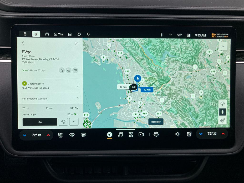
My preferred streaming music and podcast app, Spotify, worked and looked great too. It was easy to use and didn’t feel compromised by the fact that it was part of a car’s operating system. My colleague Kevin Williams got the same impression from Rivian’s Apple Music integration. Rivian also currently offers Audible, TuneIn and Tidal, with more options on the way.
Moreover, you can view the navigation and entertainment side-by-side via a vertical window that pops up on the right side of the map. Or, if you want to view the whole map, you can simply swipe that box to the side.
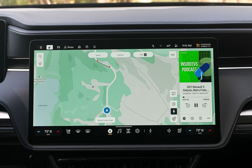
One caveat here is price. Rivian charges an optional $14.99 per month for the data connection required to run Spotify, Apple Music and some other services. For a lot of people, I think it’s worth it. And this offers a maybe obvious lesson to an auto industry looking to remake itself in the image of Silicon Valley by going big on software and subscriptions. If your user experience is shitty, people probably won’t want to shell out. Make it nice, and they’ll consider it.
What’s Not So Good About Rivian’s UX?
My complaints are small and few, but I’ll run through them anyway.
I am still not a big fan of the screen-operated vents. And I don’t love that it takes multiple steps to adjust the fan speed, which I like to do frequently. (You need to open the climate settings with a tap to get there.) To be fair to Rivian, I’m one of those freaks who fiddles with the A/C constantly—because it’s too loud or blowing in the wrong place. In a recent update, Rivian introduced customizable presets for the vents, which should help if you share a car with someone who has vastly different preferences.
The navigation system does this frustrating thing where it constantly recenters to the vehicle’s location, even when you’d rather it didn’t. This happened when a friend was searching for charging stations while I was driving. He’d click on a station somewhere, then click away to examine a different one nearby. Every time, the map would recenter, meaning he’d have to go hunting again. That’s an easy software update, I’d imagine.
The Alexa-based voice commands worked decently well most of the time—for doing things like routing to an address or playing music. I even found myself using Alexa for the trunk when I had my hands full. But sometimes, Alexa struggled with basic asks. I could not for the life of me get it to switch on my seat heating or ventilation, for example, even though I know for a fact it can do that. We’ve had similarly poor results with Alexa on the Lucid Air, which may be why Lucid recently dumped it.
Verdict
Although in-car software is steadily improving as consumers expect more, very few automakers can compete with what Rivian has developed for the R1 series. If you want an EV that truly feels like the auto-industry’s long- promised “smartphone on wheels,” look no further.
Contact the author: tim.levin@insideevs.com


