Ricky Gervais might be a controversial character but the comedian's taste in interiors is far less divisive. The British multi-hyphenate frequently offers his Instagram followers a glimpse inside his home (often following the whereabouts of his internet-famous cat, Pickles), and a recent shot of his sprawling entryway proves that despite his modest persona, the actor-stroke-comedian has a penchant for luxury design.
As far as high-end interiors go, Ricky's entryway makes an instant luxe impression. The expansive space features a huge marble staircase, crisp white walls, and a high gloss floor, and not a lot else in terms of decor, furniture, or accessories. The minimalist space might be a pipe dream for most of us but there's a lot we can learn from it, especially the simplicity of the color scheme.
At first sight, it might look like a bland and uninspiring entryway idea, but on closer inspection, the subtle scheme is clearly designed with intention. The bright white palette creates a luxurious first impression, but the few decorative details dotted about the space really tie the space together, particularly the addition of artworks that bring pockets of color to the room. If you're looking to decorate with white while offering plenty of visual interest, let Ricky's space be your blueprint.
When it comes to impactful spaces, there are few things as breathtaking as a sprawling white entryway. If space permits, it's a much-revered look among designers. Add in subtle nuanced shades as Ricky has, and you have a recipe for a spectacularly stylish space.
This entryway is evidence that decorating with white is far from boring. 'Some may say Ricky takes bright white to the extreme of stark and sterile here, but I feel that the gorgeous sleek floor with absolutely no seams is a stunning addition to any space,' says Isy Jackson, owner of Cheltenham Interiors. 'He uses a lovely all-white palette, yet it's extravagant in its high gloss floor material choice and the contrasting black trellis design of the stair railings, these two monochrome contrasting elements standing out most in the design.'
Interior designer and paint specialist Tila Lee notes the more subtle uses of color throughout the space, too. Somewhat counterintuitively, she claims that pure white walls are actually the best place to showcase color. 'In this space, the walls bounce every other shade off of them, creating illusions of the undertones in the art on the walls,' she says. 'Pair that with the shiny white floor, and you're really getting a mirrored effect that showcases the very minimal colors and makes the mostly blank slate shine.'
When it comes to choosing a color scheme, it's always a good idea to pick a few hues that occur in your favorite decor or accessories to plan the rest of your space around. While Ricky's entryway falls on the more minimalist side, the splashes of color found in his blue and brown artworks bring just enough variation into the picture, creating a cohesive palette that marries the room together.
'The neutral color in the stairwell walls pulls similarly to the neutral color on the blue art, and the wood in the railing matches quite similarly to the wood in the door,' explains Tila. 'This creates enough repetition to make the minimally decorated space feel very pulled together and intentional in its design.'
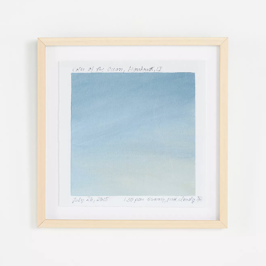
If you're partial to minimalist, neutral interiors but want a subtle splash of color in your space, a modernist piece of wall art like this one is the way to go.

White walls will always be a classic choice, especially in an entryway where they offer a bright and airy feel. White Dove from Benjamin Moore is a designer favorite, with just enough warmth for a soft, inviting feel.

Ricky keeps furnishings to a minimum in his entryway, but he still recognizes the importance of a bench. The simple lines of this wooden option will bring a clean, refined look for a similarly minimalist space.
If you're undecided on whether or not to decorate with white, let Ricky's entryway offer a source of inspiration. Contrary to opinion, bright white walls with just a smattering of color can make a huge visual impact, proving that sometimes less really is more.