Kelly Hoppen CBE once again proves why she is one of our favourite interior designers after sharing her foolproof tip for creating decorative displays that feel skillfully curated.
It may seem simple but sometimes it can be hard to effortlessly execute the interior design trends in our own spaces when we're limited on budget and time, especially when we've got all the decor pieces but no idea how to style them. This is why easy expert design tips can make redecorating our home all that more effortless and guarantee a professional-looking display in no time.
When we saw Kelly Hoppen's tip for creating displays revealed on her Instagram we just had to share. Whether looking for ways to make your home more expensive or striving to transform your living room on a budget, this interior trick is a great place to start.
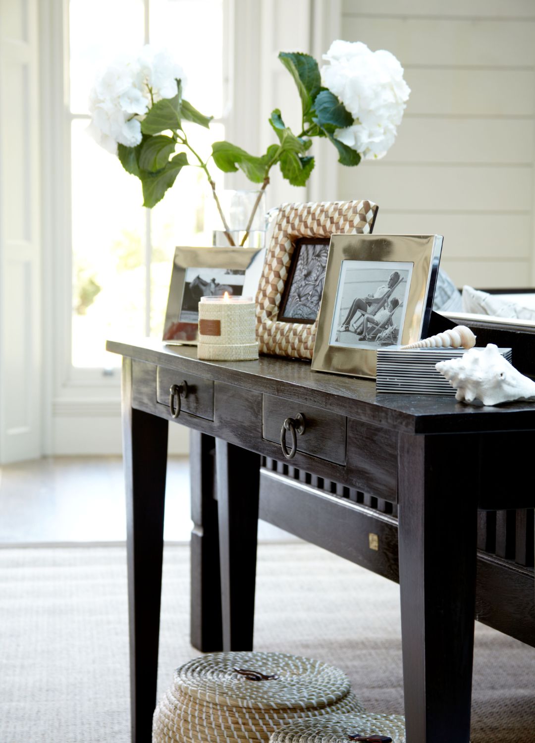
In the Instagram post, which showcased some of the most stunning decorative home displays we've seen, Kelly said, "I often get asked about easy tips for creating displays. You can use colour, texture or anything else that connects the objects together."
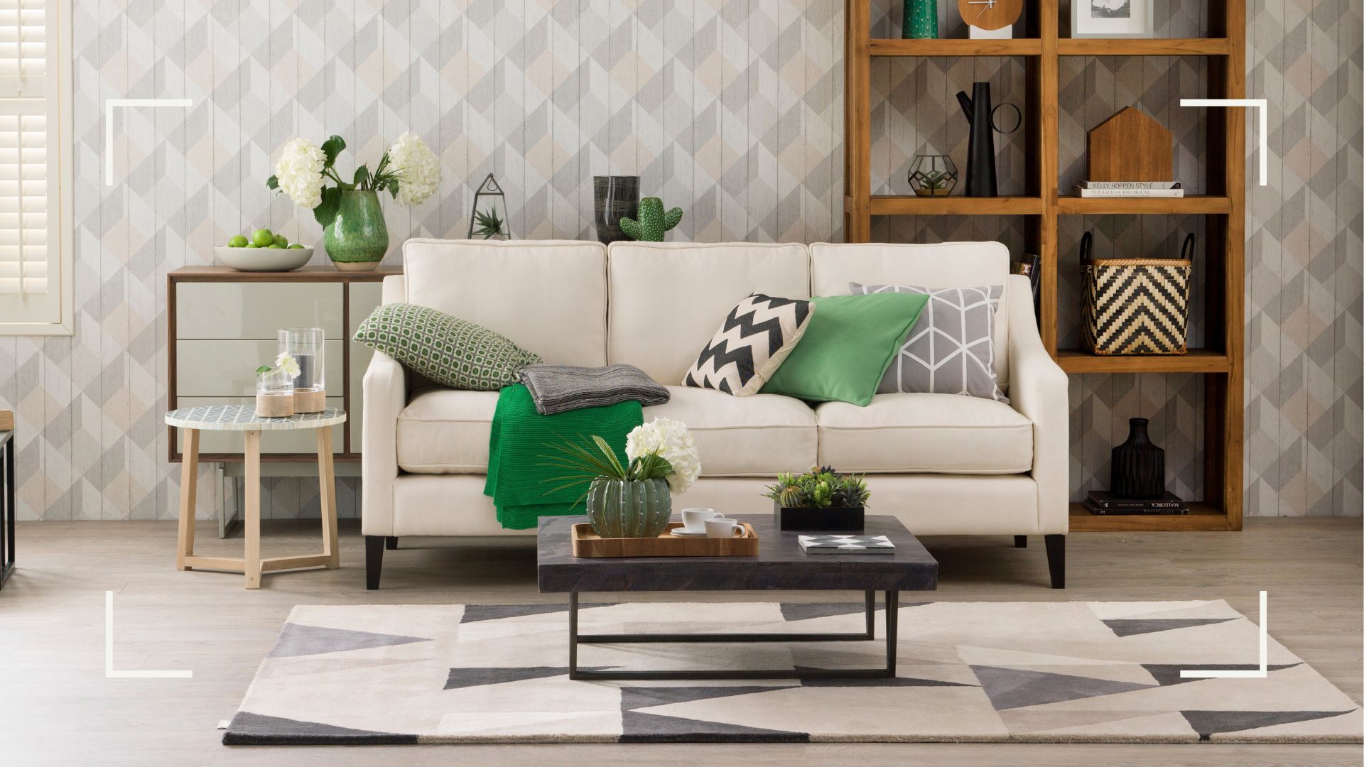
Finding a single aesthetic similarity between the objects will immediately bring a sense of cohesiveness to your display, whether it's on your bookshelf, coffee table or bedroom dresser. As Kelly says in her post, the similarity could be anything from a shared coloured element to replicated ceramic ribbed texture across different pots.
We've put together a small example group of options for a green-focused display, using the colour as the repetitiveness and mixing textures and shapes to keep the look interesting.
RRP: £20 | Adding plantlife to any green or nature themed displays is an easy win, and this abstract design pot from Patch plants brings not only colour but texture and shape too.
RRP: £4 | This vase is perfect for smaller displays or to add a pop of texture to bigger ones, we not only love the green colour on this but also its frosted look.
RRP: £75 | Although on the pricier side, this decorative bowl is sure to make a statement in your home. Foodie or not, an artichoke bowl will certainly make a style statement.
"Repetition is a well-known trick to draw the eye in and create a point of focus," Kelly explains in her post. Using fun decorative items, frames and pots with similar materials is a great way of bringing a little dramatic flair to an otherwise drab spot in your home.
Should you want to do something a little more risky, perhaps you prefer maximalist decor, then Kelly also said you can add something unexpected which will catch your eye for a different reason. Perhaps an outlandish bold pattern that doesn't seem to fit the collection of pieces, just try to find something that has a somewhat similar thread of design so that the cohesiveness isn't lost.

Kelly finishes her post with some words of wisdom, "Everything is about balance and space and sometimes nothing next to an object is as good as having one."
We all know the saying 'less is more' and this can be true for our home interiors too, overwhelming a small space is one of the common interior design mistakes to avoid.
Next time you're looking to freshen up your space, remember repetition is key and don't be shy to experiment with something a little bit unusual. In Kelly Hoppen we trust.


