
Mixing and matching patterns in the home is a fine art: while clashing different prints has become more widely acceptable, and even encouraged, there is a fine line between artful mixing and distracting clashing.
Reese Witherspoon has displayed how to do it right in a recent Instagram post, in which we see the delightful combination of plaid curtains and a floral sofa in her living room.
The mixed patterns are complementary thanks to their common blue and cream color palette, uniting the items and adhering to the increasingly popular trend of pattern zoning in interior design.
Shop the look
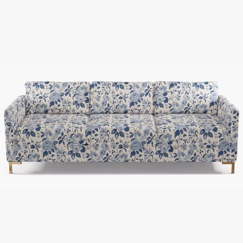
Make a statement in your living space with this beautiful, blue-and-white chintz sofa, which features elegant, gold legs and super comfortable cushions. It's a modern coastal take on Zooey's look.
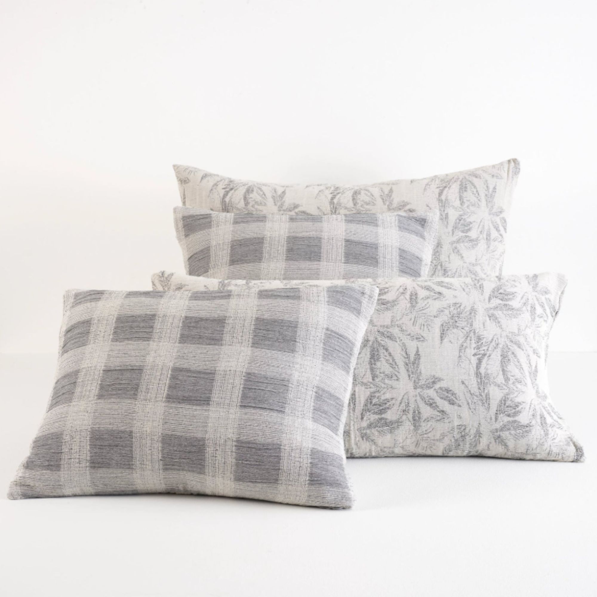
A reversible design is a win in our books, and this sham is officially on our wishlist thanks to its two options of plaid and floral patterns, along with its highly versatile gray and white color scheme.
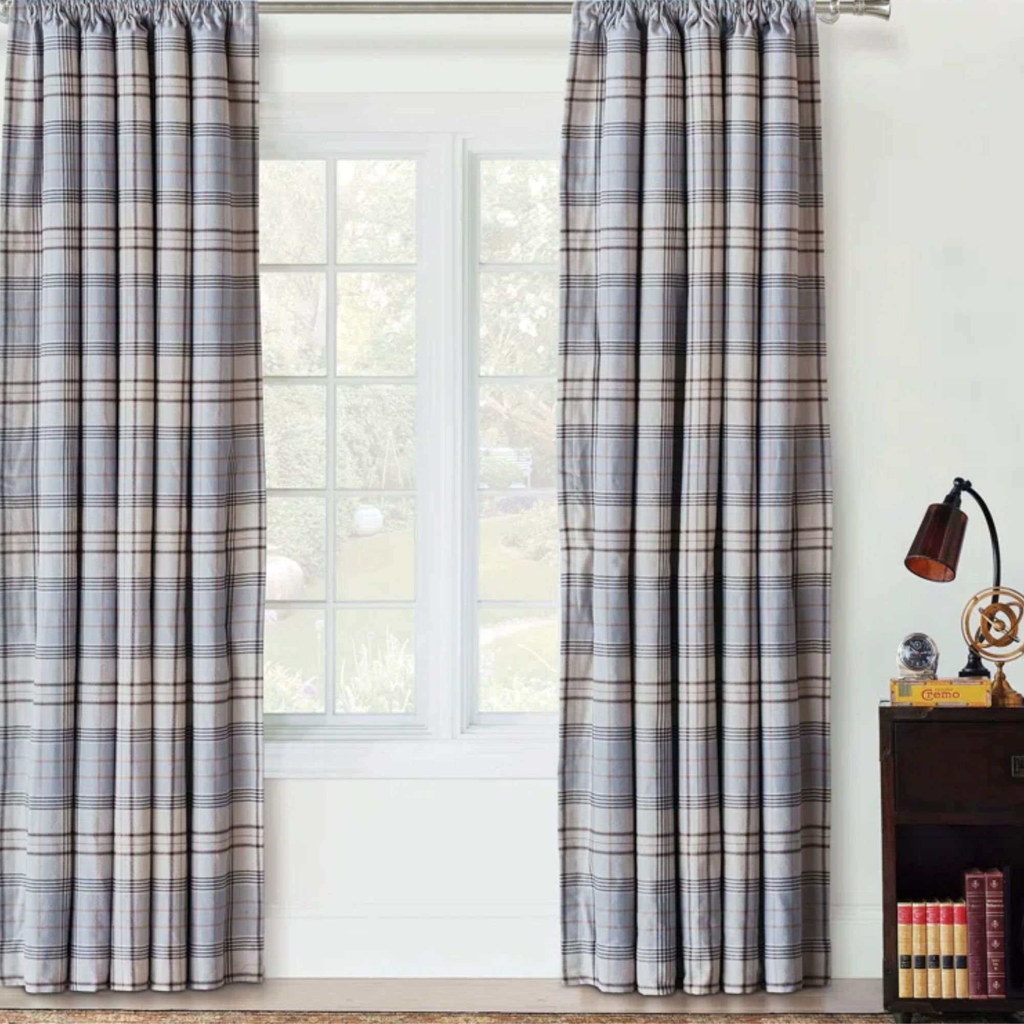
Add some 19th-century flair to your living space with this blue plaid set of curtains, which are conveniently room darkening.
According to experts, pattern zoning is a fantastic way to create boundaries in a room. David Harris, design director at Andrew Martin explains: 'Pattern zoning is the art of using different patterns to define distinct areas within a space, creating visual separation without the need for physical dividers. It’s a clever way to add depth, energy, and movement while guiding the eye through a room with intention.'
Living spaces like Reese's, as well as bedrooms, make ideal locations to experiment with pattern zoning, as they feature key accessories that can be used in the strategy.
David continues, 'Living spaces and bedrooms lend themselves well to pattern zoning, adding definition within open-plan designs. A patterned rug under a seating area or a bold wallpaper behind a dining nook can subtly define zones. Even in smaller rooms, using different patterns on upholstery and walls can add depth without overwhelming the space.'
To keep a pattern-zoned space looking harmonious, David recommends factoring in the defining elements of furnishings and accessories, and ensuring that there are some common threads between pieces.
'Balance is crucial,' he explains. 'The key is to create contrast without chaos, so consider scale, colour, and motif. A large-scale geometric print can sit comfortably alongside a delicate floral if they share a common hue, for instance. Layering patterns works best when anchored by solid tones to give the eye a place to rest.'
Whether you're experimenting with florals and plaid like Reese, or stripes and polka dots, considering color, scale, and materials will take you far in making a space feel balanced rather than clashed.