
Bookshelves often come in monochromatic neutrals. They range from crips whites to reclaimed wood homes for books and decorative objects. Reese Witherspoon breaks this tradition in her living room with a pop of navy in her bookshelves. It's proof that infusing a bit of color is a welcome change from the norm.
The actor and book-lover recently shared a post to her Instagram page, revealing that her white shelves have a navy blue paint job as the backdrop. It's a chic take on the eternally popular accent wall trend. The choice of dark blue paint is not only trend-forward, but includes psychological benefits. Experts say it's a timeless and stylish color choice, particularly in a home office.
Since many home offices feature shelving units, decorating with blue is not only a strategic styling move, but it is thought to boost productivity. 'Blue is the perfect shade to add to your office if you work from home,' says Charlotte Ford, design expert at Ruggable. 'A vibrant shade of blue is excellent for home offices. This is because deeper shades of blue are said to be more stimulating and can increase concentration. However, cobalt doesn’t need to be the primary color palette if the hue is too bold for you. Instead, opt for a neutral color palette as your base and then accent it with cobalt blue for a subtle finish. You can add pops of blue into the room through furnishings, rugs, and decor.'
Shop Reese Witherspoon's blue bookshelf edit
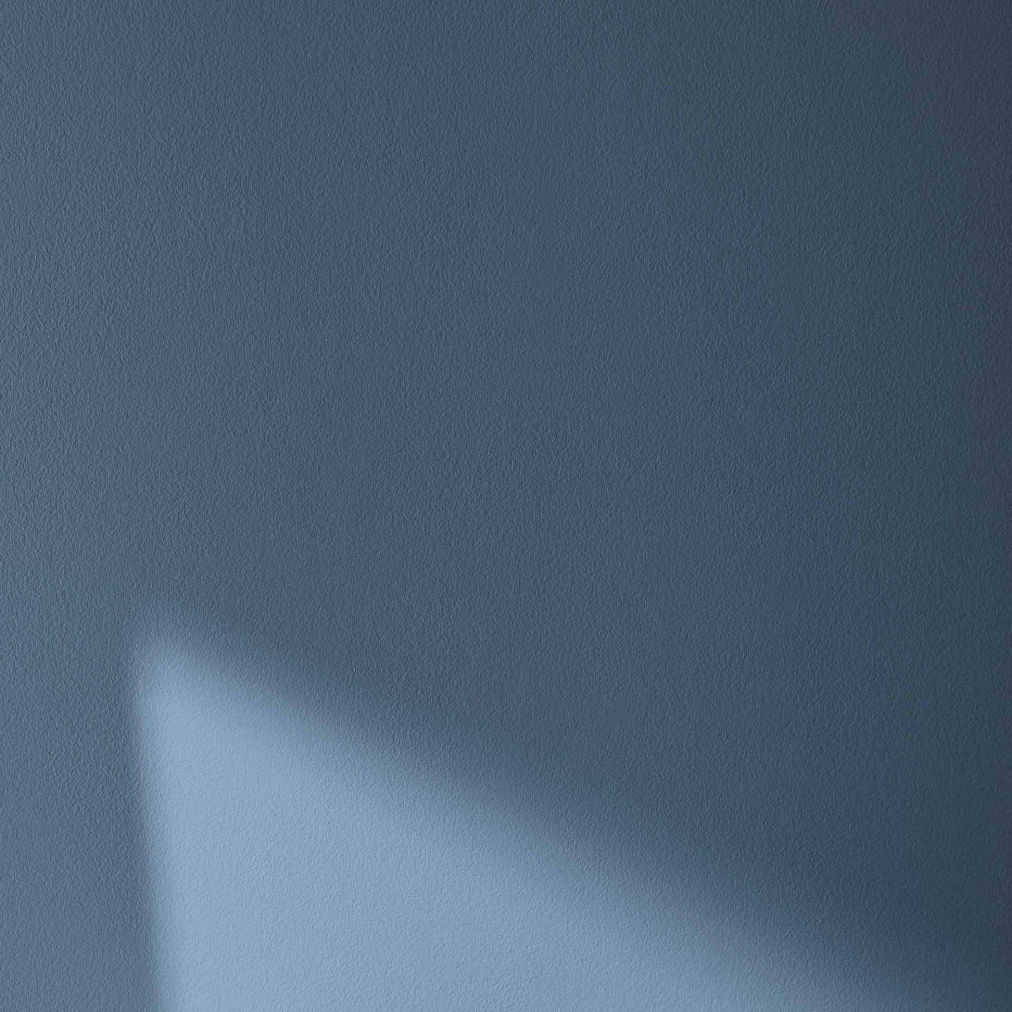
Van Deusen Blue is a mid-tone blue paint that's versatile and timeless to use in many homes across various decorating styles.
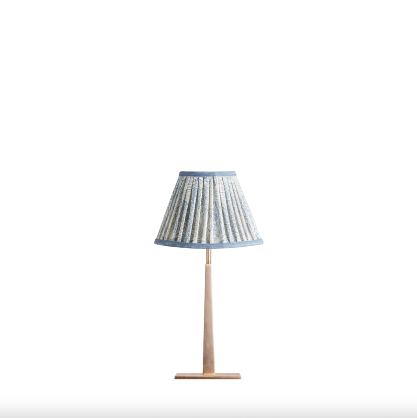
Using gallery lights or a portable table lamp, like this one, will help to brighten your bookshelves and invite the gaze. The shade can be swapped out for something that coordinates with any space.
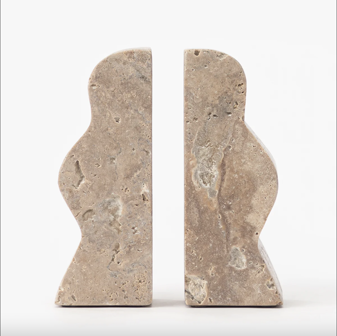
Adding stylish bookends to your shelving can easily heighten the elegance of your display. This travertine pair would work beautifully in a minimalist scheme.
Reese has followed Charlotte's advice to a tee, contrasting her blue wall with versatile, white shelves, and a mix of neutral and blue objects as decor. As far as blue color combinations go, Charlotte says experimentation is also encouraged beyond neutrals. 'Although considered a primary color, blue is extremely versatile, especially as there are so many different shades,' she explains.
'Color combinations we have seen more recently with blue include bright pops of pink, browns, butter yellow, and peach. We’re also seeing more shades of red paired with blue recently, particularly dark red, as more people adopt the ‘unexpected red theory’ into their homes.'
She continues, 'Whichever color you pair with blue in your home completely depends on how you’re using it, whether you’re color-drenching or simply adding small amounts to fit in with your current interior style, play around with it until you find the right colour combination for you.'
Working with a neutral space? Consider applying a coat of blue paint to a shelf's wall for a refined and productivity-boosting atmosphere.