Every Premier League kit for the 2024/25 season has been released, so that means just one thing: ranking all 60 of them to discover which are our favourites. Of course, you'll probably have yours - but so do we.
There are some absolute beauties that left the FourFourTwo office sharply disagreeing over, some stinkers that would work better as your nan's curtains, and a good amount looking identical on the same base templates, save for a few colour changes.
Our esteemed team have rated each shirt out of 10, helping yield an average score. What we've been left with is the definitive list of every home, away and third shirt for this campaign…
Ranked! Every Premier League kit this season
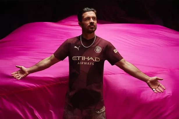
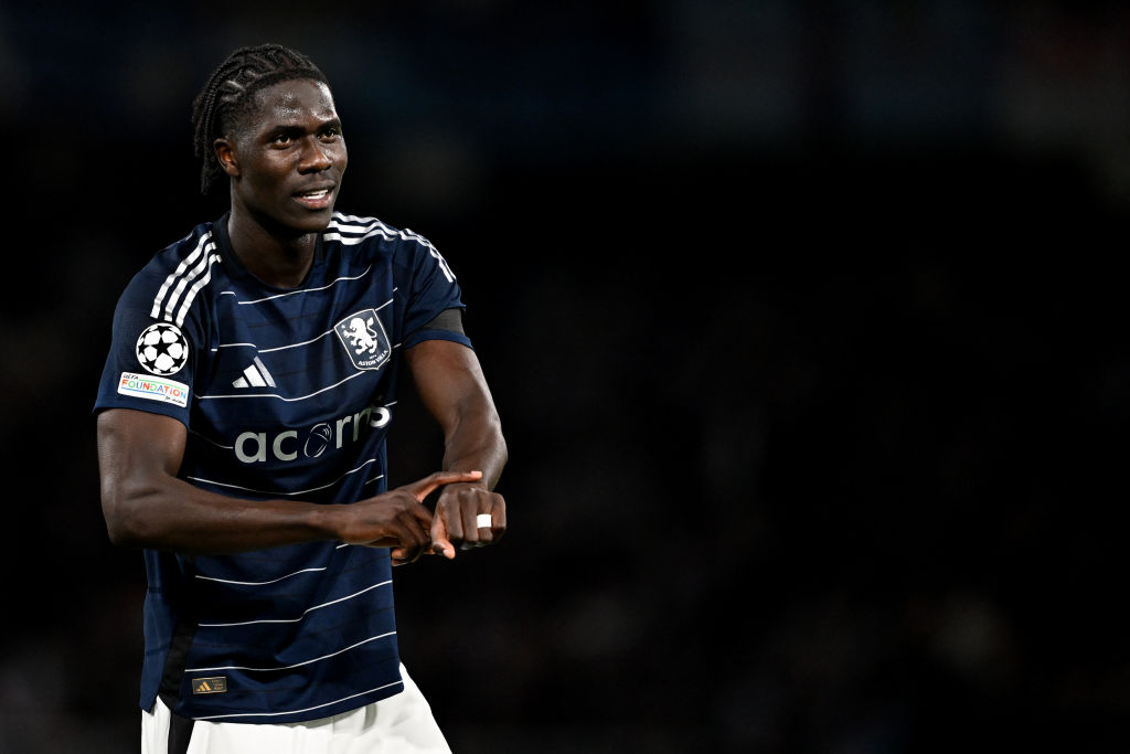
60. Chelsea home
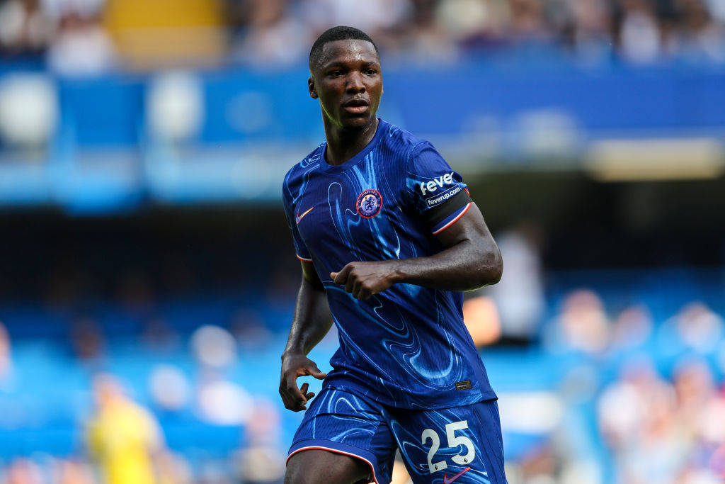
There’s a part of us that think Todd Boehly has purposefully ordered the design this season’s worst Premier League kit to take attention away from their transfer market shenanigans, but that would perhaps be giving him too much credit.
While the result looks like a lava lamp has vomited over a perfectly functional blue kit, the marketing men assure us that ‘the melting pot pattern, resembling liquid gold and silver, is a fusion of our rich legacy with the ever-hot youth culture within our city.’
Sigh. And don’t get me started about the fact that you can’t see the badge unless it’s cloudy…
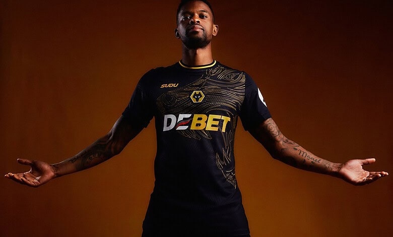
59. Wolves third
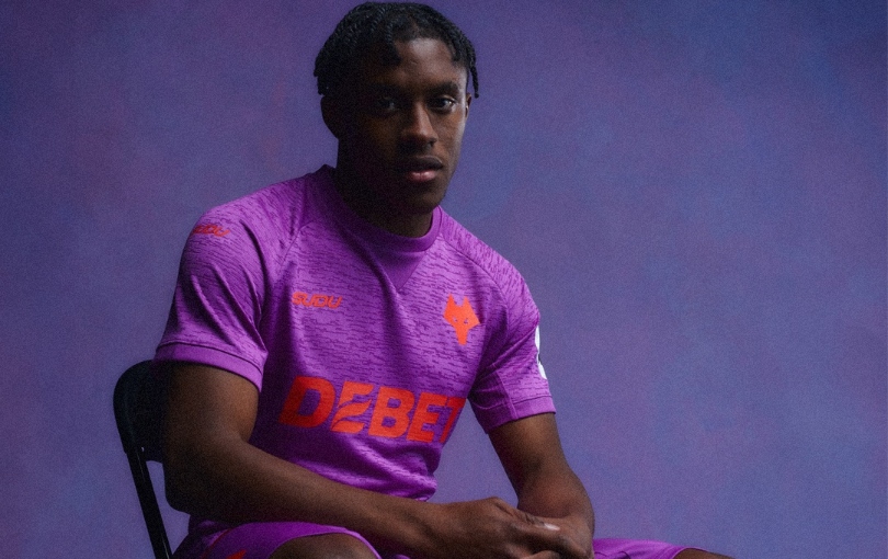
FourFourTwo's team genuinely recoiled when this appeared on our phone screen during a late-night doom scroll the other evening.
The club may say that this bright purple effort is ‘bold, rebellious and fearless’, but none of our raters can get the 1980s McDonalds character Grimace out of our heads. It’s the stuff of nightmares.
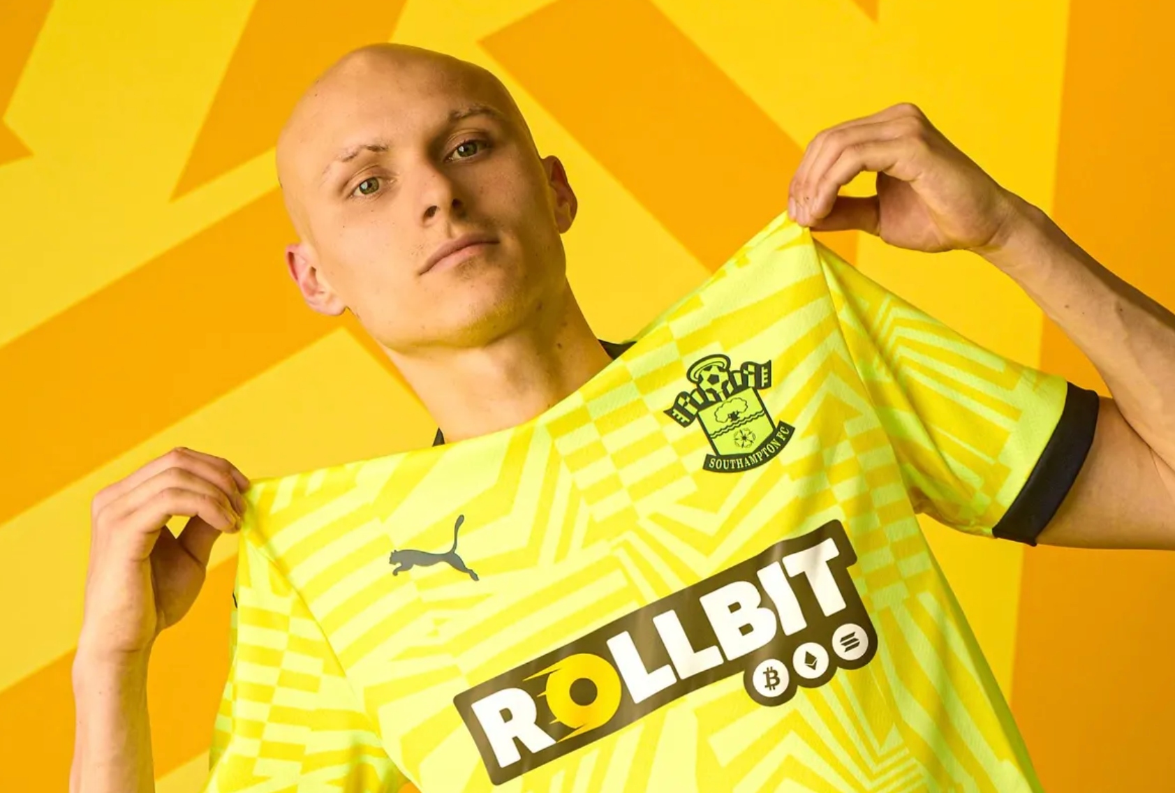
58. Southampton third
Comparing Southampton’s neon pink and yellow kit to Mr Blobby isn’t big or clever, but that never usually stops us.
Saints have gone for the jugular with this effort, and while plenty of teams have been able to make a pink kit look cool, this is not one of those occasions.
57. Leicester City home
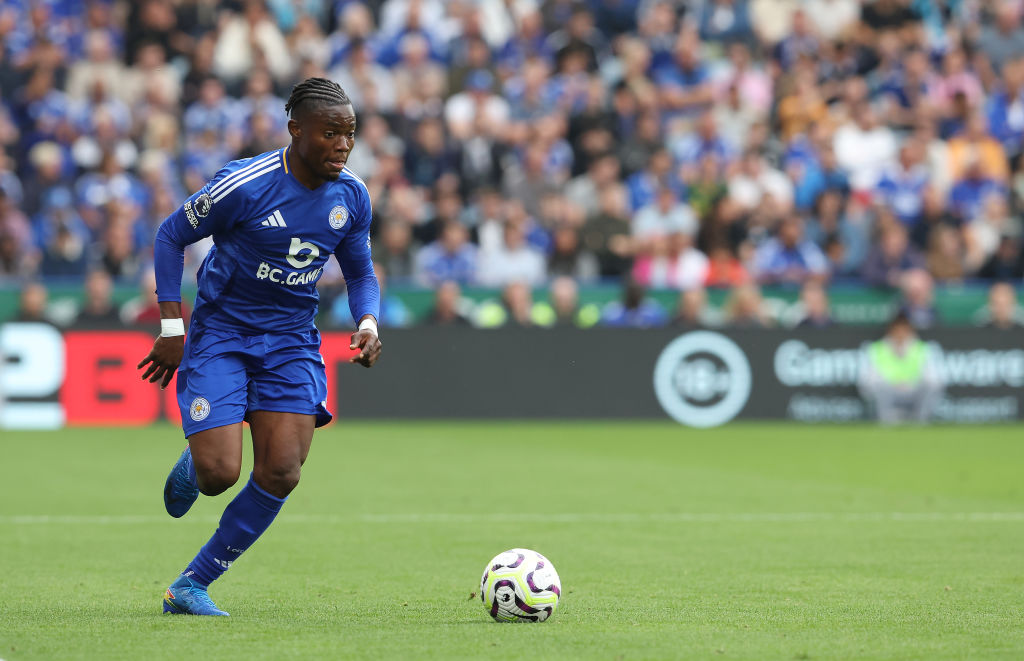
One of the first questions any kit designer asks themselves is whether they want to maintain tradition or go for something more outlandish.
Whoever drew up Leicester City’s home kit this season went for the former option, as there is nothing noteworthy about this kit. It’s blue, as it should be, it’s uncontroversial and it’s completely forgettable.
56. Chelsea away

A marked improvement on their home kit, even if this is just a version of the current England shirt that you’ve accidentally put in a high-temperature wash with a pair of black socks. That said, calling this shade of grubby white ‘guava ice’ is a win for the marketing team.
The badge has again been tampered with, but again, not to the egregious nature as on the home kit.
55. Newcastle third
Newcastle have played the retro card here, taking a 1970s club badge and a colour scheme from their 1999/00 away kit to produce something that has a distinctly ‘80s vibe.
A bit too much going on? Perhaps, but we’ll see how it looks on the pitch.
54. Leicester City third

Like the home kit, it’s a simple and clean design, but this one is a lot more distinctive. The tonal retro badge works well and was inspired by the team’s ‘Ice Kings’ side of the 1962/63 campaign that saw the Foxes go on an 18-game unbeaten run during the coldest winter on record.
53. Brighton third
If you think this kit looks familiar, then you’re right, as this is the same strip that Brighton used as their away kit last year.
A commendable move from the Seagulls in an age of spiralling cost of living and over-consumption, although we can’t really put it much higher in our rankings.
52. Manchester United away

Doesn’t scream ‘football kit’, does it? You could imagine Jos Buttler coming out to keep wicket at Old Trafford Cricket Ground for an ODI in this shirt.
Other than that, it’s a fairly inoffensive effort that is likely to sell well.
51. Chelsea third
The fact that Chelsea have looked to the 1970s west London punk scene as inspiration for their third kit is mildly hilarious, as the world of American hedge funds and private equality couldn’t really be further away than the movement pioneered by the likes of Malcolm McLaren and Vivienne Westwood fifty years ago.
But then again, isn’t punk all about subverting expectations and deviating from the norm - which is exactly how Chelsea approach the transfer market? Now we’re really confused…
50. Wolves home
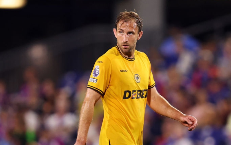
Rookie kit makers Subu haven’t rocked the boat with this Wolves design, although this is one of just two kits on this list to opt for a central badge. That at least gives it a bit of identity, but is it just us, or is that shade of gold a tad lighter than it should be?
49. Everton third
Winning the prize for the most tenuous tie-in this season, Everton’s third kit marks the 100th anniversary of an exhibition baseball game at Goodison Park between the New York Giants and Chicago White Sox.
That only raised the question of whether a grey/beige kit is the best way to mark the club’s final season at Goodison?
48. Southampton away
Another bold effort from the Premier League new boys, who appear to have let Chat GPT produce their marketing material to accompany it.
”Stand out with the Southampton FC away kit, featuring a striking dazzle graphic on the front of the shirt and sleeves in fizzy yellow and yellow sizzle,” our AI overlord spat out.
47. Wolves away
This list’s biggest swing sees Wolverhampton Wanderers put a massive, actual wolf on the front of their shirt.
It’s a bold move that’s for sure, but sadly one that doesn’t really work as the badge and sponsor cover it up.
46. Nottingham Forest third
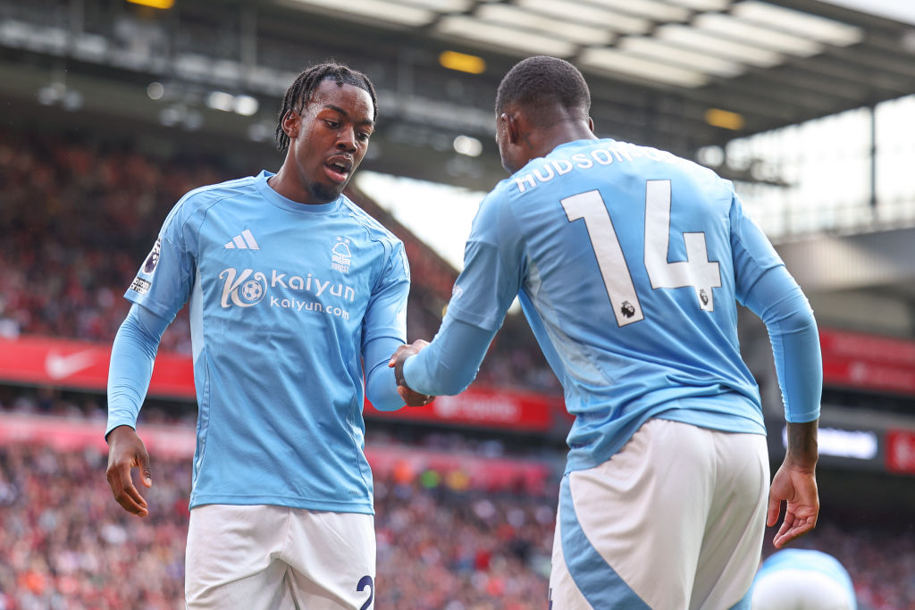
Meh. It’s a light blue shirt with no discerning features. What else is there to say?
45. Tottenham third
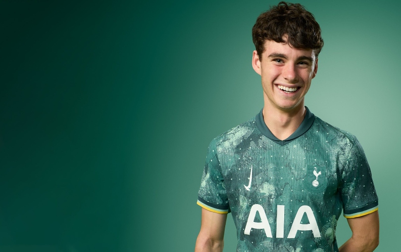
According to Tottenham "style meets peak performance" with this camouflage style green third kit.
The jury remains out on the "style" aspect of the shirt. Perhaps they are trying to blend in with the turf to fool opponents? It's certainly different at least.
44. Brentford home
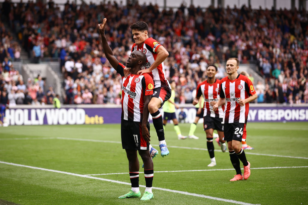
It's a clean, crisp looking shirt that does the job with minimal fuss. But the best thing about this kit? We've already seen it before.
Brentford have kept the same home shirt for two seasons in-a-row between 2023 and 2025. A rare example of a club not milking supporters at every possible opportunity.
43. Southampton home
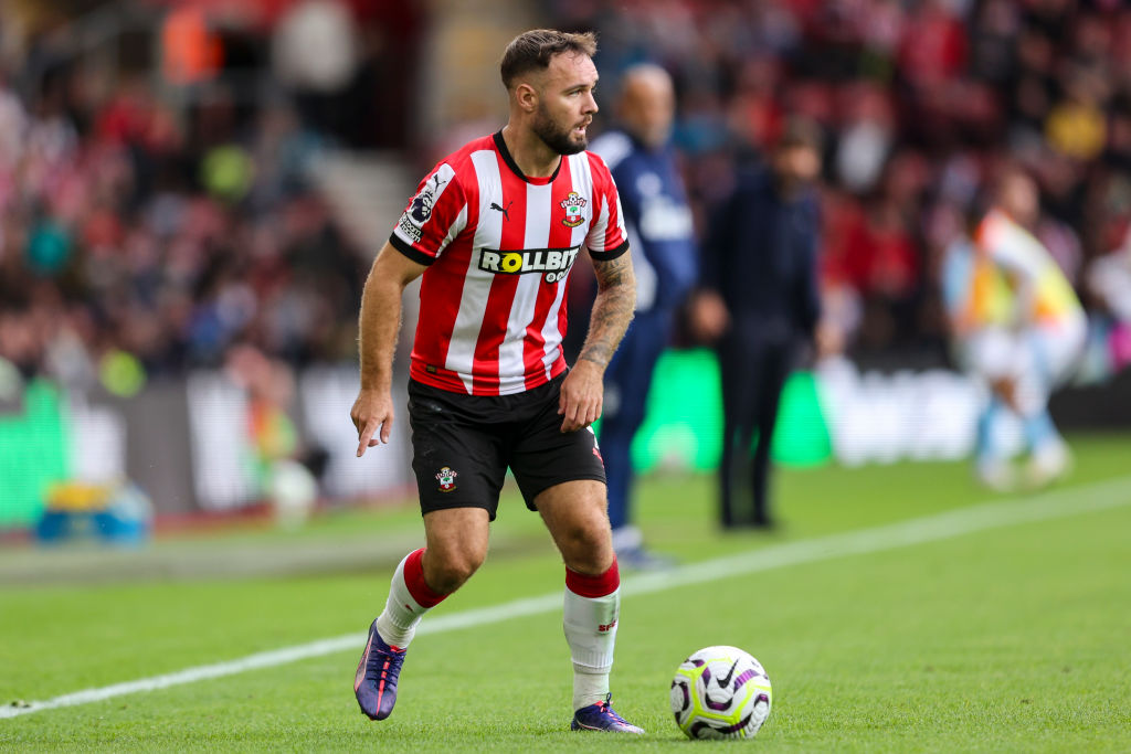
This is the first in a new partnership the Saints have signed off with Puma. It's a fairly nice effort to start out with, although the red trim alongside the black on the neck is a little jarring.
Room to improve for next season, but not a bad start.
42. Everton home
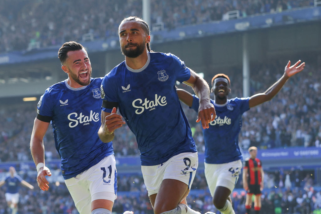
Looking at their results over the first month and the fact Jay-Z is being linked with a shock rescue takeover, Everton may well indeed have 99 problems this season.
But at least a kit ain't one. This smart effort is simple but still (just about) effective.
41. Liverpool away
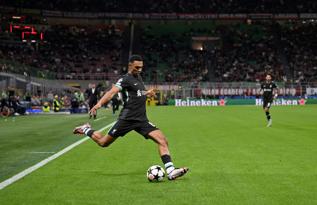
Whenever you see Liverpool in a black shirt a small part of your mind inevitably goes back to that game at the Stadium of Light in 2009 when they conceded a goal via a beach ball.
The Merseysiders wore black that day. In fairness they've had black change strips since and have yet to concede again from a beach ball again. Their latest away shirt is fine but nothing to write home about.
40. Leicester away

This shirt deserves praise for trying to be bold. Leicester's away kit for this season is inspired by the street art and murals of the city.
The result is a bit of a mesh of random colours. But it just about works. Beam orange and acidic red spray on a black background anyone?
39. Arsenal away
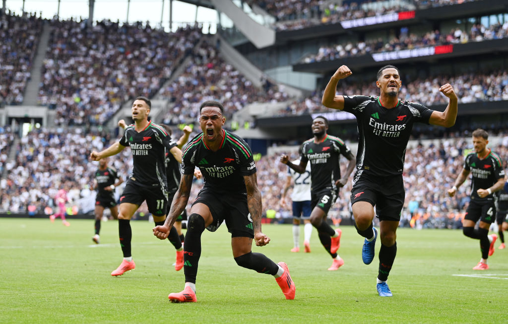
Seeing Arsenal sport this away kit in the recent win at Tottenham was jarring. Derby matches like that should always have both teams in their home strip when possible.
But Arsenal managed to give their new all-black away kit a dream debut and elevate it further in the eyes of Gooners. The red and green trim is well executed.
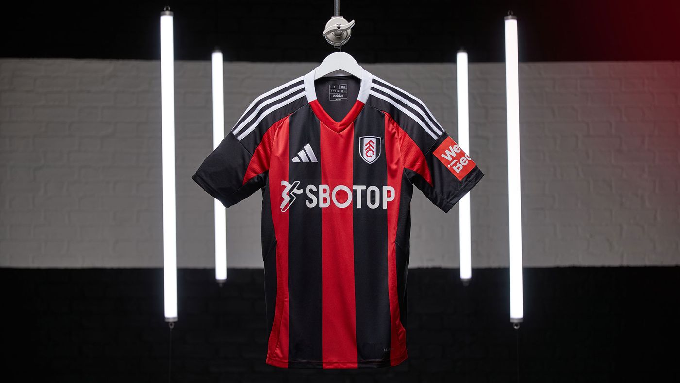
38. Fulham third
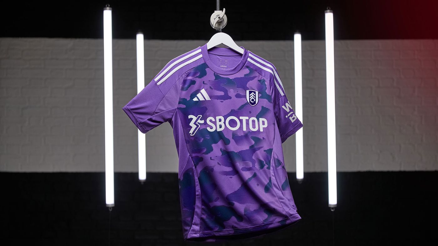
Fulham have nailed it with their home and away kits this season. So we can forgive them for their third strip being slightly odd.
Combining different shades of purple, it's a striking but perhaps not stylish effort. Then again, they probably won't want to wear this one much this season anyway.
37. Tottenham away

Is there really any point in Tottenham having light away shirt? Surely a darker colour would offer a greater contrast from their all-white home strip.
That said this is actually a nice design. Placing the iconic cockerel crest in the centre may ruffle a few feathers.
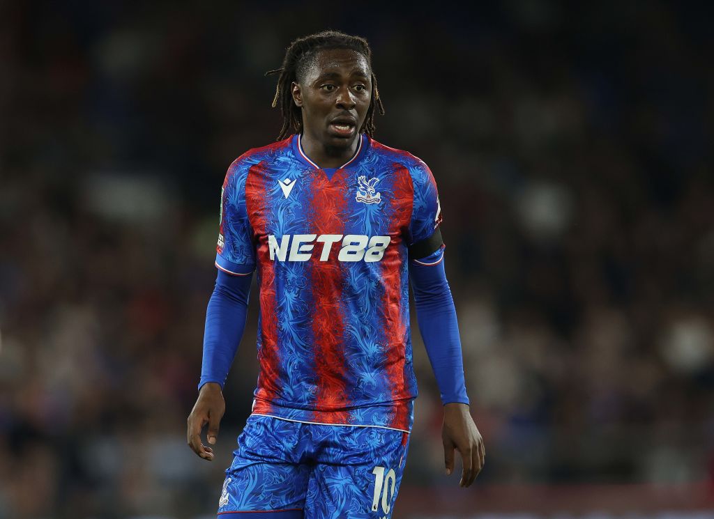
36. Crystal Palace away
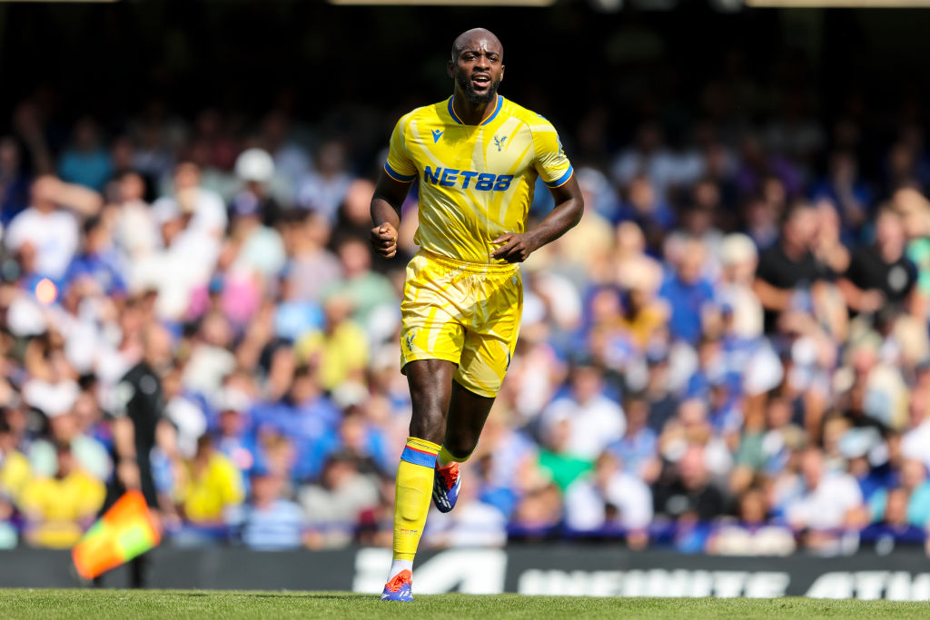
You certainly have to like yellow to get onboard with this kit. Officially the first Crystal Palace kit to feature a simplified eagle-on-ball crest, it pays tribute to the club's previous yellow away strips which first emerged in the 1960s.
The blue sponsor logo fits nicely. A solid effort from Macron.
35. Nottingham Forest away
Nottingham Forest's away shirt loses marks for the white sponsorship lettering, totally at odds with the striking pink used for the Adidas logo and club crest.
It is borderline "too jazzy."
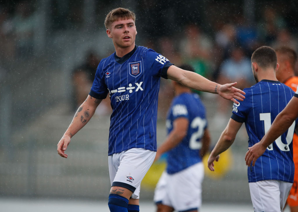
34. Ipswich away
Ipswich's first top flight away kit in 22 years is solid way to mark their return to the Premier League.
The design aims to represent the pride in the town on matchdays, with the background highlighting Portman Road full of fans.
33. Manchester United home
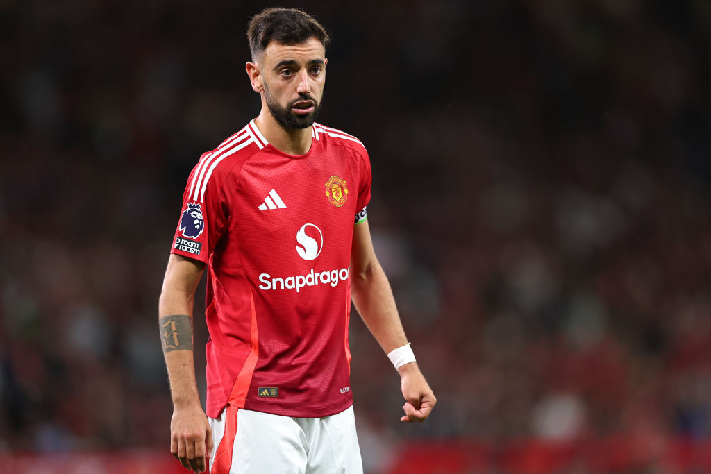
This is probably one of the better Manchester United home strips in recent years. But with the bar so low, it still didn't do enough for the judges to break into the top half of our rankings.
The new shirt sponsor seems to fit reasonably, but the overall design is basic.
32. Manchester United third
The use of the Trefoil Adidas logo as opposed to the three stripe will certainly appeal to a certain supporter demographic.
But if you take away the sponsor and club logo you're basically left with a standard Adidas originals t-shirt design.
31. Manchester City home

Although Manchester City's home shirt manages to scrape a better score than two Manchester United kits, it is not one of the more memorable designs.
This is still a reasonable jersey, albeit very similar to their kit from two seasons ago.
30. Arsenal home

A focus on simplicity can sometimes be the best way to go when designing a home kit. That is certainly the case for Arsenal's 2024/25 shirt, with the blue trim giving it a nice distinction.
It is the first Arsenal home shirt to feature the cannon crest since the 1989-90 season. There might be a bit too much blue going on for some fans, but overall this is a strong effort from Adidas.
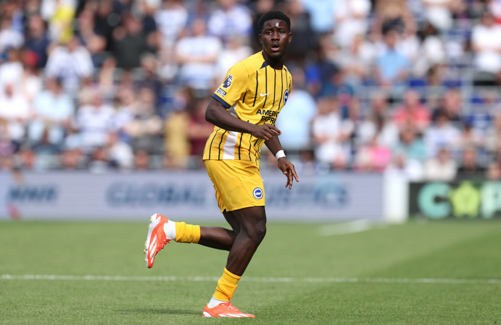
29. West Ham third
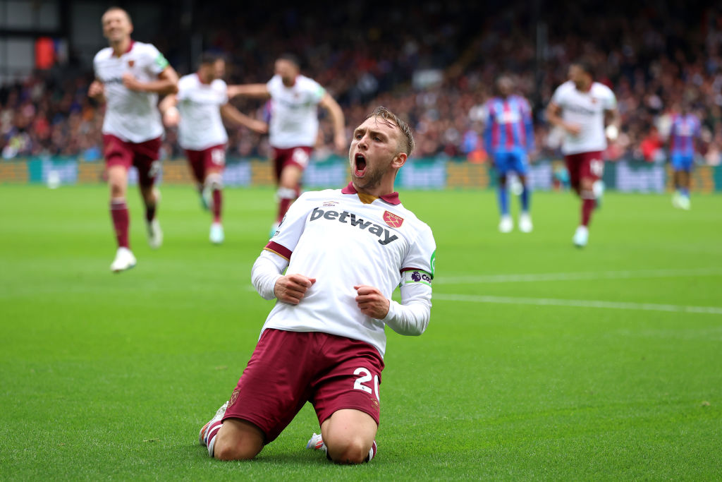
West Ham and Umbro seems to be a good fit, generally. The flashes of claret and gold detailing make this third strip an appealing alternative for Hammers fans.
"The embodiment of simple elegance," according to the press release may be pushing it a tad. But this jersey is worthy of a top-30 place.
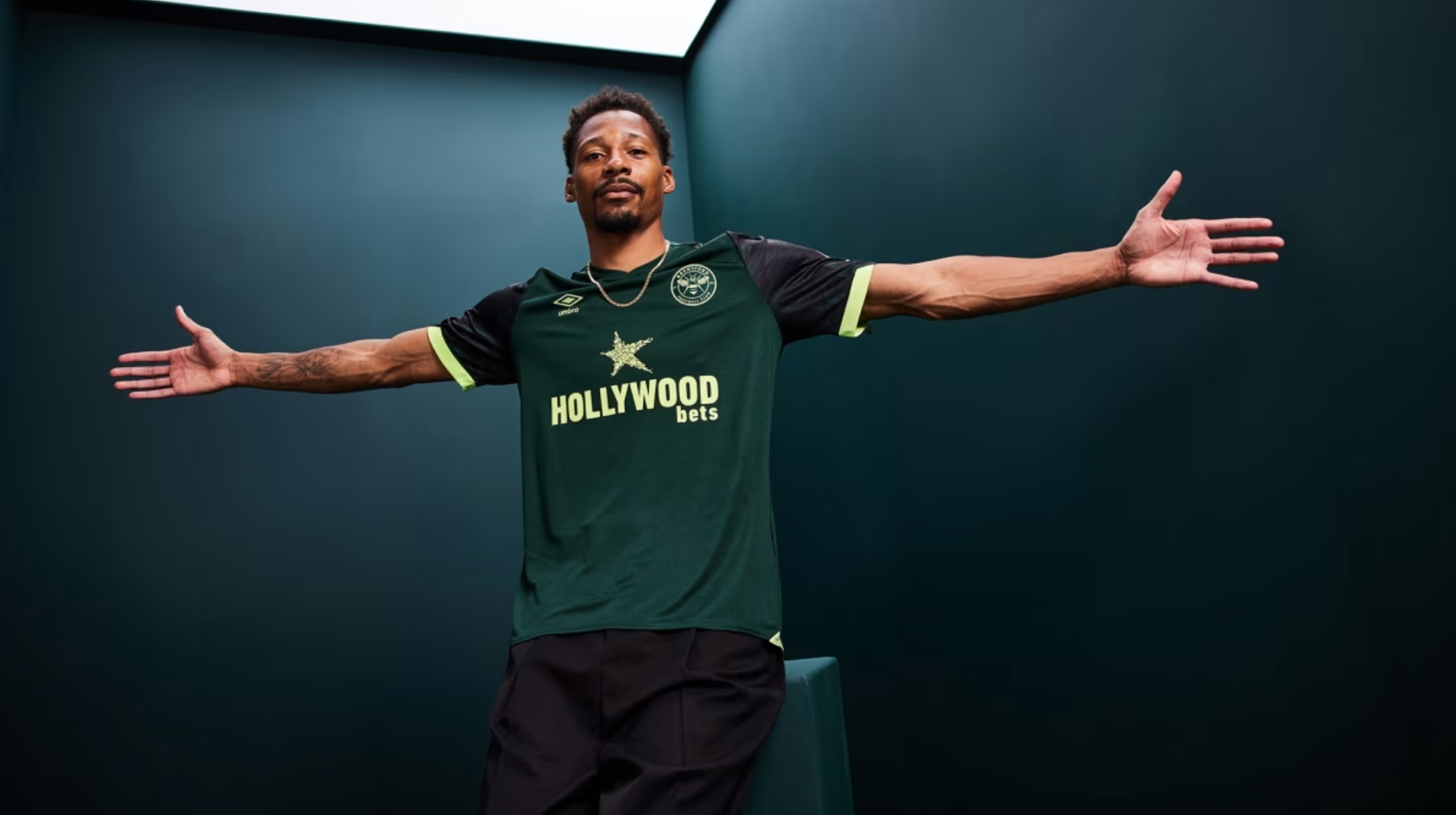
28. Brentford third
Brentford's third strip is either slick or instantly forgettable depending on your point of view. On the one hand it could be easily mistaken for a training top - on the other, the luminous trim will look great under the floodlights for a midweek away trip.
27. Liverpool third

The vertical, rather than traditional, Nike swoosh may well divide opinion. But otherwise, this is one of the better Liverpool change kits from recent years.
With the Reds reportedly set to switch to Adidas from the 2025/26 season, Nike have tried to go out in style and for the most part have done so.
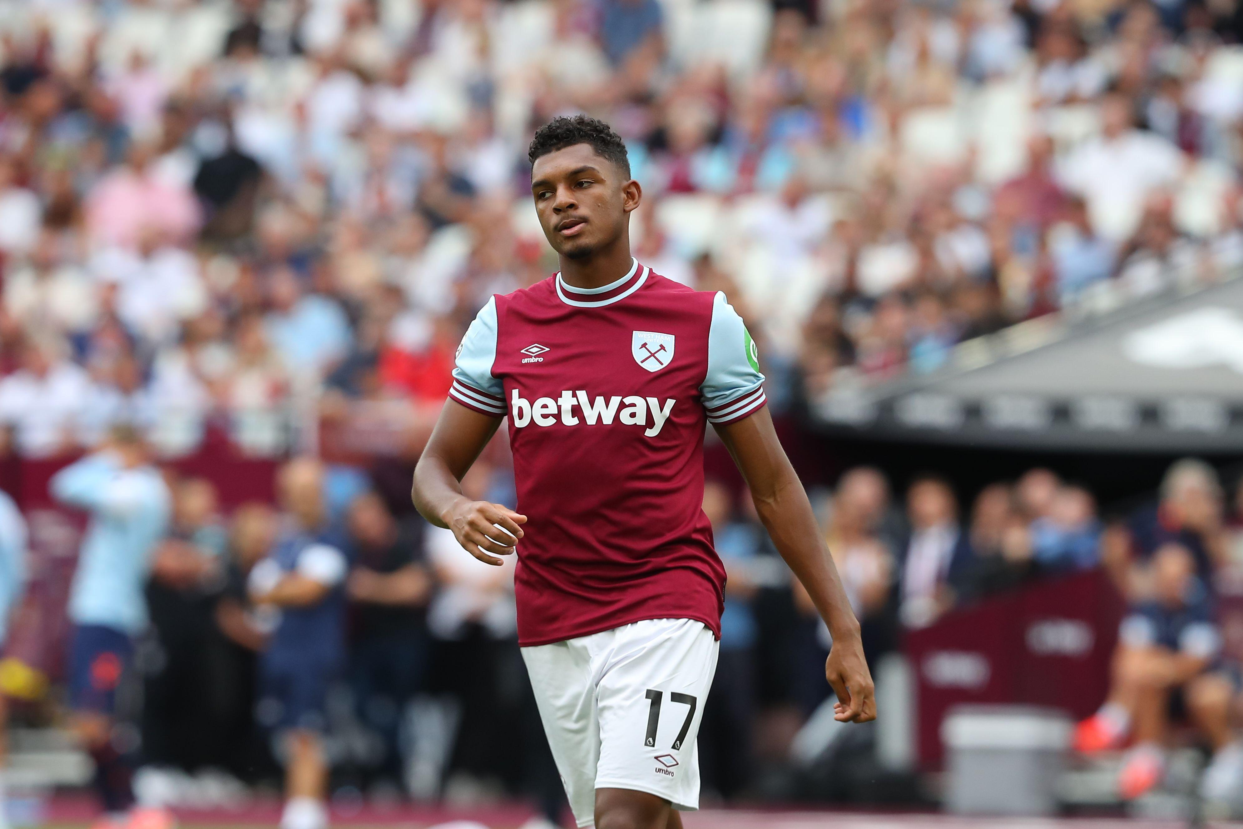
26. West Ham away
West Ham's away strip is, according to the club, inspired by the Hammers’ East End roots.
The "Cockney kit" is a sleek effort from Umbro, only let down by an out-of-place green sleeve sponsor that prevents it from finishing higher up the table.
25. Everton away
In comparison with some of the shockers they have had in recent years, Everton's away offering for 2024/25 is pretty decent. A sleek, polished black design with yellow trim marks a strong start from Castore who became suppliers in the summer.
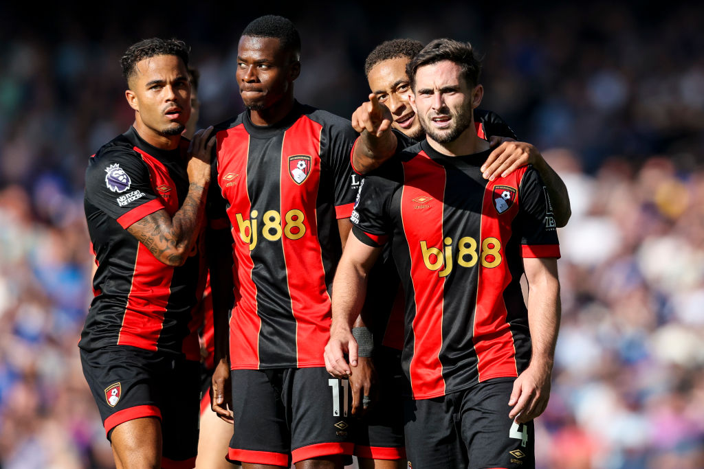
24. Bournemouth third
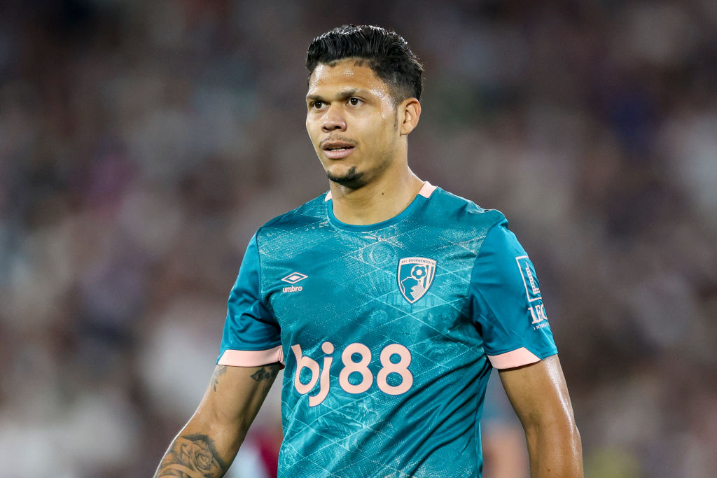
This feels very similar to some of the change kits for West Ham we've seen in recent years. The different shades of blue offer a something a tad different for Bournemouth fans.
Umbro are also using recycled materials for the first time in their partnership with the club. Kudos.
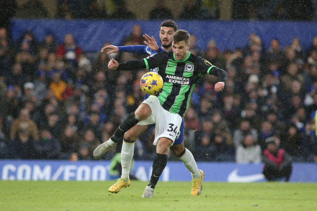
23. Brighton away
There's a lot going on with Brighton's latest away kit. But that is not to say it doesn't work on some level.
Gold and black always seem to go well together when it comes to football strips and this is no different. The stripe of white along the side is not really adding much, but that aside this is a solid effort.
22. Newcastle home
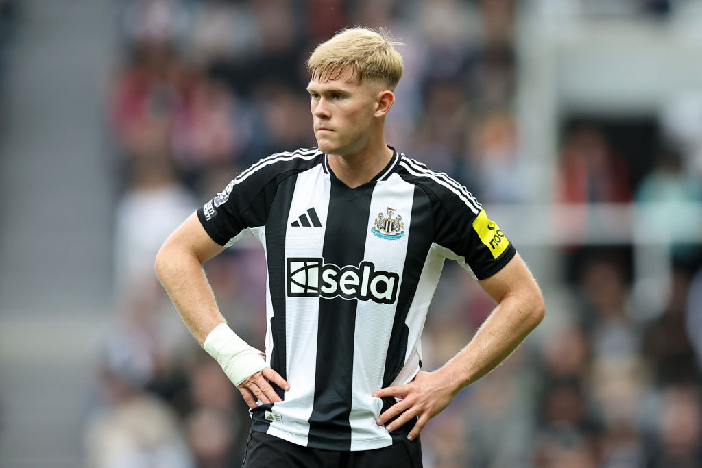
The hype around Newcastle's return to Adidas after a 14-year gap was bordering on delirium, at least in the north-east. In some ways it was never going to completely live up to it. Every fan had their own idea of what the perfect shirt would be and inevitably some were left underwhelmed.
But this smart tribute to the 2001-03 home kit worn in the UEFA Champions League, has got a lot going for it. Sure, the yellow sleeve sponsor isn't great, but the white trim on the arms is inch perfect.
This is simply an excellent football shirt.
21. Ipswich third
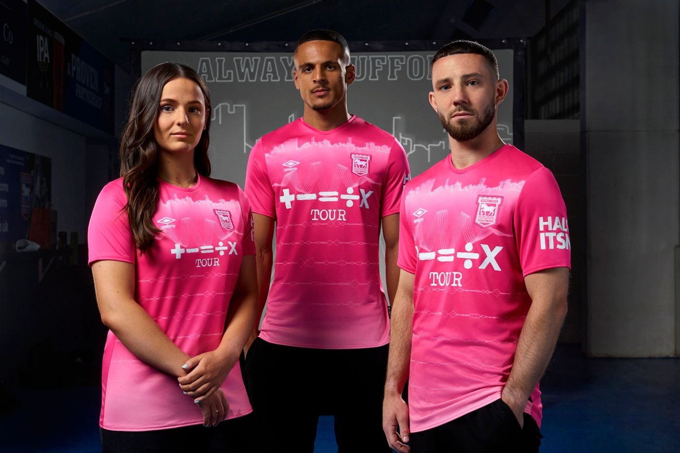
What do you get when Umbro design an Ipswich Town third kit in collaboration with Tractor Boys superfan and worldwide popstar Ed Sheeran? Pink, it turns out. Lots of pink.
The inclusion of soundwave outlines to represent "the cheer of the crowd as players run out of the tunnel," is a nice touch. Bravo Ed.
20. Liverpool home

If this does prove to be Nike's final Liverpool home shirt for the foreseeable future, they ended on a high at least. After a run of pretty boring kits in recent years, this retro 1984-inspired could grow on people as the season goes on.
The collar is the only real question mark. But overall this is a fine shirt. You'd have to go back a while to find a better one.
19. Arsenal third

As with Arsenal's home kit, the replacement of the club badge with a cannon may be a turn-off for some fans. But this stylish light blue and purple design is the best of the Gunners' three kits this time around.
If you were to describe it on paper, expect a mixed reaction. But for some unknown reason, once you see it in the flesh everything seems to blend together perfectly. Adidas know what they're doing when it comes to Arsenal.
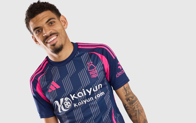
18. Nottingham Forest home
Forest's home shirt manages to smoothly balance paying tribute to the past with a modern feel. The striking, textured pattern features two overlapping stars to represent the historic European Cup wins under Brian Clough.
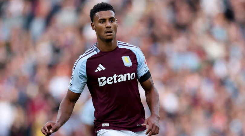
17. Aston Villa away
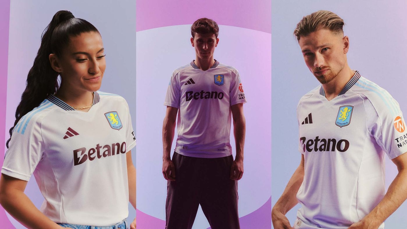
Like Newcastle, Aston Villa's switch to Adidas for 2024/25 looks to have paid off spectacularly. This white change shirt features classic claret and blue stripes on the collar and 'AV 150’ on the back. The latter is to commemorate the club's 150th anniversary.
The light blue shoulder trim upgrades this kit from merely good to great.
16. Bournemouth away
There's a lot going on here, but we're fans of it. The mint and purple graphics placed on top of the white base makes for an extremely striking look, and harks back to the away kit of 1992-94.
That '90s retro theme makes for an exceptional look - Bournemouth's stars will certainly stand out at away grounds this season.
15. Ipswich home
Returning to the Premier League, Ipswich needed something to mark the occasion. Fortunately, their home kit doesn't disappoint. The combination of colours, pinstripes and sponsor all work brilliantly together, while the retro Umbro logo matches the Tractor Boys' badge.
If it weren't for the club crest having a white border, then it's safe to say Ipswich's home kit would've comfortably broken into the top ten.
14. Manchester City third
Coming in a dark red colour, reminiscent of the one they wore during the 2012/13 campaign, the Manchester City third kit also has some subtle details that makes for a stunning design. A large graphic of the ship from the club crest is incorporated onto the shirt in a slightly darker tone to the base colour, highlighting this point.
13. Fulham home
While Fulham's home shirt features the same Adidas base design featuring on lots of other sides' kits this term, it looks a whole lot better for the Cottagers. That black colour is exceptional against the white base, while the orange trim is in keeping with the accents on the crest.
12. Crystal Palace third
Every year, Crystal Palace receive a black third kit - and every year, it fails to disappoint.
There's just something about the colour palette that works beautifully; the contrast of the blue and red stripes atop the black base is incredible. For one of our scorers, this received a perfect 10. Others (bizarrely) weren't as convinced.
11. Tottenham home

It's difficult creating a new design every year for a home shirt that features, by and large, quite safe colours - but Nike looks to have found the perfect blend this term. Navy sleeves and that round-neck collar are two standout features that help contrast with the white base.
Sure, it might look similar to many other Spurs kits from years gone by, but it's by far one of the better shirts that has been produced.
10. Brighton home
Thinner stripes, interspersed with faded pinstripes in between, help to create a completely different, modernised version of Brighton's iconic home kit - and we love it. It's an extremely clean looking kit that would work just as well as a fashion piece as it does on the football pitch.
Just as long as Fabian Hurzeler is telling you how to wear it...
9. Aston Villa third
Phwoar. Navy blue, metallic accents, black detailing. It's impossible to find a fault with this Aston Villa third kit. Both futuristic and retro at the same time, the kit looks even better on the pitch.
It's just as well Unai Emery's men managed to secure a 3-0 victory against Young Boys on their return to the Champions League in their first outing with the kit, otherwise the stunning kit might've held bad omens in future games.
8. Fulham away
Red often features on Fulham change kits, but rarely to such great effect. Danny Murphy became synonymous for Fulham fans in a similar looking 2007/08 away kit, as he bagged a last-minute winner against Manchester City that season to keep their survival hopes alive.
Will Tom Cairney produce the same this term? Marco Silva will be hoping it won't come to that. But, if something similar happens at the Etihad Stadium on October 5, don't say we didn't warn you...
7. Aston Villa home
Villa wave goodbye to Castore and welcome in the new Adidas era to great aplomb, with this extremely clean kit everything fans would've hoped for.
Claret and blue is a popular colour combination, and our voters believed this had no airs and graces about it - consistent high scores all round, and for good reason.
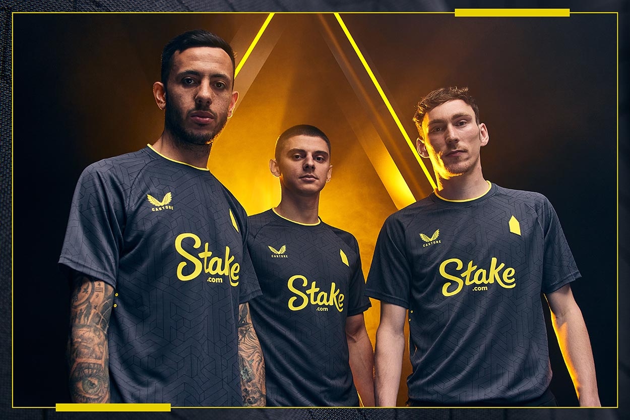
6. Brentford away
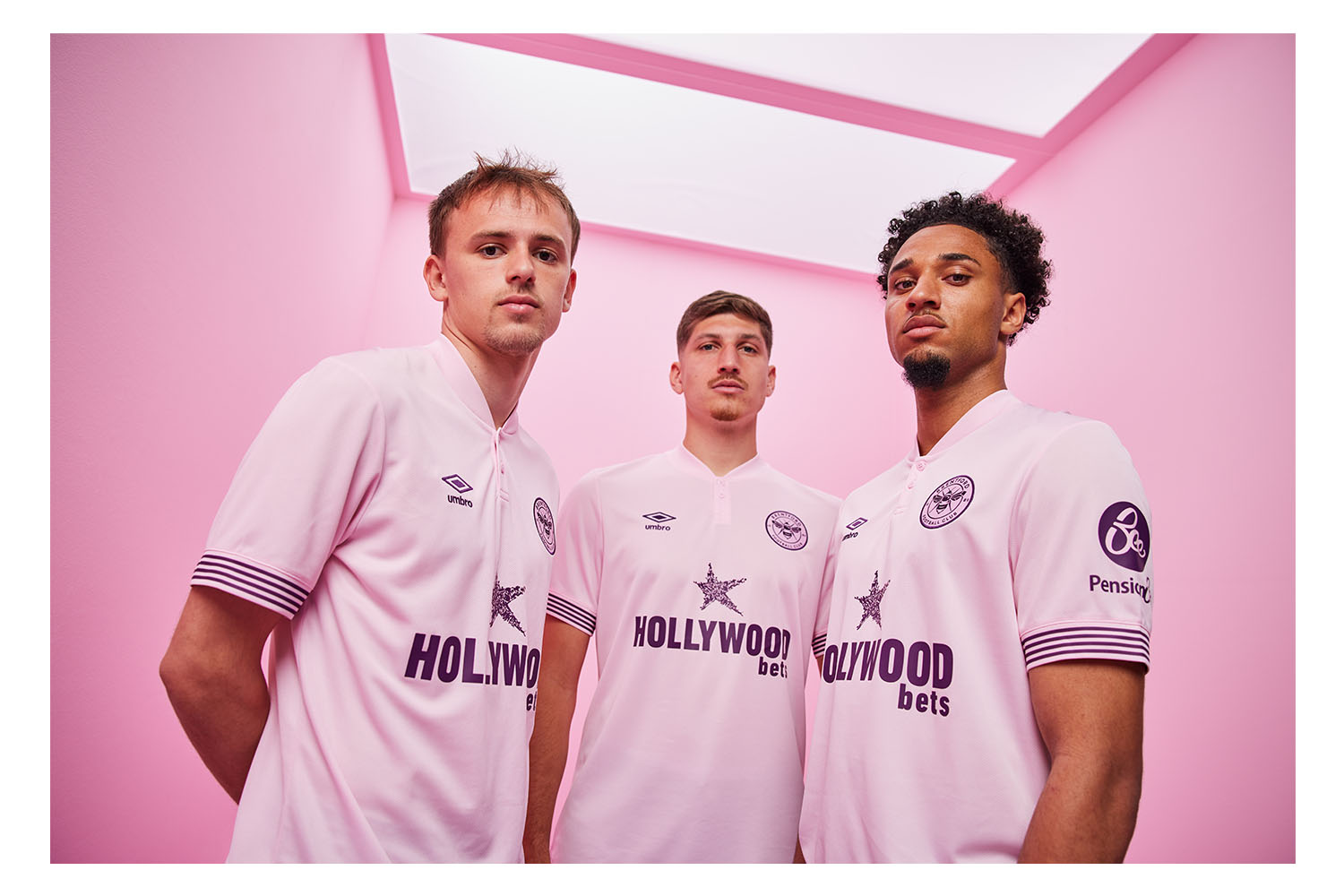
Pink kits aren't often received how clubs would hope for (Southampton, we're looking at you), but Brentford have managed to pull off this number much better than anyone could've anticipated.
The pink certainly isn't an eye-sore, instead a duller version that of course stands out, but doesn't cause retinal damage at the same time. Purple accents help create a lovely contrast that managed to catch the eyes of our judging panel.
That button-down collar is sublime, too.
5. Crystal Palace home
There's being bold, and then there's this. In order to make something a lot more arty and unique than what has previously featured on the Crystal Palace home kit, designers understood that taking a risk was essential - and it's certainly paid off. Eagle motfis have become the vertical stripes, helping create that wavy pattern that initially looks like your two-year-old toddler has had a hard time staying between the lines.
Some especially high scores from our critical judges, though that didn't stop one issuing a six. Boo.
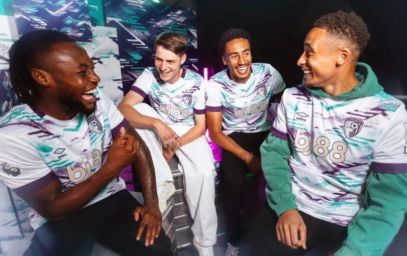
4. Bournemouth home
It's clearly the year of paying homage to previous season, as Bournemouth's home kit celebrates the kit worn a decade ago in their successful promotion-winning campaign from the Championship. The thick red and black stripes are a welcome return from recent thin stripes, while the gold Umbro logo and pinstripes give obvious hints to winning.
For a minute, just imagine that 'bj88' sponsor didn't exist. What a masterpiece we'd then be looking at.
3. West Ham home
In FourFourTwo's opinion, West Ham have won the claret and blue war this time out, with the Hammer's home effort a retro-inspired banger. There's a classic ringer collar and cuffs that look amazing whenever Jarrod Bowen is hitting the back of the net, in a design that Bobby Moore and Co. wouldn't have felt out of place wearing 60 years ago.
Changing the colour of the badge clearly works, too, if pulled off correctly. Chelsea, take note of your London rivals, please!
2. Manchester City away
Paul Dickov. Gillingham. Wembley Stadium. 1999. Division Two play-off final. With the score 2-0 to Gillingham heading into stoppage time, it seemed Manchester City were consigned to another season in the third tier of English football. Dickov had other ideas, scoring in the 95th-minute to send the game to extra-time and then penalties, which City duly won.
But while City fans now have the luxury of Erling Haaland bagging a hat-full of goals, the importance of Dickov's goal at Wembley hasn't been lost on fans old enough to remember. So, 25 years on, there was only one way to commemorate that goal - with a near-identical shirt paying homage to the moment, of course!
Two 8s, two 9s and two 10s show this shirt has been received exceptionally well, regardless.
1. Newcastle away

On the pitch, Newcastle United are cool. Really, really cool. 30 years ago David Ginola, Faustino Asprilla and Les Ferdinand were tearing apart opposition defenders on their own turf in a navy blue and maroon-hooped shirt. Fast-forward to the modern day, and Alexander Isak, Bruno Guimaraes and Sandro Tonali are set to do the exact same.
In another retro-inspired kit, the latest version of the Newcastle away shirt has been modernised - but the resemblance is uncanny. The white collar remains, while the hoops are slightly thicker than what was worn in 1995/96. Adidas had to do something to update what many regard as the greatest kit of all time in their return to manufacturing for the North East side - and they've duly pulled it off.
Two tens and two nines - there was only ever going to be one winner for 2024/25. All we're waiting for now is Harvey Barnes to grow a flowing ponytail to dance around his marker. One can only dream.