There's nothing like a new set of app icon designs to start a debate. People still have strong opinions on Google's app icons. Now, it seems, it's the turn of Microsoft.
We still haven't got over the Microsoft 365 rebrand, but the tech giant is now reportedly sounding out opinion on a full suite of new icons for Microsoft Office (sorry, Microsoft 365 Copilot), from Word and Excel to Teams and SharePoint. At least it it isn't planning to make them all the same colour, but the designs are dividing opinion all the same.
It seems that Microsoft hasn't yet made a decision on what would be its first app icon makeover since 2018. According to Windows Central and a number of users on Reddit, the company has sent the designs out to a select group of users in a survey to get feedback (it's offering a $10 gift card to those who take the time to reply, apparently).
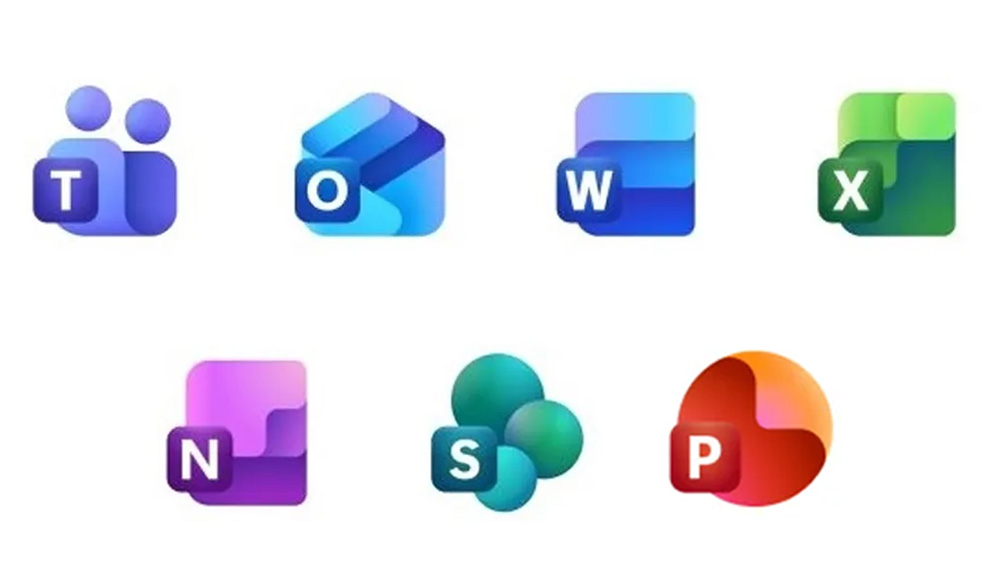
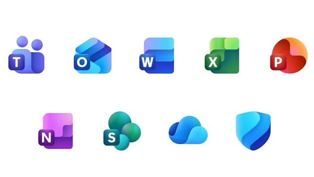
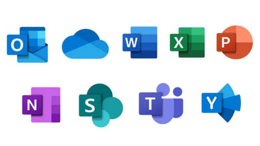
The proposed new icons have colour gradients, adding more depth to the layers, confirming that 3D is very much back. This makes them feel more fun perhaps – less dull and serious Microsoft Office. They also feel more akin to Windows 11's 3D emojis. There's a little more variation among the designs, and the letters are a little smaller. Compare them to the current designs below.
Alas, the designs have been shared on social media, so Microsoft may be getting more opinions than it bargained for. And those opinions are very much divided.
Some people are just happy to see the back of flat design "The industry seems to FINALLY shift away from the horrible flat design era," one person writes on Reddit, noting that Samsung's Android 15 One UI 7 also has new icons.
But some people think Microsoft's making simple icons more complicated. "I really like the design language, but these icons are almost TOO much," one person writes. "Like, why add that purple to word? And purple to PowerPoint? And the shadows are also becoming too dark, and for what? It makes the icon feel less uniform and too complex."
Some also suggest the new designs make it less obvious what each icon is supposed to represent. Take Powerpoint. The current icon is clearly a pie chart. The potential new design is more of an amorphous blob. You wouldn't know what it was if you hadn't seen its predecessor.
"Design is not just meant to be beautiful but INTUITIVE," one person says. "OneNote does not refer to a notes application, Word does not refer to a text application. Excel does not refer to a tables and calculations application. What is that in PowerPoint? What does it mean?"
But do Microsoft Office app icons need to have a figurative meaning? Some suggest not any more. "I'd argue that, by now, everyone who may be susceptible to interact with Office apps is already familiar with the colours and iconography, no matter how convoluted and unintuitive they are," one person argues. "Like how younger generations who never used a floppy disk still identify said floppy disk as 'the save icon'.
I guess time will tell which side of the argument wins out when Microsoft collates all the feedback. I suspect that we'll be seeing at least some form of new app icons emerge even if these don't end up being the final designs.
For more logo design news, jump into the Volkswagen logo confusion that's rocking the internet.