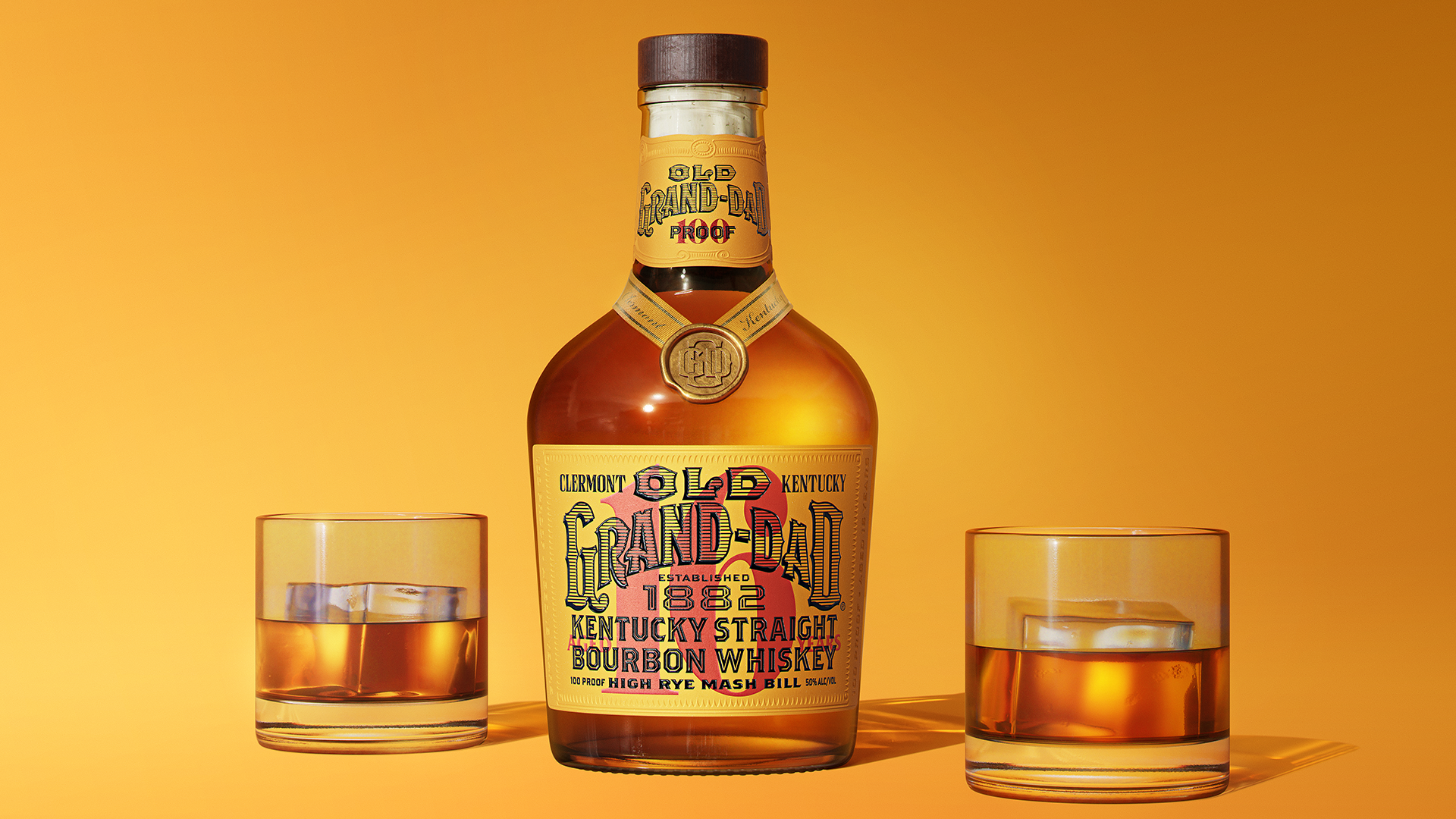
Bourbon branding is all about balancing heritage and style – something that the James B. Beam Distilling Company embraces down to the last drop. Celebrating its latest release Old Grand-Dad 16yr, the 100-proof, highly aged, one-time-only edition bottle is a masterclass in legacy-led design with a timeless appeal.
Dating back to 1882, Old Grand-Dad is the distillery's oldest expression, representing decades of industry excellence. Combining pre-prohibition aesthetics with slick contemporary flair, the stylish packaging design is a celebration of the brand's rich heritage, letting the finer flourishes shine against the label's contemporary, type-centric look.
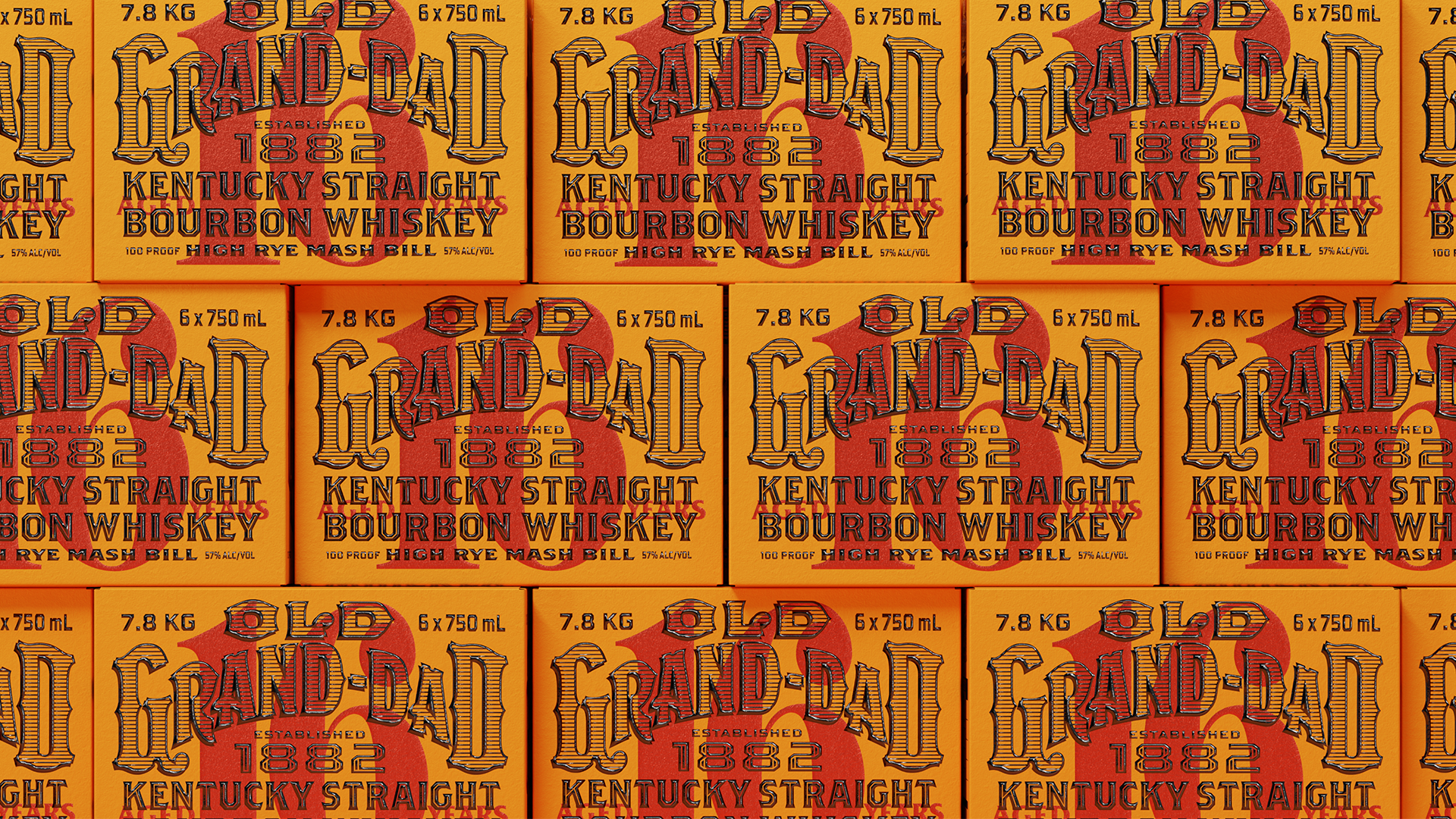
Created in collaboration with Brooklyn-based branding agency Tavern, the bottle's slick design is a masterful blend of old aesthetics, complemented by clean modern design. Displayed proudly on the label is a bold red age statement inspired by the stamping trends of pre-prohibition whiskey bottles, while the warm yellow base colour reflects Old Grand-Dad's previous colour palette from the brand's archives. The overall bottle structure pays homage to heritage design with the neck taking inspiration from Old Grand-Dad 114's packaging from the 80s and 90s.
"Taking a modern heritage approach to the design, we dove into the archives, carefully selecting a unique blend of old and new design elements for inspiration," says Mike Perry, founder and CCO of Tavern in a press release. "Boldness and prestige, inspired by the liquid inside, drove every design decision. We decided on a bold, stripped back, and type-centric approach for a more modern feel that allowed the subtle details of the overall design to sing."
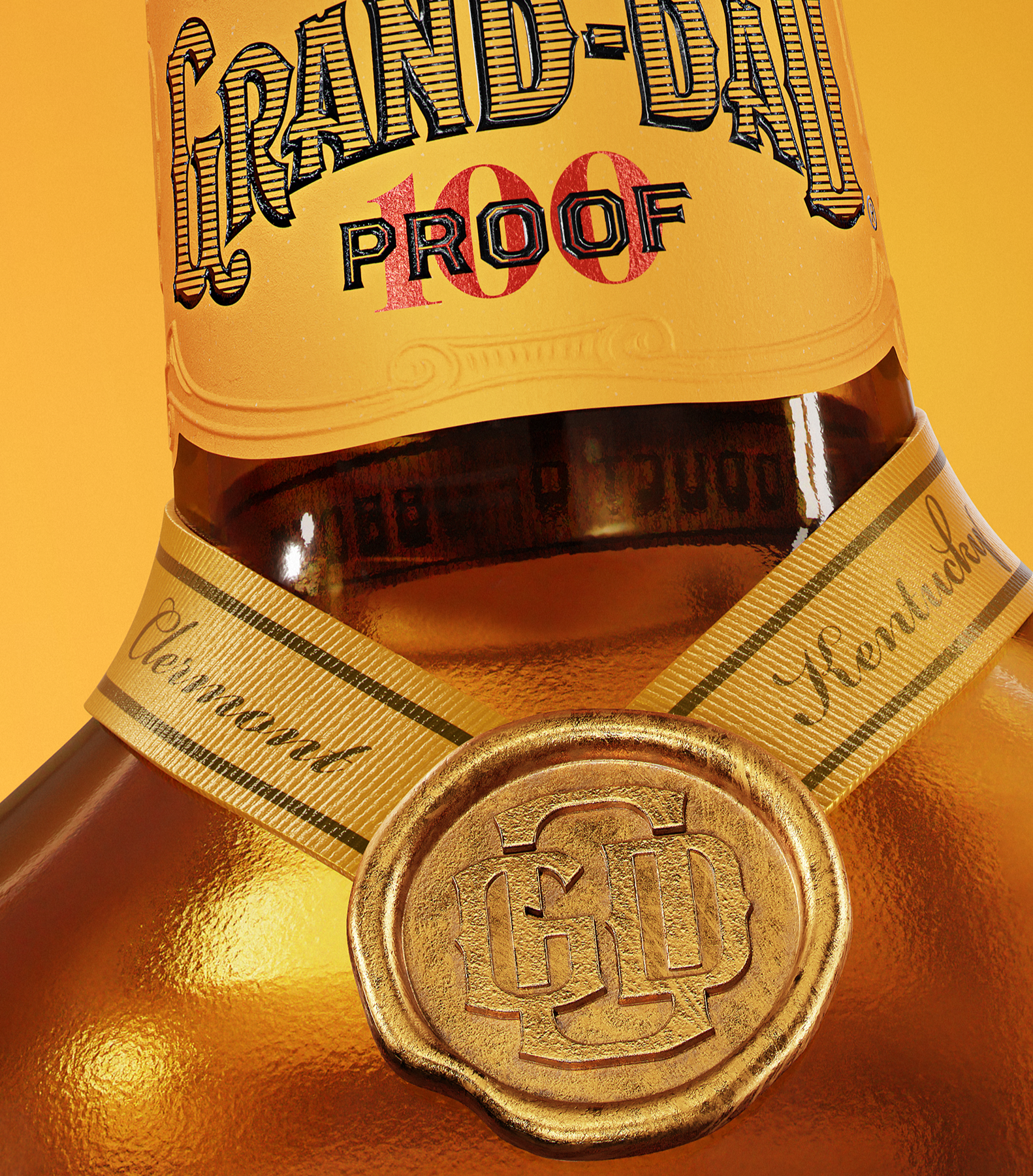
In keeping with the brand's heritage, Tavern revamped the old wordmark opting for a hatched design over a solid black fill. The Western-style design is complemented by unique copy highlighting the bourbon's identity with lines such as "established 1882", "high-rye mash bill" and "Clermont, Kentucky", celebrating history, quality and authenticity. Refined flourishes such as the bottle's wax seal, ribbon and subtle raised sheen on the black type give the packaging a sense of tactile luxury, contrasted with a contemporary OGD monogram for a clean, modern look.
For more from Tavern, take a look at the branding agency's custom wine (spoiler alert, it's as beautiful as you'd expect). If you're after more packaging design inspiration, take a look at Beyoncé’s elegant whisky packaging that proves Queen B is more than a one-trick pony.