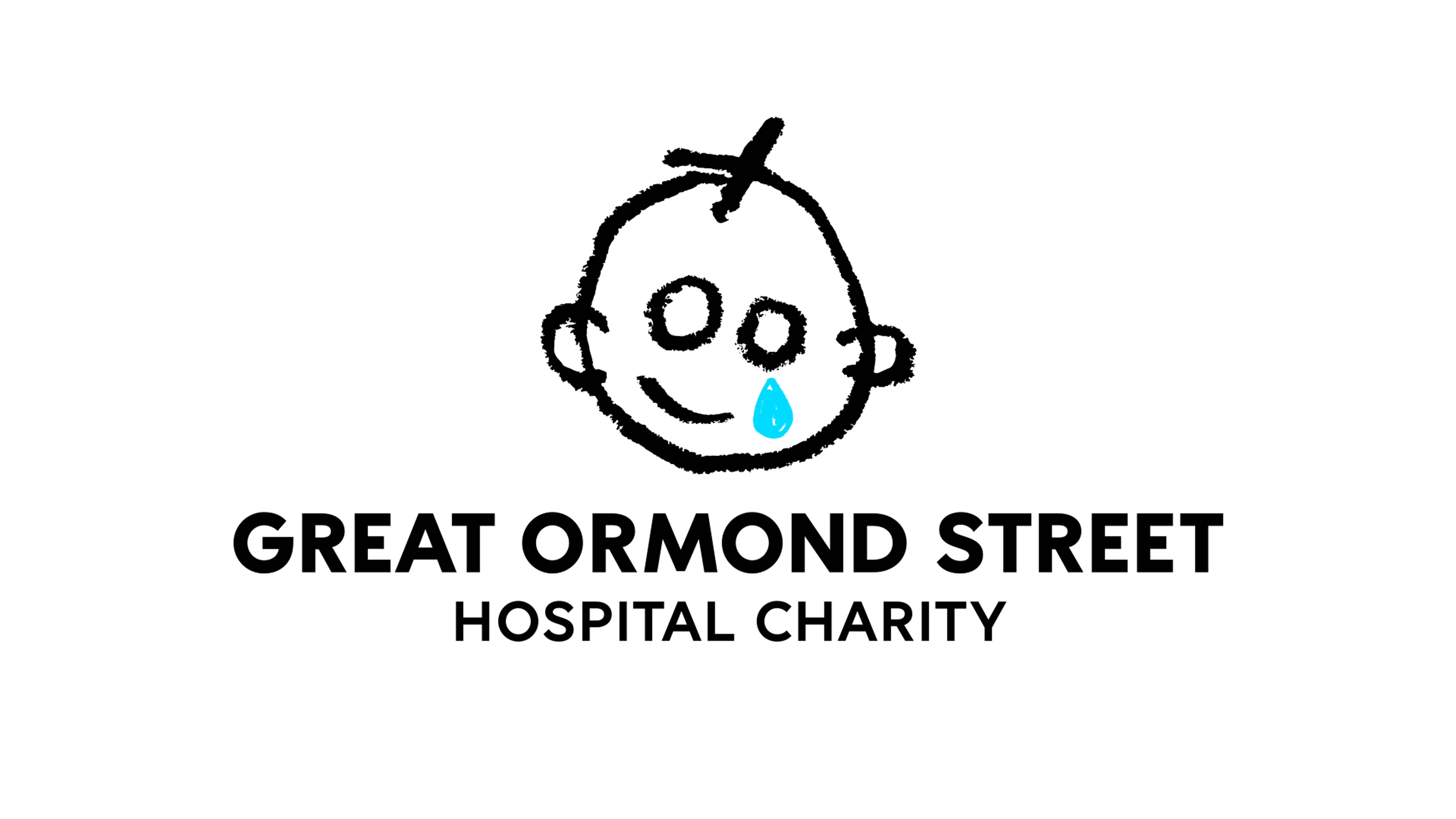
Great Ormond Street Hospital Charity (GOSH Charity) has unveiled a fresh rebranding with a new logo, brand colour and a host of illustrated icons. And it's one of the most distinctive and versatile new charity identities I've seen for a long time (see our pick of the best rebrands of the 2020s).
The classic GOSH Charity logo has been refreshed and now feels even more authentically childlike, while the broader brand assets succeed in treading a difficult line, capturing the harsh reality of childhood illness while also incorporating fun and play. The result is a distinctive identity that works for all stakeholders, from children to donors to parents and donors.
Great Ormond Street Hospital (GOSH) has specialised in treating children with rare or complex illnesses since 1852. The GOSH Charity's mission is to transform the lives of seriously ill children by raising funds to complement the hospital's NHS funding. This helps to support new research, provide cutting-edge medical equipment and to fund child-centred medical facilities and support services.
The rebrand was developed with independent creative director Stuart Gough and the Brand Narrative team at Pentagram, led by Ashley Johnson and Ruth Jamieson. The refreshed identity and platform were built on a brand strategy developed by the creative agency Impero.
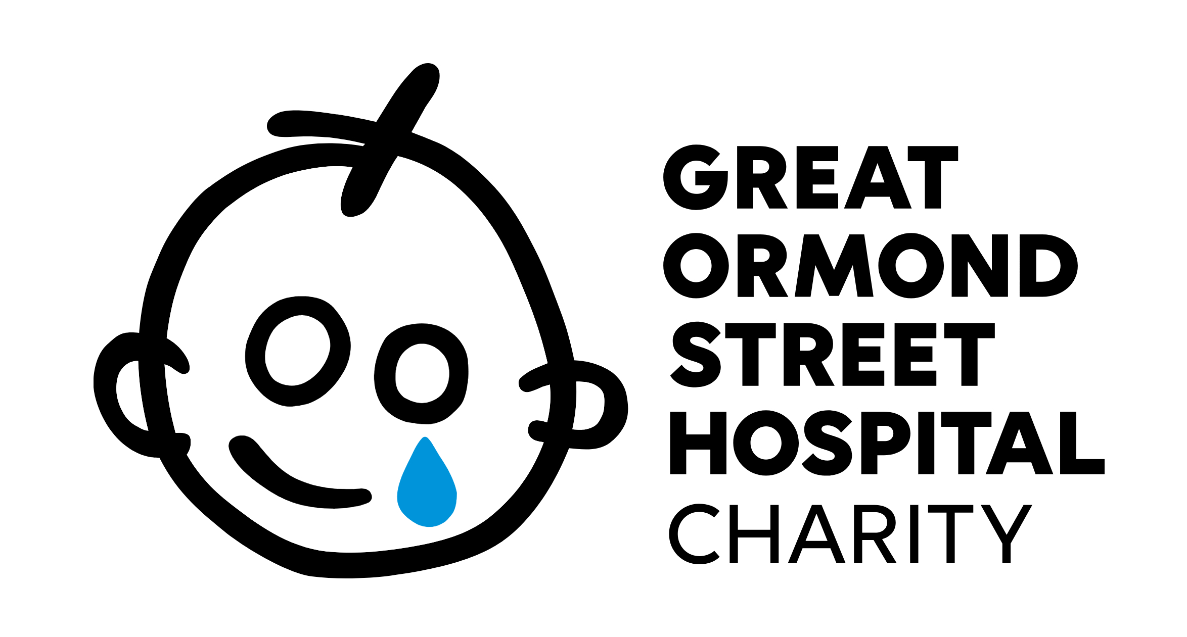
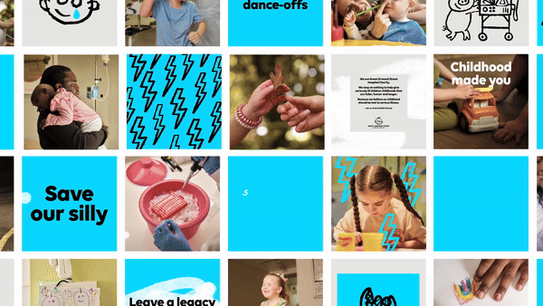
Childhood is a central part of the identity. The updated logo retains and emphasises the longstanding motif of a crying child in a hand-drawn style. The original logo was developed for the Wishing Well Appeal in 1987 and was inspired by a child's drawing. And that feeling that the identity could have been created by a child is now is enhanced by the use of a stroke that looks more like crayon.
“We saw an opportunity to create a design system that leveraged the love and character of the original sketch," Stuart says "The concept throughout the identity is to embrace the energy of a child’s drawing; the charm and mistakes that this can bring – when harnessed carefully it can make a distinct and positive identity system that is recognisable through its entire personality, not just the logo."
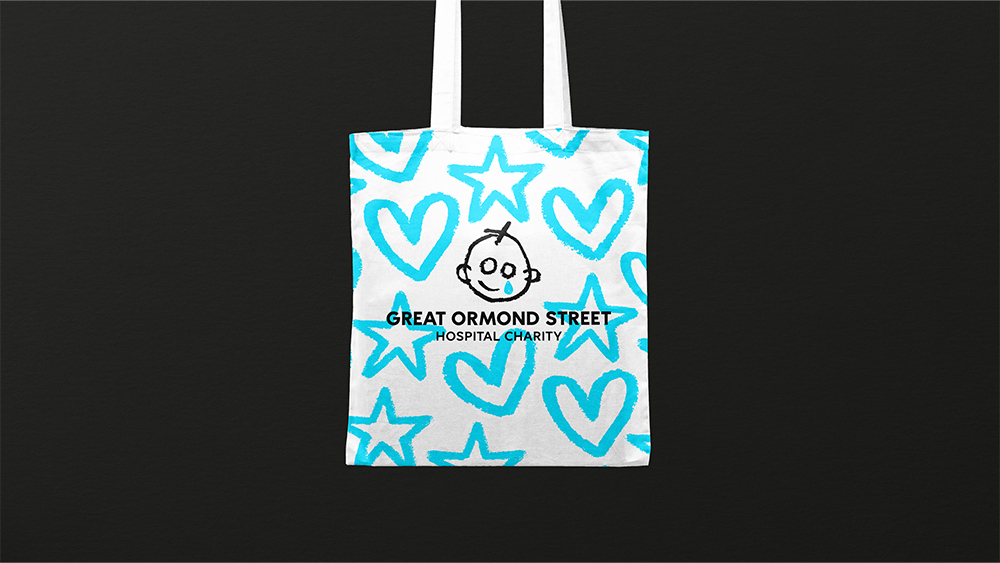
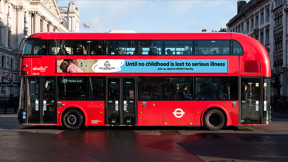
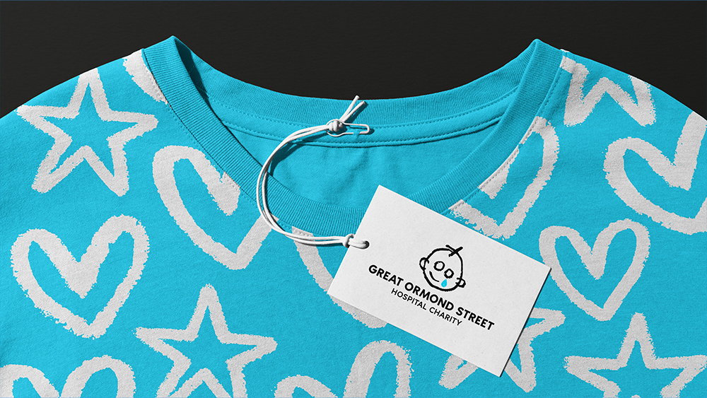
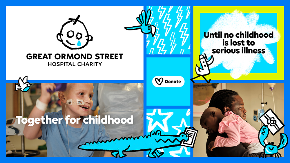
The new logo also introduces a fresh shade of blue for the tear in the logo design. This is adopted as the main colour in the new identity to achieve consistency and enchance recognition. Meanwhile, photography focuses on children's lived experiences, capturing spontaneous, unposed moments using natural light, from the joy and play in the hospital to the emotional challenges faced by families.
There is also a series of new animal illustrations inspired by the ward names at the hospital. While the logo itself shows a child crying, these illustrations, also used in animated form, convey the fun and play of childhood and create a sense of togetherness, expanding the tonal range of the identity. The animation was the work of branding agency Jones Knowles Ritchie (JKR) under the leadership of Tom Gould and, and motion was made a key consideration from the outset in order to create impact on digital channels.
"Motion plays a pivotal role in this project, enhancing emotional connections and storytelling capabilities," Tom says. "With these new motion tools, the charity can now spotlight the needs of the children and families they support with unprecedented impact."
Around 3,500 stakeholders ranging from patients, families and staff at GOSH, to the charity’s employees, big donors and corporate partners, and members of the public contributed input to the rebranding process in a bid to ensure it resonated with all target audiences.
Emma Guise, Director of Marketing and Communications at GOSH Charity, says the aim was to create an identity that was "more accessible, inclusive, and digitally enabled" while also symbolising the progress the charity aims for and the collective role people can play in realising it.
A new tone of voice and core brand language puts an emphasises collectivism, championing everyone who contributes to the charity's work; determination, and, again, a child-centred approach.
"Patient families at GOSH have been central to our decision-making process; their call for boldness and acknowledgment of the harsh realities of serious childhood illness resonated deeply. Furthermore, our unwavering focus on childhood and our pivotal role in protecting every aspect of it guided the essence of our new look and feel," Emma said.
“It’s always been important to Great Ormond Street Hospital Charity to tell the real stories of the children and families who are welcomed by GOSH each year," adds Ashley at Pentagram. "We’ve built on these foundations, translating the strategic platform into a fresher and more confident verbal identity that can advocate, challenge, champion, change things and bring new and existing supporters closer to the vital work they do for seriously ill children.
"We wanted to tune our ears to the authentic voices of GOSH kids and their families, so you’ll see and hear more playful, child-centred language in the tone of voice. You’ll also notice a braver and more direct authenticity in the copy, unafraid to share some of the challenges and harsher realities faced every day."
The new brand identity is making its debut in a new targeted brand marketing campaign developed by Stuart Gough, Pentagram and the charity’s in-house team. It will be the charity's first brand campaign to raise awareness of its work they do, highlighting the realities of childhoods impacted by serious illness but focusing on hope and determination.
"Throughout this project, we've had the honour of meeting remarkable individuals—patients, families, doctors, nurses, porters, researchers, volunteers, fundraisers, play specialists—all dedicated to making a difference. Our task was simply to share their purpose with the world," Stuart concludes.
For more great charity branding, see the recent RSPCA rebrand.