You can forgive PepsiCo executives if they have a bit of an inferiority complex. The company has spent decades as the clear number two in both the cola and overall non-alcoholic beverage space.
That's a tough spot to be in because you fully understand that when someone goes into a restaurant and orders and Coke and is asked "Is Pepsi okay?" the answer might be "no." It's possible that has happened in reverse order to someone ordering a Pepsi, but it's a lot more rare.
DON'T MISS: Dunkin' Has a New Weapon in Its War With Starbucks
To fight that perception (and reality) PepsiCo (PEP) has tried everything from the Pepsi Challenge," a blind taste test designed to convince people that their product beats their rival on taste to a rash of special flavors. Over the years, the company has tried everything from Crystal Pepsi to Pepsi Blue, and most-recently its Pepsi x Peeps flavor tied to the iconic marshmallow Easter candy.
You can't fault the company for trying and now, PepsiCo has decided to make a bold change that's not about adding a new flavor, Instead, the company has decided to overhaul its brand.

Pepsi Embraces Its Underdog Role
Give PepsiCo executives credit for understanding that they're the the number two player with eyes on the top spot. The company maintains what it describes as a "bold challenger mindset." It has also tried to be a little more in the moment than Coca-Cola (KO) maintaining what it described as a "strong link to pop culture," according to a press release.
"Pepsi also continuously reinvents itself with brave marketing and product innovation, from creating its own television shows, exploring Web3 and introducing compelling new varieties over the years including the recent Nitro Pepsi, Pepsi x Peeps, Pepsi for SodaStream, and an improved Pepsi Zero Sugar taste in the U.S. to give fans the best tasting cola in the zero-sugar category," the company added.
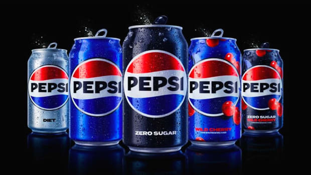
Now, Pepsi has reimagined its branding and has made some big changes to its iconic cans and other packaging.
Pepsi Makes a Major Change
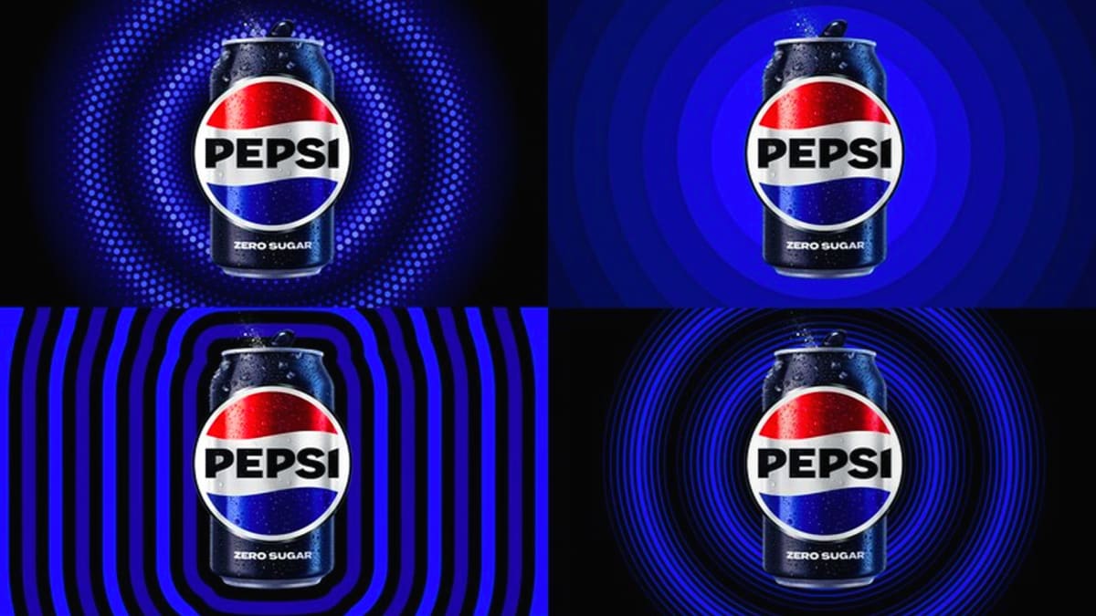
Basically, PepsiCo wanted to make its brand reflect its disruptor mindset. That meant a much more in-your-face-logo with some tweaks that include (and these are the company's words):
- An updated color palette introduces electric blue and black to bring contrast, vibrancy, and a contemporary edge to the classic Pepsi color scheme. Given the brand's continued focus on Pepsi Zero Sugar, the design brings in the color black, further showing the brand's commitment to Pepsi Zero Sugar in the future.
- A new visually distinct can silhouette, which heroes the iconic Pepsi can as an accessible brand for all.
- A modern, custom typeface reflects the brand's confidence and unapologetic mindset.
- The signature Pepsi pulse evokes the "ripple, pop and fizz" of Pepsi-Cola with movement. It also brings the rhythm and energy of music, an important and continuing part of the Pepsi legacy.
Most people, however, will look and think "Pepsi made the logo bigger on its bottles and cans." It's hard to imagine many people will catch the inferences, the company is making, but PepsiCo is confident in its new image.
"At PepsiCo, we design our brands to tell a compelling and holistic story. Pepsi is a shining example of a brand that has consistently reinvented itself over 125 years to remain a part of pop culture and a part of people's lives," said PepsiCo Chief Design Officer Mauro Porcini. "We designed the new brand identity to connect future generations with our brand's heritage, marrying distinction from our history with contemporary elements to signal our bold vision for what's to come."
The new packaging will hit stores in North America in the fall and roll out globally in 2024.


