A collaboration between function-forward power brand Braun and Paul Smith may not immediately feel like an obvious one, with a brand not known for monochrome futurism imbued with a joyful expression of colours. So what happened when the sartorial nous of Paul Smith was juxtaposed with the techy minimalism of the German brand?
With a portfolio of modernist, often Bauhaus-inspired designs, Braun is an award-winning brand known for domestic appliances, razors, and minimal alarm clocks. But they have always had a sleek line of watches with a spare, architectural vibe and have collaborated with Smith before (see the series of Braun and Paul Smith clocks).

The Braun watch range is based on a pared-down essence of timekeeping, so what has the coloured outlook of Paul Smith brought to the table? A lot as it happens, with a cheeky twist on a well-known formula and some discreet rainbow pops. Known for low-key collabs with Off-White and Highsnobiety in the past, Braun flies under the radar with its curated quartz-powered range. But this time, Swiss ETA movements ratchet up the desirability with added British flair.
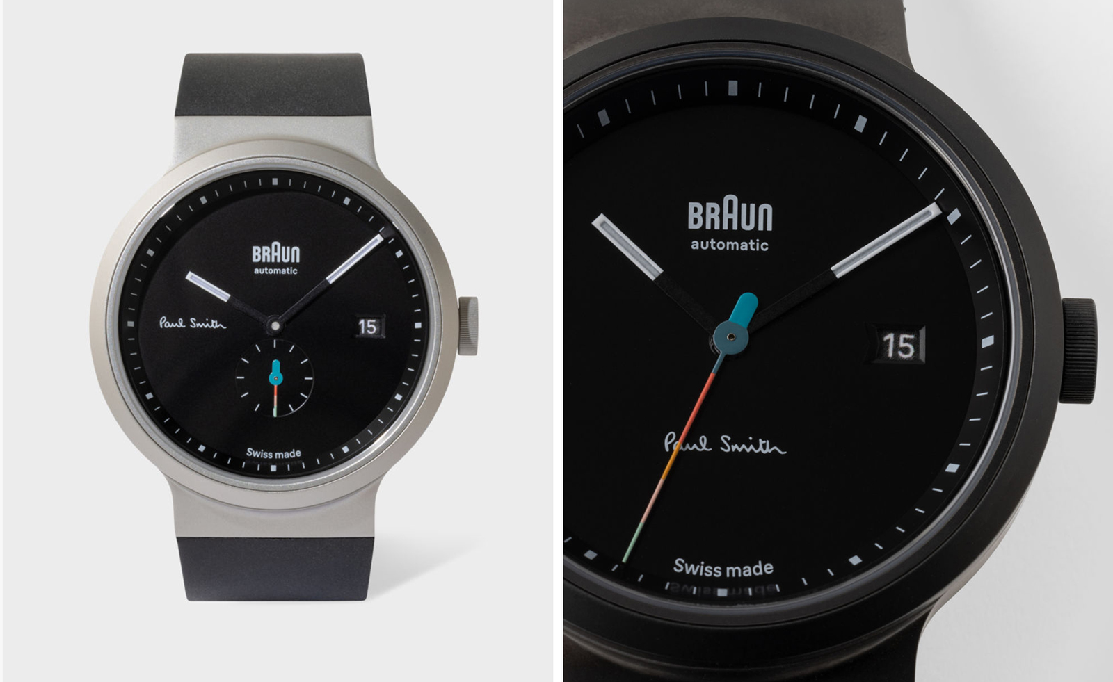
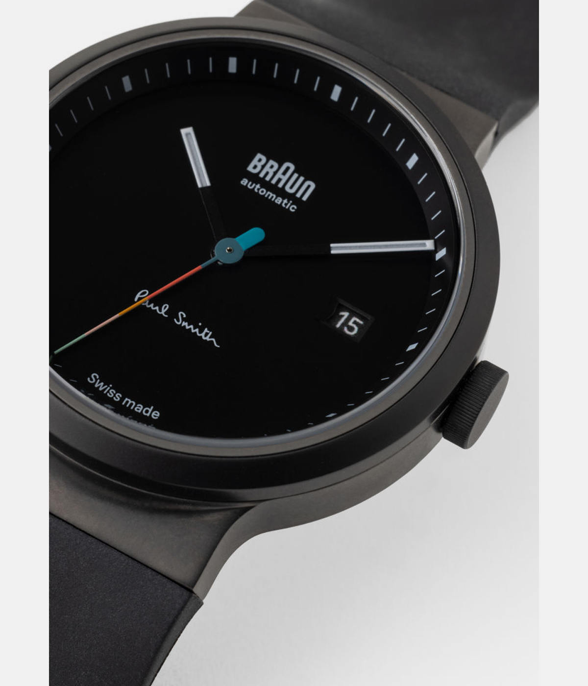
Together with Paul Smith, Braun dropped two slim sandblasted cases on integrated straps, with one sporting a dark gunmetal case, the other matte blasted steel. Both 40mm dials are matte black with black and white lumed hands, and crisp hour and minute markings. The smooth integrated PU strap is a flowing part of the case shape itself, but what about Sir Paul’s influence? The sandblasted steel model has the most discreet of sartorial touches. The clues are in a single scribble of Paul Smith’s signature at nine and a small, rainbow-coloured hand at 6.
Braun’s balance of function and aesthetic makes itself known in the architecturally shaped date window of both. Yes, they would look cleaner without it, but this is about essential readability, not minimalism, for the sake of it. The gunmetal-cased model has the most frivolous detail, with its dark monochrome cheered up by a vibrant sweeping seconds hand. With a rounded blue center and an unmistakable array of colours, the balance between Paul Smith’s signature stripes and the zen-matte background makes for an architectural bullseye.


