We’re only three months in, but 2025 has already proven itself to be the year for embracing maximalist design choices. So, it’s no surprise that pattern drenching is in.
I’m sure you’re already familiar with colour drenching – the popular paint method that involves using one solid colour to fill every corner of a room, from skirting to ceiling. And perhaps you may have dabbled in some of the more adventurous takes on this trend, like stripe drenching or tile drenching, for instance. But pattern drenching takes the look up a notch.
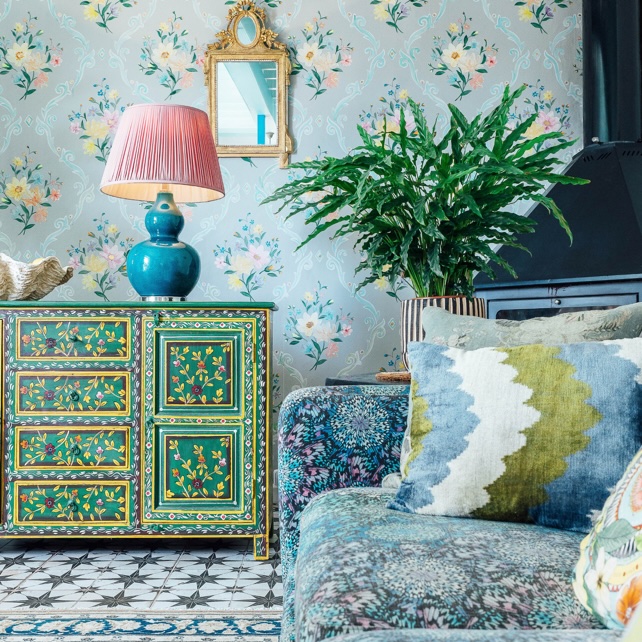
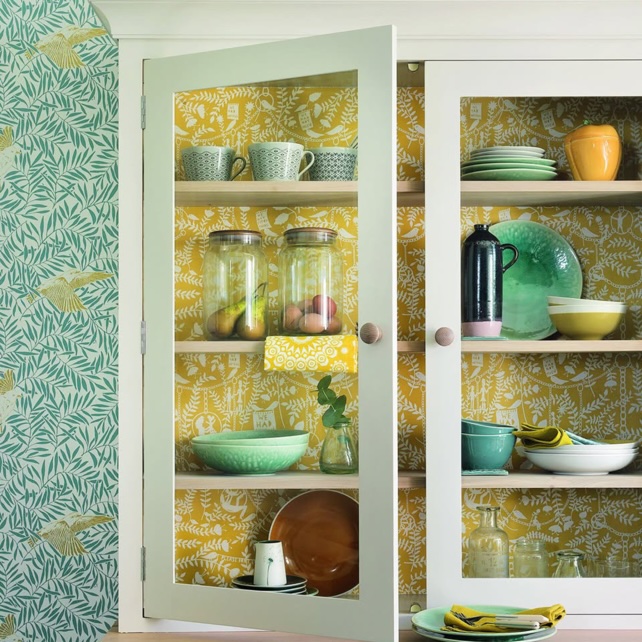
While ‘drenching’ seems to be all the rage in the latest home decor ideas, pattern drenching is definitely the most playful take on the trend yet. ‘Pattern drenching involves using a single pattern to follow throughout an entire room, covering everything from walls and furniture to windows, and possibly even cushions, rugs and accessories,’ explains Kit Kemp, Creative Director at Kit Kemp Design Studio. Or, it can take a more eclectic approach, using a mixture of different patterns and motifs within the same room. Either way, using patterned wallpapers and fabrics to uplift your room is guaranteed to make a statement.
It might sound easy enough to submerge your space in the same print, but nailing this look is a skill. So what is the secret to successfully pattern drenching your scheme? The experts reveal their golden rules.
1. Ditch the direction
If you choose just one pattern to achieve a drenched look, try opting for a print with no clear directional flow. ‘It's important to choose a non-directional motif so it never feels upside down, no matter the angle,’ advises Kit.
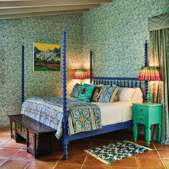
An abstract floral or a small-scale geometric print are always a safe-bet for creating a look without a clear directional flow. These motifs would look great in a bedroom idea, effortlessly elevating the space and creating a calming effect.
2. Choose complementary colours
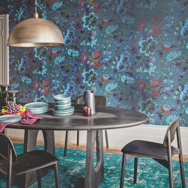
‘When using contrasting patterns, limit the palette to two or three shades to avoid overwhelming the room,’ suggests David Harris, designer at Andrew Martin. This way, even when you use multiple patterns, they will feel like a considered part of the same scheme. Don’t use matching colours, instead opt for shades that complement one another to create a sense of cohesiveness,’ he adds.
This is a golden rule to remember if you want to achieve a luke look through pattern drenching. If you’re not sure where to start, use a colour wheel to help you find the best suited tones to use together in your scheme.
3. Consider size and space
Patterns can easily warp our perception of a space, so it is important to bear in mind the size of your room when picking your print. ‘Smaller scale patterns work well in big rooms, but can overwhelm smaller spaces,’ says Martin Waller, founder of Andrew Martin.
However, be careful not to use a pattern so small that it looks lost on the large walls in your space. ‘Larger scale patterns work well in most rooms,’ adds Martin. But be careful if opting to use them in compact areas – they could make the space feel busy.
4. Contrast is key
‘Contrast is crucial when working with multiple patterns… it allows each pattern to shine,’ says Kit. For instance, florals and stripes pair well together for a classic approach. Use bold florals in big spaces, like the wall, and take small-scale stripes to the upholstery.
For a final touch, offset the design further with a solid colour detail. ‘A bold shade found within the room’s patterns gives the eye a chance to rest. It’s a punctuation mark, adding balance to the overall scheme,’ adds Kit.
5. Layer different textures
When using the same pattern throughout a scheme, adding different textures is a great way to add a sense of depth. ‘A textured or striped rug can ground the room and bring balance to the bold patterns,’ suggests Kit.
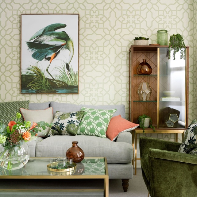
Or, for a slightly different approach, try adding artwork to the walls to break up the sense of immersion created by the patterns. When done correctly, this can create an effective moment of pause – just remember to consider the rules surrounding colour and size when picking your piece.
Get the look
With these expert-approved golden rules, you will be able to master the maximalist look in no time. So, will you be trying pattern drenching in your home?