The color of your kitchen is an important element to get right when it comes to designing your home since we increasingly spend more and more time in these social yet hardworking rooms.
When choosing the right color for your kitchen, there are many things to consider. Colors you have a natural affinity with, color psychology, and the latest kitchen color trends may well inform your decision, but you might also want to consider taking stock of outdated kitchen color trends.
While color is subjective, and what you love will likely differ from the next person, designers say that certain shades have had their heyday and can risk appearing outdated when used in the heart of the home in 2025. If you want your kitchen to stay ahead of the curve, consider swerving from the following five outdated color trends.
5 kitchen colors that are dating your home in 2025
Choosing kitchen color ideas can be a daunting process as there are so many to choose from, but becoming your own color consultant is easier than you think, and we are on hand to help inspire you with a range of painted kitchen ideas for your home.
1. Pastels

If you want to go bold with colorful hues in your kitchen in 2025, opt for rich tones instead of pale pastels to ensure an on-trend look. While pastel kitchen ideas are sure to uplift the kitchen with a playful feel, designers say they're not as stylish as they once were.
'Soft pastels like pale peach, mint green, and light lavender can make a kitchen feel dated,' explains interior designer Juliette Byrne. 'While these shades once had a vintage charm, bolder and richer hues are more favored now for creating a striking, fresh aesthetic.'
Instead of pastels, consider colors with more depth for 2025 such as sage green kitchen ideas, warm terracotta, or blue-gray.
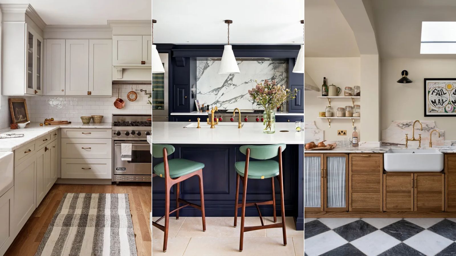
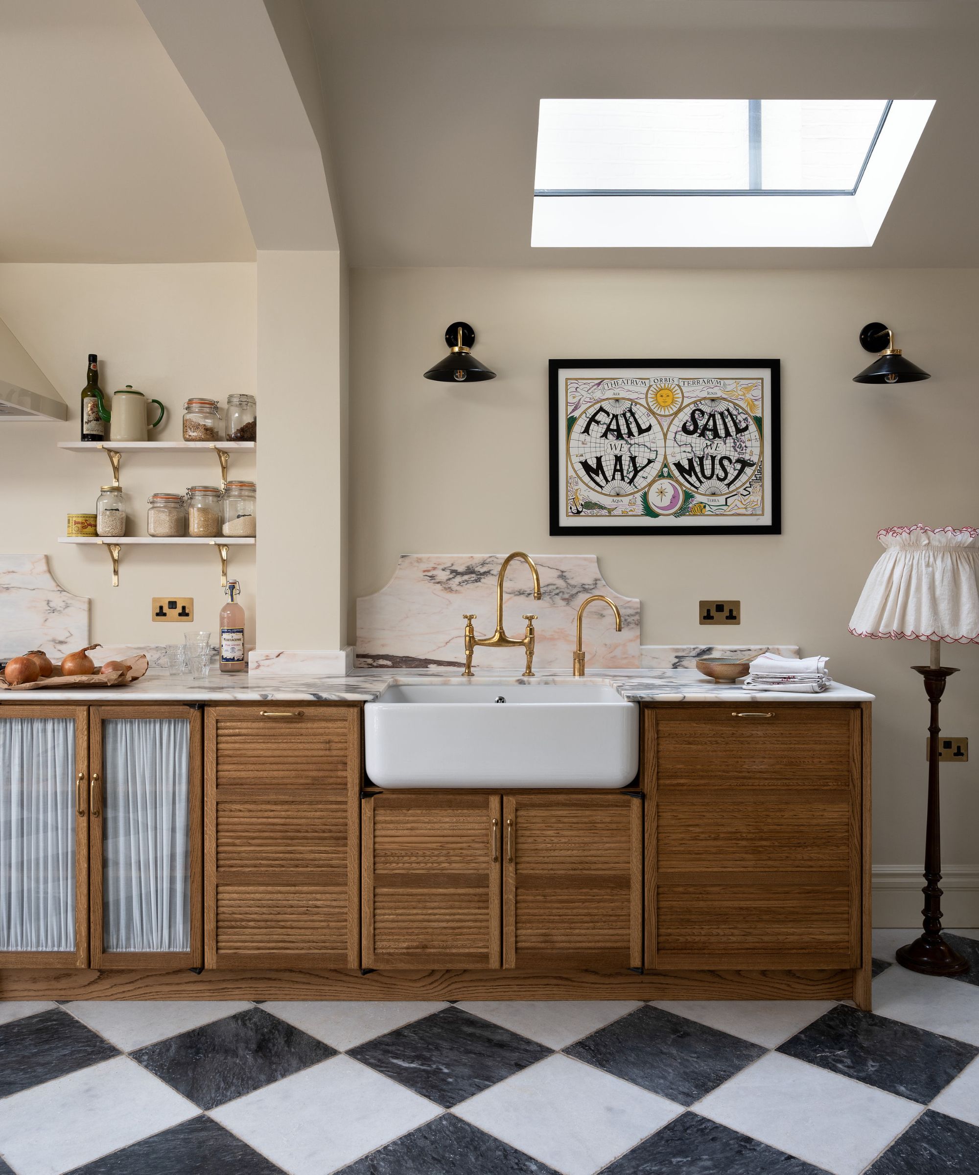
2. Navy blue
Navy blue kitchens were once a go-to kitchen color choice, but in 2025, their popularity among designers is starting to lessen.
'I would say dark blue has had its time in the sun,' says Lindsay Thornton, founder of Cornerstone Design & Build. 'Splashes of color are moving towards softer, earthy tones such as sage green, greige, and taupe.'
'The navy island and units might be dead for 2025,' agrees Lucinda Sanford. But that's not to say you can't embrace blue kitchen ideas – consider shades of blue with green or gray undertones for a modern look. Paint colors such as Farrow & Ball's Hague Blue are a good choice, adding drama in a stylish way to the heart of the home.
Looking for more help with your kitchen design? This deVOL book is filled with inspiration to help you on your way.
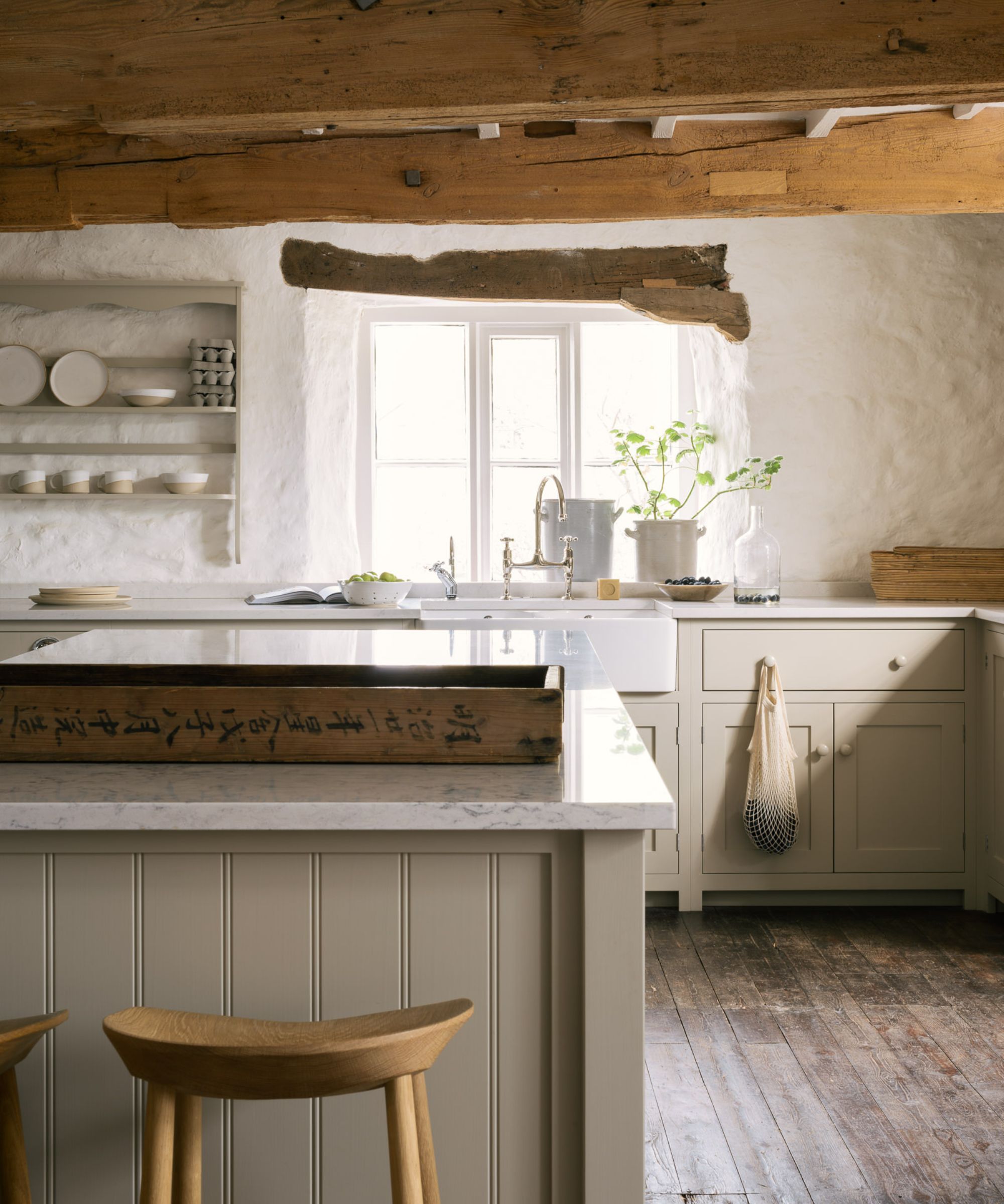
3. Light wood tones
Depending on the materials used in your kitchen, wood tones often play a role in informing the overall color scheme. For 2025, designers are turning to rich, warm-toned woods in place of lighter woods, which can be linked to the white-washed, ultra-minimalist look of years gone by.
'While the bleached white oaks' light and airy quality is beautiful, heading into 2025, I see this not being as popular as it has already been done before,' says Martin Horner, principal at Soucie Horner. 'People are seeking more uniqueness within their kitchens.'
In this timeless deVOL kitchen, the warm wooden kitchen cabinets add depth to the neutral color scheme, helping to create a welcoming and cozy kitchen.
4. Cool-toned gray
Like most things, color trends come and go, so while the cool-toned grays of the early noughties once adorned many homes up and down the US, we are now seeing a sudden shift away from cool tones in favor of warmer color schemes.
'Layering multiple shades of gray, without contrast or warmth, is becoming outdated,' says Juliette Byrne. 'Gray cabinets paired with gray countertops, gray walls, and gray floors lack the contrast necessary for a fresh, dynamic design.'
This color trend is commonly associated with ultra-modern finishes, which can also be seen by some as outdated for 2025. 'Industrial kitchens with loads of gray, metal, and commercial finishes are a thing of the past,' adds interior designer Nadia Watts. 'The starkness just doesn’t feel homey or comfortable. People want their kitchen to feel lived in, to feel comfortable, and like it’s the heart of the home. It’s hard to create a cozy kitchen destination with shiny hard sleek surfaces at every turn.'
So what color is replacing gray? Of all the neutrals, gray was always the one that instantly brought the most gravitas, but there's a new color in the interior sphere; welcome greige. An amalgamation between gray and beige, greige is certainly having its moment in the spotlight.
Greige harmonizes well with almost every other hue, making it a most adaptable neutral and giving good reason for its rising popularity as the kitchen cabinet color of choice, says Helen Shaw, director at Benjamin Moore. Greige is the new gray in interior design, and it isn't too difficult to see why. In fact, we would go as far as to say that greige is also the color replacing white.
5. Bright white
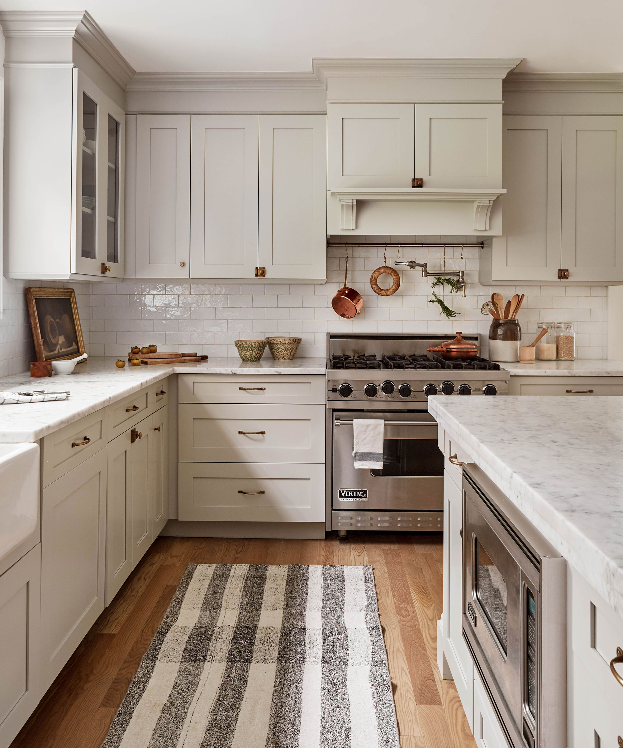
White kitchens are one of the most versatile shades in all of design, but interior designers and trend forecasters are instinctively leaning towards calmer versions from the same color palette, such as ivory, linen, sand, and stone. 'Kitchens have come a long way from the stark all-white cabinets, counters, and walls,' says Nadia Watts. 'White can be a great accent in a kitchen but all-white everything feels dated.'
'The all-white kitchen, once a symbol of cleanliness and modern minimalism, is starting to feel flat and uninspired,' adds Juliette Byrne. 'Kitchens in 2025 will have more contrast, incorporating rich colors, natural wood tones, and bold accent shades to avoid an overly sterile look.'
Here, interior designer Becca Galbraith of Becca Interiors uses this color palette to perfection. 'The search for the ideal neutral is not as easy as it would initially appear,' says Becca. 'Pure white can often be too cold and sterile, while trying to warm it up means possibly straying into the magnolia territory. Instead opt for a softer, warmer white and cream that grounds and lifts at the same time.'
Cream kitchen ideas, along with the trend for 'quiet luxury' are no doubt going to endure in 2025. Elegant and timeless in their simplicity, creamier color schemes have become a stalwart in the world of interiors, and are the perfect color addition to modest spaces.
While designers say these five colors now feel outdated when used in kitchens, keep in mind that all colors are subjective, and first and foremost, your home should be a true reflection of the colors that bring you the most joy.