We've been looking forward to the logo design trends of 2025 but before we forget all about last year, why not revisit our most popular logo and rebranding stories of 2024?
Last year brought us plenty of logo and visual identity stories, and it was the biggest companies' new looks that caught the attention of our readers. Here, in reverse order, are the most read logo and rebrands stories on Creative Bloq from 2024.
10. Audi's new branding is proving almost as controversial as Jaguar's
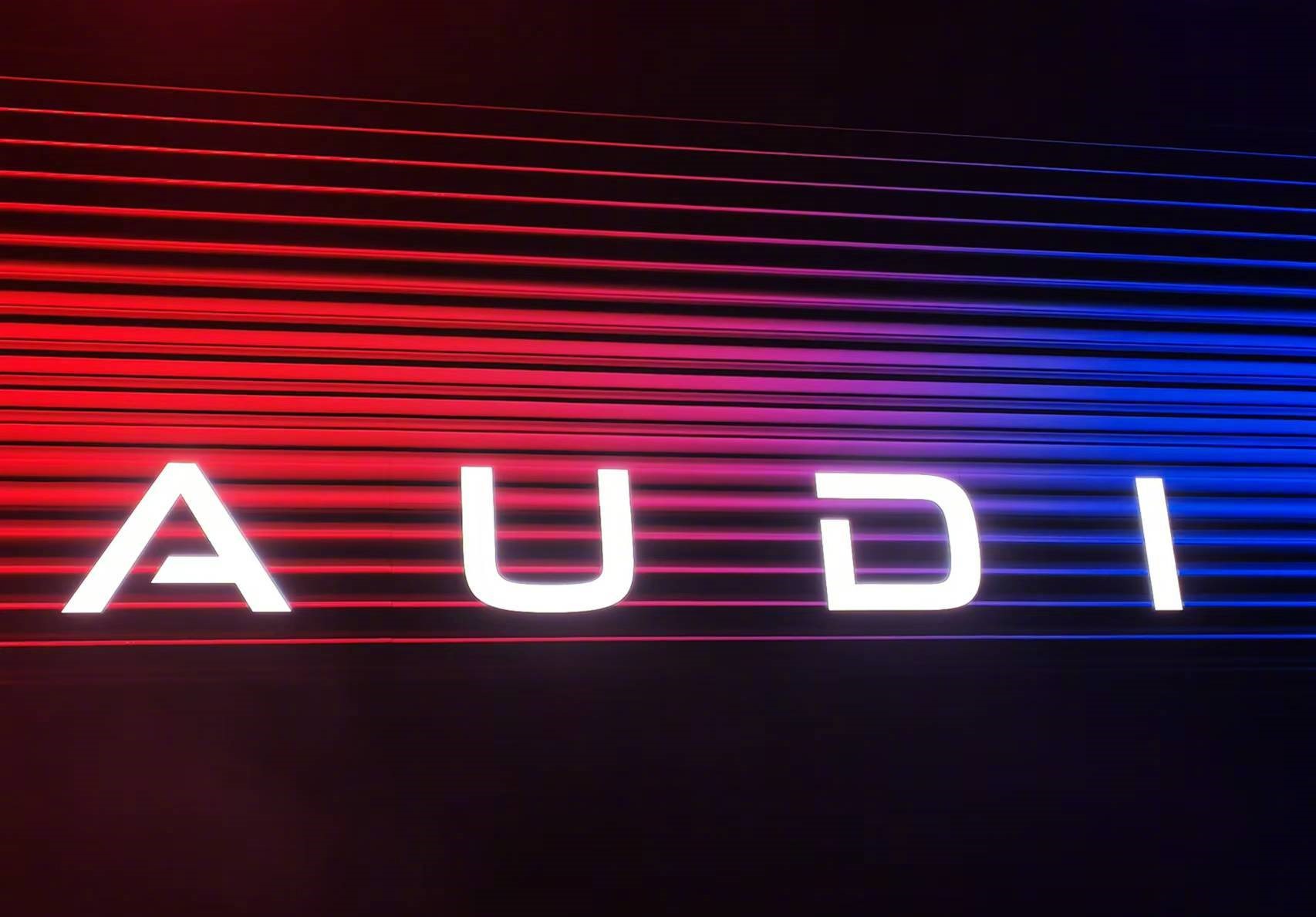
Shortly after Jaguar's controversial rebrand (rest assured, that's covered in our list), we saw the rebrand of car maker Audi. For its new range of electrical vehicles, Audi E, the brand ditched its famous four interlocking rings in favour of a new capitalised wordmark, AUDI. Like with any big rebrand, many fans were not impressed.
09. Bose's new rebrand showcases its hand drawn heritage logo
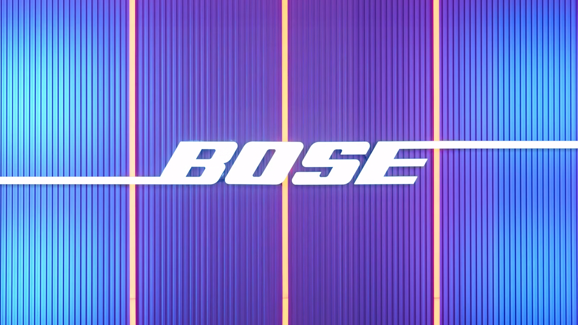
The next in our list was a story about a subtle design tweak that made a big impact. Bose's rebrand by COLLINS celebrated its heritage while carrying its legacy into the modern age with a new colour palette, sleek new typography and an authoritative brand voice. The brand kept its original wordmark, with only minor tweaks made.
08. A designer has 'fixed' the controversial new Jaguar logo
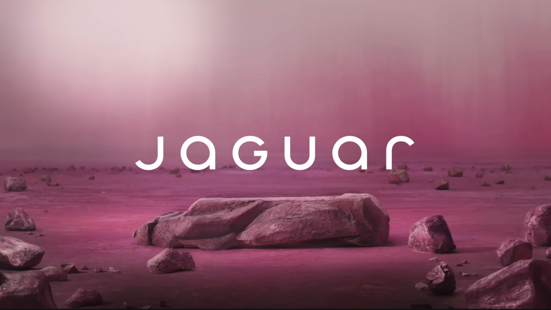
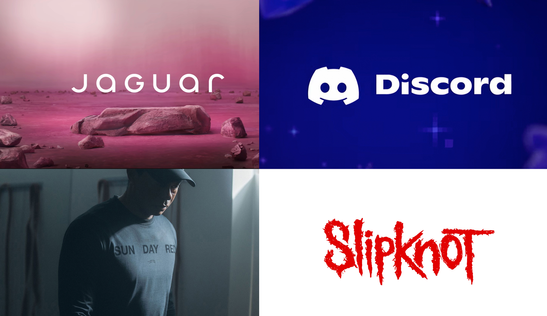
We were surprised to see that this year's Jaguar story wasn't higher on our list, but we know that this rebrand really got people talking. The rebrand saw a new mixed-case wordmark, a monogram and a tweaked version of its famous leaping animal, and people were really upset about it. One TikTokker subsequently 'fixed' the logo, and garnered an awful lot of likes in the process.
07. Lego's vibrant new brand identity feels both nostalgic and timeless
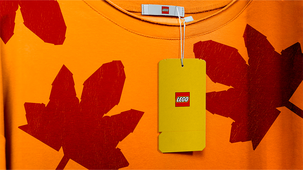
Seventh on our list was our story about Lego, which unveiled a full new brand identity that brought cohesiveness across its range of products. It cleverly uses Lego bricks to construct both physical and digital assets, with an emphasis on learning through play.
06. The Harris x Walz logo gets a subtle yet effective design tweak
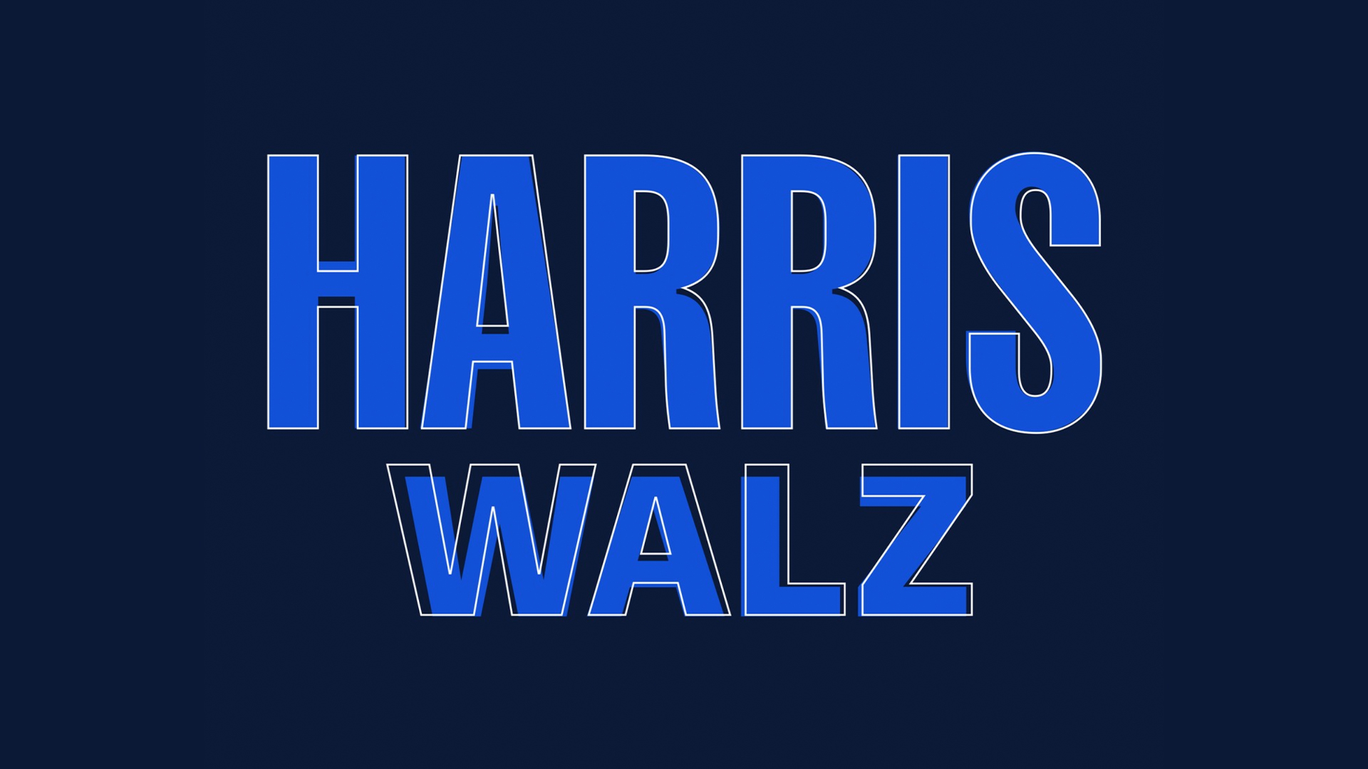
The Harris x Walz logo was given a more authoritative feel in August thanks to a humble bit of kerning. The new logo irons out visual impurities like letter height and centring, making it much more powerful and scalable (though it turned out not to be powerful enough...).
05. The new Slipknot logo is a real Disasterpiece
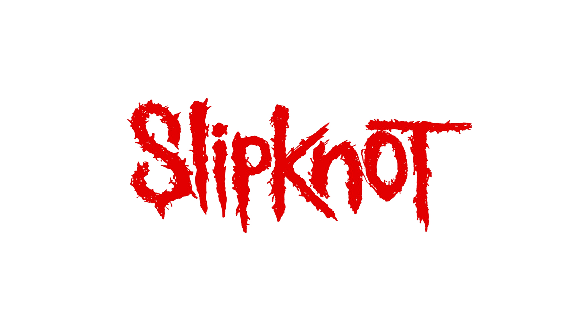
In at number five is Slipknot's new logo, which appeared on a limited edition set of T-shirts. The new take on the 'S', which is more vertically elongated with smoother edges than the former version, seemed to really upset fans.
04. The new Las Vegas Raiders logo is as sharp as a blade
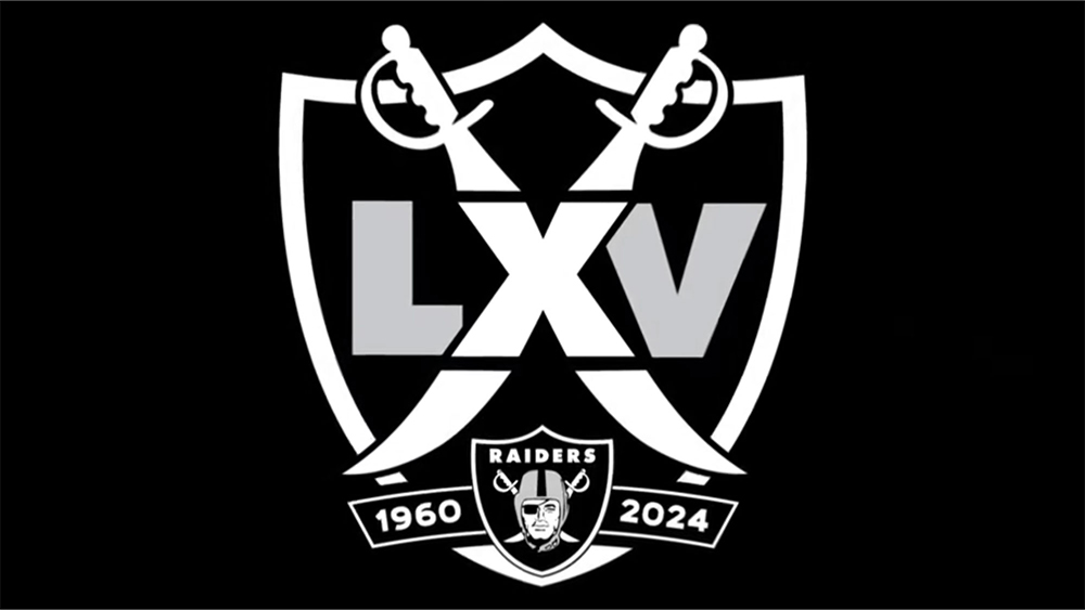
The Las Vegas Raiders released a clever 65th anniversary logo, which made use of its traditional crossed swords motif. This was another one that divided opinion and plenty of you enjoyed reading about it (or at least read about it, we can't always tell if you've enjoyed it or not).
03. Tiger Woods' new logo has a genius hidden meaning
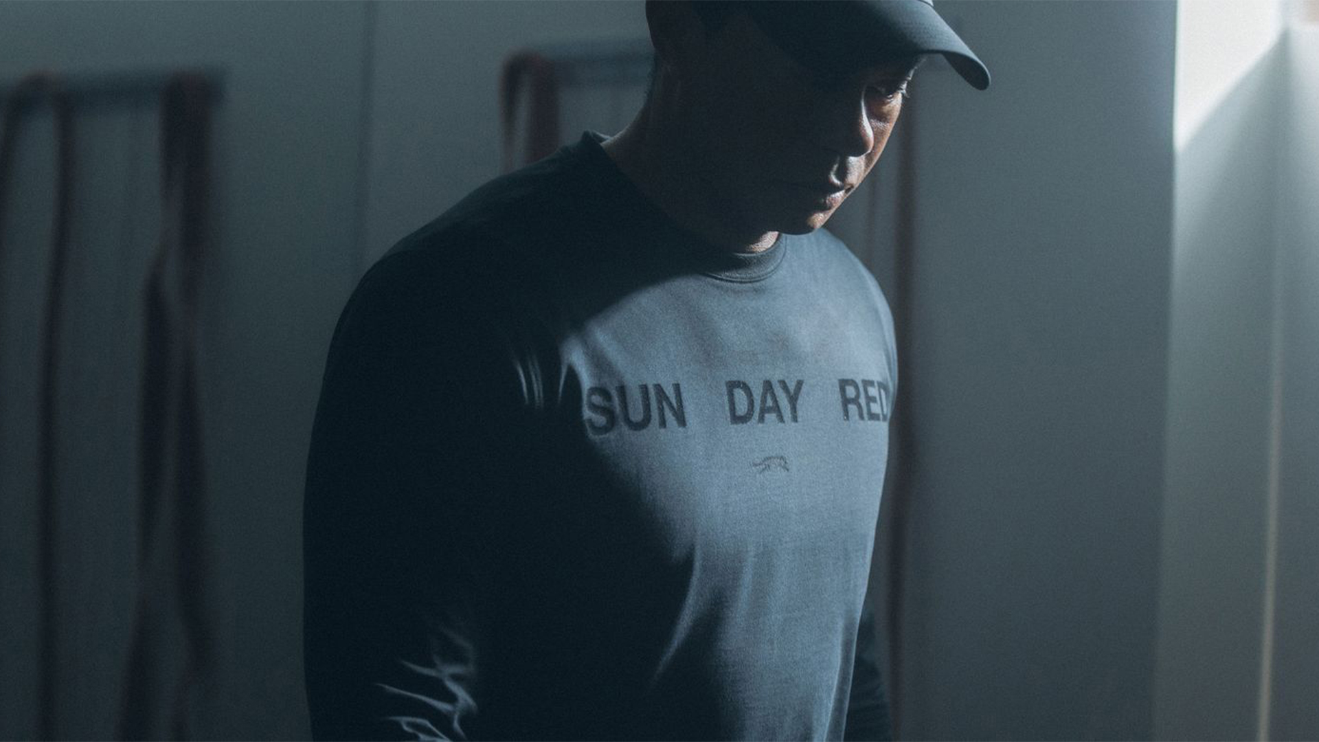
After splitting from Nike, Tiger Woods announced his new brand Sun Day Red. Its logo features a tiger adorned with 15 stripes, representing each of Woods' 15 major titles.
02. Users are already poking fun at the Discord rebrand
Back in May, Discord announced yet another brand refresh to mark its ninth anniversary. The rebrand tweaked the UI and adopted a darker brand colour but it was the tagline 'Group chat that's all fun and games' that drew most attention.
01. The new Mazda logo was long overdue
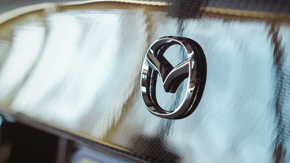
And in first place is a story from July 2024 about the new Mazda logo. Our freelancer Joe Foley argued that the new flatter design may not break the mould, but was totally necessary.
For more on visual identities, see our logos of the decade and rebrand of the decade series.


