Despite recent surprise competition from the likes of DeepSeek, OpenAI remains the biggest name in AI right now. The company behind ChatGPT has experienced exponential growth in recent years, and as a result wasn't particularly anchored by a strong visual identity. That's all changed today with the company unveiling its first ever rebrand.
The new identity includes a new colour palette, typeface and wordmark, as well as a long overdue tweak to its previously unbalanced logo. It's certainly a bold and comprehensive rebrand, and like all the best rebrands, it's one that gives the amorphous tech company some much needed colour and personality.
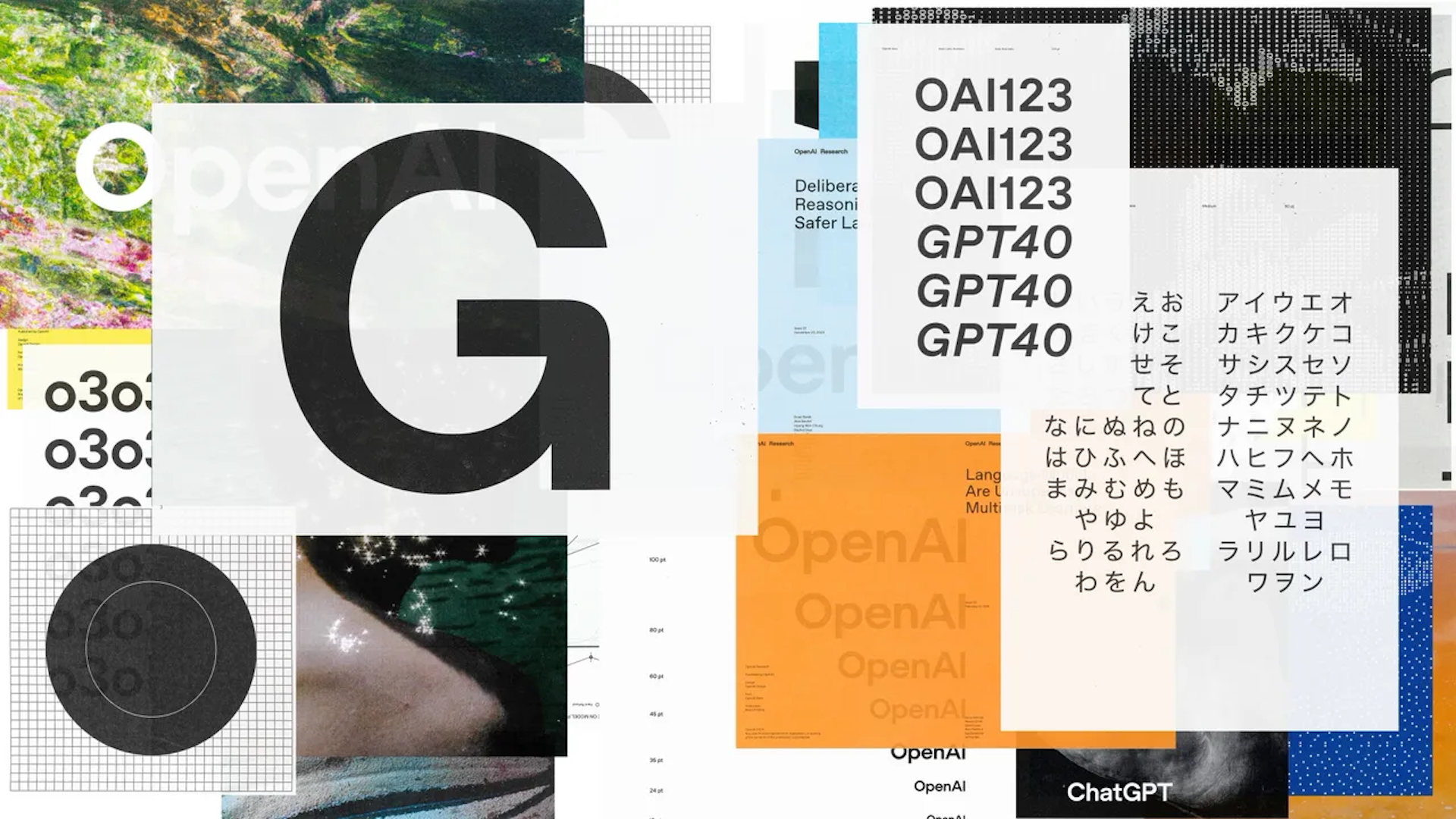
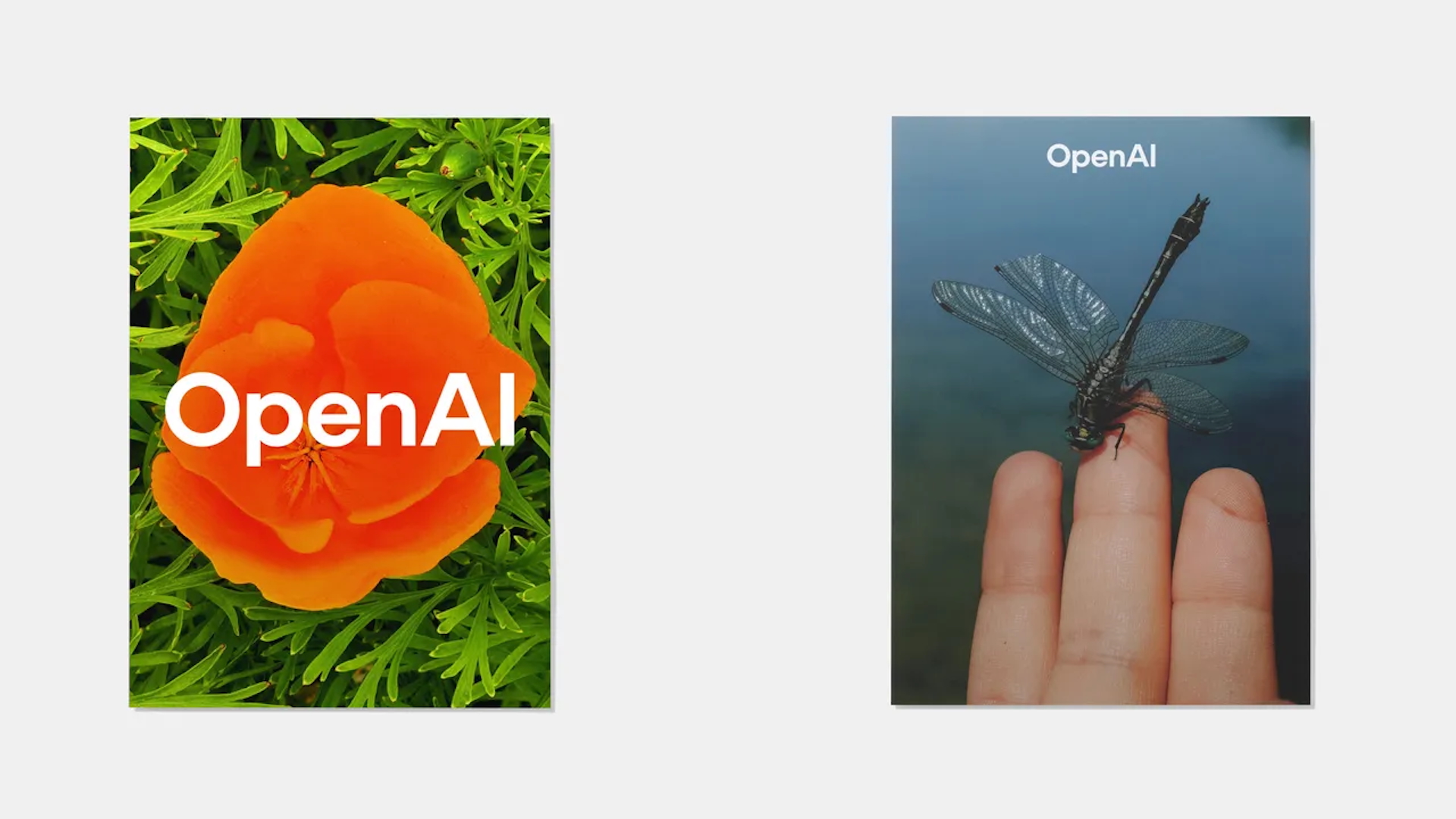
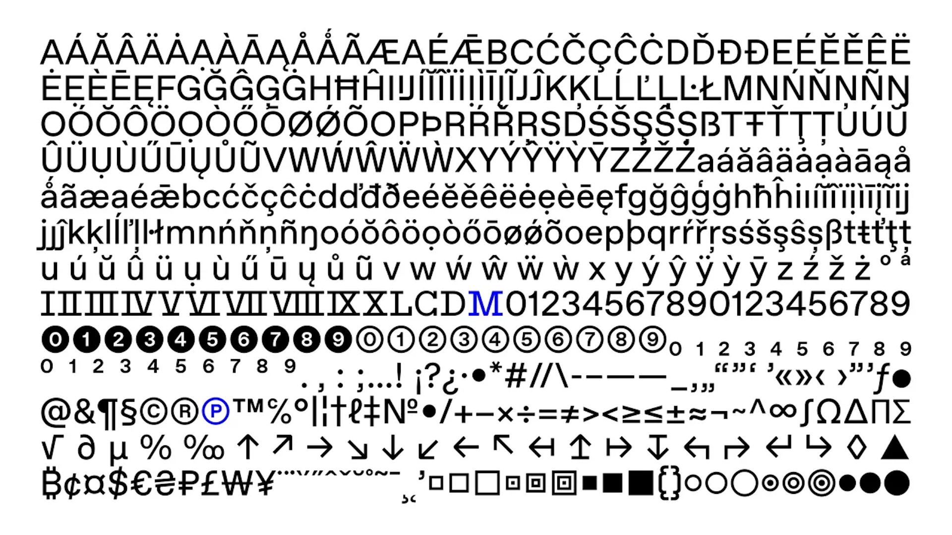
At the centre of the rebrand is a new font, OpenAI Sans. which is described as merging geometric clarity with a soft, inviting feel. The updated logo now incorporates this typeface, showcasing an "O" with a smooth, uniform outer shape and a deliberately irregular inner form, designed to soften the rigid precision and add a more human touch, according to in-house designer Veit Moeller via an interview with Wallpaper.
"OpenAI Sans blends geometric precision and functionality with a rounded, approachable character. Subtle modifications, such as smoother curves and bespoke letterforms, give it a friendly and circular appearance," OpenAI announces in its new design guidelines.
For the world's leading AI brand, it's notable that so much of this rebrand is designed to look "more organic and more human". Along with the naturalistic colour palette, whose primary base of greys and blues evokes "horizons, skies and expansive space," the new identity includes photographs of landscapes and still lifes, for which the team commissioned several contemporary photographers.
And then there's the logo. The changes here are subtle, but users have been complaining for years that the OpenAI 'blossom' logo wasn't entirely symmetrical, with the line thickness varying throughout. That's now been fixed, leading to a more uniform design.
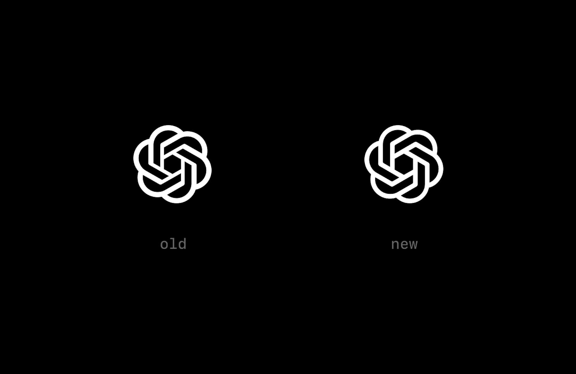
"The Blossom logo is more than just a visual symbol," OpenAI explains. "It represents the core philosophy that guides our approach to design and innovation. At its heart, the logo captures the dynamic intersection between humanity and technology—two forces that shape our world and inspire our work. The design embodies the fluidity and warmth of human-centered thinking through the use of circles, while right angles introduce the precision and structure that technology demands."
The sound design, the animation, everything.... This video is just so good https://t.co/WYcAbLXGAVFebruary 5, 2025
The animation, typography, and sound design in this is so slick! Absolutely love seeing beautiful brand design in action. https://t.co/3UgpMb1dOvFebruary 4, 2025
Indeed, it's certainly a strong rebrand for a company that has entered the public consciousness in seemingly no time at all. And hey, it also puts to bed those bizarre rumours that the OpenAI logo is changing to a plain circle.