
Onyx Boox Tab Ultra C: two-minute review
I take my hat off to ereader maker Onyx for trying to do something different with its Boox E Ink tablets – making them a little more multimedia-friendly. It did that with the Boox Tab Ultra and didn’t quite hit the mark. The company has tried again with a color version of the same tablet – the Onyx Boox Tab Ultra C.
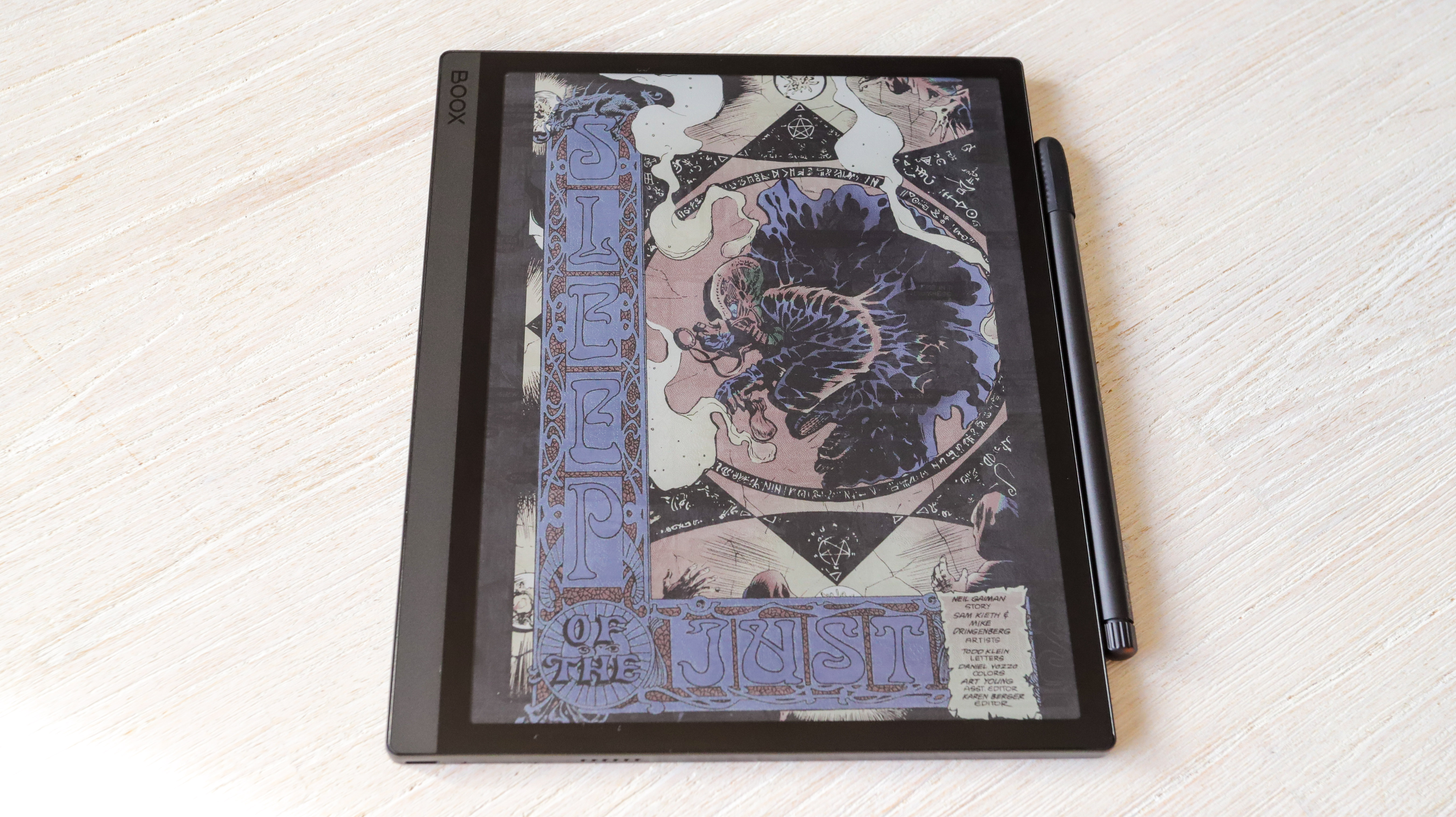
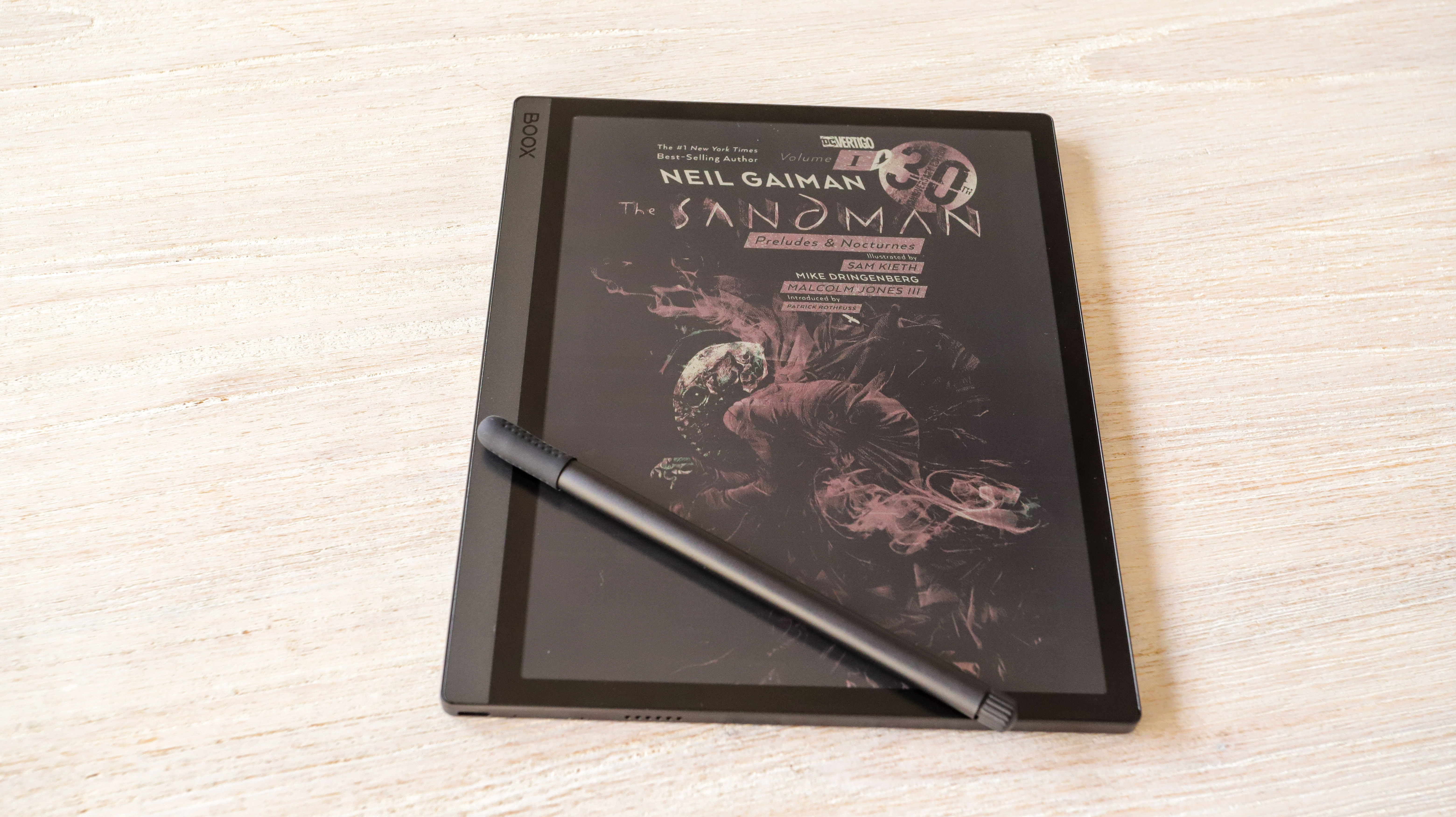
The color screen makes quite the difference, particularly when you’re reading something that’s supposed to be viewed in color. As with other color ereaders, however, the Onyx Boox Tab Ultra C uses the E Ink Kaleido 3 screen that has some significant limitations. It can only display 4,096 colors without a lot of saturation, so what you see is rather muted. Still, even that little bit made my reading experience more enjoyable, particularly when I’m absorbed in something like a Sandman graphic novel. “You can enjoy them better on an iPad,” I hear you say. As true as that may be, the Tab Ultra C is first and foremost a note-taking ereader and I’ll refrain from comparing it to an actual multimedia tablet.
As great as having the color screen is, the ghosting here is really significant. Despite Onyx bringing over the multiple refresh rates from the Boox Tab X, even the fastest Regal option can be disappointing.
Despite a decent processor – for an ereader that is – performance was generally slow and laggy, even for simple tasks like page turns – something my colleague also noticed when he tested the monochrome Boox Tab Ultra. Battery drain is also rather high when compared to other 10.3-inch notetaking ereaders, including the Onyx Boox Note2 Air Plus, with the whopping 6,300mAh pack draining away in a week.
While access to the Google Play Store is great, I think using Android 11 as an operating system feels dated. It’s not really an issue here, but there will be some apps you might want to use that are no longer optimized for this version and Onyx doesn’t offer a way to update to Android 12 or 13 on its ereaders.
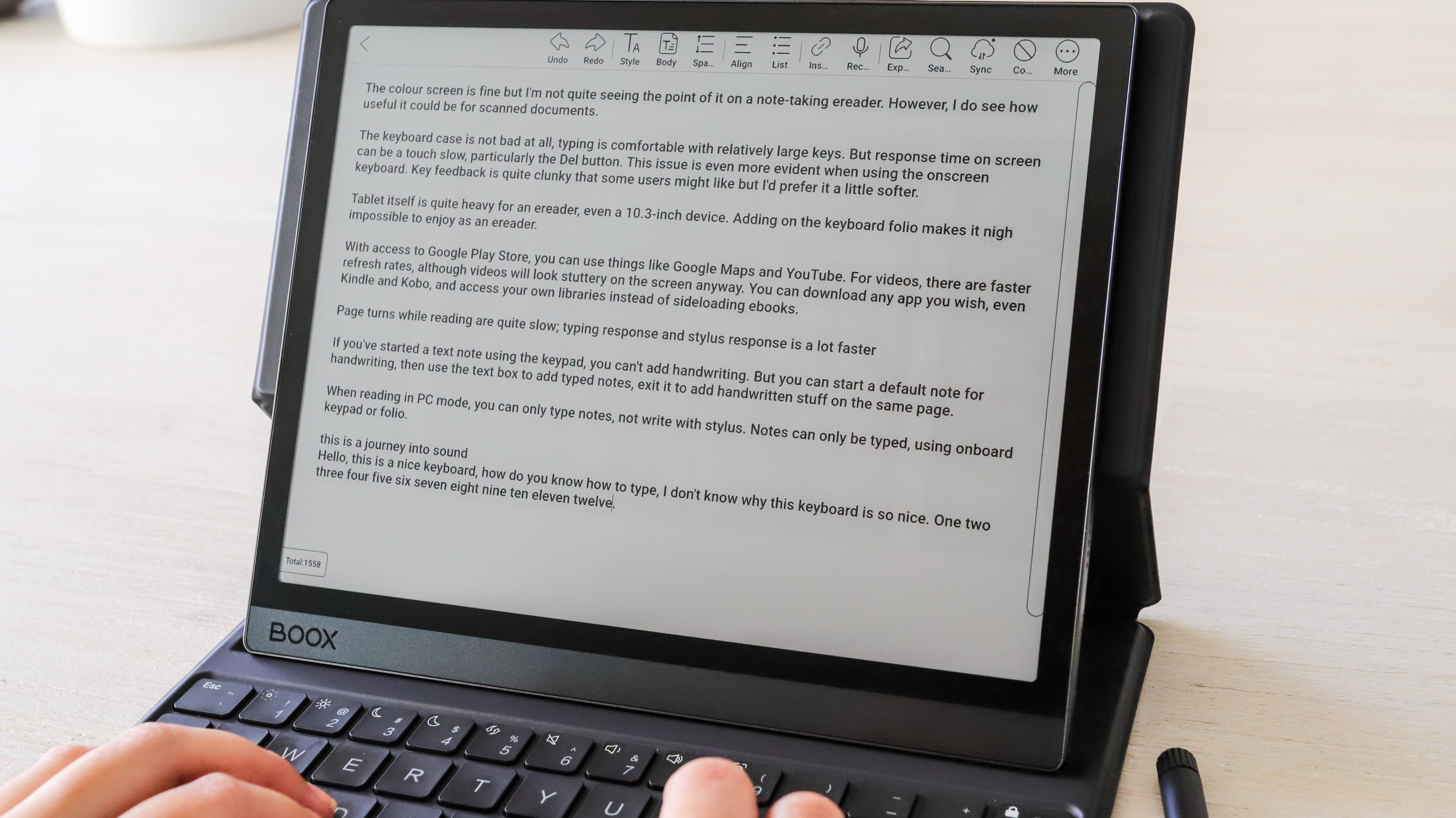
The writing experience, however, is good and on par with the other Onyx tablets I’ve tested. Like its monochrome sibling, the Boox Tab Ultra C can also be used with a keyboard – the folio can be purchased separately. While I enjoyed typing on this keyboard, there was the occasional lag to deal with, which was a little disconcerting when typing at speed.
If it’s just the color screen that is its main selling point, then the Tab Ultra C can be a rather expensive proposition.
Onyx Boox Tab Ultra C review: Price and availability
- Available in two bundles directly from Onyx or select retailers
- Standard bundle list price: $599.99 / €649.99 (around £559) / AU$979
- Keyboard cover bundle: $665.99 / €715.99 (around £615) / unavailable in AU
Onyx has priced the color version of its Tab Ultra E Ink tablet the same as its monochrome counterpart, at least in the US. The Tab Ultra C retails for $599.99 / €649.99 (around £559) / AU$979 for what is called the Standard bundle – this includes a magnetic case and the stylus in the box.
While you can buy the keyboard folio separately, there’s a bundle for that as well and it will set you back $665.99 / €715.99 (around £615). The Keyboard Cover bundle is unavailable in Australia, but the folio costs AU$179.99 to purchase separately.
You can get both bundles directly from Onyx’s Boox Shop in the US and Europe (UK customers can choose the EU storefront). In Australia, only one retailer, Elite Electronics, stocks Onyx products.
While the price point might seem fine given it’s a large, color E Ink screen, it is an expensive tablet. And the value diminishes further as its performance is subpar.
As much as I hate making this comparison, a 10.9-inch iPad would be a better (and potentially cheaper) investment if it’s a color screen you’re after. Throw in an Apple Pencil and you wouldn’t be spending too much more either. If a color screen isn’t important and you want a really capable note-taking ereader, then I’d recommend the Kobo Elipsa 2E in a heartbeat and you’ll save a lot of money too.
• Value score: 2/5

Onyx Boox Tab Ultra C: specs
Onyx Boox Tab Ultra C review: Design
- 10.3-inch color E Ink screen
- Thicker and heavier than other large-screen ereaders
- Features a rear camera
In terms of overall design, nothing has changed from the Tab Ultra. The Tab Ultra C is still a “black slab” as we called the black-and-white model and is really quite thick and heavy. Compared to other 10.3-inch note-taking ereaders, it really is chunky and heavy. Pick it up and you instantly feel every bit of its 490g bulk – it’s perhaps one of the heaviest ereaders I’ve tested. Add in the weight of a case, particularly the keyboard folio, and this is not a very comfortable ereader to use on the go or read while lounging in bed. However, the sharp corners give it a sleek look.
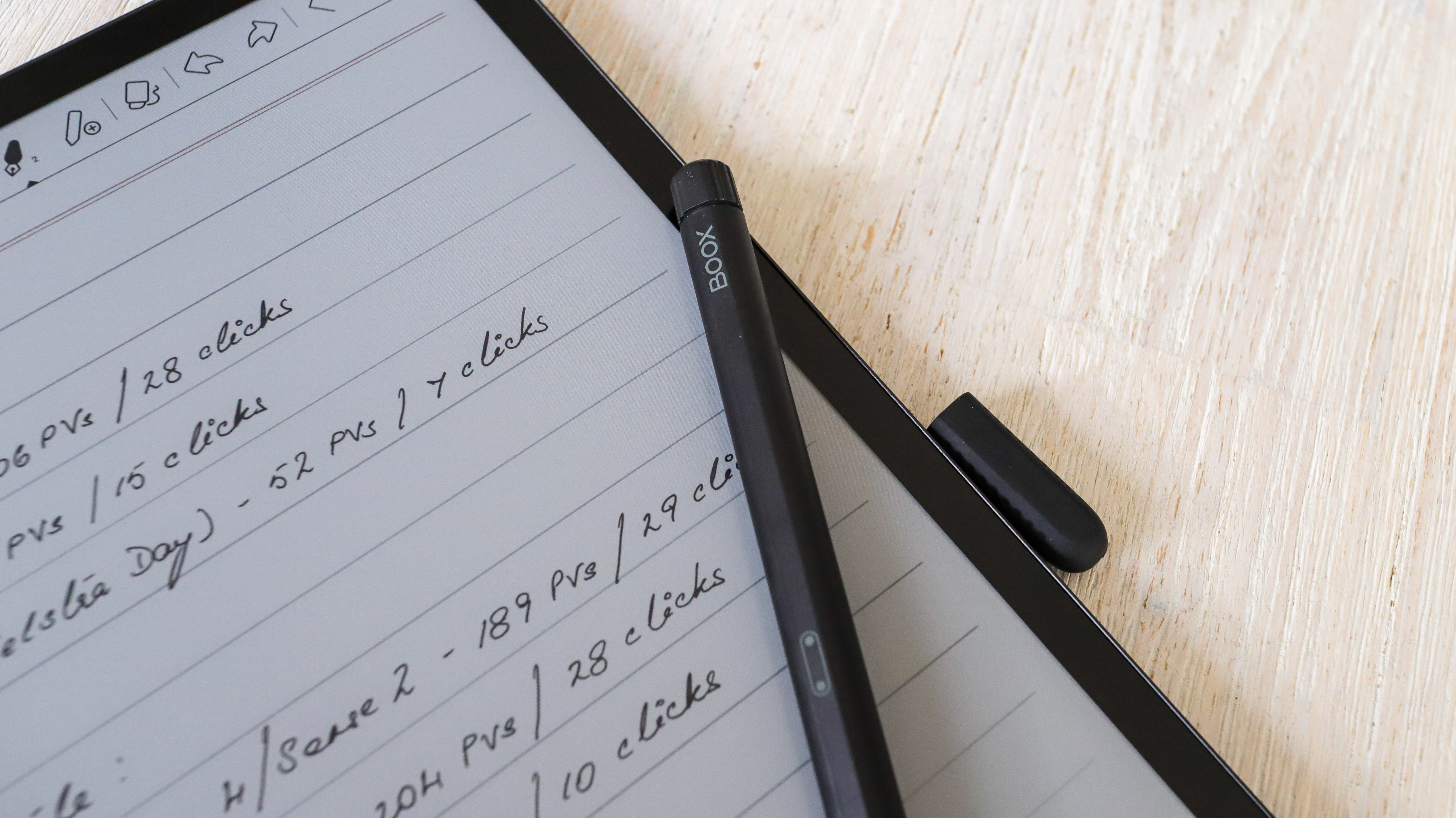
A rear camera bump – for scanning documents – means the tablet doesn’t lie flush on a table, but it's not as pronounced as it is on other multimedia tablets. And it won't be an issue if you use the magnetic or keyboard case. There’s no front-facing selfie camera here.
The front bezels are free of any embellishment with the sole exception of a barely-visible Boox branding in one corner. On the side of the top bezel is the power button and a speaker, while the bottom bezel houses the uSB-C port, mic and microSD card tray. This supports up to 1TB of expanded storage in addition to built-in 128GB.
There’s no 3.5mm headphone jack here but the speakers don’t sound too bad. However, connecting to your favorite Bluetooth headphones or speaker will be better if you’re listening to music (two audio files are supported, so you can sideload some MP3s).
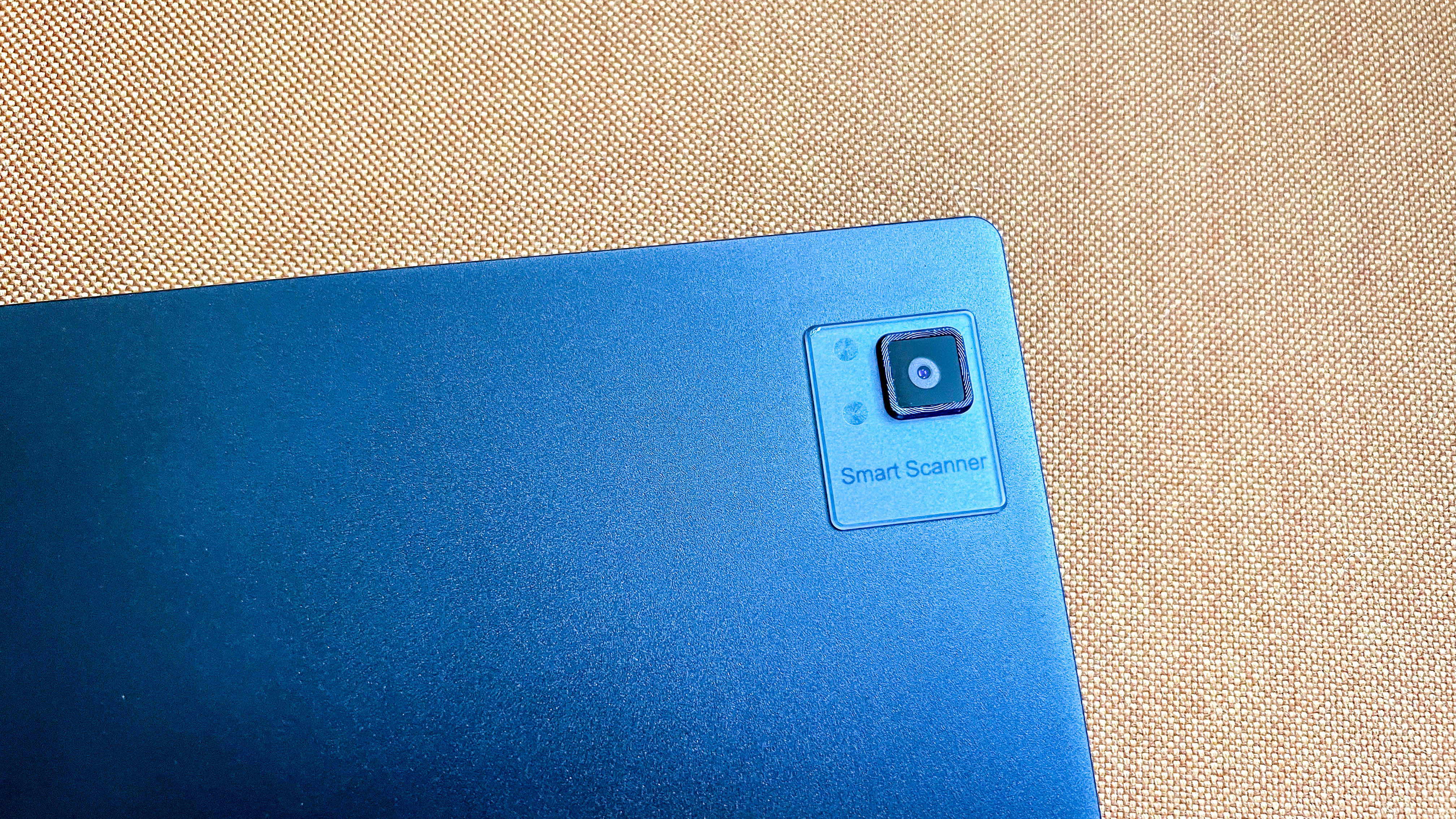
I was sent the Keyboard Cover bundle for this review, so I don’t quite know how the magnetic case looks with the device, but I do like the keyboard. This attaches via the five-pin connector on the side of the tablet. Despite its compact size, the keys are comfortable and there's good feedback from them. Some users might find the keys clacky, but I didn’t mind it at all. Likewise, the stylus that ships with the Tab Ultra C is also great and it attaches magnetically to empty side of the Tab Ultra C. I’ve used it before with the Onyx Boox Note2 Air and the Tab X, and it works really well. I personally love the eraser on the top as it actually manages to erase more surface area than the Kindle Scribe’s pen.
• Design score: 3/5
Onyx Boox Tab Ultra C review: display
- Large 10.3-inch color e-paper screen
- 150ppi resolution in color
- 300ppi resolution for black and white

The main talking point here is the 10.3-inch color screen… there aren’t too many such options on the market. Using E Ink’s Kaleido 3 screen tech gives the Tab Ultra C a nice display for comics and ereaders. All your ebook covers will be displayed in color at a resolution of 150ppi, which is standard for most color ereaders. Screen resolution for black and white is 300ppi.
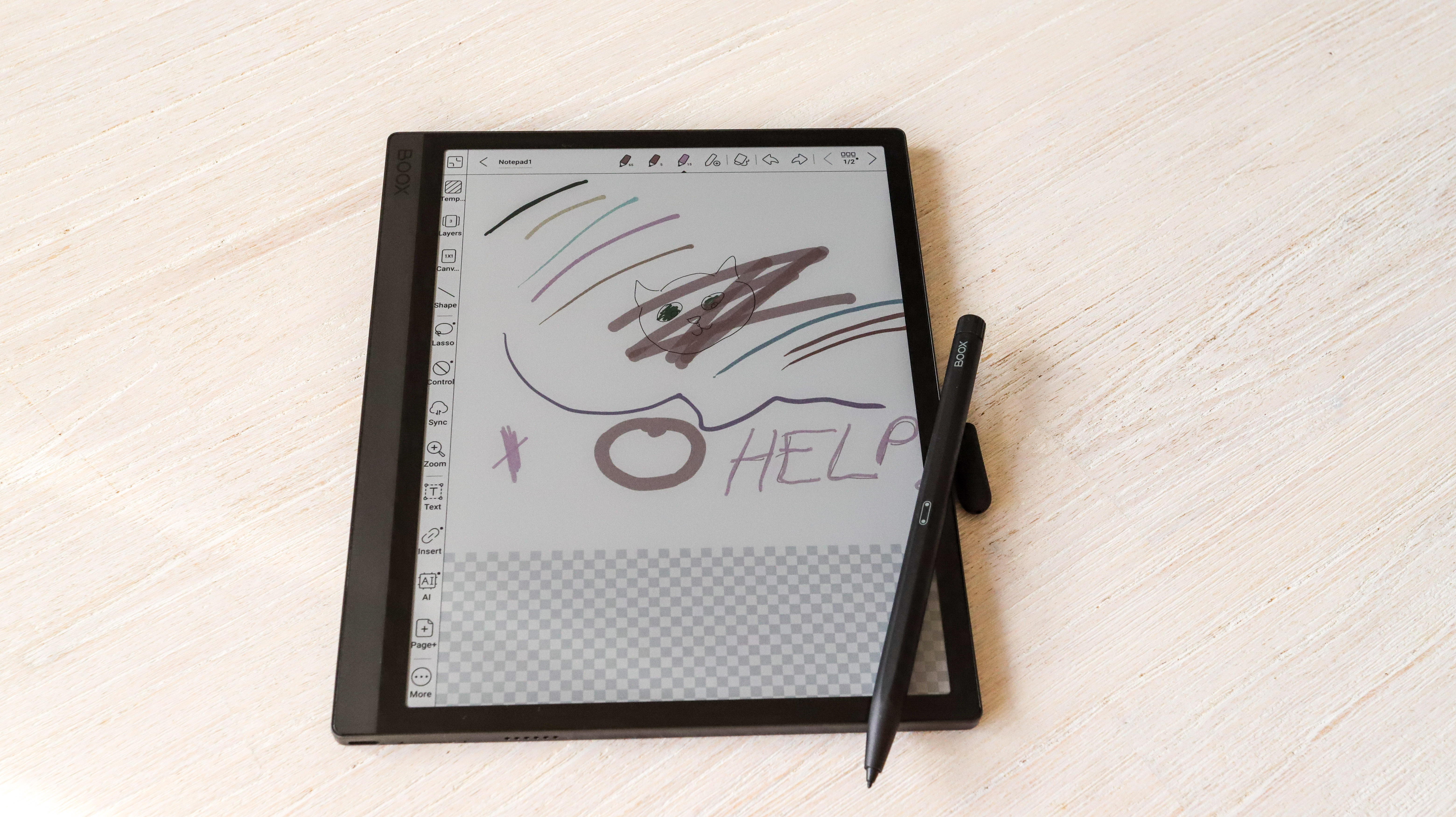
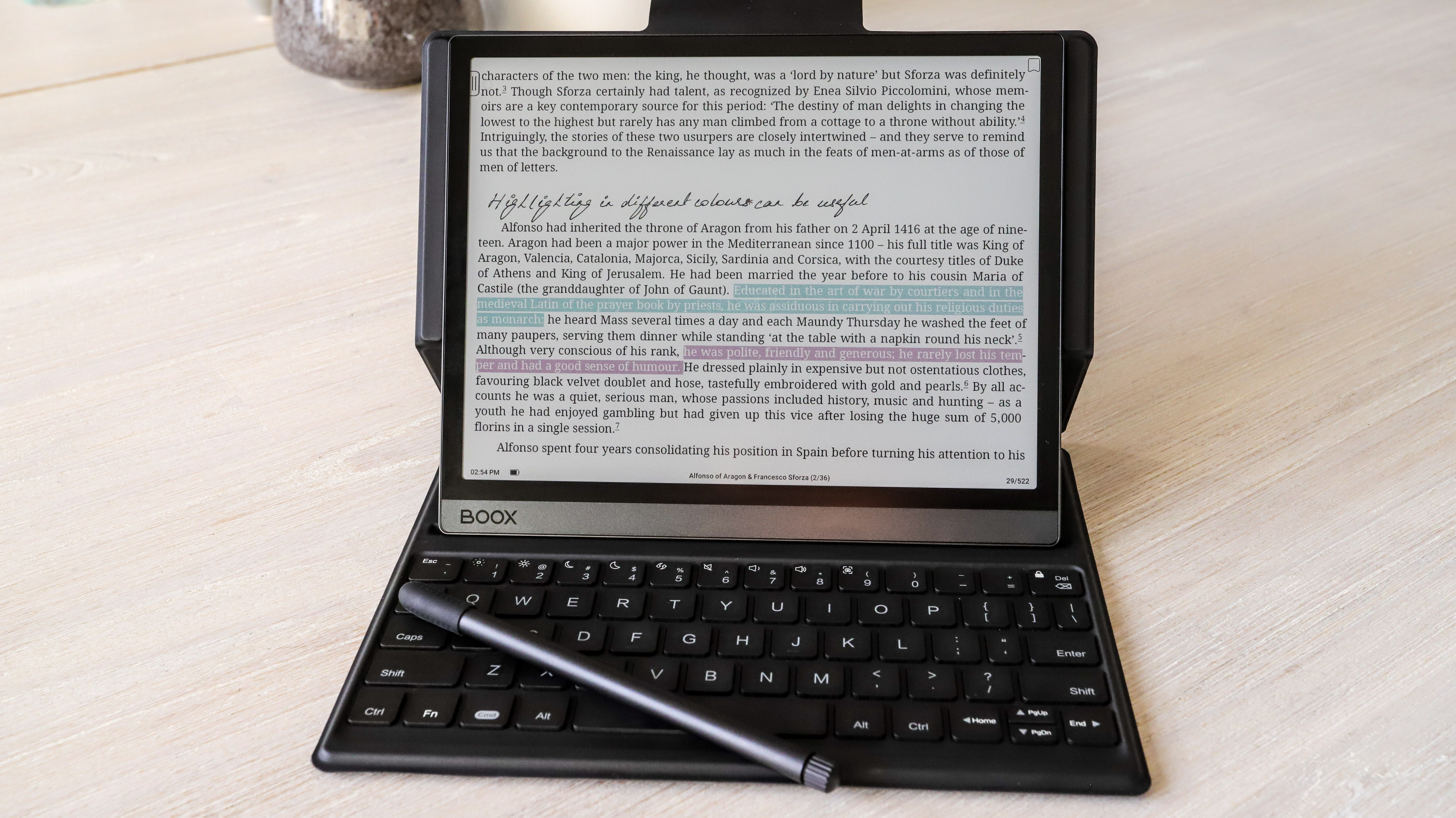
Having a color screen also means you can choose to highlight text in different colors if you are in the habit of adding annotations and notes. And you can draw in color too.
Don’t expect bright colors like you would on an iPad or any other multimedia tablet. E Ink Kaleido tech has limitations and can only display about 4,096 colors that appear washed out on screen. A new tech called Gallery 3 is ready for mass production which promises better saturation, but we still haven’t seen a single color ereader with this screen yet. Soon perhaps. Even with muted colors, it’s a pleasure reading on the Tab Ultra C’s screen.
• Display score: 4/5
Onyx Boox Tab Ultra C review: performance
- Powerful processor for an ereader, but sluggish performance
- Heavy ghosting
- Bad battery management
The color screen is sadly where all the good things end with the Onyx Boox Tab Ultra C. While I loved reading on it, simple tasks like page turns are occasionally slow – whether you use the screen to navigate to the next page or the keyboard (the PgDn key). And this happens on both the default reading application and on the Kindle or Kobo apps that I downloaded from the Google Play Store.
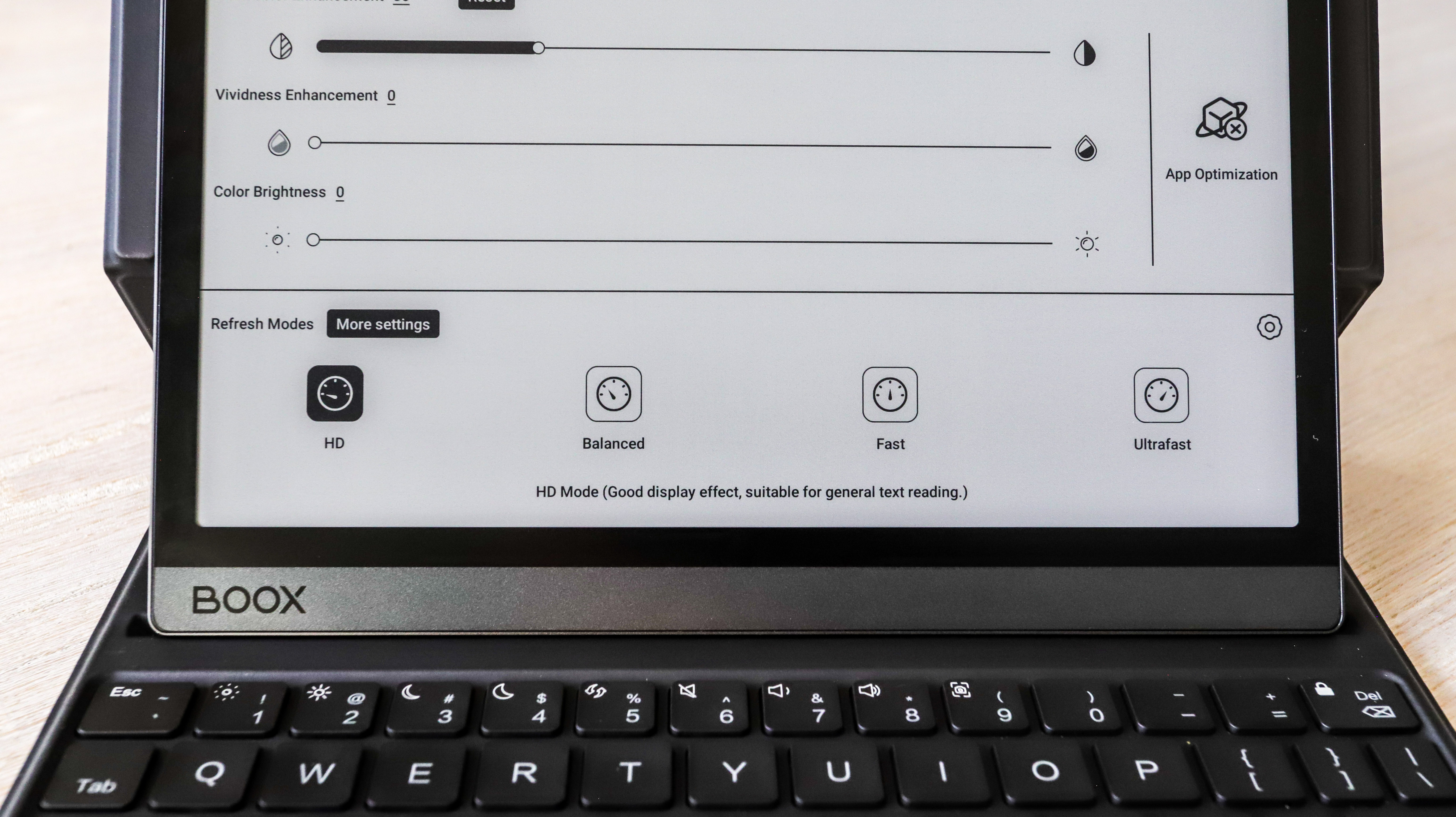
The Tab Ultra C has multiple refresh rate options like the Tab X. And while they work really well on the bigger 13-inch tablet, they don’t seem to function as well here and that means there’s heavy ghosting on most of the applications. It’s very noticeable when reading, which disappears as soon as you change the refresh rate, only to reappear a few pages later. The same occurred when using the built-in web browser or any other downloaded application.
Using the on-screen keyboard is a laggy experience. I’ve used other 10.3-inch ereaders that have faster response times than the Tab Ultra C, and this includes other Onyx tablets. Switch to the keyboard and, while I was expecting a lag there, it’s not as significant. Still, text doesn’t appear in real time and can be a little disconcerting when you’re typing at speed.
It’s a similar experience my colleague had when he tested the Tab Ultra, so Onyx hasn’t done anything different here except to use a different screen. In both cases, this disappointing performance for basic tasks is surprising as the devices have powerful processors in the form of an octa-core Qualcomm Snapdragon 662… well, it’s powerful for ereaders. It’s possible that an over-the-air firmware update might sort a lot of this out – although the two that I did get pushed through to my device didn’t help.
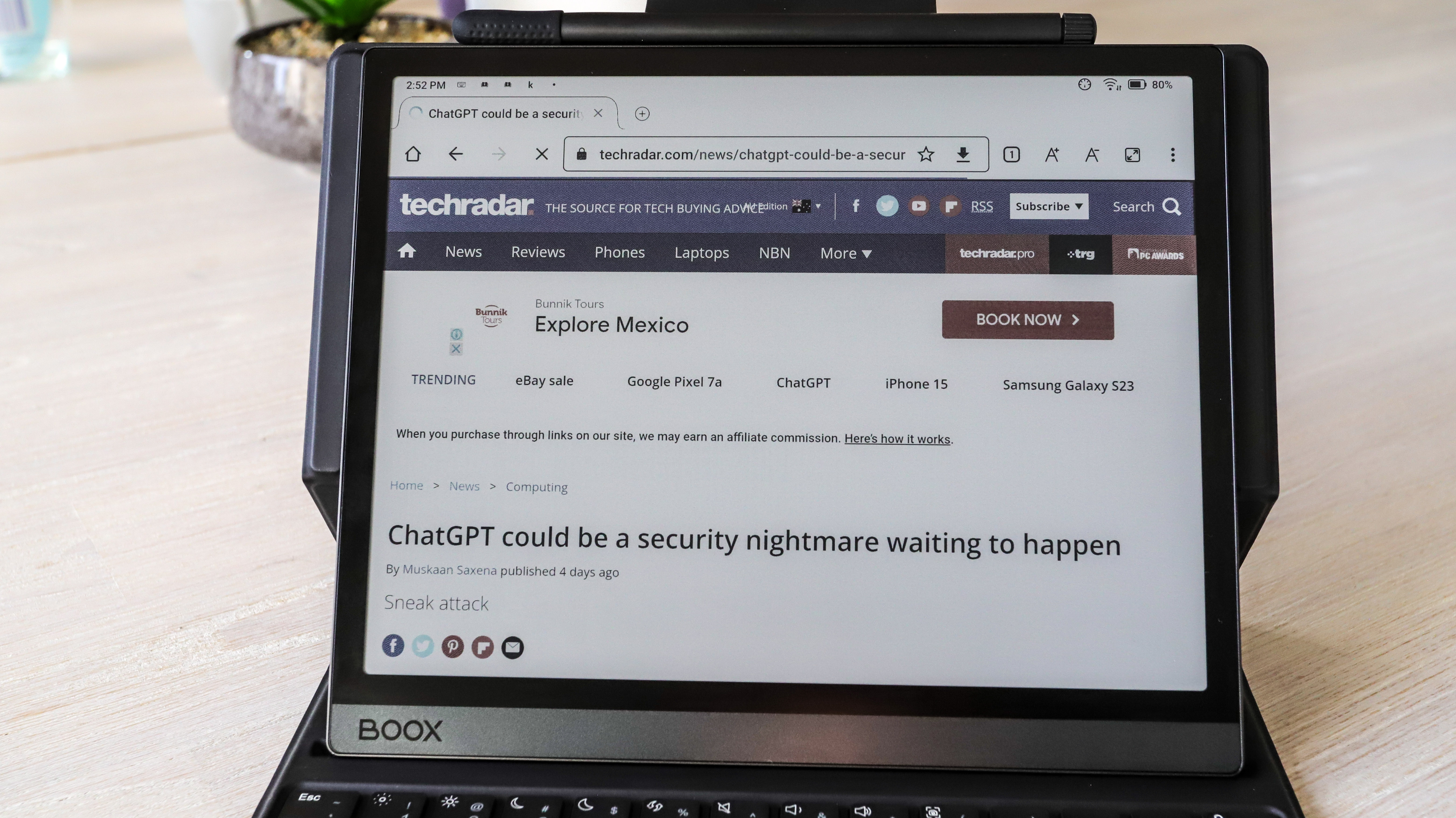
Interestingly, using apps downloaded from the Google Play Store – including some mobile games – run quite well. I even watched YouTube videos and didn’t think they were too bad! And yet basic tasks aren’t being handled well, go figure.
There’s also something not right with the battery management on the device. The drain on the 6,300mAh battery pack seems significant even when you’re just reading. The Onyx Boox Note2 Air Plus has a 3,700mAh battery and lasts about 5-6 weeks while reading, writing, browsing the web and playing mobile games. Similarly, the Kindle Scribe’s 3,000mAh battery goes on for weeks at a time too. The Tab Ultra C, on the other hand, drained in a week while mostly reading with a few minutes of typing via the keyboard cover thrown in…and this is both before and after the firmware update.
Topping up the battery also takes a while but that’s expected from a massive 6,300mAh pack – it took about 4.5 hours to go from 7% to full when plugged into a 9W USB-A wall adapter. For me, it was easy enough to let it charge overnight after I’d finished reading for the night to wake up to a fully topped up ereader.
However, general performance is just not up to scratch, something I did not expect from an Onyx device – pretty much every other one from ereader maker I’ve tested has impressed.
• Performance score: 2.5/5
Onyx Boox Tab Ultra C review: Camera
- 16MP rear camera
- Used for scanning documents
- Feels superfluous
Like the Tab Ultra, there’s a 16MP rear camera on the Tab Ultra C too. Its main task is to help you scan documents and it does that well enough, but not consistently enough. The good thing about the scans are that they’re in full, saturated color… once you’ve shared them to yourself via Dropbox, Boox Drop or cable transfer (or any other method – you link you Google Drive and OneDrive accounts).
The advantage of having this scanning facility is that you can sign the digital copy using the stylus and directly email it as an attachment to whoever needs the document (you can download the Gmail app from the Play Store).
That said, the scanned documents aren’t of the best quality and I occasionally found some copy looking a little fuzzy. That could perhaps be because my hand was shaking too. The device is heavy and you have to hold it two hands to keep it focused on the sheet you’re trying to scan. I found using my iPhone 13 Pro to scan to be a lot easier, rendering the camera on the Tab Ultra C superfluous.
This isn’t a camera you’d use to take regular photos. While it can, what you see is a pixelated, fuzzy rendering of the scene that’s saved in PDF format, not JPG. So you can’t even edit in post-production like you would a regular photo.
• Camera score: 2.5/5
Onyx Boox Tab Ultra C review: Software
- Runs Android 11 with basic interface
- Access to Google Play Store
Software is where Onyx’s tablets shine, with all of them running on Android 11. This gives you access to the Play Store, so you can download pretty much anything… as long as it will run on the E Ink device.
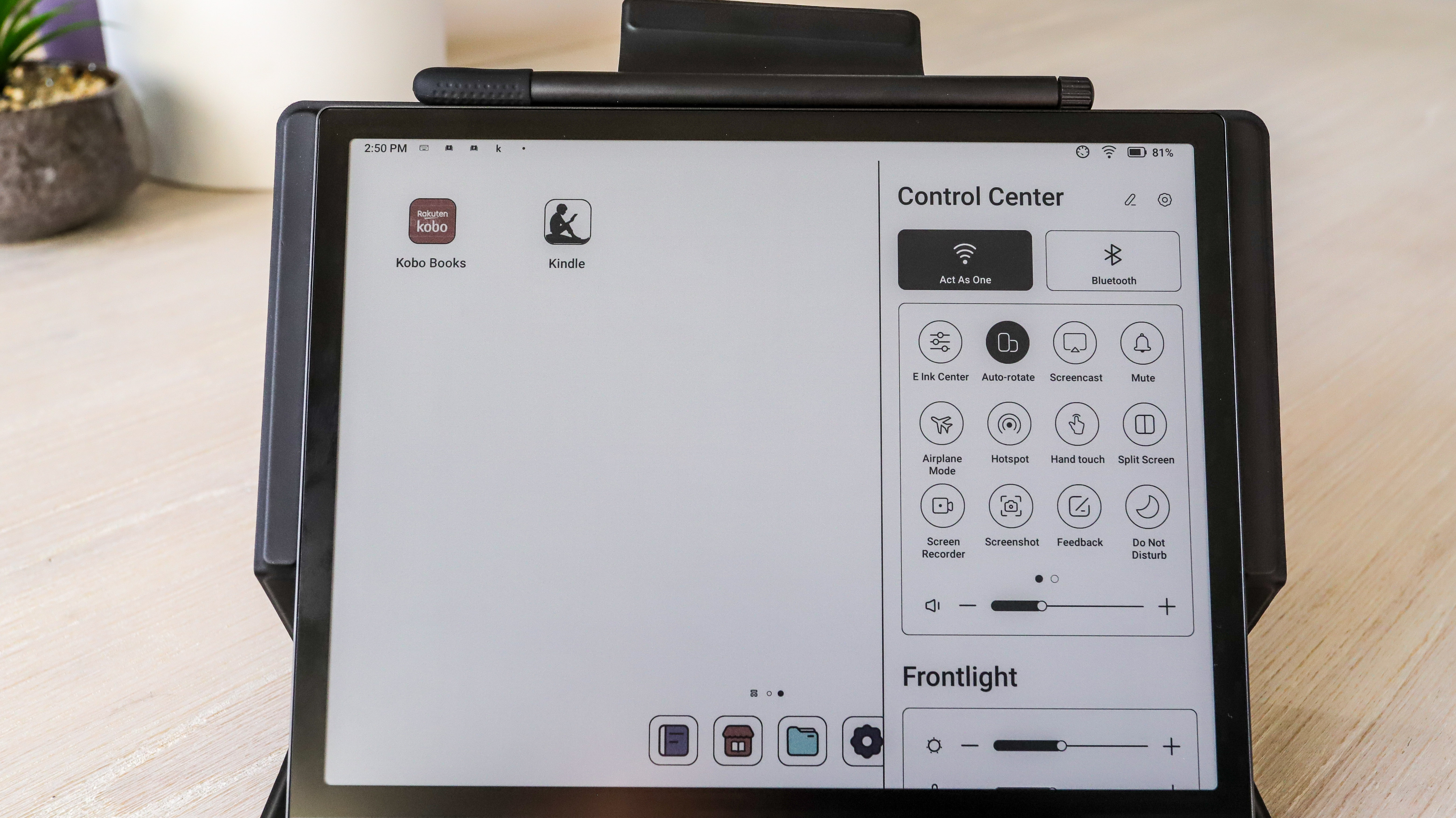
More importantly, though, Onyx has done a marvelous job of adapting the OS to suit the device. The company’s tablets arguably have the most number of settings parameters for you to tweak of any ereader out there and it’s the same here again. In fact, there are times when I feel the adjustments are overkill, but they all work well and once you’ve used them, you wonder why other such devices don’t have something similar. And this goes for the multiple refresh rate options accessible via the E Ink Center (swipe down from the top right corner to bring up the Control Center)… but strangely enough they don’t seem to work as well here.
However, Android 11 is now nearing its use-by date. While security updates may not be important for an ereader, there are going to be apps that no longer run on Android 11, and there’s no way to update to Android 12 (or 13 for that matter).
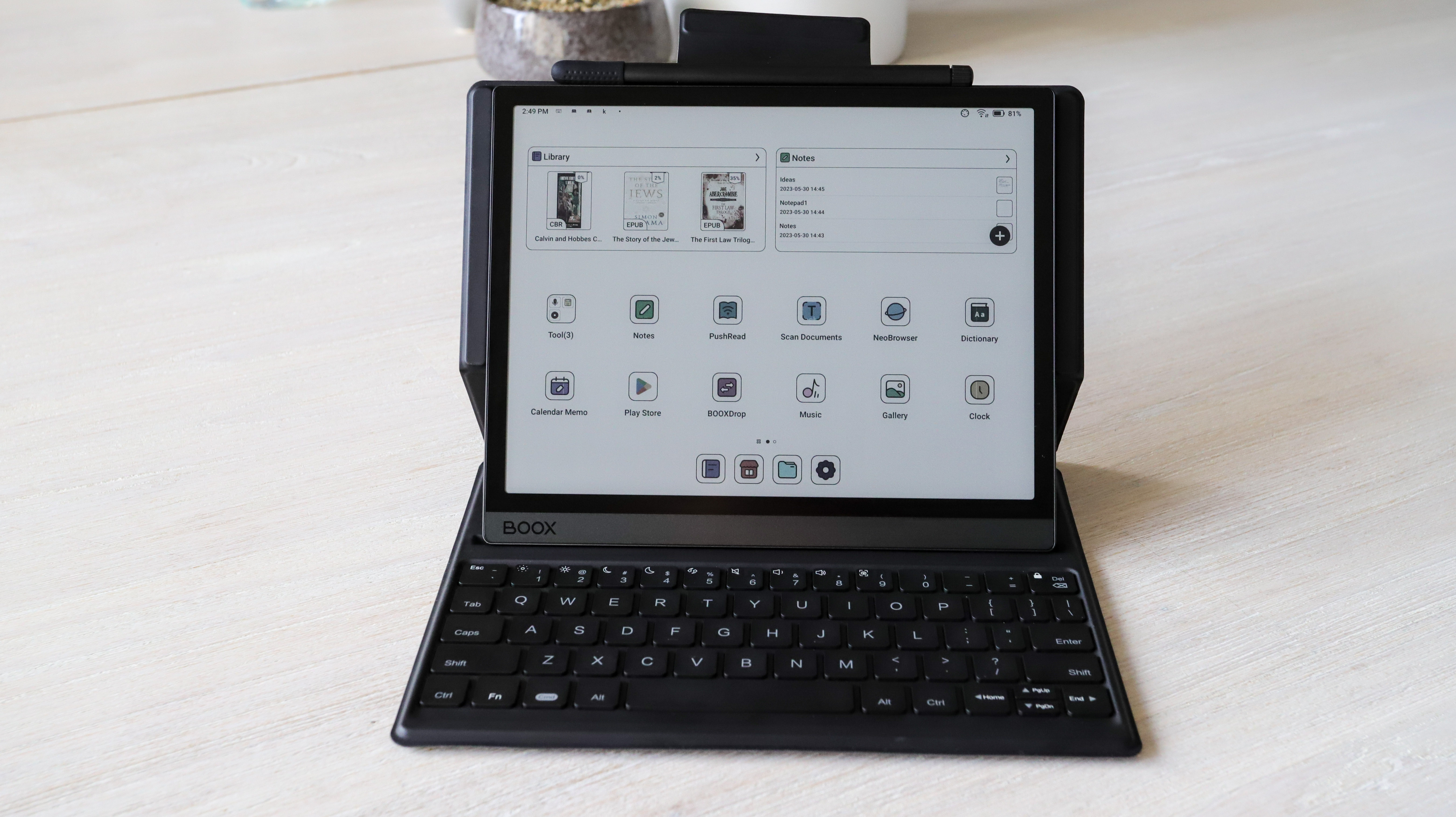
Moreover it’s not the easiest of user interfaces to come to grips with. There’s so much going on – take the default notes application as an example – that it will take someone with a decent amount of technical knowledge to become comfortable with it quickly. The note-taking app looks like a stripped back version of an Adobe application with lots of tools at your disposal. You’ll need time to familiarize yourself with them all to make the most of them. On the other hand, Kobo’s Advanced Notes – despite also offering a lot of features having – is actually a little easier to get to grips with. That’s not to say there’s anything wrong with the UX, it’s just… complicated and is a steep learning curve.
Still, I am a big fan of having Android as the OS on my ereader… I’d really like a newer version though. Android 11 on an ereader released in 2023 feels very dated.
• Software score: 3.5/5
Should I buy the Onyx Boox Tab Ultra C?
Buy it if...
Don't buy it if...
Also consider
It’s hard to consider the Onyx Boox Tab Ultra C as a contender for one of the best ereaders on the market, so if you’re looking for similar alternatives, take a look at a few other options below. There aren’t any other 10.3-inch note-taking ereaders with a color screen, so all the alternatives below have a black-and-white E Ink display.
How I tested the Onyx Boox Tab Ultra C
- Tested for about two months, which included a new firmware update
- Used extensively for reading, writing, drawing and typing using the keyboard folio
- Also used to listen to music and browse the internet often
- Compared with Amazon Kindle Scribe and Onyx Boox Note Air2 Plus
I’ve had the Onyx Boox Tab Ultra C for a while and, during my testing, I’ve had a firmware update rolled out. I began my testing from scratch after this update, in case there were new features or improvements to performance. All told, I spent two months with the device before I started writing my review and used the Kindle Scribe and Onyx's own Note Air2 Plus at the same time to make comparisons.
During this time, I used the Tab Ultra C as my primary ereader, to make notes – particularly for this review – using both the on-screen keyboard and the case, and creating hand-written todo lists and other notes.
While reading, I used different colors to highlight passages of interest to me and also attempted to draw something using different colors. My reading was primarily on the Kindle and Kobo apps that I downloaded from the Play Store – I have accounts for both with purchased ebooks that I could read.
I even spent a lot of time browsing the internet on the default browser. I also watched a few YouTube videos to test the different refresh rate options. I also used it to listen to music by sideloading MP3 files to the default player.
[First reviewed June 2023]


