From the very beginning I have always been an iPhone fanatic.
I was lucky enough to be there, in the room, in 2007 when Steve Jobs launched the original iPhone. Ever since then, I’ve been on a constant cycle of upgrading to a new iPhone once my current model has been flogged to death.
Nowadays I don’t automatically upgrade each year — I usually leave it a few years between purchases, but I’m so heavily invested in the iPhone and iOS ecosystem, both emotionally and spiritually, that I’ve never felt the need to so much as cast a sideways glance at an Android phone. Until now that is…
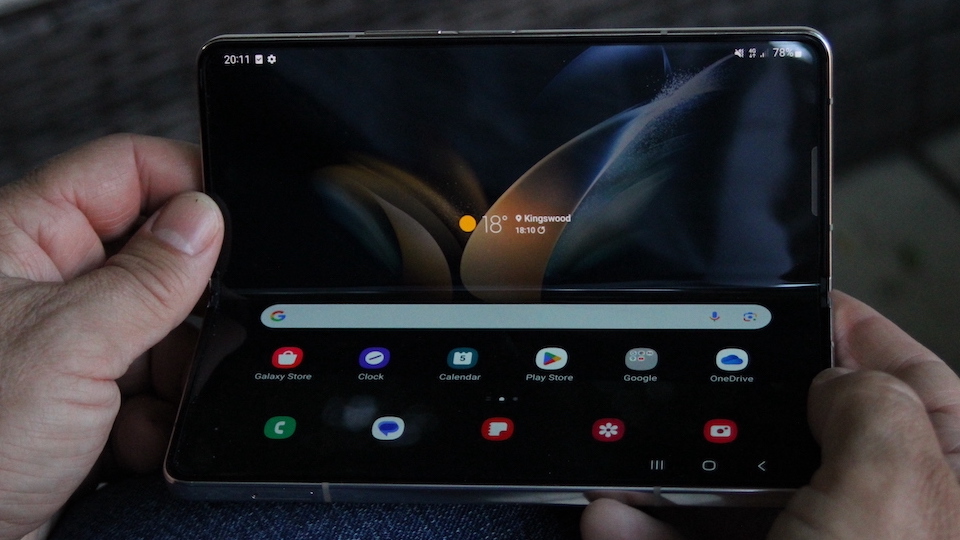
After an initially rocky launch in 2019, in which the folding phone’s longevity and durability were rightly questioned, the Samsung Galaxy Z Fold has matured, and the latest incarnation, the Galaxy Z Fold 4 looks so delicious that even a you-can-take-it-from-my-cold-dead-hand iPhone owner like me has to sit up and take notice. But could I really live with it instead of an Apple flagship like the iPhone 14 Pro? Would it turn my head away from the incoming iPhone 15 and iPhone 15 Pro? And what could Apple learn from it for a foldable iPhone Flip phone?
The only way to know for sure was to see if I could survive for a week using only the new Samsung Galaxy Z Fold 4. There were bound to be a few things that surprised and delighted me about a folding phone, as well as a few frustrations, so let’s see how I got on.
First impressions
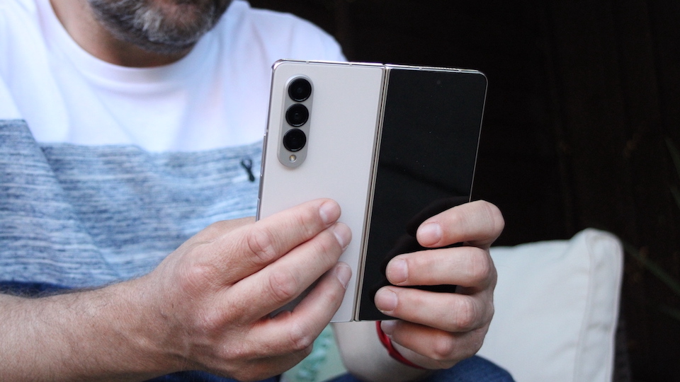
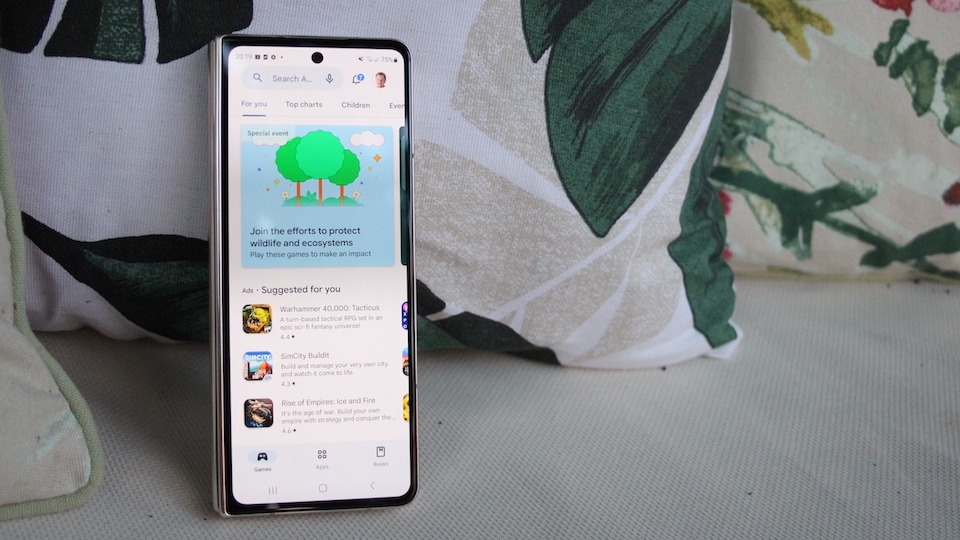
Out of the box, the Galaxy Z Fold 4 looks effortlessly stylish, consisting mainly of smooth Gorilla glass curtained off by a rose-gold aluminium trim. Even for a device that’s more chunky than an iPhone it somehow seems to retain a feeling of elegance. In folded mode it looks long and slim, and slightly narrower than a standard-sized iPhone. I really like that look, since most of what I do on my iPhone — Twitter, Facebook, Messenger, email — consists of a vertical scrolling interface. It becomes apparent very quickly that long and thin is essentially the shape of the Internet, and my iPhone was starting to look a bit short and stocky in comparison.
The one thing you notice when switching phones is just how many apps you have to install, and what a slog it is. Not only do you have to install them all, you also have to log in on them all, which is time consuming, especially if you have no idea what your Facebook password is since you last changed it back in 2015. But the upside here is that I still haven’t really found a crucial app that I had on my iPhone that I couldn’t get on the new Samsung. I could even install Apple Music and keep my subscription going.
Android vs iOS
Like a lot of people, I get used by my parents as free technical support all the time, and being an iPhone owner I used to hate having to try and navigate their Android phones to find that one elusive setting for that annoying thing they wanted to change. But using the Galaxy Z Fold 4, I was surprised to find that now, once you get over the initial hump, Android is actually pretty simple to navigate. Since Apple ditched the Home button in 2016 (something I still haven’t forgiven it for) Android phones are just as easy to use as iPhones.
Or should I say, they are both equally frustrating? On both systems I occasionally lose myself in a confusing mass of swipes up, down or sideways that are almost the same but also just subtly different enough to create a different outcome. At least Android has a software home button that floats at the bottom of the screen and stays there when you are in different apps, along with an easy to understand back button. I wish Apple would reinstate something similar. Even after all these years, I still feel a bit adrift on an iPhone without a Home button to anchor me.
iPhone design vs Galaxy Z Fold 4
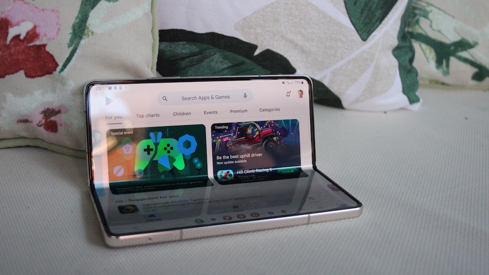
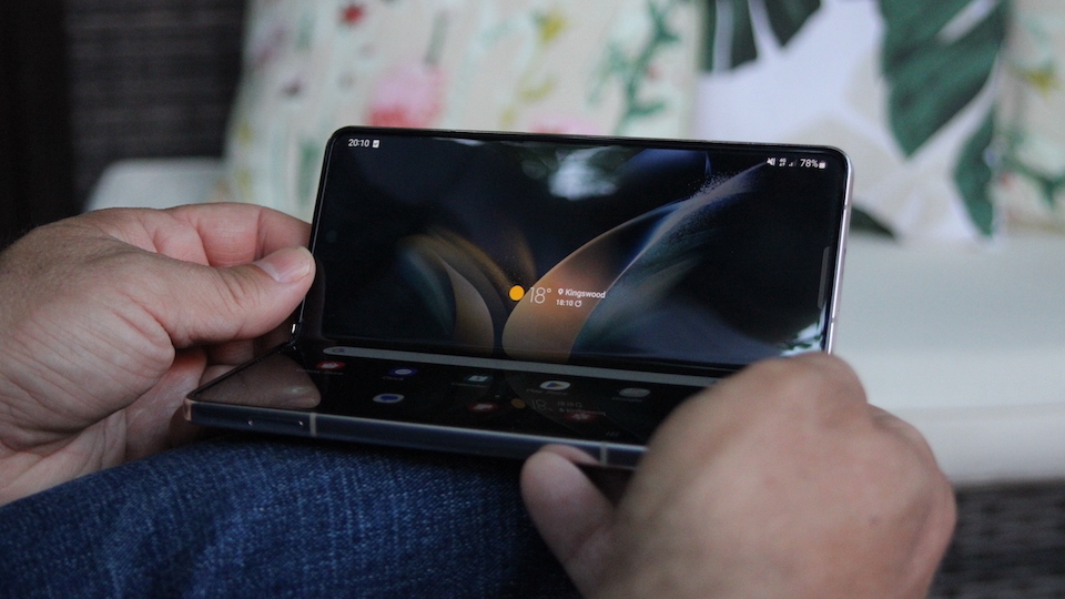
The raison d'etre of the Galaxy Z Fold 4 is that you can use it in three different positions: Folded, as discussed already, unfolded, where it pops out to form a mini tablet, or in a flexed, half open, half closed, position. Flex actually turns out to be a useful way of using the Galaxy Z Fold 4 because in this position you can sit it up on your desk like a mini laptop. It’s a great way to use your phone as a kind of companion device for keeping one eye on Facebook or messages whilst using your laptop for your work, and it makes the iPhone look a bit underpowered in comparison.
Forget picking up your phone to read your messages, now you can just glance down and read things perfectly easily. Some apps, like YouTube make clever use of the fold, so that the video stays in the top half, and the comments remain, quite literally, below the fold. Gmail also shows some design flair, keeping the keyboard below the fold when you are writing an email and the text above.
It’s a great way to use your phone as a kind of companion device for keeping one eye on Facebook or messages whilst using your laptop for your work.
A lot of engineering has gone into getting the folding mechanism just right. It requires just enough force to prise open that it never accidentally opens, but it’s not so stiff that it’s an effort to get into it. When you unfold the Galaxy Z Fold 4 into its tablet form, the fold mark disappears from view completely when you are staring straight at the screen, it’s only visible from the side, which means it genuinely functions like a mini tablet in this mode, which is great for video or games. Then when you fold it back again it shuts with a satisfying click as the two sides come together.
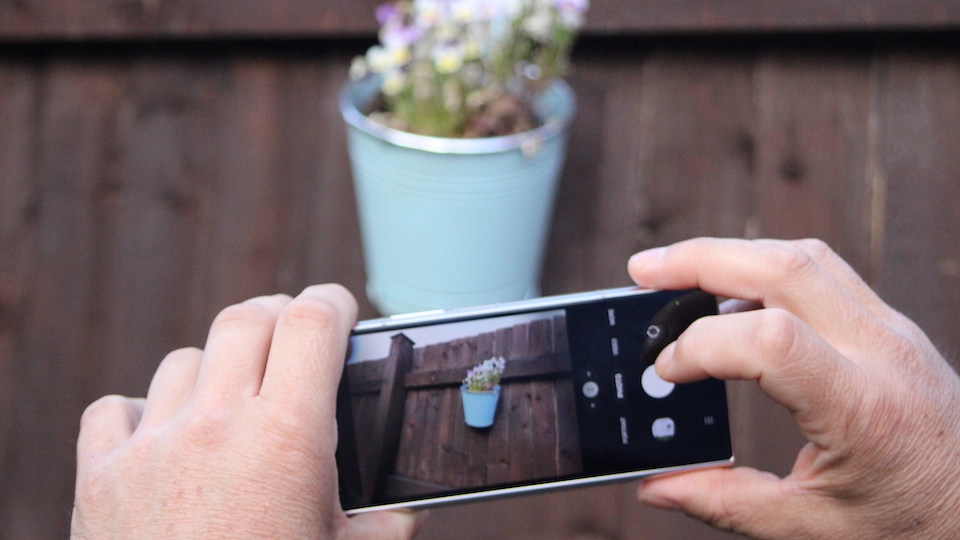
I’m always told that the cameras on Samsung devices are better than the ones on the iPhone, but I don’t tend to obsess over photos to the extent that I can notice the difference. They both take great pictures as far as I’m concerned, but I prefer the layout of the lenses on Samsung phones — all in a vertical line — to the arrangement on the iPhone.
Key takeaways for Apple
So, after going cold turkey on my iPhone for a whole week and using nothing but the Samsung, I’ve come to the realizaton that there was really nothing that I could do on my iPhone that I couldn’t also do on the Galaxy Z Fold 4. It fitted into my life so easily that the once great rivals of iOS and Android are pretty much interchangeable now. I could listen to all the same podcasts, I could use the same websites, and apps. Email was the same, and so on. Even my AirPods Pro worked just fine with it! But I had added two extra phone positions to my life, and I’m going to miss them when I have to go back to my iPhone. I’ve got to say, I really enjoyed the geeky fascination of being able to fold and unfold a phone. What was also fascinating to me was that my family, who are also die-hard iPhone users, didn’t share my enthusiasm for folding phones at all, and I think that’s when it hit me — folding phones are for geeks. And I’m a geek!
When I look back to that hallowed auditorium at MacWorld in 2007, it’s easy to forget how revolutionary, but also geeky the first iPhone was. It was the first time most people had ever seen a touch screen device that could fit in their pocket and we just couldn’t believe our eyes.
The people who brought the original iPhone weren’t a mainstream audience — they were geeks and early adopters excited by the technology. Even more so once they later found out there was going to be an App Store and that anybody who signed up could code their own apps. This was geek heaven.
As the iPhone got more popular it became cooler to own one and it slowly moved into the mainstream taking up its place alongside big name brands like Nike, Disney and Coke. Now it’s the safe choice when it comes to buying a smartphone, and sadly that has led to a stifling of innovative features like folding technology, that has let Google and Samsung slip into the position of disruptors in the market.
For too long now Apple has been playing it safe with the iPhone. In fact, until it announced the new Apple Vision Pro, it had been playing it safe across the board. Before Vision Pro, its last big product, the Apple Watch, was hardly revolutionary, but with its bold step into headsets, Apple is showing signs that it might not be afraid to take a risk or two again. Perhaps Vision Pro can be the spark of inspiration that ignites the iPhone again, because at the moment it looks like Samsung and Google are ahead of the game.


