The question that’s usually top of mind when we’re shopping for a new gadget is: Do I really need another screen?
Apple’s Vision Pro, which attempts to subsume reality into the company’s curated, high-fidelity walled garden, asks it aggressively. AI gadgets, like the Rabbit R1, ask it more quietly and cutely. But we’re approaching what feels like life’s “carrying capacity” for screens that do things, and something is bound to change.
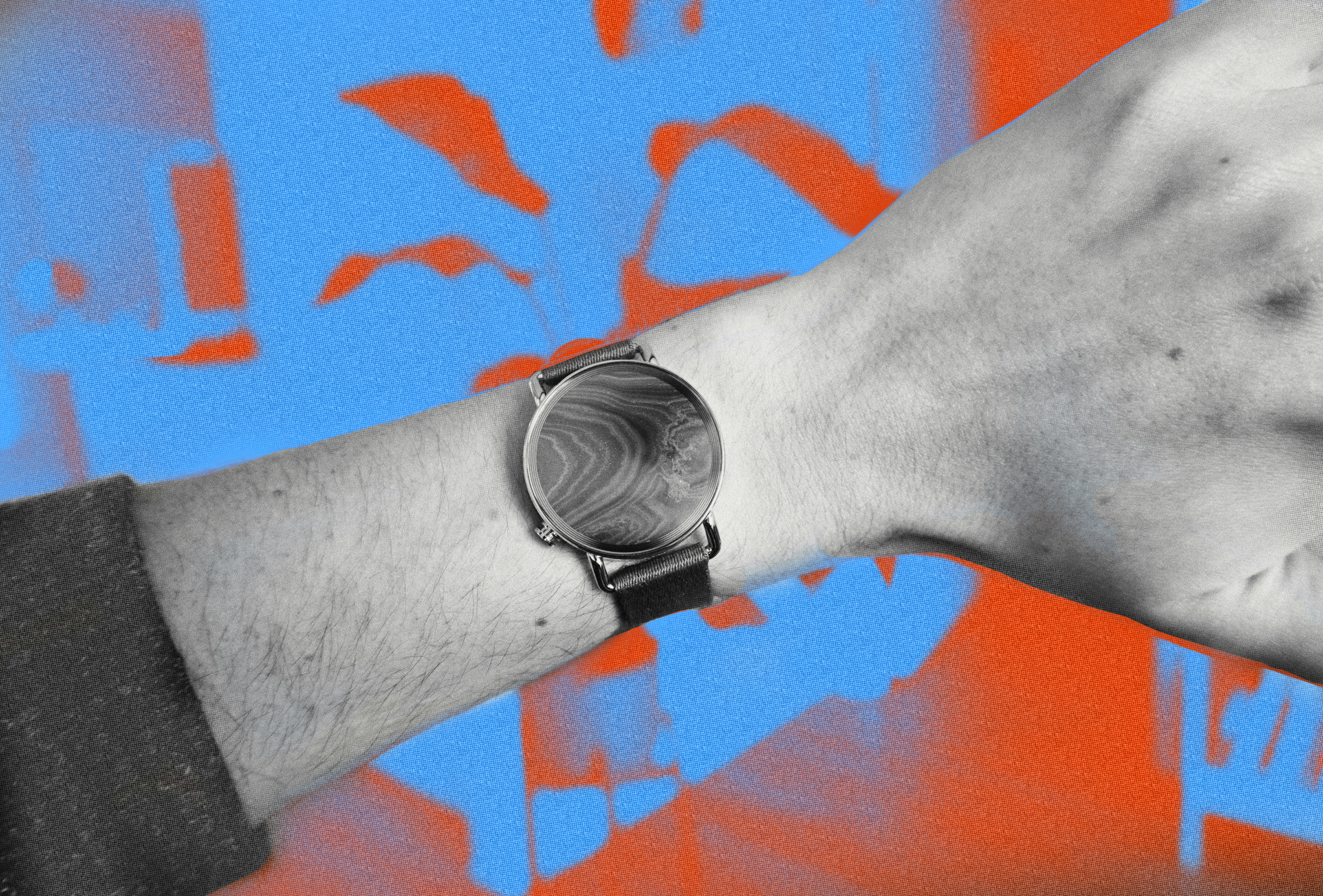
The Nowatch, created by a company of the same name from the Netherlands, is a “smartwatch” trying to sidestep that issue by using no screen at all. I know what you’re thinking: How is a smartwatch “smart” without a display? The wearable comes with an interchangeable dial that can be filled with discs made from precious stones, metals, and even a clock, that tracks your health and fitness, but pointedly doesn’t show you notifications, apps, or more visual information. Instead, the Nowatch offloads all of that to your smartphone.
This hybrid device with no screen that can still track your health and fitness is a strategy that has worked well for the Oura ring, but the Nowatch runs into some natural obstacles because of its form factor. I tried the Nowatch for a month and while it’s great at not being a full-blown smartwatch, it also can’t quite escape the fact that you wear it on your wrist.
Nowatch

A Wristwatch with a Missing Piece
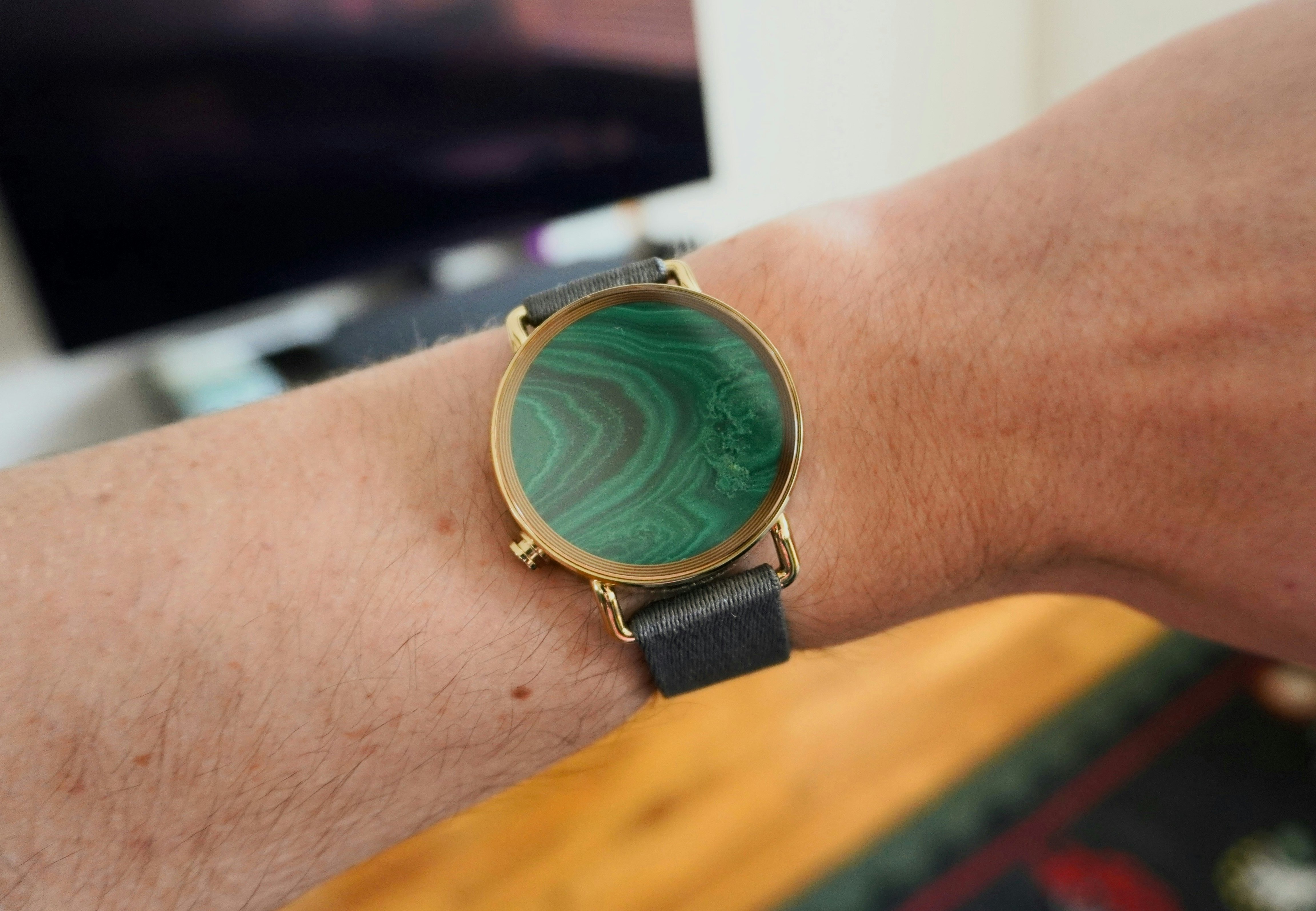
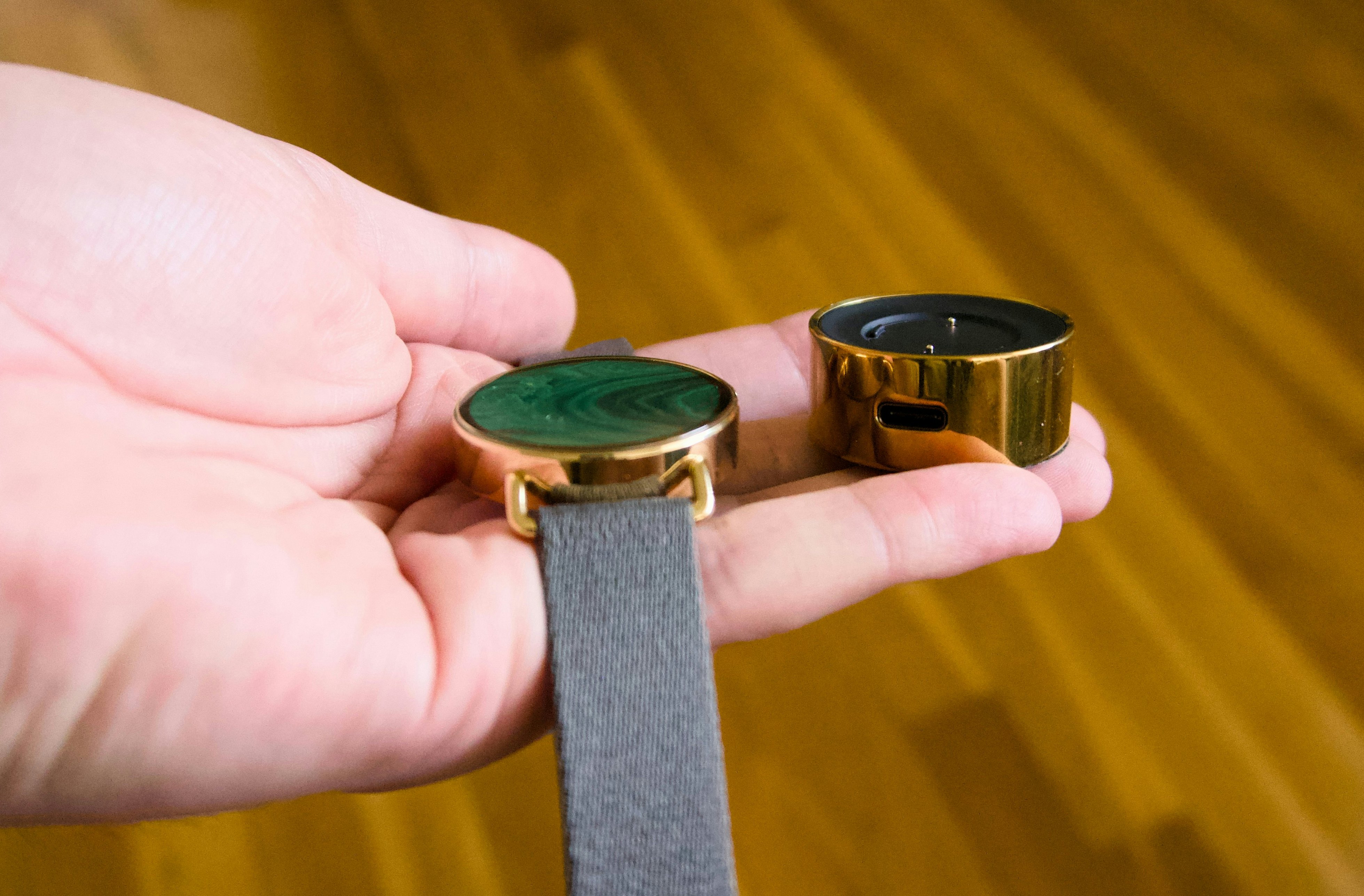
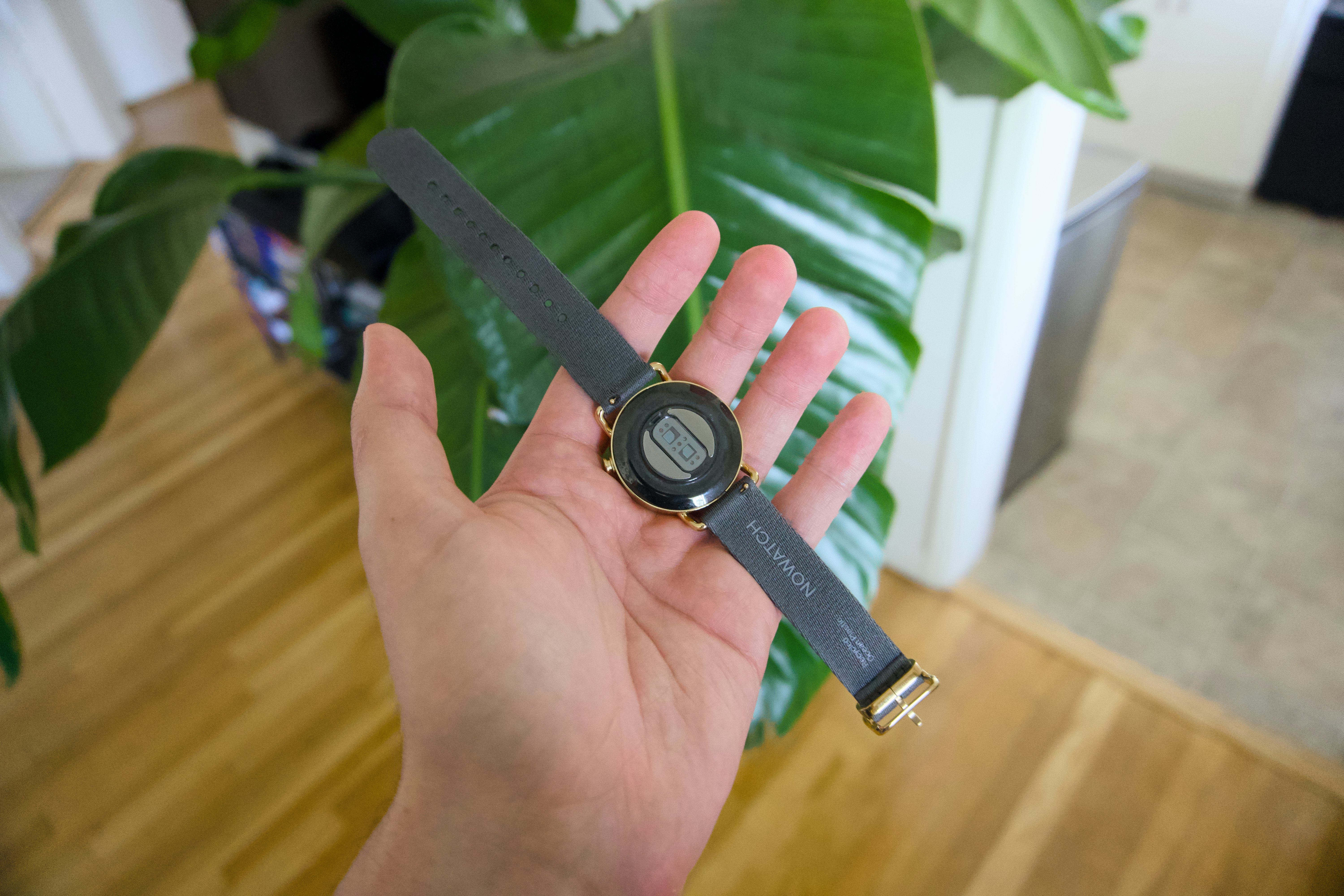
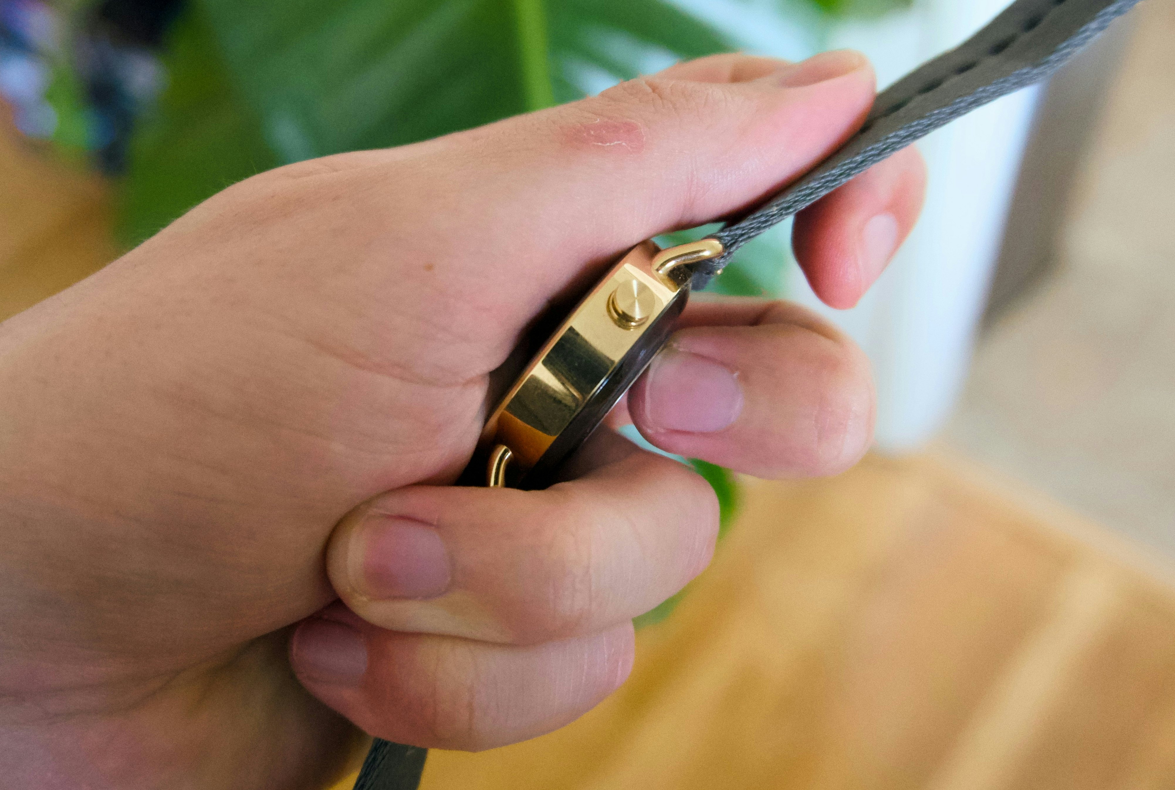
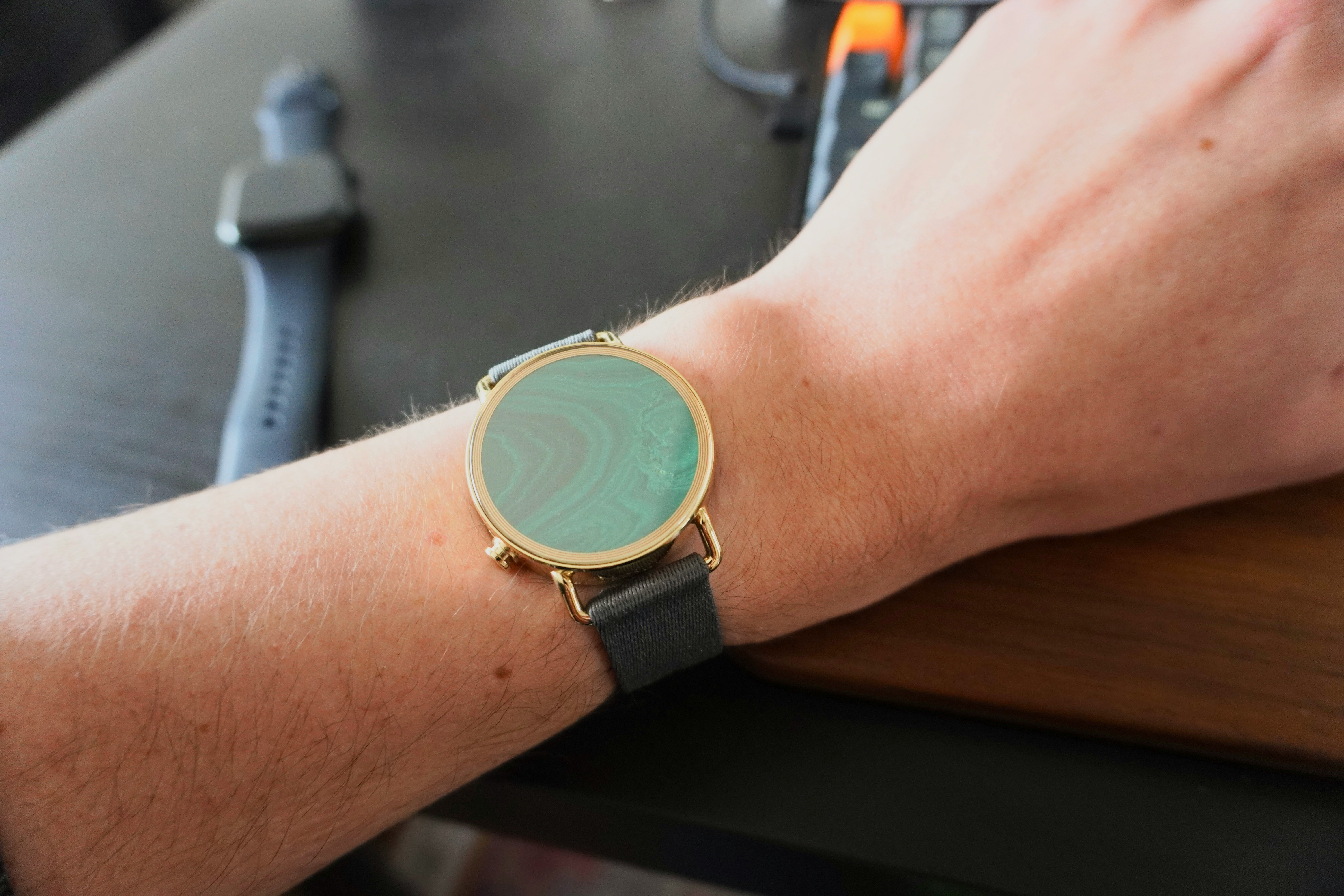
At first blush, the Nowatch looks the most like a traditional wristwatch of any wearable I’ve worn. It’s round (a plus in my book) with removable straps that use the same retractable pin system as most classic watches, and features one button on the bottom left that acts as the Nowatch’s sole input method. If you look at it from the side, the Nowatch is thicker than your average Timex Weekender, likely to accommodate the sensors on the bottom, but it still feels noticeably slimmer than an Apple Watch or Galaxy Watch.
In terms of health and fitness tracking, the Nowatch can track your heart rate, body temperature, blood volume circulation, breath rate, blood oxygen concentration, and movement. It has a host of sensors you might already be familiar with on other smartwatches like a photoplethysmography or PPG sensor (using flashing lights to examine your blood), an EDA sensor for monitoring electrodermal activity (like the Fitbit Sense 2), an accelerometer, barometer, and temperature sensor.
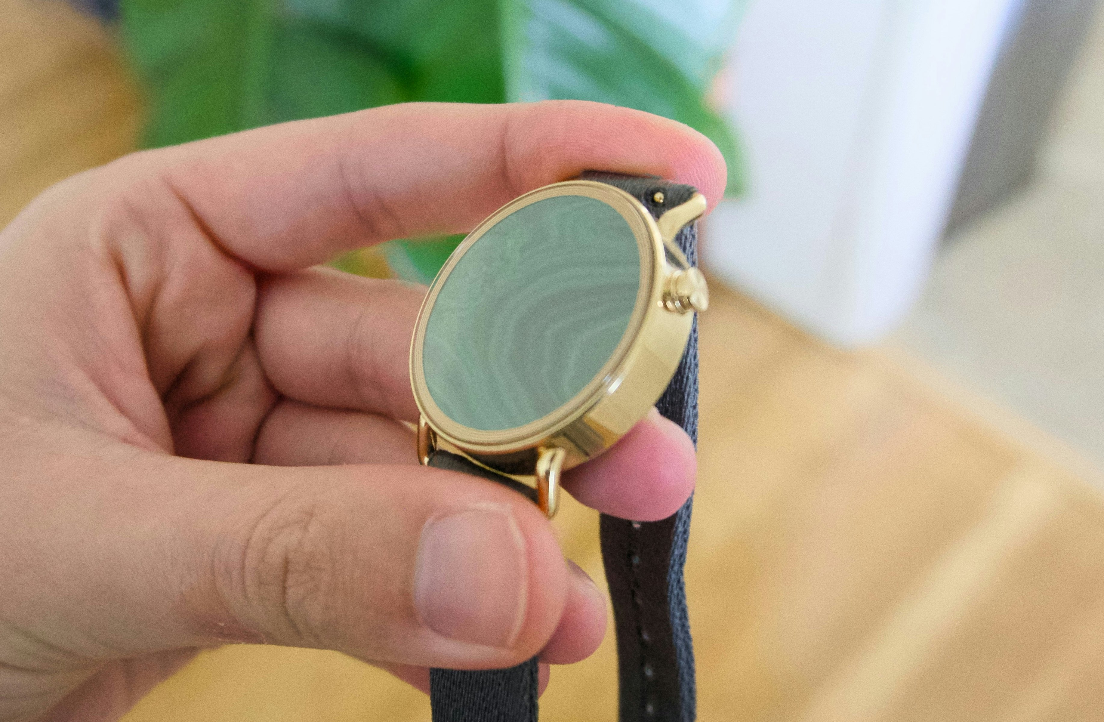
The most visible gimmick of the Nowatch, and the one that strangely felt the most satisfying while I was using it, is its interchangeable dial / watch face. Originally, Nowatch exclusively sold metal and stone discs that could be magnetically removed and reinserted (using the charger) to change the look of your watch. My model shipped with a brushed gold disc that’s curved in such a way to make it look “deeper” than it already is and a green malachite disc with a nice swirl that was fun to look at throughout the day. These serve no purpose beyond their aesthetic for me, but I like that you get the option to choose them. At CES 2024, Nowatch announced it would start selling traditional watch face inserts called “Time Discs” too, because as I’ve learned, I think it makes the Nowatch make more sense.
Wearing Nothing
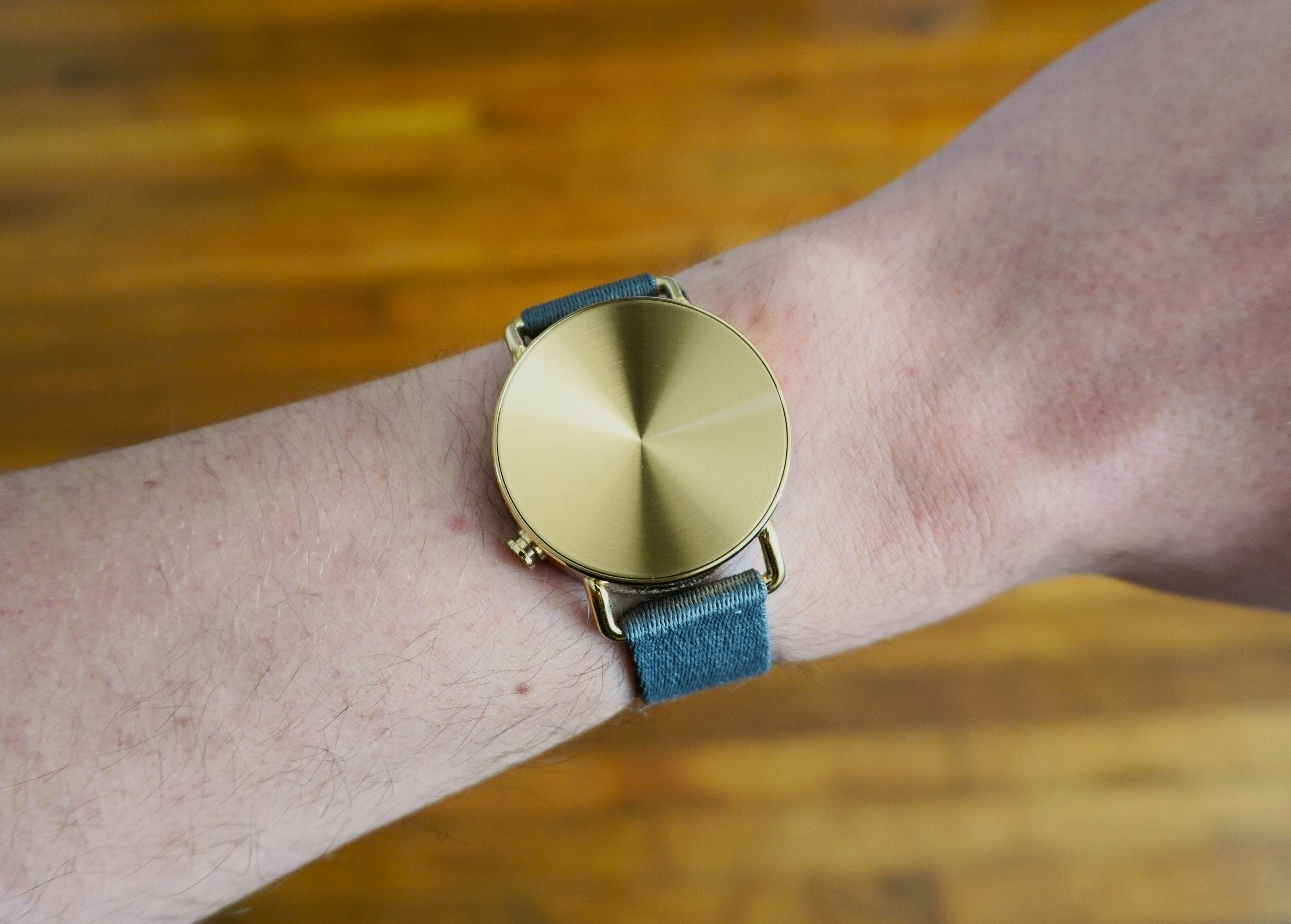
Wearing the Nowatch was a very pleasant experience. The leather band that shipped with my watch was more rigid than the fabric one I later switched to, but overall, it was just as easy to forget I was wearing it as any other smartwatch. The fact that the Nowatch looks like a regular timepiece on your wrist goes a long way to making it fit into your life. To most people, it’s normal.
Like other wearables without screens, you do have to get used to new behaviors to make sure you’re using the Nowatch to the fullest. In this case, checking the Nowatch’s companion app in the morning to make sure all of your sleep data is synced and to view its battery life, and then checking in at the end of the day to set alarms and learn any insights Nowatch has spotted.
The first key annoyance I had with the Nowatch wasn’t that this behavior was required, but that it felt like the watch wouldn’t always sync information to the companion app unless I opened it at least once throughout the day. I know that third-party Bluetooth devices on iOS can function as second-class citizens in comparison to the connection the Apple Watch has with an iPhone, but the Nowatch’s inconsistent ability to connect and transfer data was a small red flag that never quite left my mind.
An Obtuse Companion App
For a nice-looking watch that is easy to wear, it might not matter that you have to double-check if it’s actually syncing data. The real problem, though, is that the companion app you have to use to view it all leaves a lot to be desired.
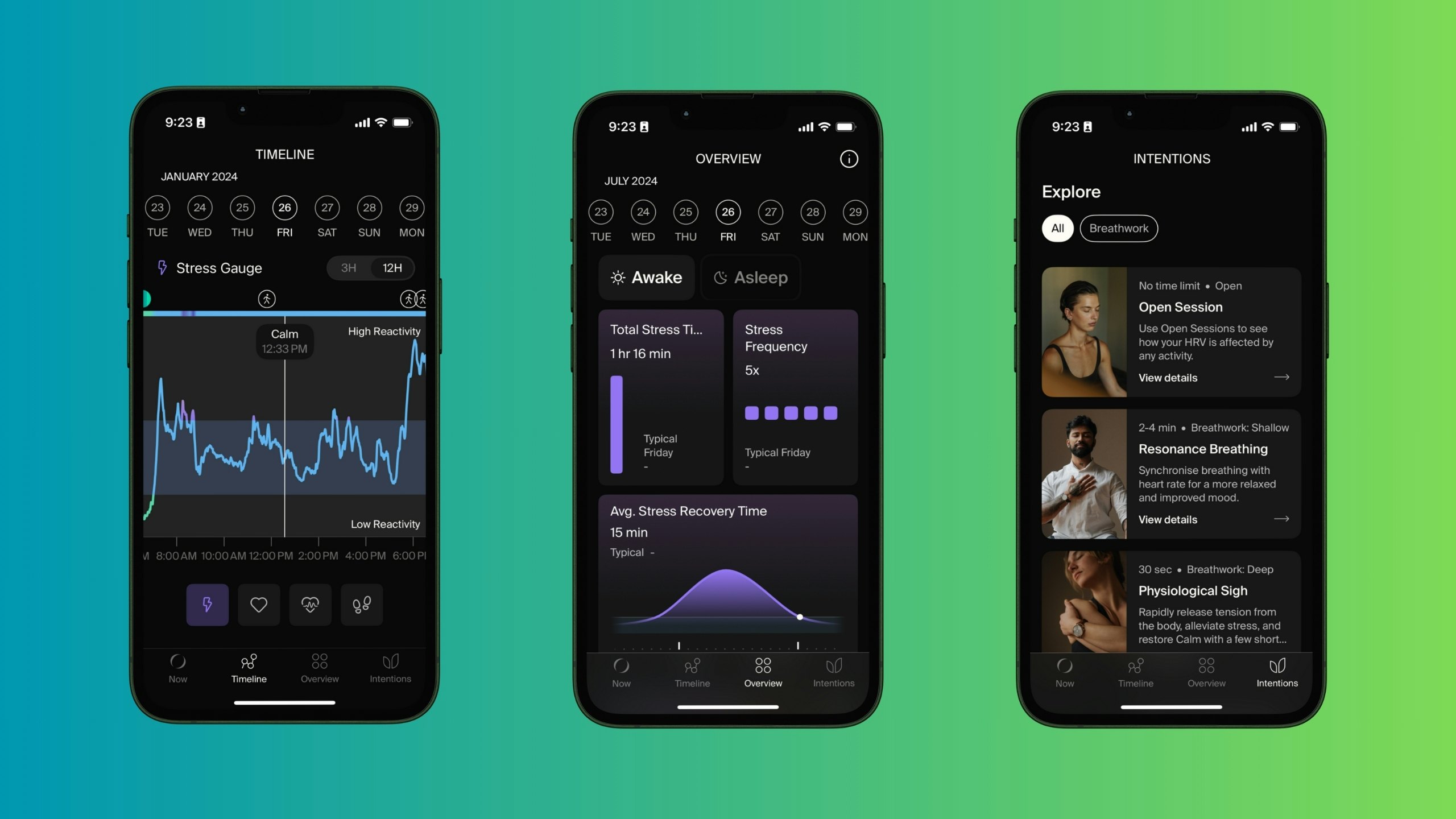
The Nowatch app presents itself as simple enough, but hides a lot of unnecessary complexity. The app’s main “Now” screen displays a swirling mass of particles that change color based on your level of stress. Tap the screen and you can pull up information like your current stress level, steps you’ve taken, and your heart rate. Press the “+” button, and you can set alarms, record a “session,” or complete a “check-in.” And at the bottom, there are three other tabs to choose from, “Timeline,” “Overview,” and “Intentions.”
The Timeline presents a day-by-day graph of the stress, heart rate, heart rate variability, and steps the Nowatch tracks. Things get more complicated in the Overview tab, which includes data about how you slept the previous night, trends in your heart rate, stress levels, activity, check-ins (essentially a mini-survey that requires answers about mood and what you’re doing), and an AI-generated daily report.
I like that Nowatch is monitoring all of this information. My issue is that it gives you few tools to understand these numbers and charts, or how to change them in a positive direction outside of the daily report. Other than a single page explaining what each chart or bar graph measures, there’s little in the way of instructions. Nowatch creates a summary of your various health trends and pairs it with a tip from the philosophies and wellness trends that are popular with the tech crowd. I’ve seen a lot of Stoicism and mindfulness tips that are fine if you’re into that kind of thing, but they don’t feel particularly catered to me or what I’m going through.
I’ve written about this before while covering the Oura ring, but the best thing a wearable can do for you is make its information actionable. Some companies do this by making their products akin to medical devices through FDA approval and clearance, essentially applying some level of definitive diagnosis, but most just try to explain information in a way that’s approachable and usable. My frustration with Nowatch is that there’s very little of that in the current companion app and the stuff the AI writes, while certainly not useless, isn’t really hitting the spot. This could still change with some software updates, but even after a few months of tweaks Nowatch has added to its app, I can’t say it’s been improved.
Proactive information is one of the things that makes a wearable actually feel useful when you’re wearing it...
What I think is working is Nowatch’s approach to stress tracking and management. By combining all of the Nowatch sensor data, the company is able to monitor your relative stress level, noting how much of your day you spent calm, stressed, physically active, and when those shifts put you in low or high reactivity. By pressing the side of the Nowatch once, you can mark a specific moment during the day that you want to refer back to; pressing the same button twice starts a session that will monitor your health stats as long as you’re tracking. Combining these two tracking methods, you can start to puzzle out what things during the day stress you out and then decide if you want to do them anymore.
There’s also a setting you can toggle inside the companion app that can have the Nowatch buzz your wrist anytime it detects you’re stressed — a super simple reminder to take a breath and re-center yourself. This is the stress tool I found the most useful, along with the Living Lab tab in the companion app that includes basic breathing exercises you can do if you’re feeling particularly overwhelmed. Proactive information is one of the things that makes a wearable actually feel useful when you’re wearing it, and in a watch mostly free of proactive tips, this stress tool stood out. I could see other wearables easily adopting it.
I Need More and Clearer Information
The Nowatch isn’t the perfect health and fitness wearable, and software updates haven’t radically changed it. There’s nothing stopping Nowatch from making it that way, of course, but its success as a general distraction-free gadget is more complicated.
You don’t expect a ring to do anything other than look pretty, so a smart ring that offers no information outside of its companion app isn’t really a negative. Something watch-shaped that you wear on your wrist is a different story. The number of times I looked at the Nowatch expecting to see the time is too high to count. I never learned my way around it. It makes sense the company is starting to sell a proper watch face as an option because, despite its name, the Nowatch is much more attractive as a watch than it is a rock or metal disc.
The Nowatch is a curiosity with a few clever ideas rather than an essential alternative to the wearables you might already own.
The customization options Nowatch offers are nice and cleverly implemented, but ultimately, saving yourself from the distractions of stress-inducing notifications doesn’t prevent you from having to visit your phone to sync data. One trip to your phone and you’re right back to being exposed to all of the things you were trying to avoid. Not to say we should all just embrace screens, it just means that everything else about how the Nowatch works should have gotten more consideration.
I’m sympathetic to the idea of the Nowatch, but it makes more sense to me as a classy (though very traditional) wearable than something that’s going to change your relationship to your mental well-being, especially with a €530 (approximately $572) starting price. Maybe if the app worked perfectly or if the watch shipped with the ability to tell time by default, but as it stands, the Nowatch is a curiosity with a few clever ideas rather than an essential alternative to the wearables you might already own.


