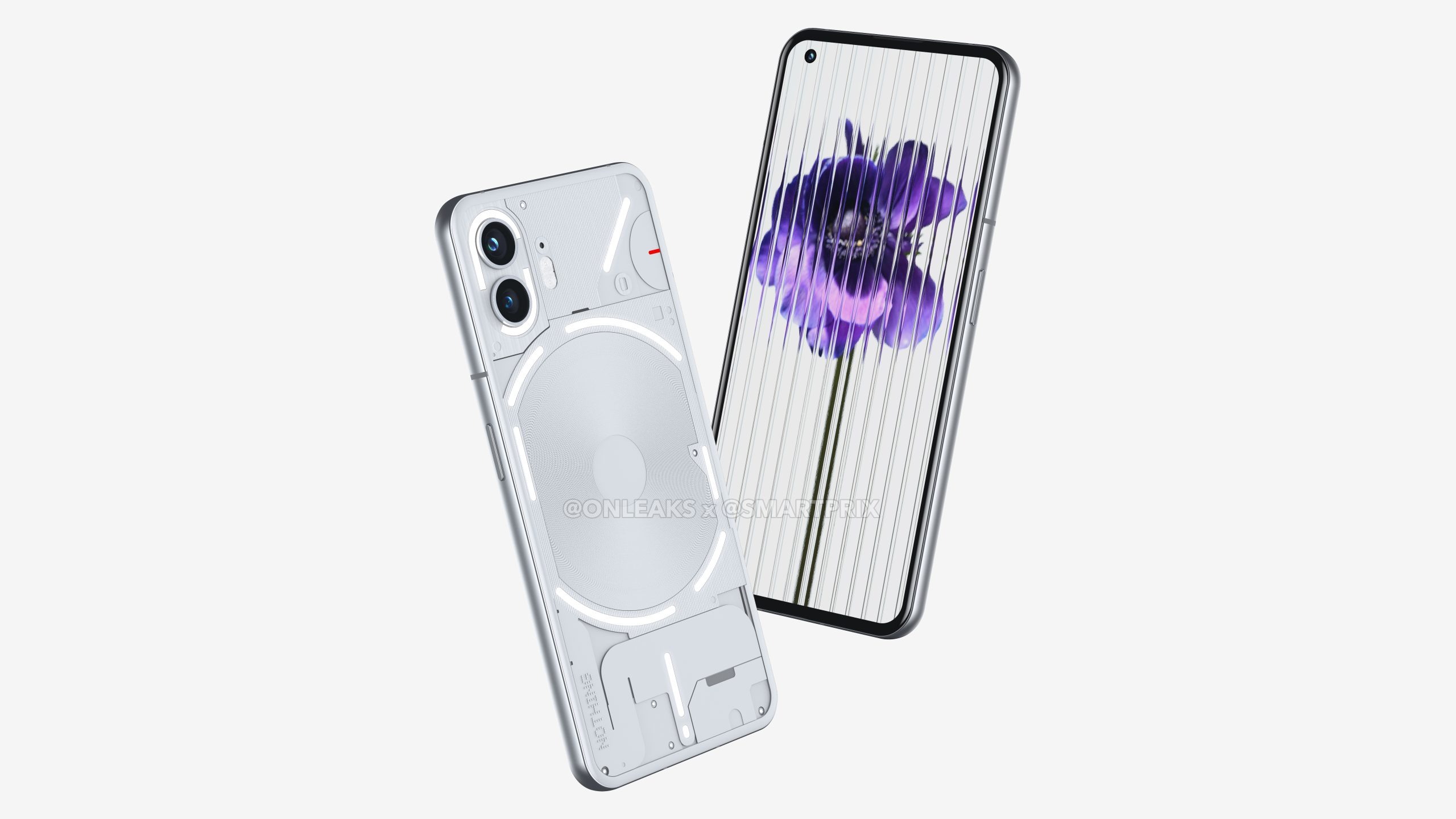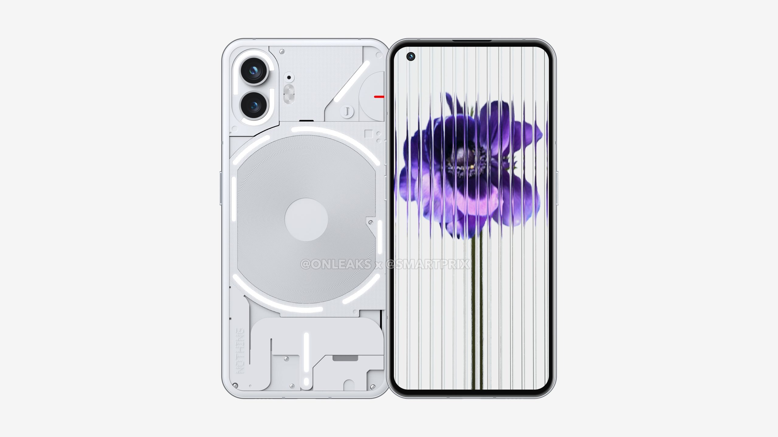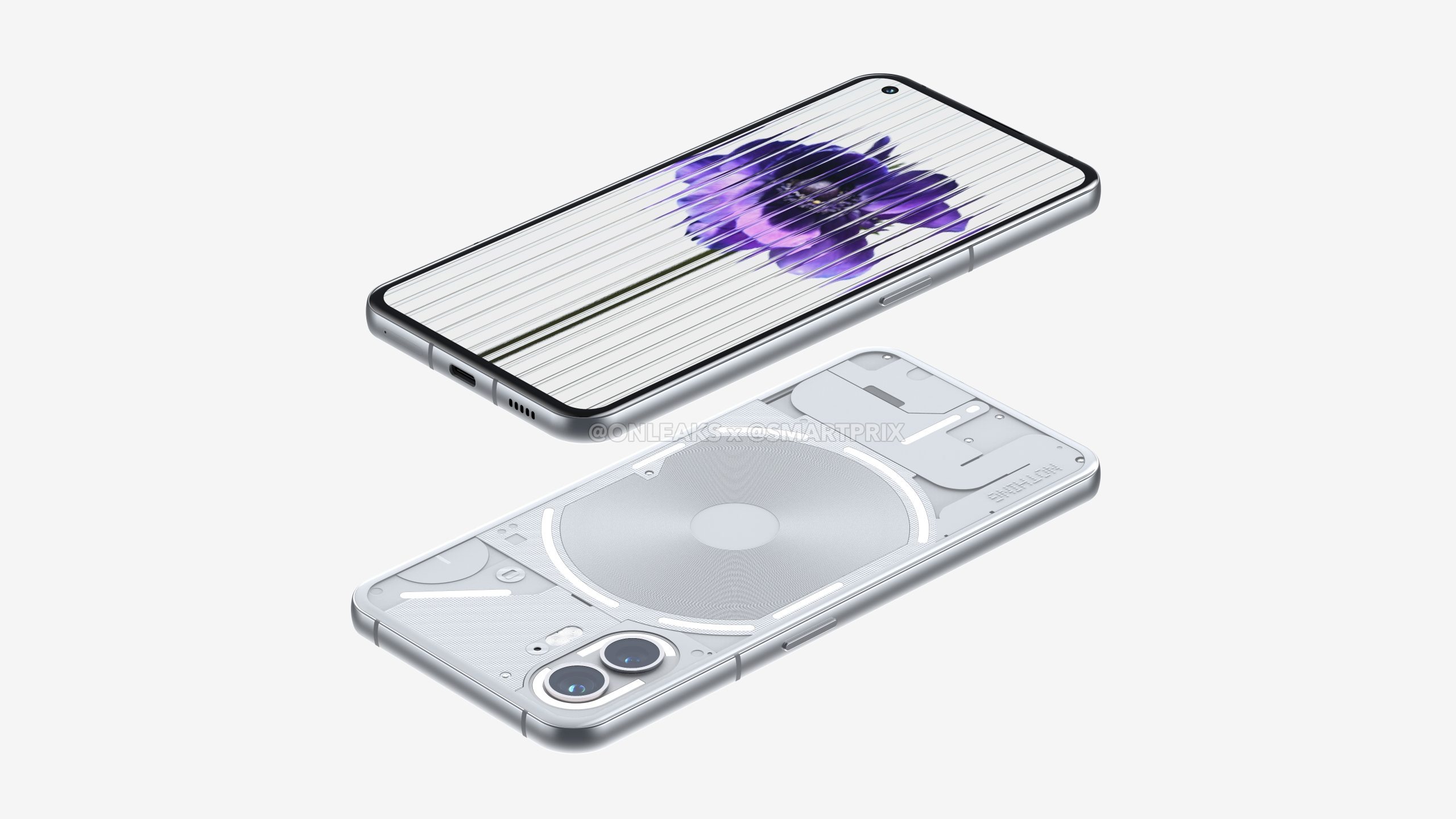
Well that didn’t take long. Courtesy of OnLeaks and Smartprix, we have our first peek at what reportedly are rendered images of the Nothing Phone (2). While most of the original’s design language is intact, like the series of LED lights with the Glyph interface, the Nothing Phone (2) appears to ditch the flat edges in favor of a curvier one.
We could argue that it makes for better ergonomics holding the phone. If you’re not fans of flatter edges, like on the current iPhone 14 Pro series, then you might be happy about the rounded aluminum edges here. No matter how you feel about this subtle change, it simply gives the phone a slightly new identity.

Besides its curvier edges, the renders also reveal the glass panels on the front and back are curved around the edges – which sort of gives the design a more uniform look and feel. Additionally, it also looks like the camera’s flash has been upgraded to a dual-LED system, as opposed to the single one of the original.
And lastly, while the Glyph lighting interface on the back of the phone is sure to attract curious eyes, it looks as though the circular light strip around the back has been broken up into more segments. The official reason will eventually be revealed for this decision, but we bet that it’ll provide users with greater controls for notifications and other lighting effects.

Whether you’re digging the curvier look of the Nothing Phone (2) or yet, it shouldn’t be long before it’s officially announced. It’s tapped to feature a larger 6.67-inch display, Qualcomm Snapdragon 8+ Gen 1 SoC, and dual 50-megapixel camera sensors. All of these rumored upgrades certainly make a compelling case for the Nothing Phone (2), even more if it can match the cost of the original. And yes, it looks like it'll have up to four years of Android security updates.


