Last year's Nothing Phone (1) was a spectacle of a device. Nothing CEO and founder Carl Pei is a hype man, if nothing else, and his new company's first device was certainly unique, but it had its flaws. Chief among them were some issues with the hardware and software that just wasn't as full-featured as phones from companies like Google, Samsung, and Apple.
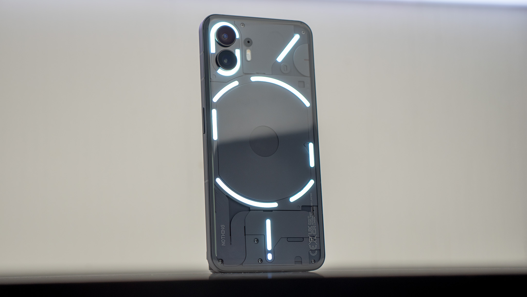
This year, Nothing is leaning into the fun factor with the Nothing Phone (2), a phone that certainly looks like a "Nothing Phone" complete with the lighted glyph interface on the back. The hardware has been refined, with a slightly taller build, a curved glass back, and a faster processor. But the real improvement is in the software.
From the moment you turn it on, you can tell this thing was designed to provide a certain look and experience from the get-go. The monochrome dot matrix look is everywhere, from the initial setup to each and every widget and app Nothing makes. It's incredibly stylish, and Nothing even launched several new unique features that are just plain fun, but is it enough to merit the price increase over the Nothing Phone (1)?
Why initial review?
I've had the Nothing Phone (2) for over two weeks now but haven't had the chance to really dig my claws into its inner workings. Among the many reasons, the biggest was that I couldn't use the phone for more than 5 minutes at a time without my head hurting, thanks to a lovely little thing called PWM sickness.
The Nothing Phone (2)'s OLED display uses a low-frequency flicker rate, and my eyes just don't care for it. Thankfully, I got a new pair of glasses on Monday this week that make it possible to use the phone full time, giving me a handful of full days' usage to bring you some initial review thoughts.
I'll be publishing a full detailed review in about a week, but until then, this should be enough information to help you decide whether to order a Nothing Phone (2) or not.
Nothing Phone (2): Price and availability
The Nothing Phone (2)'s release marks the first time Nothing is officially offering a phone in North America. That means you'll get full 5G speeds with full network support on AT&T and T-Mobile. It's not officially compatible with Verizon.
The Nothing Phone (2) is available in both white and dark gray colorways starting at $ 599 USD / $929 CAD for a model with 8GB RAM and 128GB storage. Upgrades are available with 12GB of RAM, starting at $699 USD / $999 for 256GB of storage and $799 USD / $1,099 CAD for 512GB storage.
You can preorder the phone from Nothing's website as of July 11, and open sales begin on July 17. Folks living in Manhattan can stop by one of the pop-up kiosks the company is putting together from July 13 onward, including a $50 discount for anyone able to purchase the phone at the kiosk.
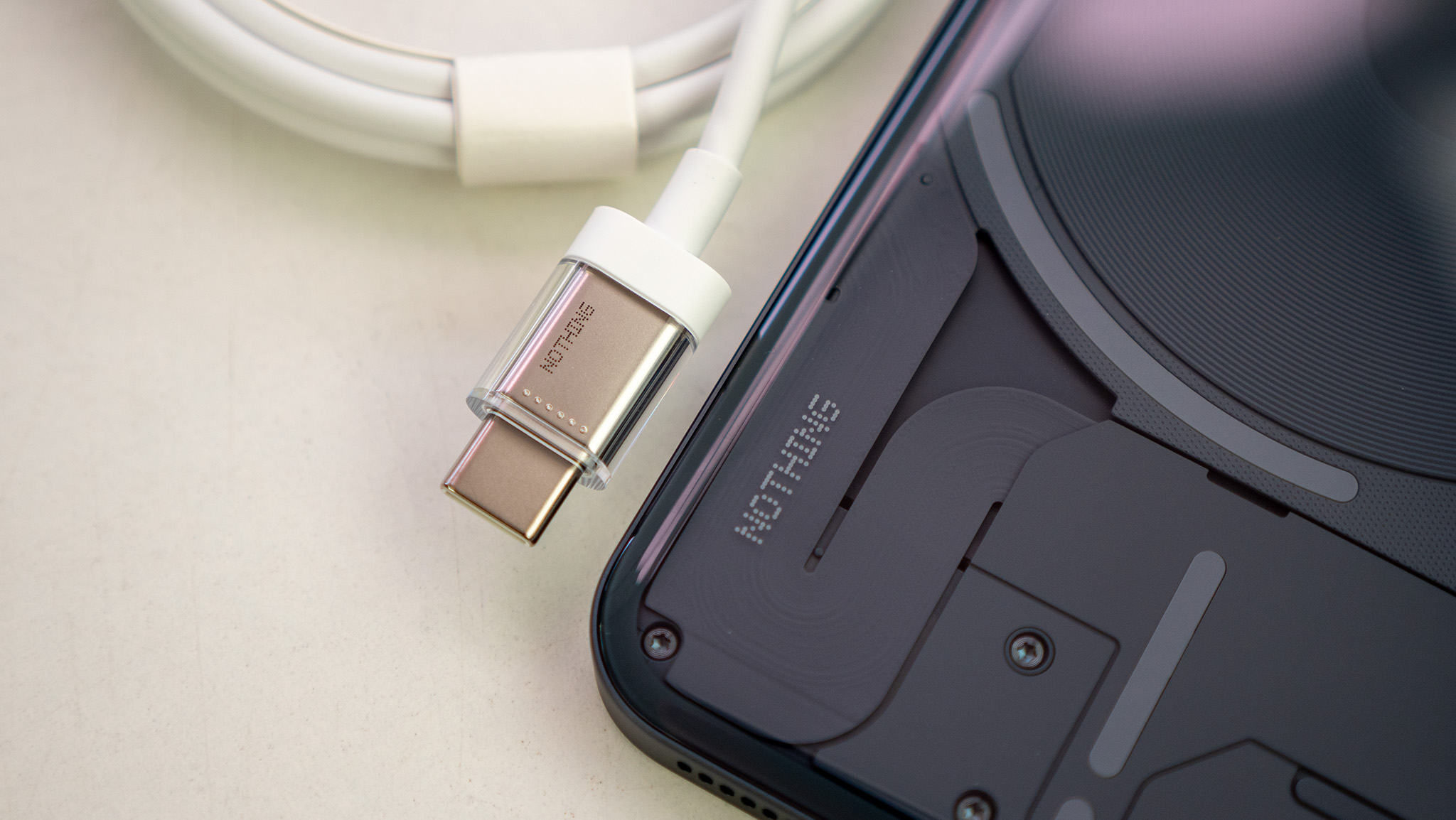
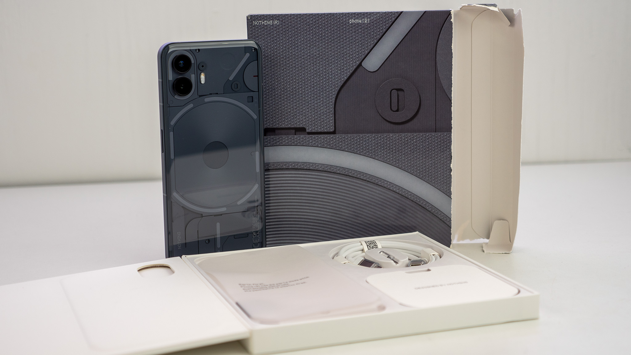
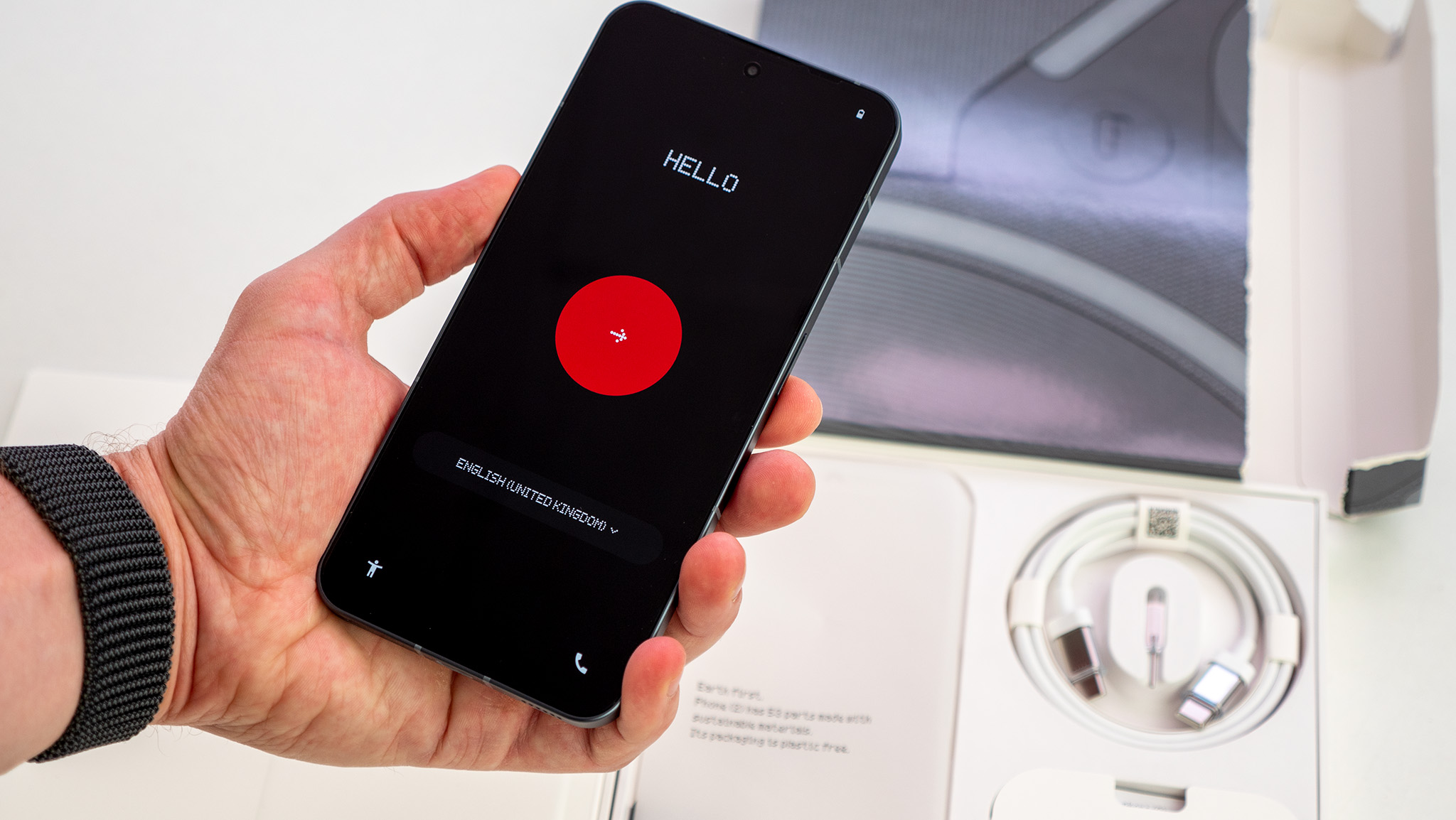
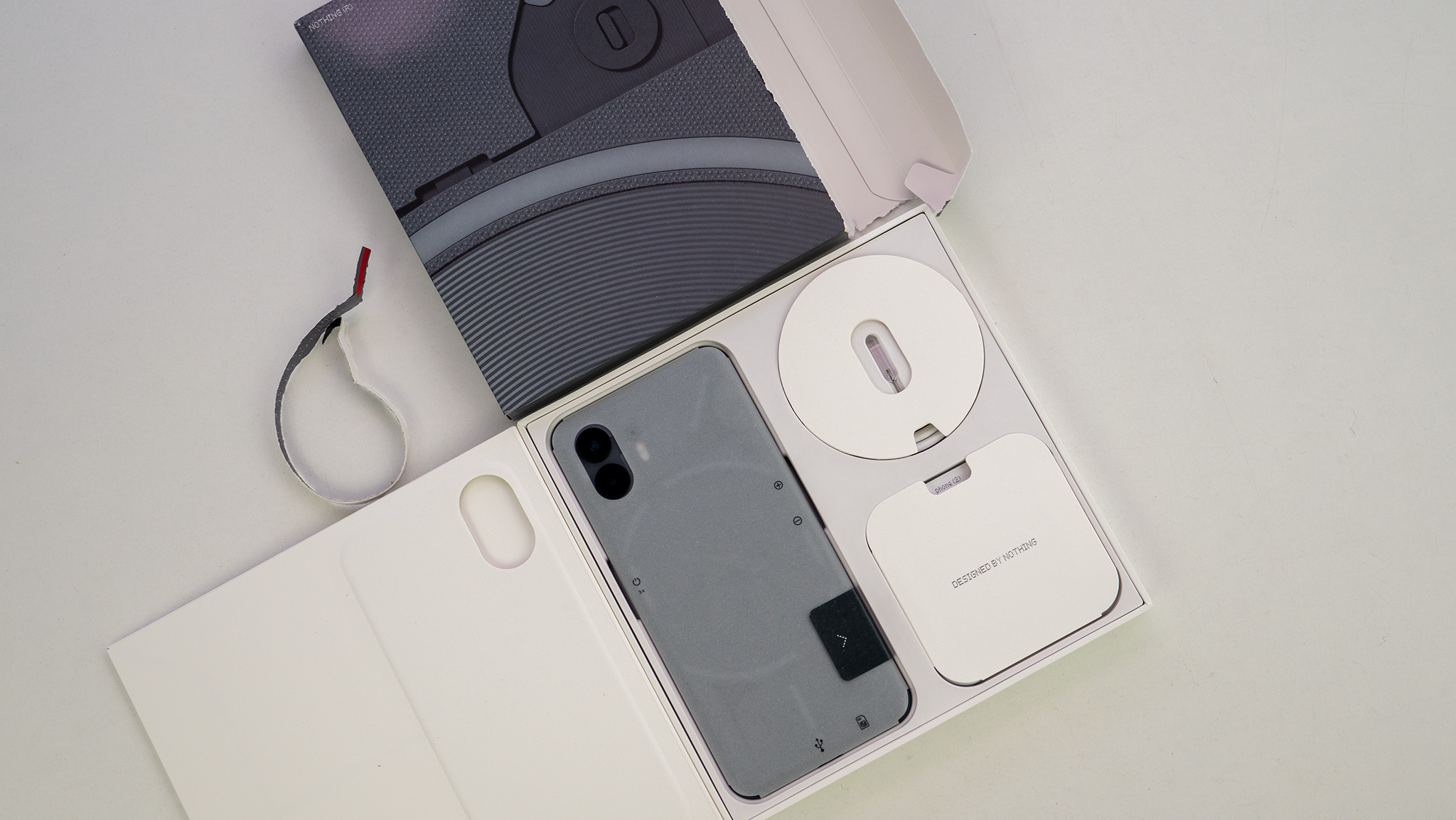
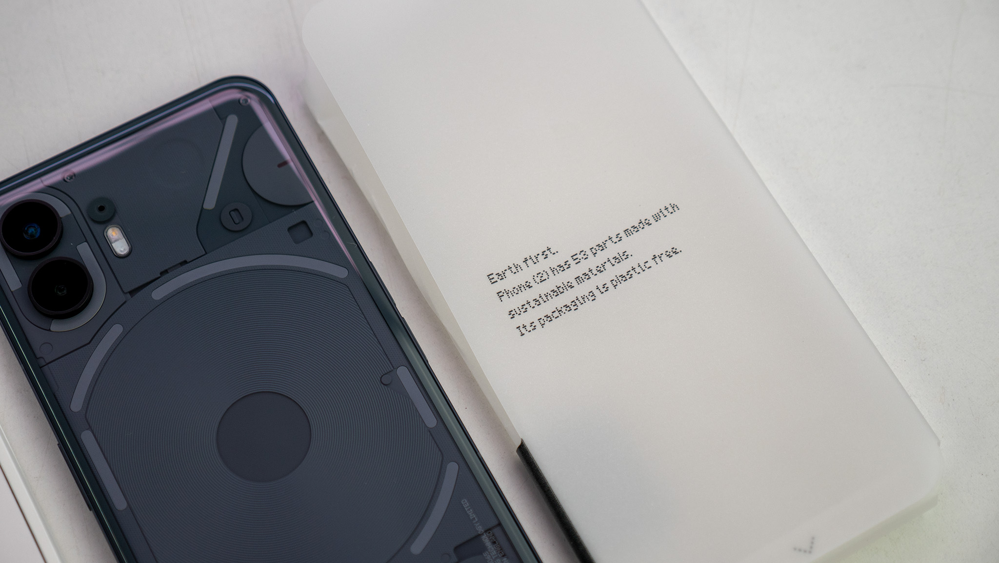
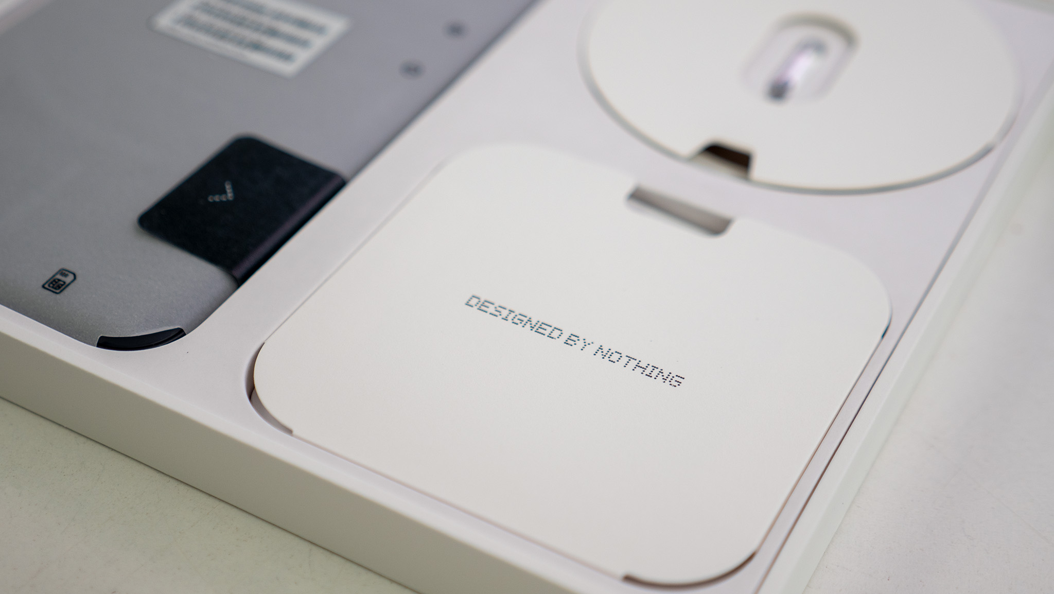
In the box, you'll find the phone, a new USB-C cable with transparent connectors, the same snazzy transparent SIM ejector tool from the first phone, and a handful of small pamphlets. The packaging is entirely plastic-free, and Nothing even prints the phone's carbon footprint on the box.
Nothing was able to reduce the carbon footprint of the phone by using less plastic and more recycled materials. The Nothing Phone (2)'s carbon footprint is 53.45 KG CO2E, a full 5.05 KG CO2E lower than Nothing Phone (1). SGS certifies this rating, so you know it's legitimate and not something only Nothing's marketing team came up with.
The Nothing Phone (2) is an affordable flagship with a unique design that incorporates a translucent back and built-in LEDs that can be used for notifications and other functions. It comes with a dual 50MP camera setup and is powered by one of the best Snapdragon chipsets to date, all for a low price of $599.
Nothing Phone (2): Prime design
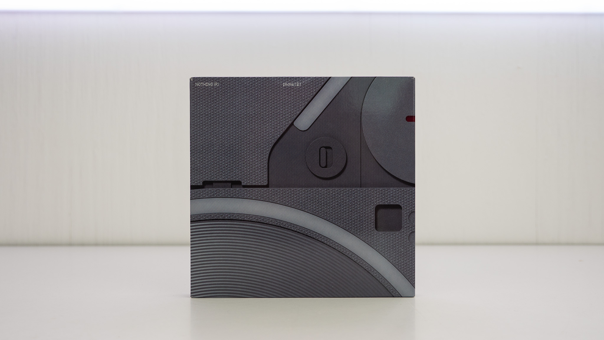
Everything about the unboxing process for this phone is beautiful. As with last year's Phone (1), the Nothing Phone (2) comes packaged in a box that has no openings except for a small pull tab at the top. Like a gum package, you'll use this tab to tear the box open and slide the phone packaging out.
The company is headed by huge names in the design industry, and you can tell Nothing takes design seriously just from the box alone. A new USB-C cable with transparent connectors is included and continues to flow along with Nothing's transparent design mantra, found in products like the Nothing Ear (2).
There's no denying that Nothing is still styling its phone similarly to an iPhone in every way, complete with the faux "deconstructed" Apple logo on the back in lighted glyphs. But that doesn't mean it's just a copycat.
The curved glass back makes the phone feel so much nicer to hold. As my colleague Andrew Myrick put it, "This is how I want the iPhone to feel like when I pick it up."
The frame is made of 100% recycled aluminum and, combined with the curved back, feels elegant and premium. Not everyone will enjoy the flat sides, but the argument between flat and curved sides is more of a preference, anyway.
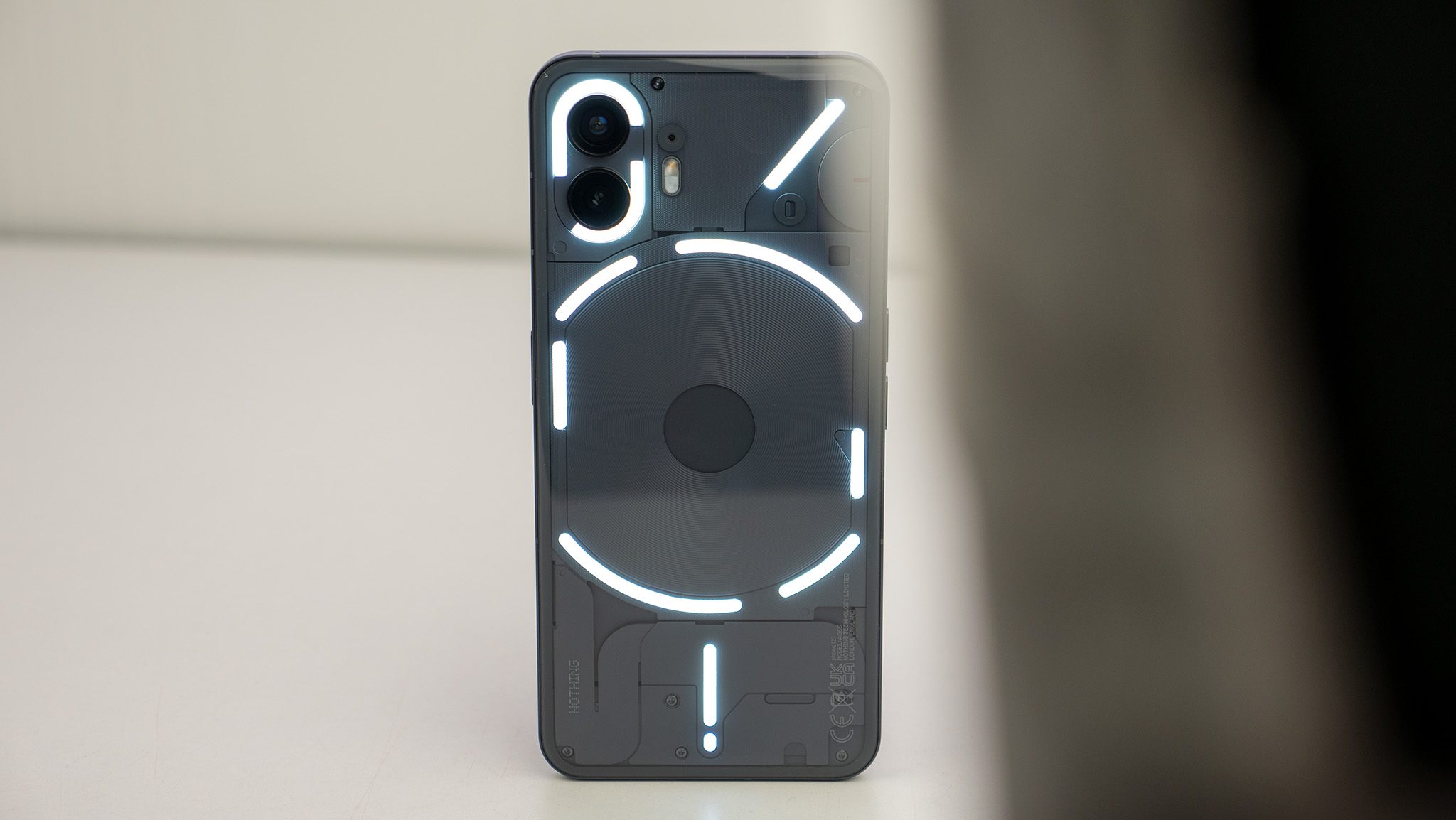
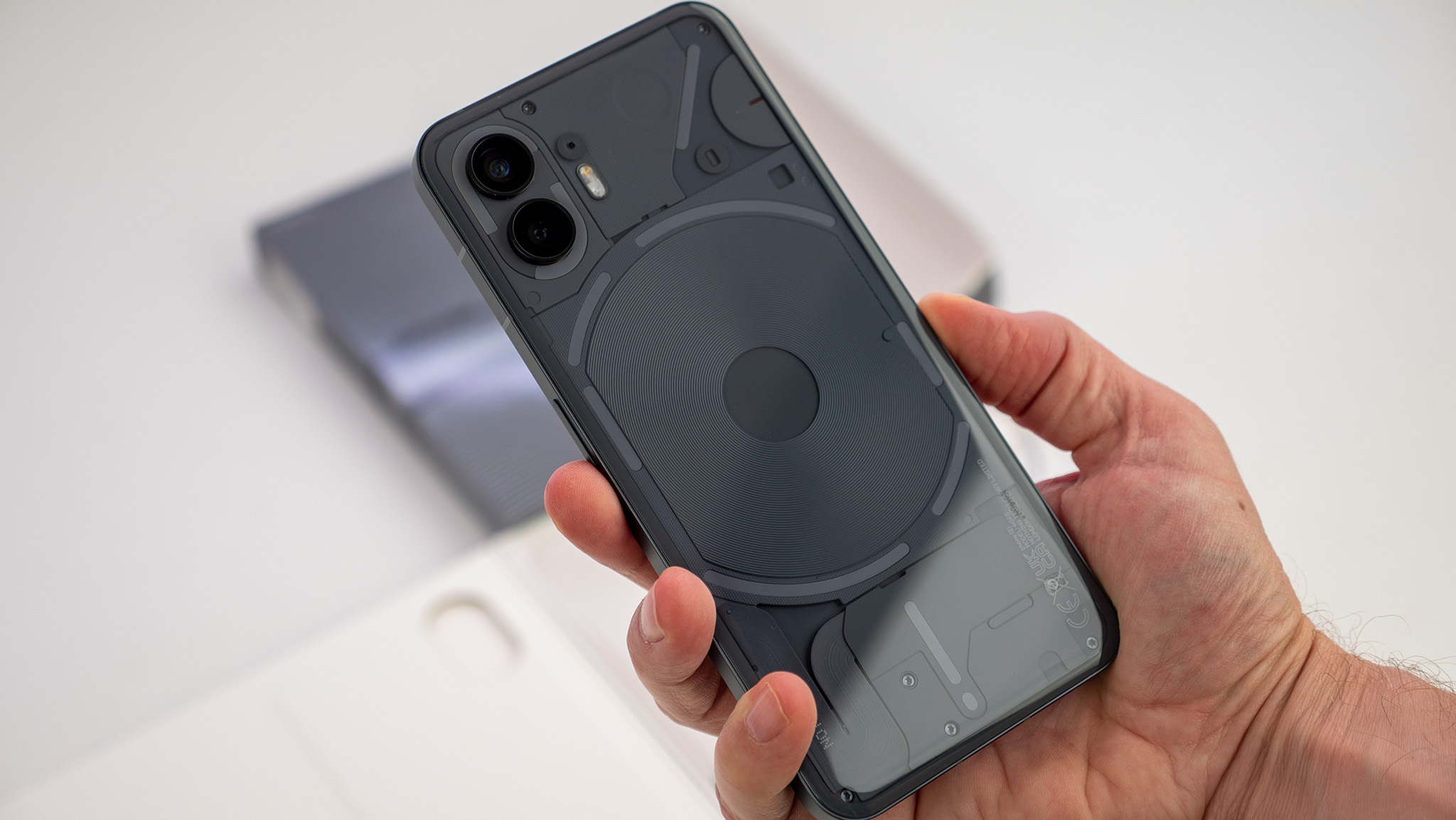
The back of the Nothing Phone (2) is absolutely striking and immediately recognizable. While there's little functional purpose behind the transparent design, the company's lighted Glyph Interface has proven to be a boon for setting the phone apart in more ways than just looks.
Those LED lights on the back of the phone have been upgraded and now have more functionality. Phone (2) has 11 LED strips on the back, and each strip is made up of 33 individual zones — up from 12 on Phone (1). Nothing says it designed the Glyphs so users can be "more present in their everyday lives."
The Glyphs have been improved with 33 individual zones and the ability to create more custom ringtones and notifications.
The idea is that you'd put your phone face-down on a table and, instead of reading individual notifications as they come in, the Glyph interface can be used to filter out the noise so only important notifications come through.
Think of the Glyphs a bit like a Do Not Disturb mode, as you can select which apps display Glyph lights and customize the pattern for each app. Furthermore, some apps let you even dial down into individual notification types or conversations. So if your significant other messages you, the lighting pattern can be different than if someone else is trying to get your attention.
Most days ended with over 50% battery left, and the phone's performance is no slouch.
There's even a cool new Glyph Composer that lets you make your own ringtones, complete with lighted Glyphs and custom sounds by EDM group Swedish House Mafia.
While the Phone (2) sports last year's Qualcomm Snapdragon 8+ Gen 1 processor, there was never a time when I felt like performance is lacking. As Nothing says, the 8+ Gen 1 is a "proven processor" that's both efficient and fast, ensuring gaming on the phone is smooth, daily tasks happen without hitching or lagging and, yet, the phone still sips from the 4,700mAh battery.
I never had a day where I even considered what the battery life might be, let alone needed to top the phone up. Most days ended with over 50% battery left, which is always a good sign.
The Nothing Phone (2) supports 45W PPS wired charging, so a full charge takes less than an hour, and topping up 50% happens in 25 minutes. Plus, it's got 15W Qi wireless charging and 5W reverse wireless charging for added convenience.
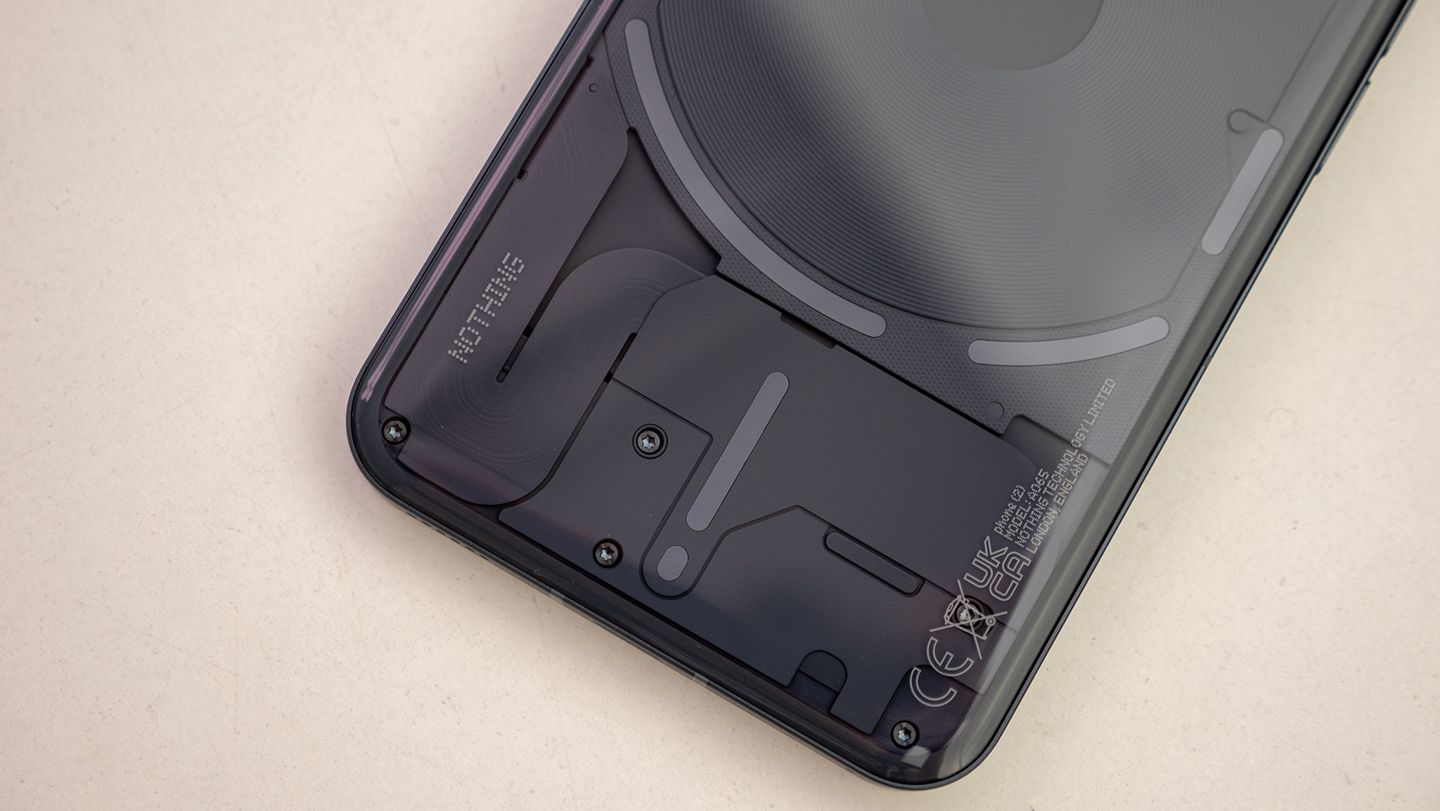
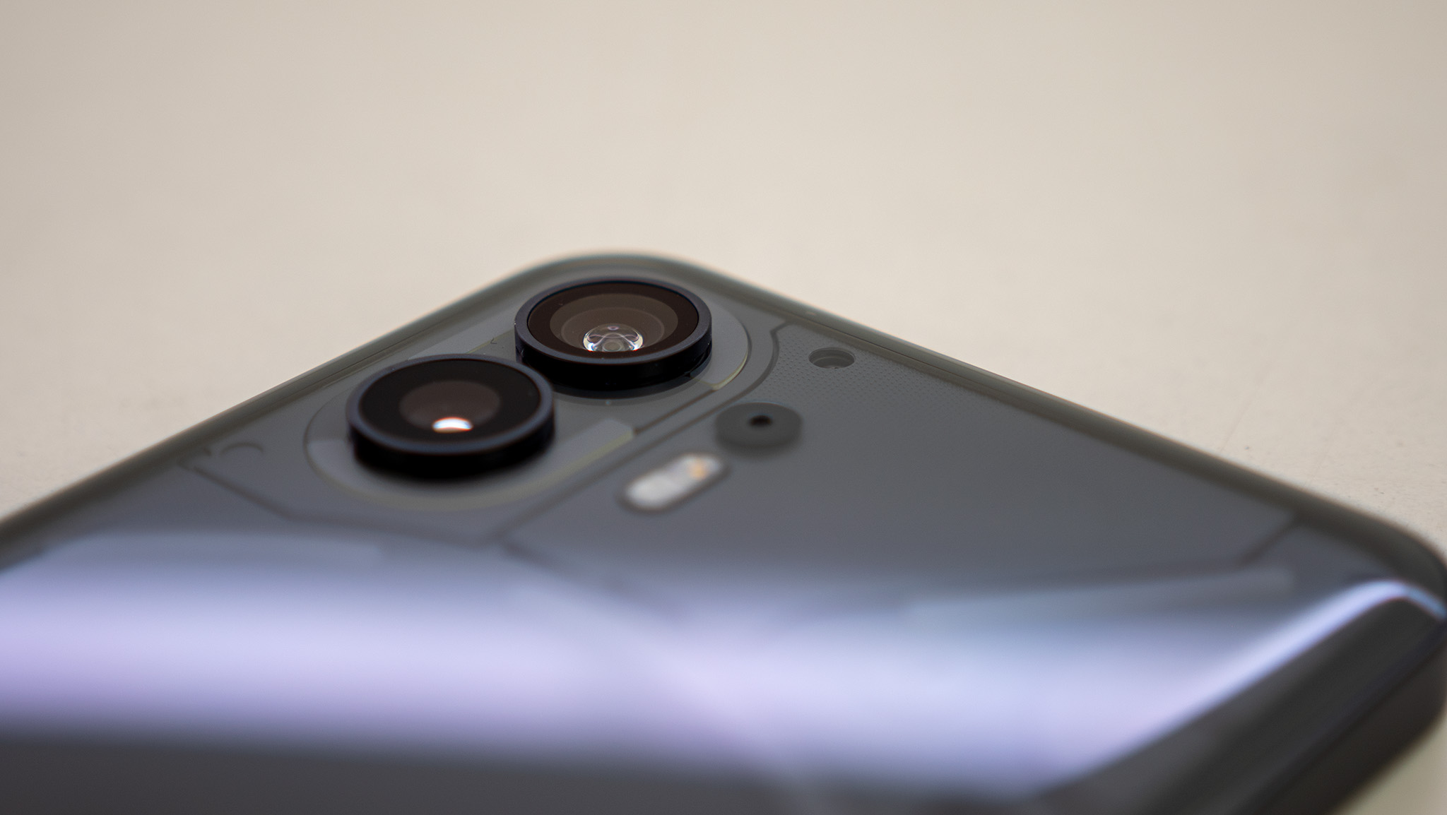
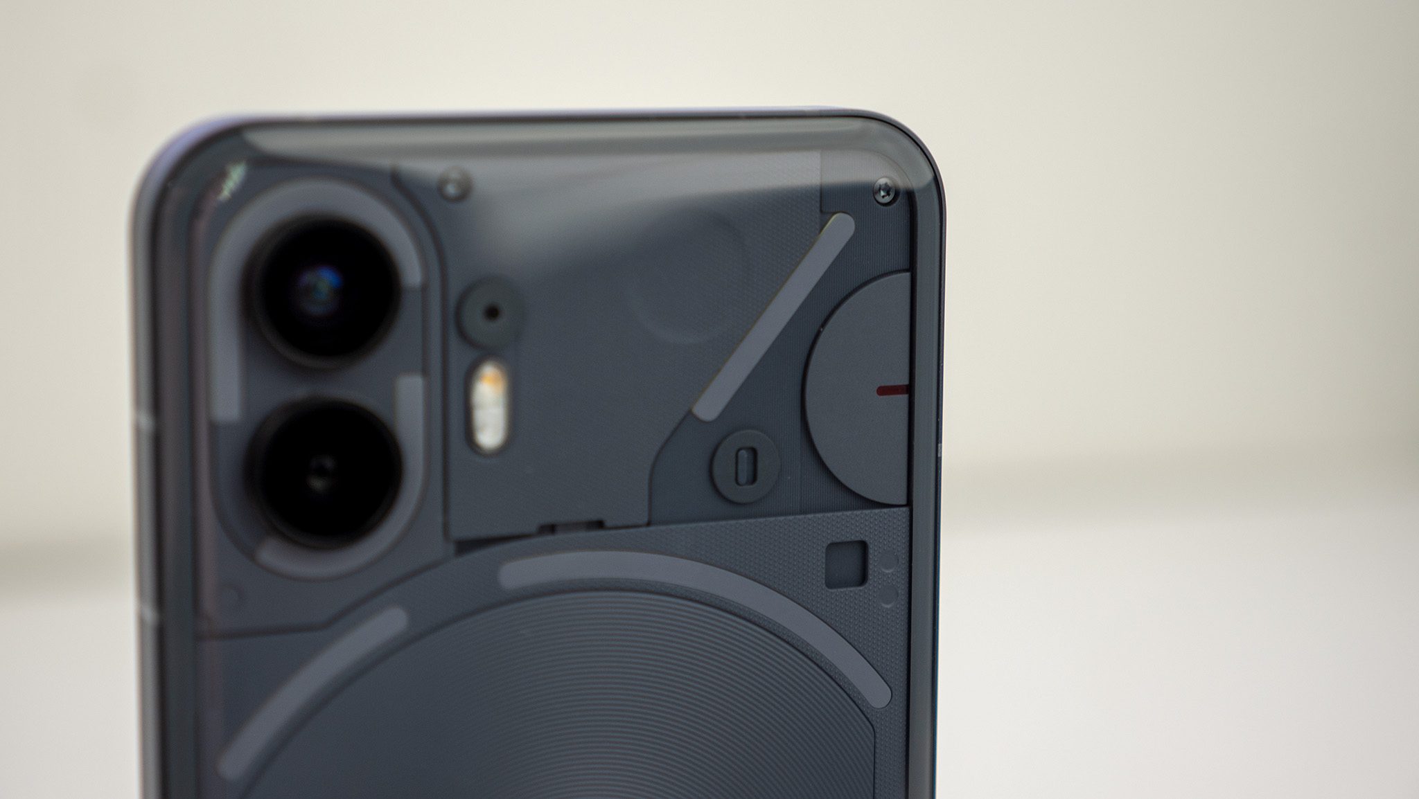
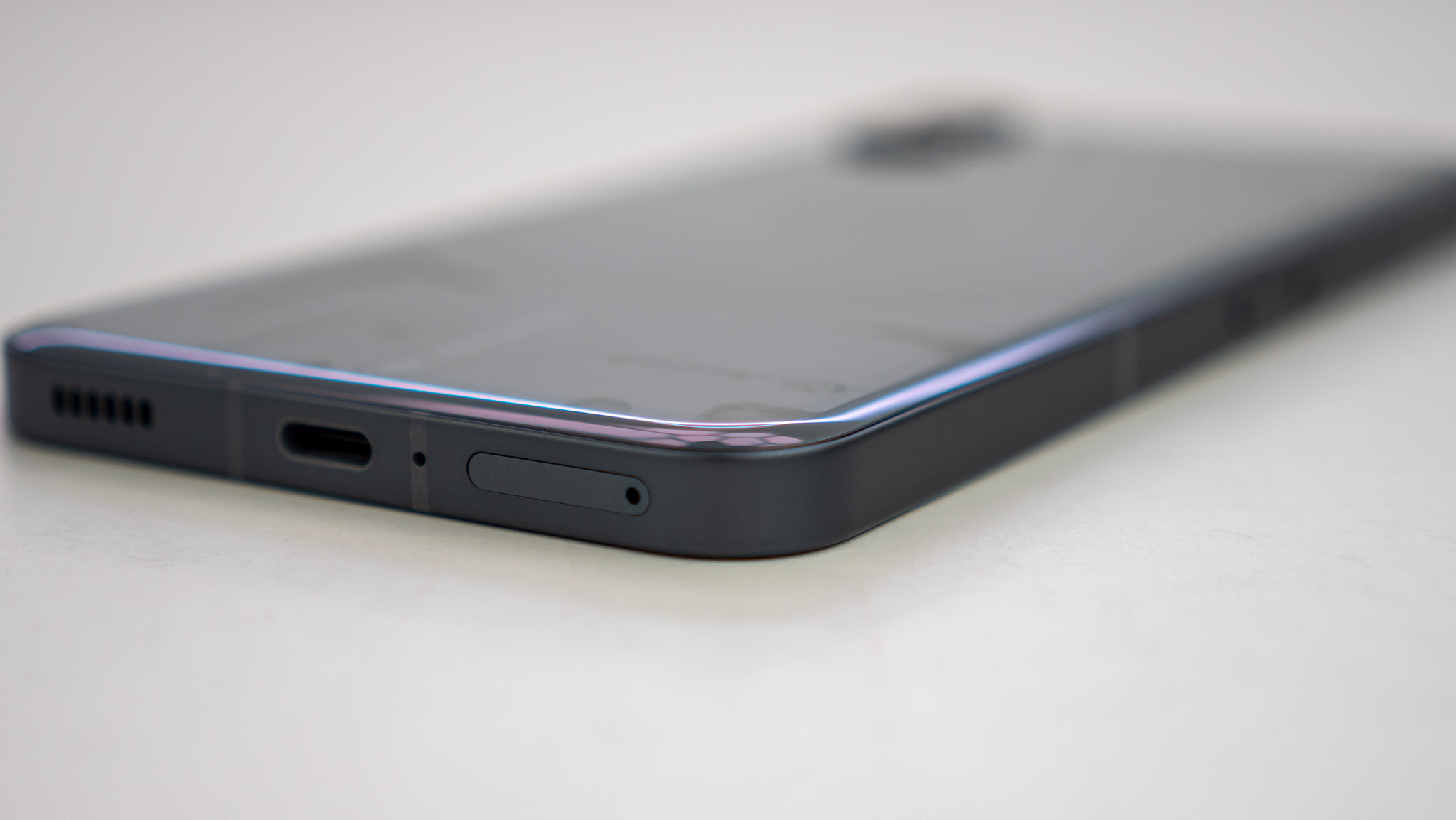
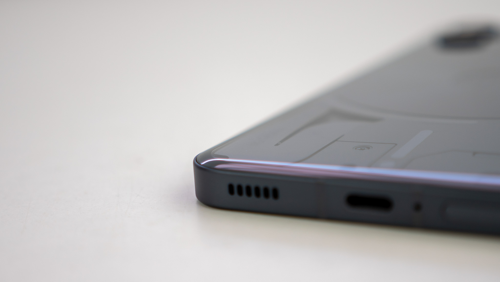
The design is gorgeous and elegant feeling, but it's also incredibly slippery.
But being all glass and aluminum means this phone is heckin' slippery. I don't have one, but the official Nothing Phone (2) case is a must-buy for anyone worried about dropping the phone.
I can't tell you the number of times over the past few weeks that the phone has dropped itself on the floor when I just placed it on a table or a couch. This is both when the phone is face down or back down, and it made me nervous to put it on any smooth surface.
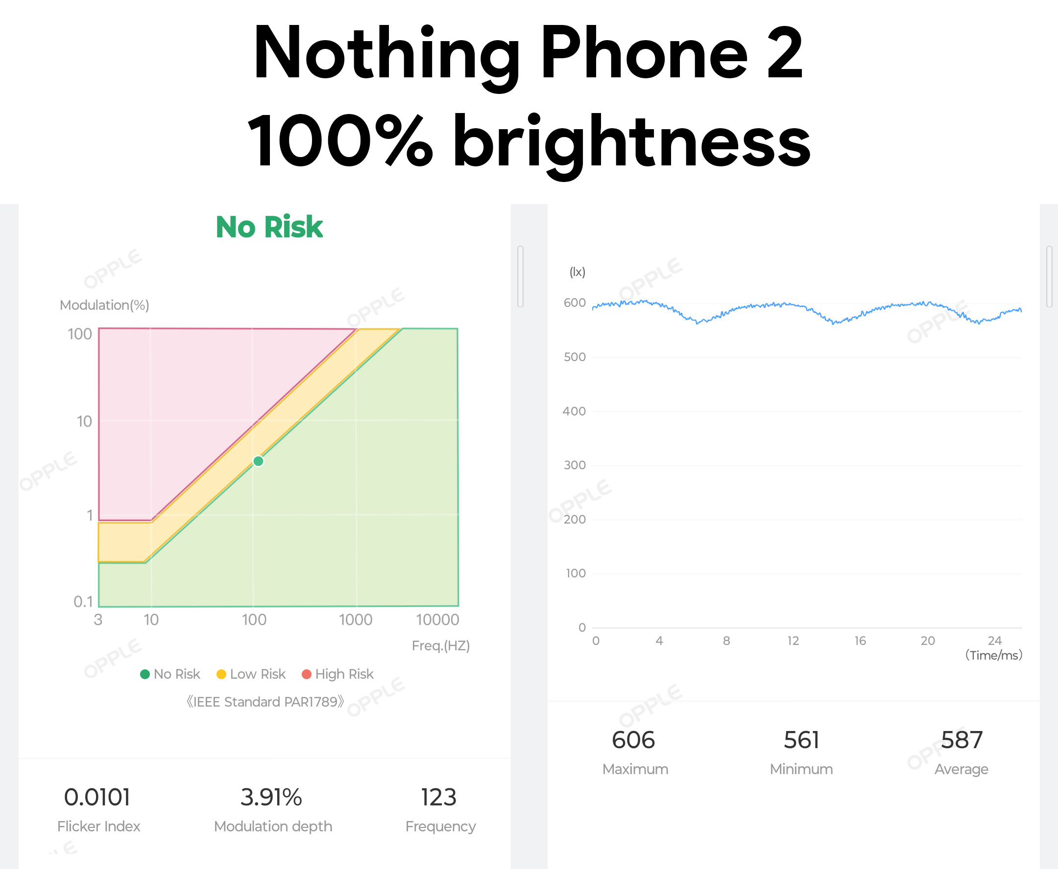
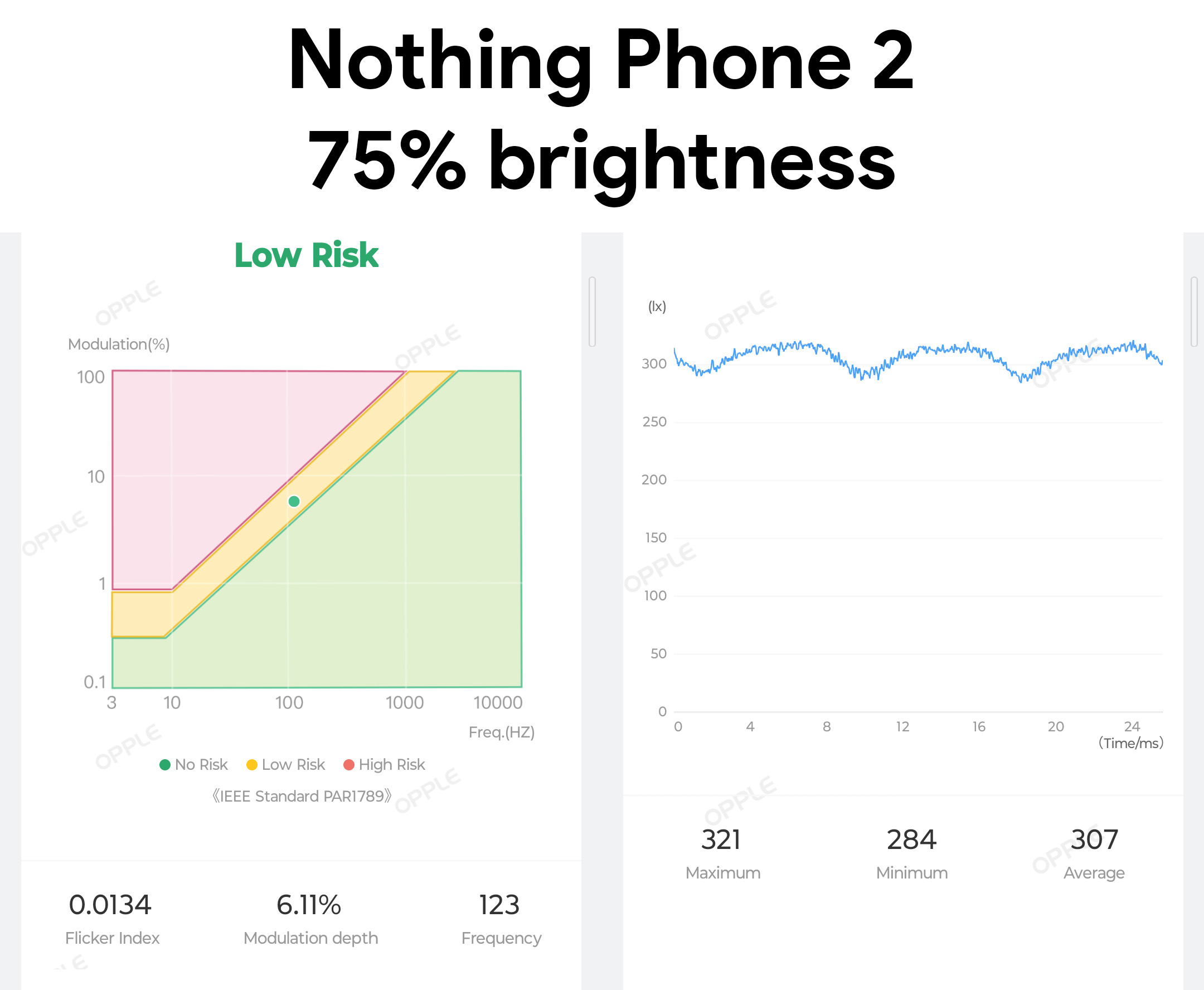
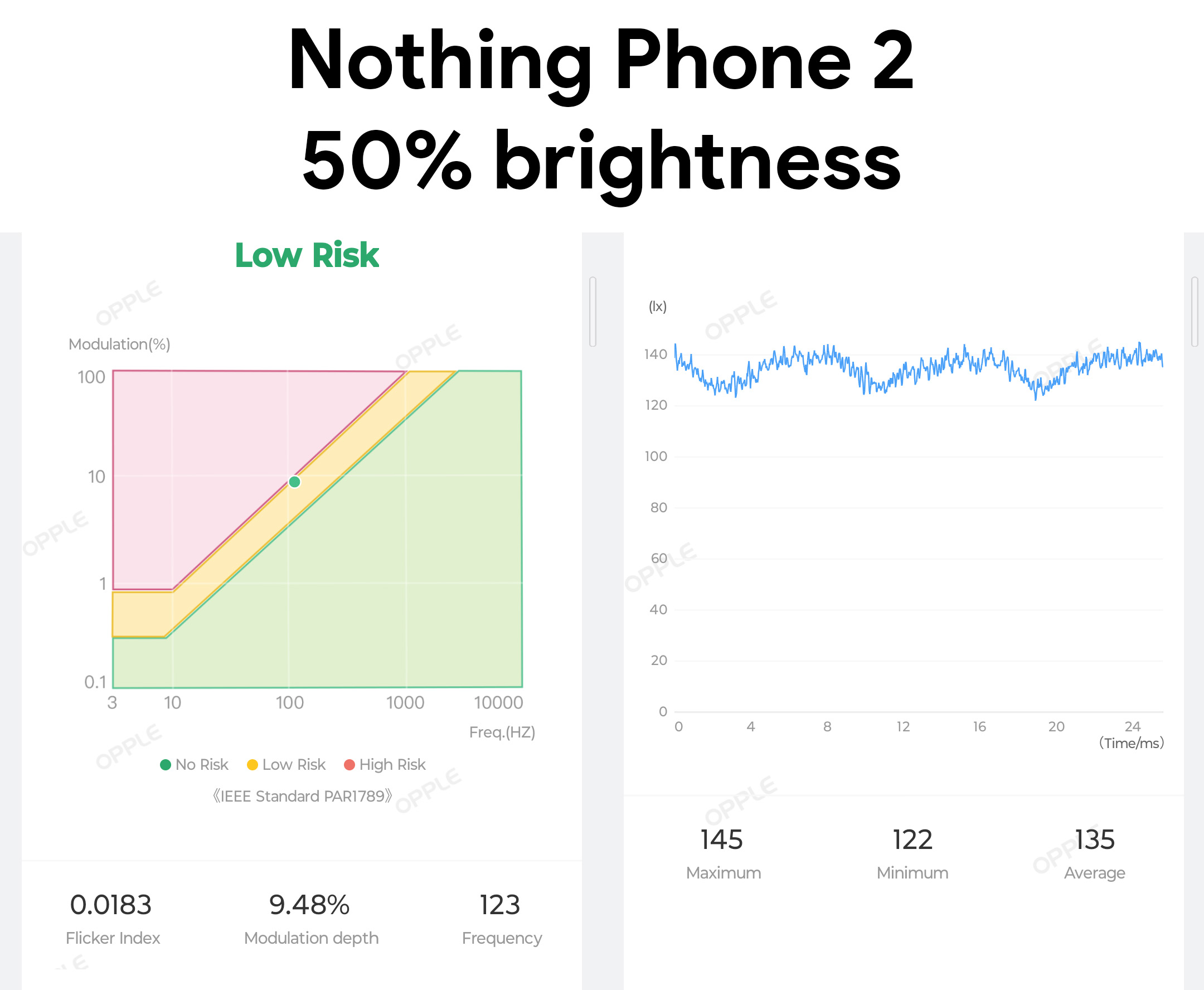
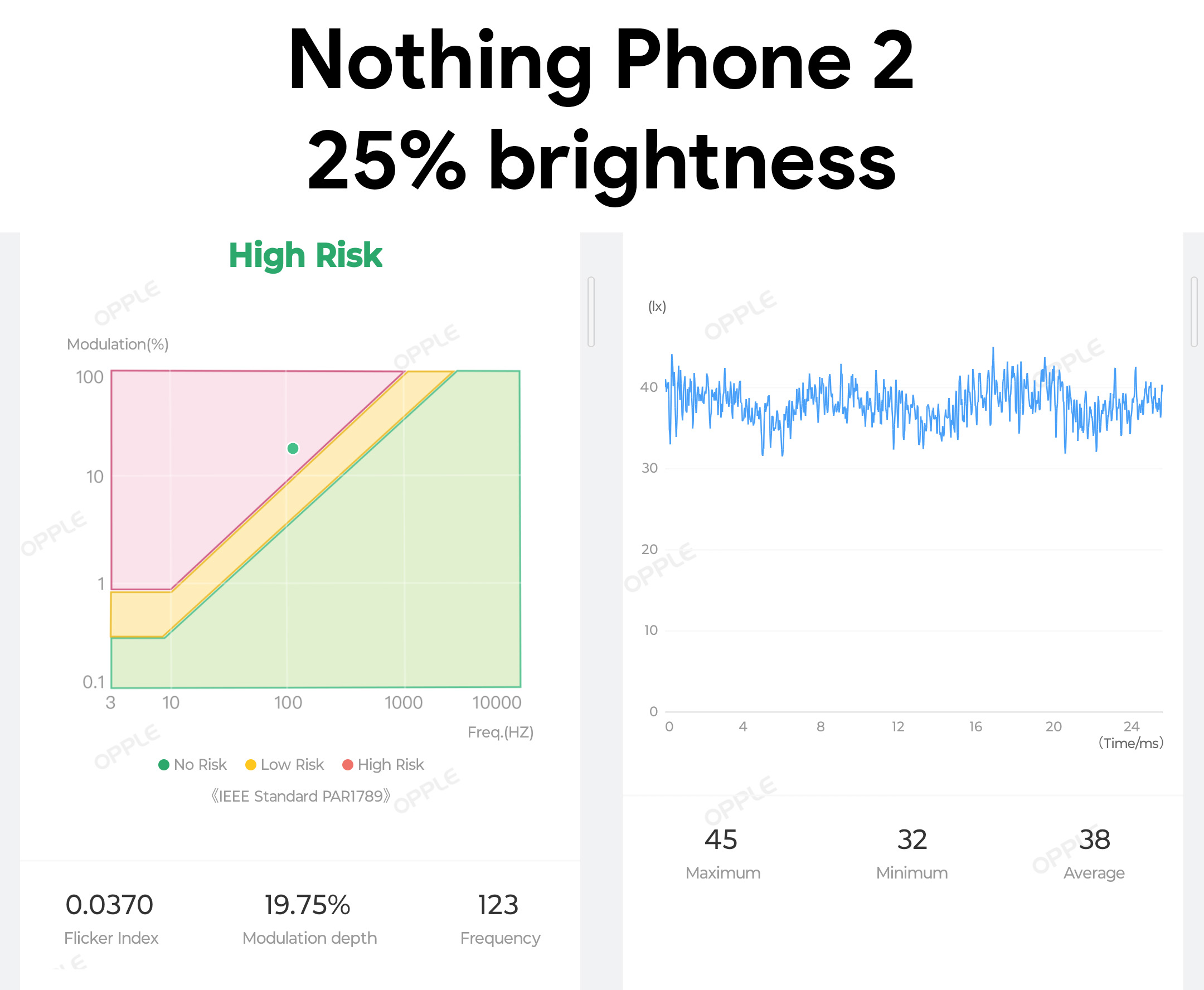
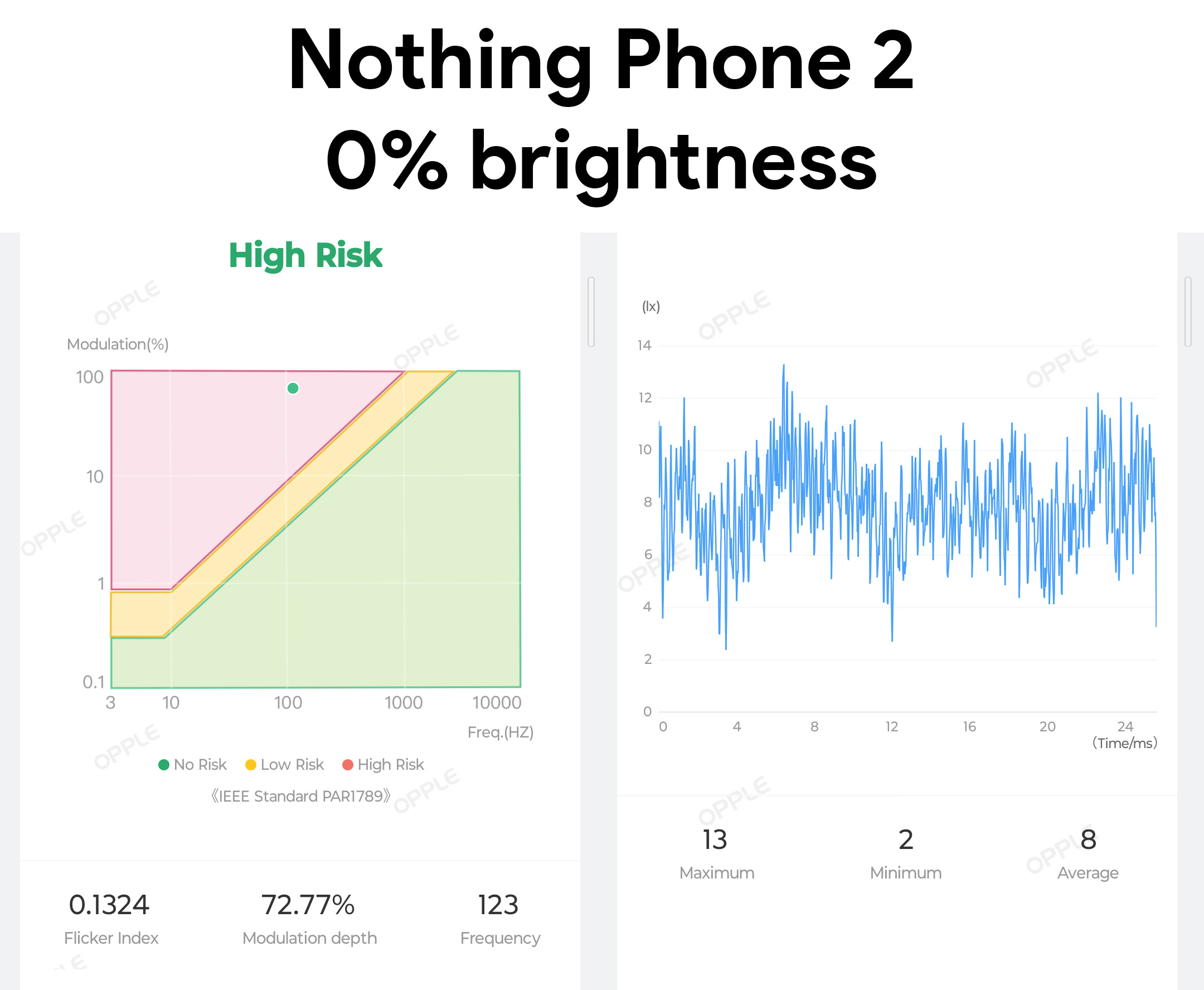
And, as I said in the intro, this isn't a phone that's great for folks sensitive to PWM display flicker. I was initially able to use it for an hour or two, but the feeling of eye fatigue and sickness that's so prominent with low-frequency PWM dimming on AMOLED displays eventually set in, and I couldn't use the phone for more than 5 minutes at a time without feeling awful.
What's strange is that, just like the Vivo X Fold2, the charts here don't look bad at all. Modulation depth is fine, but I don't know what the PWM rate is. My Opple Light Master IV light meter says it's 123Hz, but I know that's wrong — no consumer display goes that low — and I've seen this nonsense reading before on plenty of other phones that use different PWM frequencies.
Display flickering sickness is a terrible thing to deal with, and, to make matters worse, it's incredibly complicated to diagnose exactly what makes someone sick. Some folks who are sensitive might be OK with this phone above 75% brightness, given the modulation rate is generally low. As for me, I can't use this phone without glasses that correct for astigmatism at any brightness level without feeling awful.
Nothing Phone (2): Superfluous fun, serious improvement
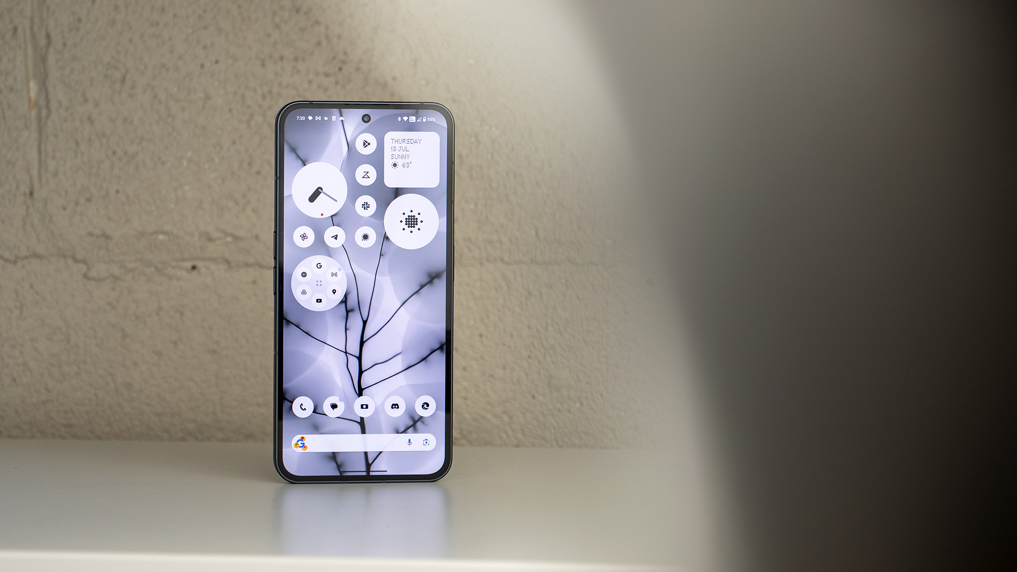
As a child of the 80s and 90s, I have a fondness for retro-chic design. Clearly, so do the designers at Nothing. Every app and widget Nothing designed for this phone fits perfectly into this design, and it's so refreshing to see something so well-honed and executed make its way into a consumer product, especially one that's only a second-generation product.
There's something calming about the Nothing Phone (2)'s home screen that I just can't quite put my finger on. Maybe it's the entirely grayscale color palette or the bevy of beautiful, circular widgets and folders? Either way, I love the way this home screen looks and that feeling channels itself into other apps and settings menus throughout the experience.
In short, this is what the experience on Phone (1) should have felt like, and Nothing OS 2.0 is proving to be a substantial upgrade in every way possible.
Little things like the quick toggles menu — which retains the oversized Wi-Fi and Bluetooth buttons of the original release — aren't just cool looking. They're also incredibly functional.
Those Wi-Fi and Bluetooth toggles dynamically change and can be swiped on, and Nothing even added a quick Bluetooth connection pop-up that's similar to Android's Internet Panel. Why this isn't available in stock Android is beyond my understanding, it's just so darn useful!
And the cameras have been substantially improved over the original Nothing Phone (1). This isn't just a "better" camera, though. It's a genuinely excellent one that has surprised me every single time I use it. Shots are crisp and clean, dynamic range is excellent, colors are natural, and portrait mode cutouts and bokeh are out of this world good.





It also shoots incredibly nice-looking video, far eclipsing the quality of similarly-priced phones like the Pixel 7. Plus, Nothing actually made a phone that can capture movement in pictures. Google perfected this ages ago, but companies like Samsung still have trouble capturing moving objects — like children and pets — on very expensive phones like the Galaxy S23 Ultra.
I'll need a bit more time with it to fully judge — plus compare it to other phones in this price range — but, for now, I'm extremely happy with what's here. Check the samples above taken from the Nothing Phone (2) to see what I mean.
Nothing Phone (2): Should you buy it?
The hardest part about recommending a new phone isn't usually based on the phone itself; it's based on the phone's competition. But, at $599, this phone doesn't have too much actual competition. The Google Pixel 7 retails for the same price and includes a better IP-rating for water and dust resistance, plus an additional year of software and security updates.
But, beyond that, I think you can pick and choose which features are more important to you. The Nothing Phone (2) seems to capture better quality video, while the Pixel 7 captures better photos. Google has plenty of great Pixel-exclusive features, but Nothing has the style factor going for it, including that nifty Glyph interface on the back.
Plus, the Nothing Phone (2)'s performance and battery life are substantially better than what's offered on the Pixel 7. All in all, I'd definitely recommend it, even at full price.


