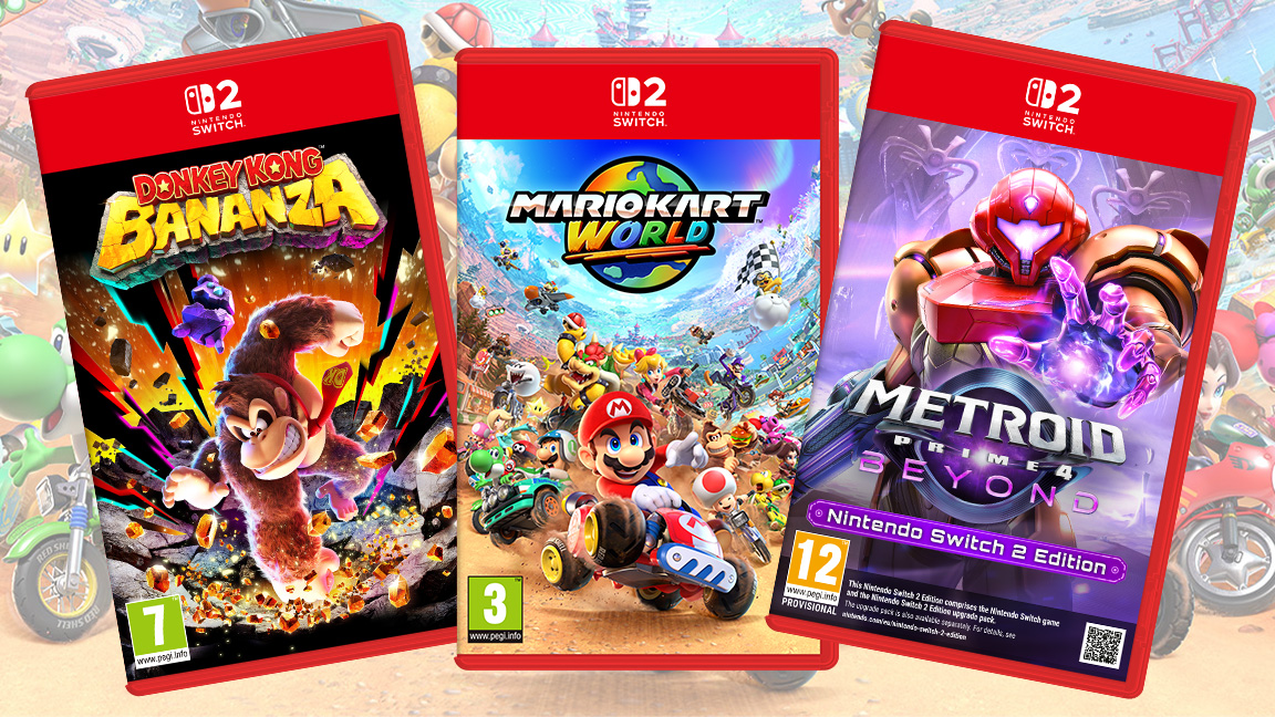
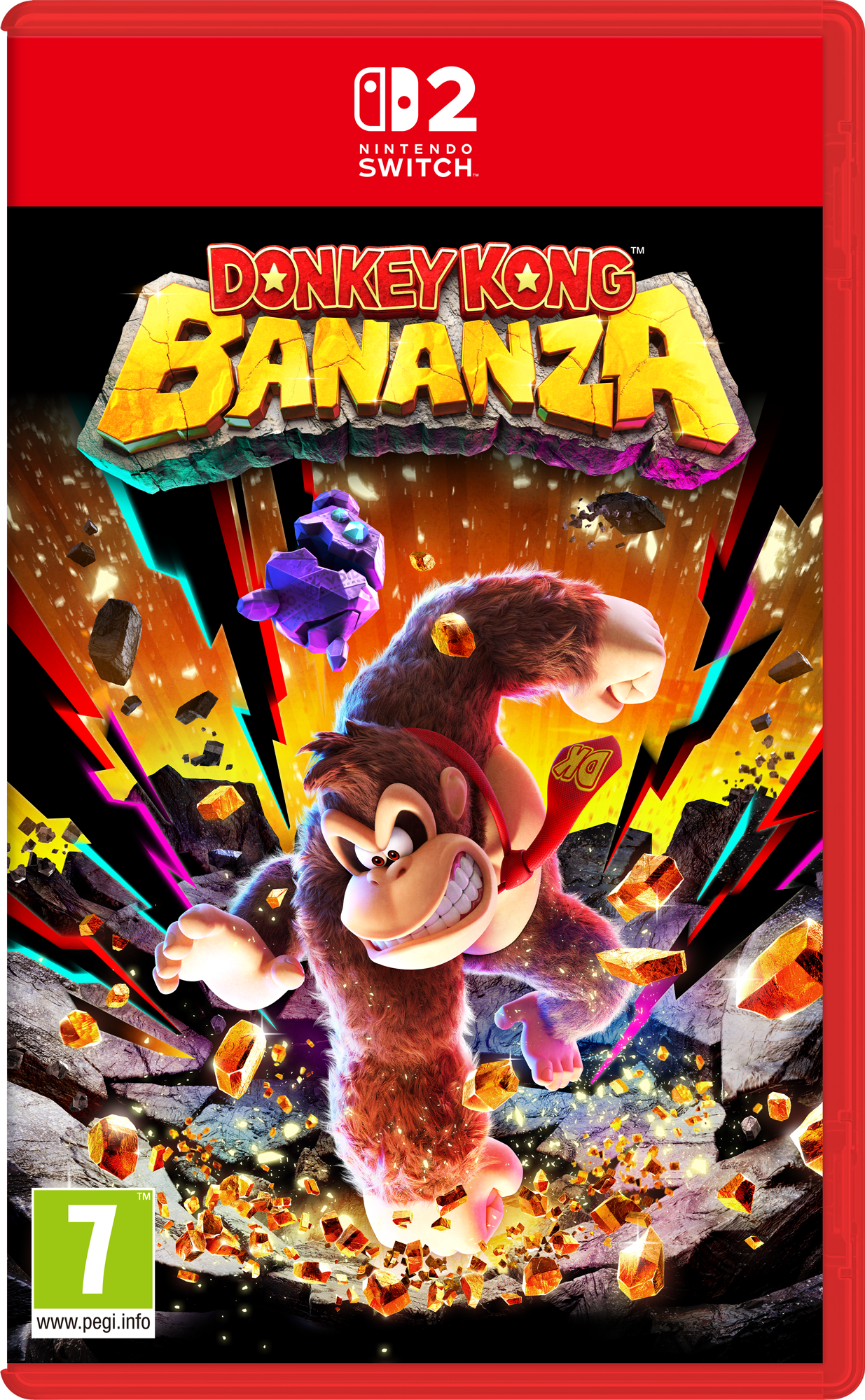
While the art itself for the new Nintendo Switch 2 game boxes is beautiful, with Donkey Kong Bananza looking particularly striking, many Nintendo fans have taken to Reddit and social media with one gripe – the large red slab across the top of the game boxes and centred logo is a problem.
Given the controversy around Switch 2 game prices, this feels like a minor issue, but it's the kind of design 'fail' that many die hard fans pick up on and can't overlook.
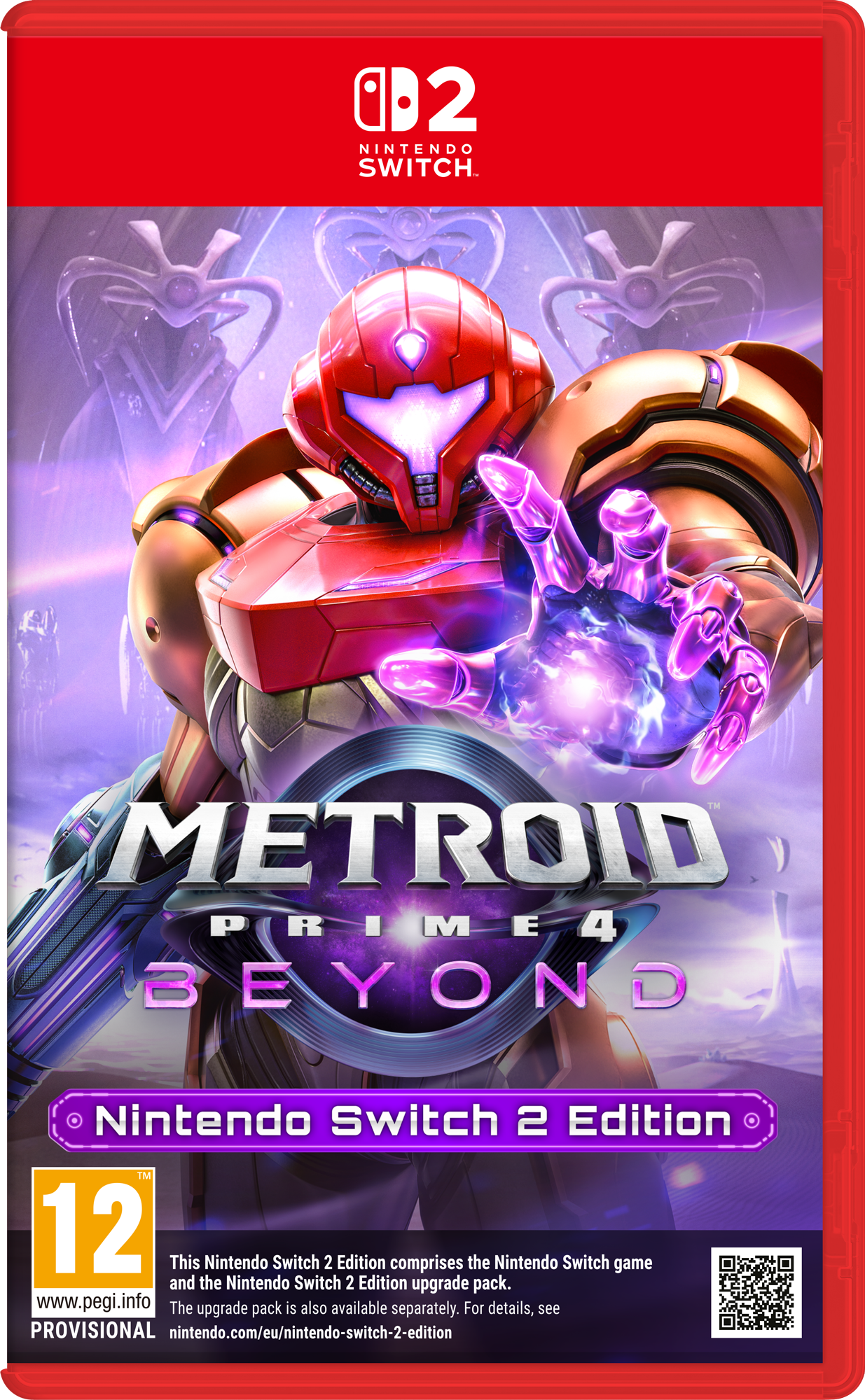
While the new and exclusive Switch 2 games feel more unique and balanced, the real issue fans are having is with the upgrade editions – the Metroid Prime 4: Beyond box art in particular is irritating fans, with many bemoaning the red slab, combined with the disclaimed text as off-putting, preferring the simplicity of the Switch box, which has a small logo in the corner.
"I feel like that and the red box is overkill," wrote resplendentcentcent on Reddit, adding: "Red box with an obvious logo containing the 2 in the corner would be much preferred. It's a shame after I felt like the Switch 1 box design was perfect."
Some fans have even joined the dots that suggest the new Switch 2 box art is bringing back the centred logo design of the old Wii U packaging – a console that was a notorious failure for Nintendo.
snk50 wrote on Reddit: "It is but it's very obvious they're trying to differentiate between switch 1 and 2. Don't want to go the wii u route lol."
SonicHokage added: "Funny the wii u logo was in the middle too, are we about to witness another console fail (sarcasm)."
I can personally see the point many of these fans are expressing, particularly as the art itself is beautifully rendered and Nintendo has a history of creating impactful illustrations.
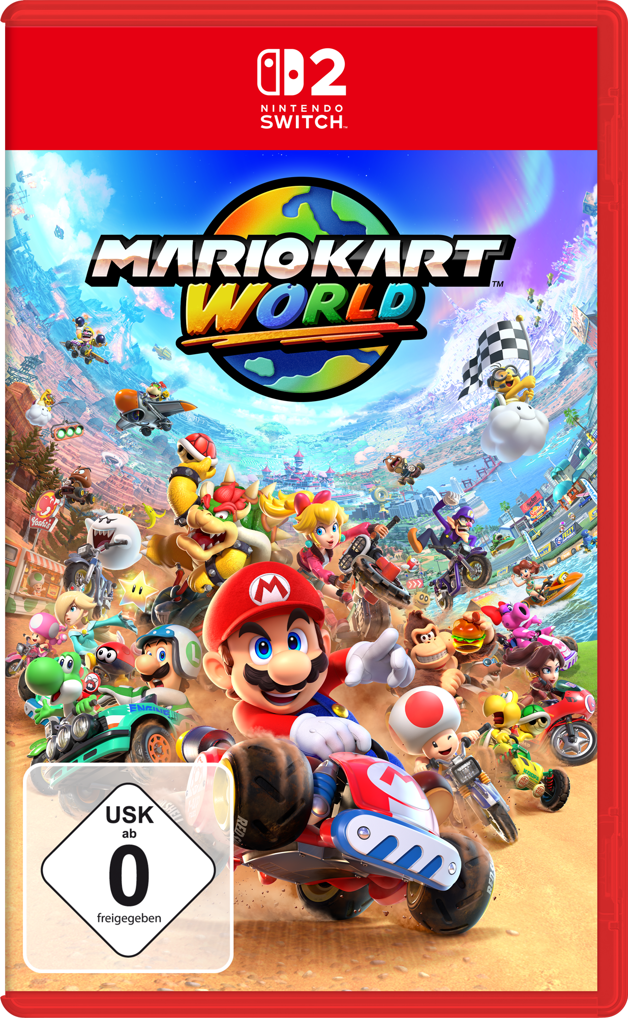
To mask and hide this artwork, for new games like Mario Kart World, but particularly Switch 2 Editions of classics like Kirby and the Forgotten Land and Legend of Zelda: Breath of the Wild, feels wrong. The art is hidden behind a slab of red, with a small logo and then caked-over with the kind of disclaimer text usually reserved for the rear of a box.
If you're not put off by the prices and the box art, read our explainer on how to pre-order a Switch 2. And for a more positive take, read the five epic Nintendo Switch 2 surprises that have fans talking.