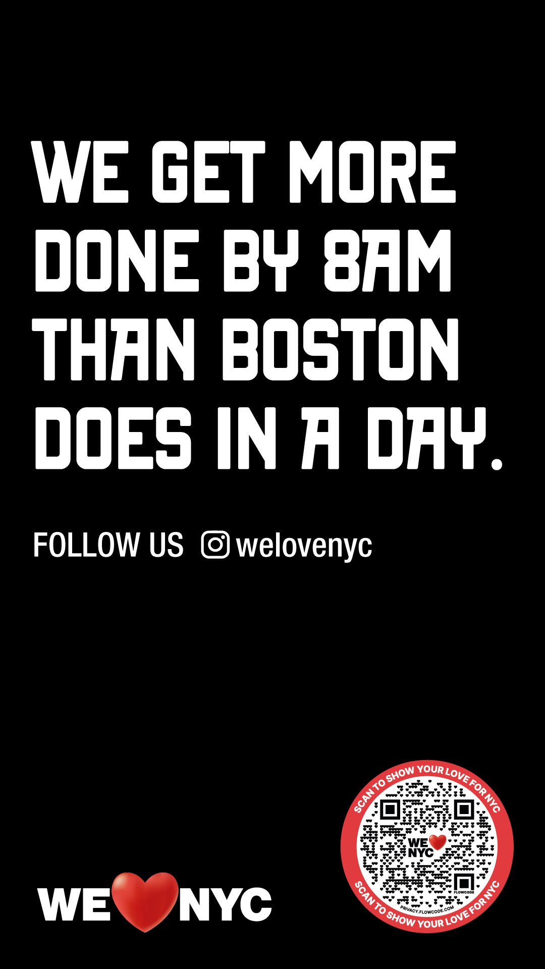
A promotional advertising campaign launched by “We Heart NYC” has ruffled some feathers after taking a swipe at fellow east coast city Boston.
“We get more done by 8am than Boston does in a day”, reads the street display, a photograph of which was shared to social media.
Not everyone was a fan of the provocative message.
“Aside from the abominable design, this we heart nyc publicity campaign is also very rude,” captioned the original poster.
Some commenters described feeling “embarrassed” by the campaign: “Proof that Boston lives rent free in the heads of NYC officials,” wrote one.

Others contested the “hustle culture” that the campaign seemed to promote: “It’s like someone got read too many of those ‘I get up at 3am’ posts on LinkedIn while drunk and and decided they were a good thing,” wrote commenter, while another said: “Guilty as charged: I am not trying to get anything done before 8am and I'm pretty ambivalent about what gets done after that.”
Other commenters took exception to the suggestion that New Yorkers were early risers, with one writing: “This is also funny because when I used to travel from Boston to NYC for work I would get to the office in Brooklyn at 9.30ish and none of my coworkers would be there yet.”
Another added: “People in Manhattan don't start work until 9.30”.
One person saw the opportunity to attack New York’s sports fraternity, writing: “I guess this doesn't include winning a single playoff series”.
In a statement shared with The Independent, Kathryn Wylde, president and CEO, Partnership for New York City, said: “With humour and a touch of hyperbole, our campaign celebrates what is great about NYC.
“We are well known to have the most productive workforce in the world. Substitute any other city for Boston, and the point is the same.”
The controversial image comes days after the city unveiled an updated version of the iconic “I Heart NY” logo, which was rebuffed by many New York natives.
On 20 March, a committee of elected officials and community members launched the “We Heart NYC” campaign to “inspire optimism and civic action” in a post-pandemic New York City.
Many felt that tampering with the original 1977 logo by Milton Glaser was a mistake, however.
“Feels emoji-like and lacks anything that feels timeless or iconic,” said designer Scott Belsky. “Why not engage some long-time NYC designers to explore more possibilities?”
“My intro to graphic design professor in college would have absolutely dunked on the student that tried to submit this for a grade,” said reporter Rebecca C Lewis.


