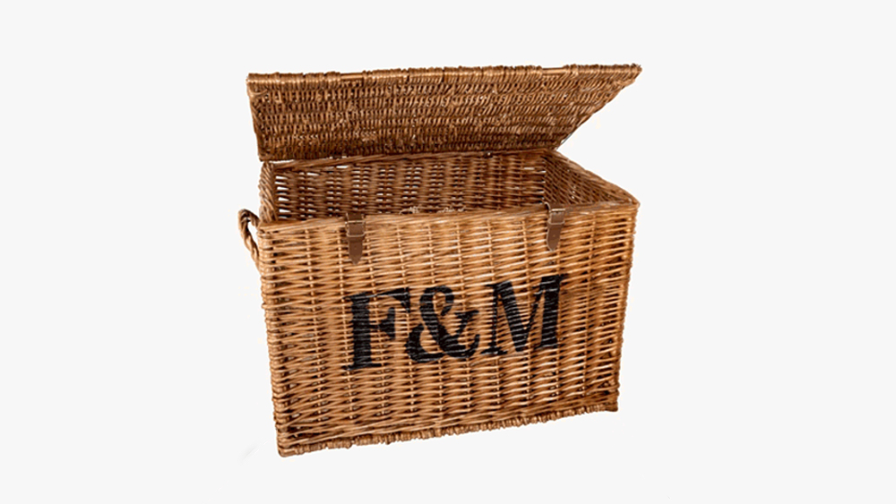
For 317 years, the London department store Fortnum & Mason has been selling everything you could need for a swanky picnic, from posh pickles to booze and (now faux) foie gras. Yet somehow, despite its pedigree, it's never had its own typeface.
It's been rolling with Gill Sans in recent years, but it didn't seem right for such a historic and esteemed brand to making do with something so generic. But Finally, it has the exclusivity that you would expect with its own bespoke fonts: a whole hamper full of them (they could hardly go with one of the best free fonts, could they?)
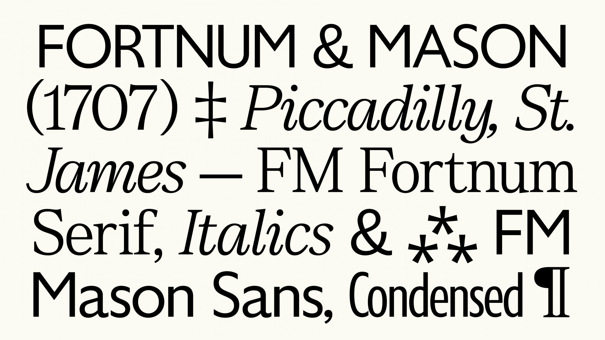
Created by Otherway and Colophon Foundry, the new type family comprises three collections with a sans serif, FM Fortnum Serif, its condensed counterpart, and a serif, FM Mason Sans, totalling 12 styles.
Otherway says the high-end store had realised it needed to move away from the "increasingly overused" Gill Sans but also needed a new serif with better readability and more personality than the classic Century.
"We delved into the Fortnum's archive for inspiration – finding details and quirks from that would build a robust set of design principles to draw from," the studio says of the project. The new fonts capture the essence of a contemporary British brand, honouring its past while embodying modern design principles and its vision for the future. Ensuring the brand remains a symbol of British design and innovation."
As ever when pairing two entirely new typefaces, there was the challenge of making them feel distinct from each another but also harmonious when used together. "After all, Fortnum & Mason was started back in 1707, by two very different personalities - but both came together for the greater good of an enterprising business opportunity at 181 Piccadilly," Otherway says.
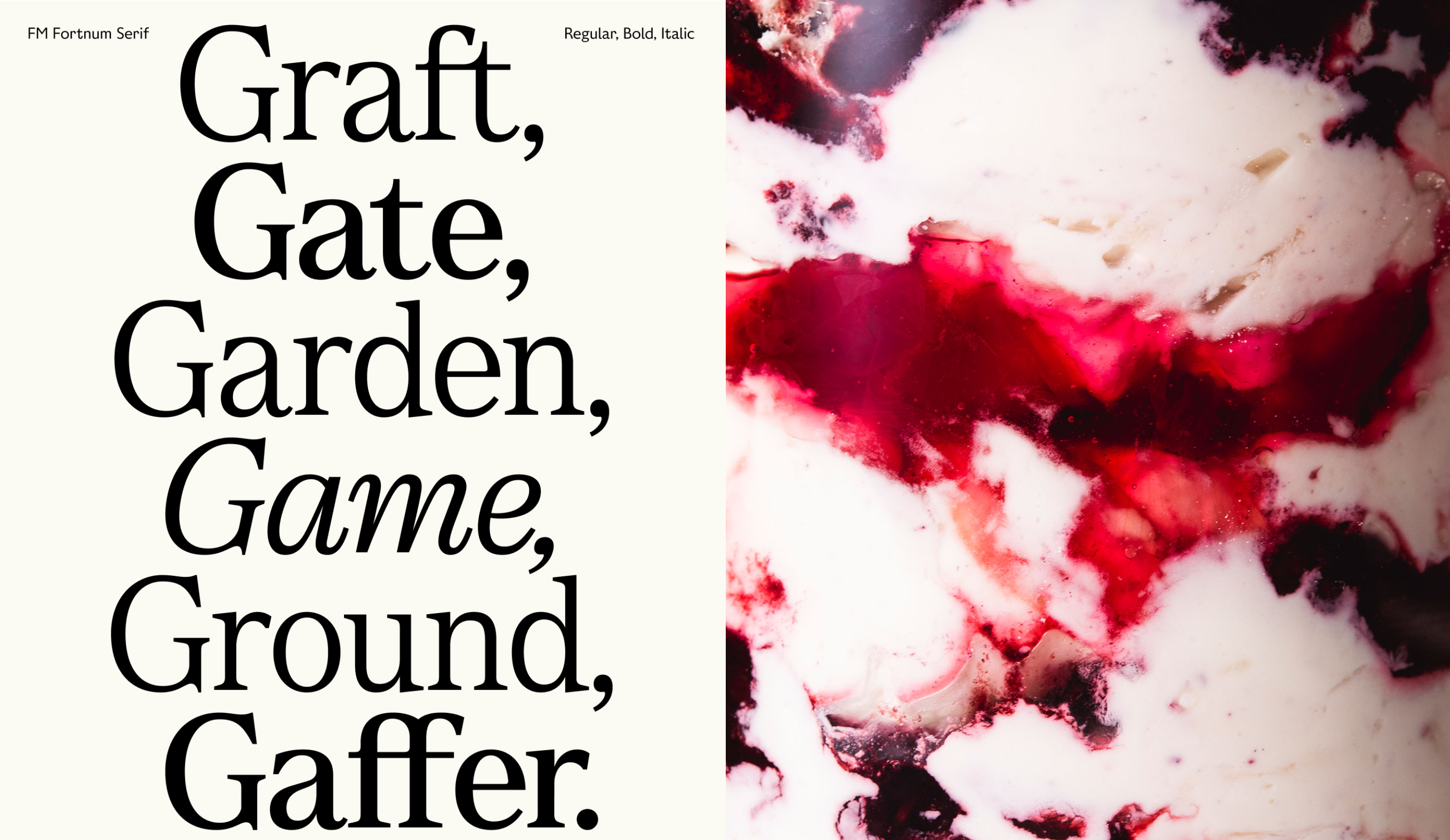
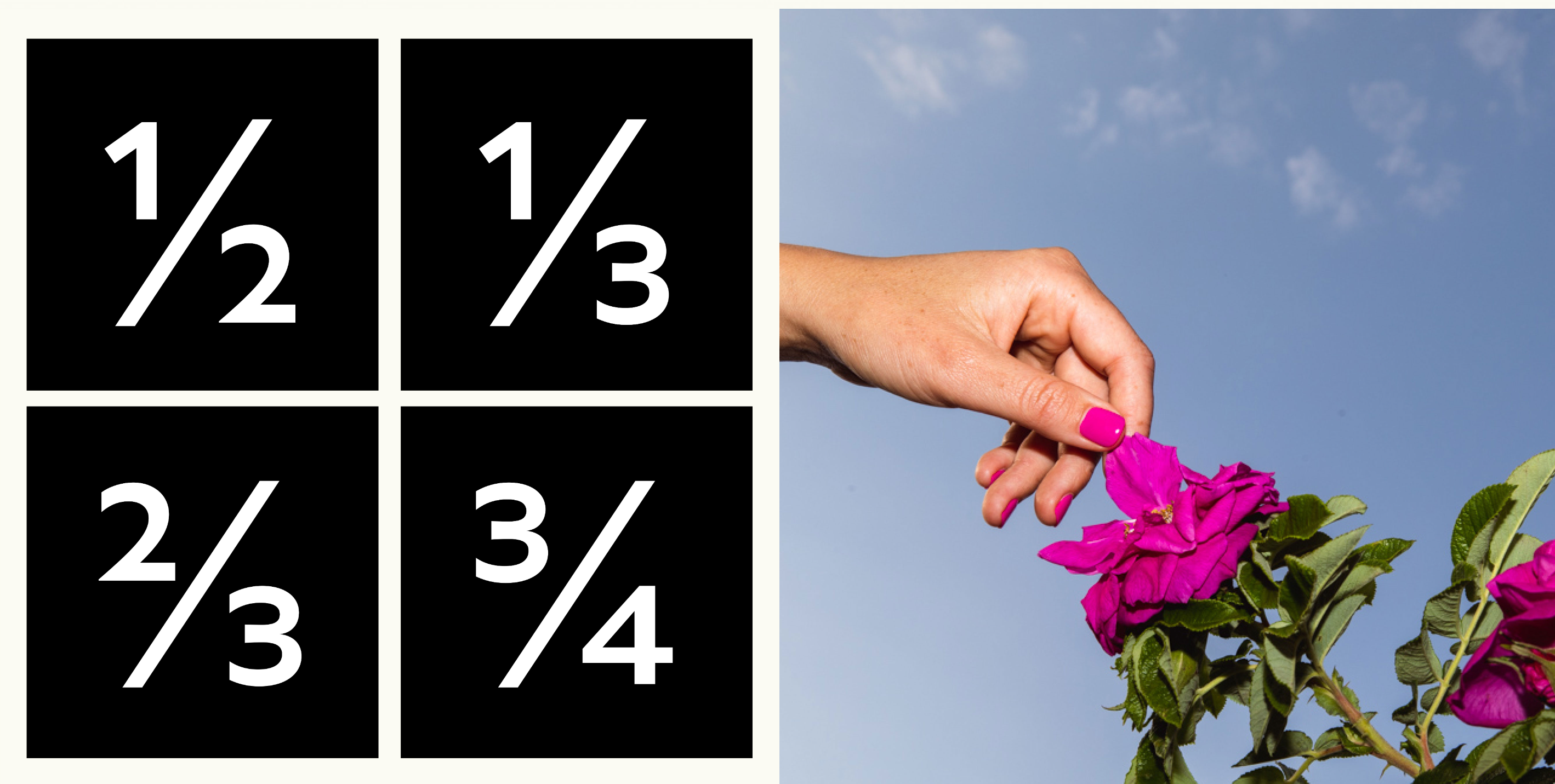
The result is two typefaces with different personalities that work together. Drawing inspiration from the penmanship of calligraphic letterforms, FM Fortnum Serif evokes the brand's heritage with a nod to craft traditions, balanced with the elegance of contemporary type design. On the other hand, FM Mason Sans is described as a versatile, hardworking typeface imbued with quintessential British character and quirk. Finally, the condensed collection serves to make the typographic style work on even the smallest packaging. Together, the new type family is a homage to Britain’s typographic history and a fitting voice for a storied London brand.
For more typography news, see the nostalgic Kellogg's typeface and the new Spotify font and typeface for Shakespeare's The Globe. We also have a list of tips for creating your own typeface.