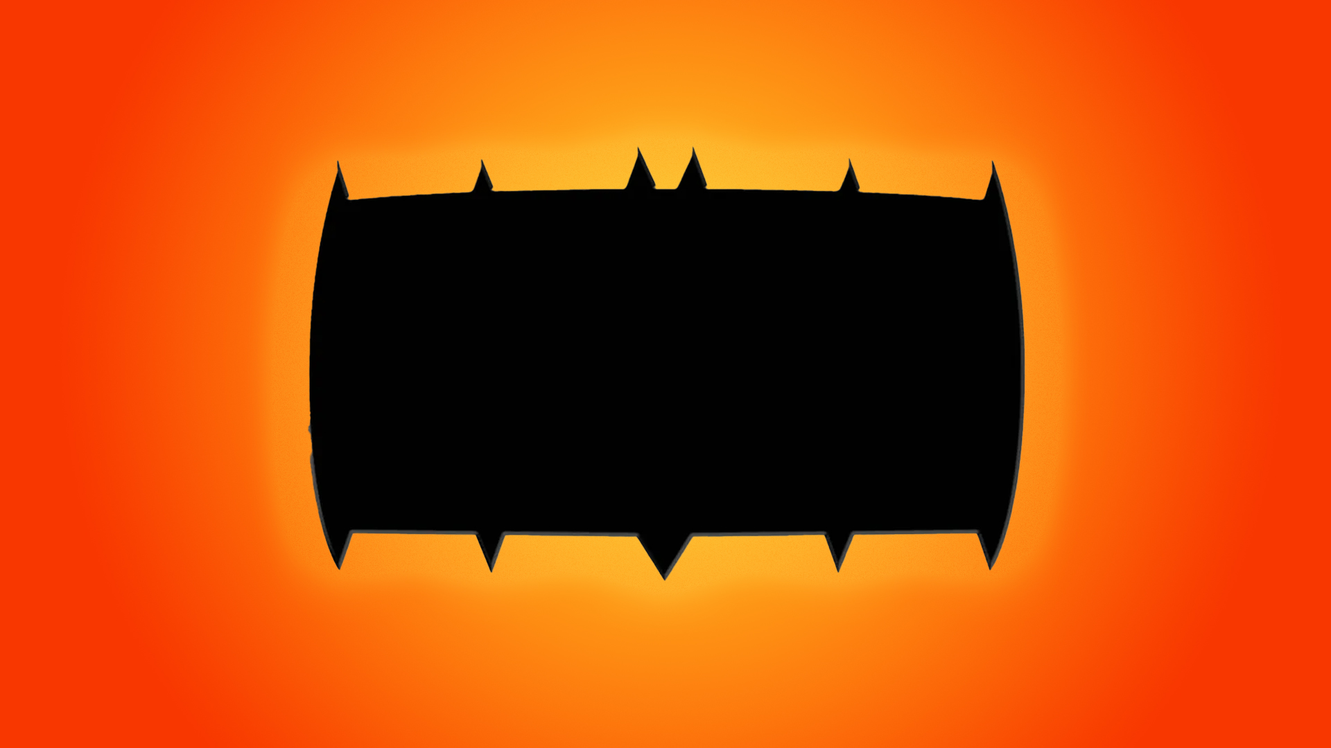
Last month, comic book publisher DC revealed the revamped character design for its new series, Absolute Batman. While most fans were on board with the pumped-up, exaggerated design of the new Dark Knight, one issue has caused major contention – the bizarre redesign of the iconic bat symbol.
Initially, I brushed it off as a simple costume redesign, but it turns out the brick-like bat logo is here to stay and some fans are not happy, with some even calling for James Gunn to scrap the design altogether. Love it or hate it, the fierce backlash to the new Batman logo is a testament to the importance of comic logos as a symbol of a fanbase (and confirmation that you can't please everyone).
Post by @stuart.dillon.7View on Threads
The logo design in question is abstract to say the least, featuring a rectangular shape with rough jagged edges that somewhat resemble the pointed wing tips of the original bat symbol. While Batman's new character design brought the promise of a bigger and broodier Bruce, fans weren't exactly anticipating this broadening across all aspects of the new comic artwork. The flattened and fattened logo design has received such scathing backlash that some fans have called for a total redesign.
"Artistically, just seems like a lazy design," one fan on X commented while another suggested that the "chonker of a Batman logo" was a "deliberate marketing strategy" purposely ruffling feathers to promote the upcoming comic series. Calls to change the design soon reached DC CEO James Gunn, who told fans on Threads "I have no jurisdiction over the comics!", so it seems we have no choice but to make peace with this beefy design (whether we like it or not).
This Absolute Batman symbol would look better if the top spikes weren't there, aside from the two in the middle. Artistically, just seems like a lazy design. pic.twitter.com/UNyPgLWvrIAugust 23, 2024
They're high, right? Like, This is a joke? Absolute Batman? More like Absolute Buffoon.I sincerely doubt anyone actually looked at this logo and thought it looked good or was remotely acceptable 😭#Batman pic.twitter.com/oWN6r87Yr5August 24, 2024
i'm curious how long it will take ppl to figure out that the existence of this absolute chonker of a batman logo that dc came out with recently isn't a matter of poor design, but a deliberate marketing strategy pic.twitter.com/J3xjYS6HtCAugust 25, 2024
At the risk of sounding like a contrarian, surprisingly I'm quite a fan of the new Batman logo. In the context of the Absolute Batman character design, the logo complements the exaggerated comic book style of the new illustrations, giving a more graphic feel to the logo. Since its debut back in 1939, the Batman logo has undergone countless iterations and not every design is going to fly with diehard fans. It's refreshing to see DC branching out with a more stylised look and I'm excited to see how the Absolute DC series evolves more iconic characters.
For more comic news, check out CASETiFY's swanky Deadpool & Wolverine Co-Lab accessories that have a delightful retro vibe. If you're after more from the world of DC Comics, take a look at the new DC logo that's a welcome return to a classic design.