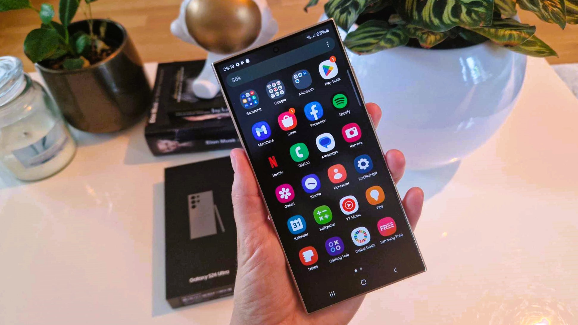
What I hate most about smartphones is Settings. It’s hard to organize a Settings menu, and today’s phones prove that. Even the best phones have terrible Settings, and because it's such a challenge, I like to make Settings the focus of my argument to explain how Samsung’s OneUI software has gotten so terrible, and why Apple’s iOS is better. Buckle up, because I’m opening Settings, and it’s about to get ugly because Settings are bad everywhere, but especially on a Samsung phone.
What’s the best I can expect from a Settings menu? Nothing. Really. I hope to never use Settings. On an ideal smartphone, Settings wouldn’t exist. The AI revolution in smartphones is leading to this point. Eventually, AI is going to manage Settings. You’ll tell the AI what you need, and it will make the adjustments.
To that end, Samsung could end up with the BEST Settings on any smartphone. Bixby, Samsung’s much-maligned digital assistant, is built to manage Settings. Most of what you want to do with your Galaxy phone, and what I’ll complain about below, can be simplified using Bixby.
Hold down the Bixby button and ask your phone to “turn on the Wi-Fi hotspot” or “change the screen mode to Vivid” and Bixby will do it. Bixby knows Settings better than any human. That’s part of the problem. The Galaxy’s Settings are so complicated they need to put an AI in charge.
What I want from Settings is as little as possible
Back to what I want: the least effort possible. I don’t want to use Settings, so the more time I spend with Settings open, the bigger the fail.
The most common Settings on a phone should be available with one swipe. On my iPhone 15, I swipe down from the upper-right corner of the screen, and I get instant access to not just brightness and Wi-Fi, but also I can quickly tap Do Not Disturb, activate Power Saving, open my Apple TV remote, or even create a new reminder.
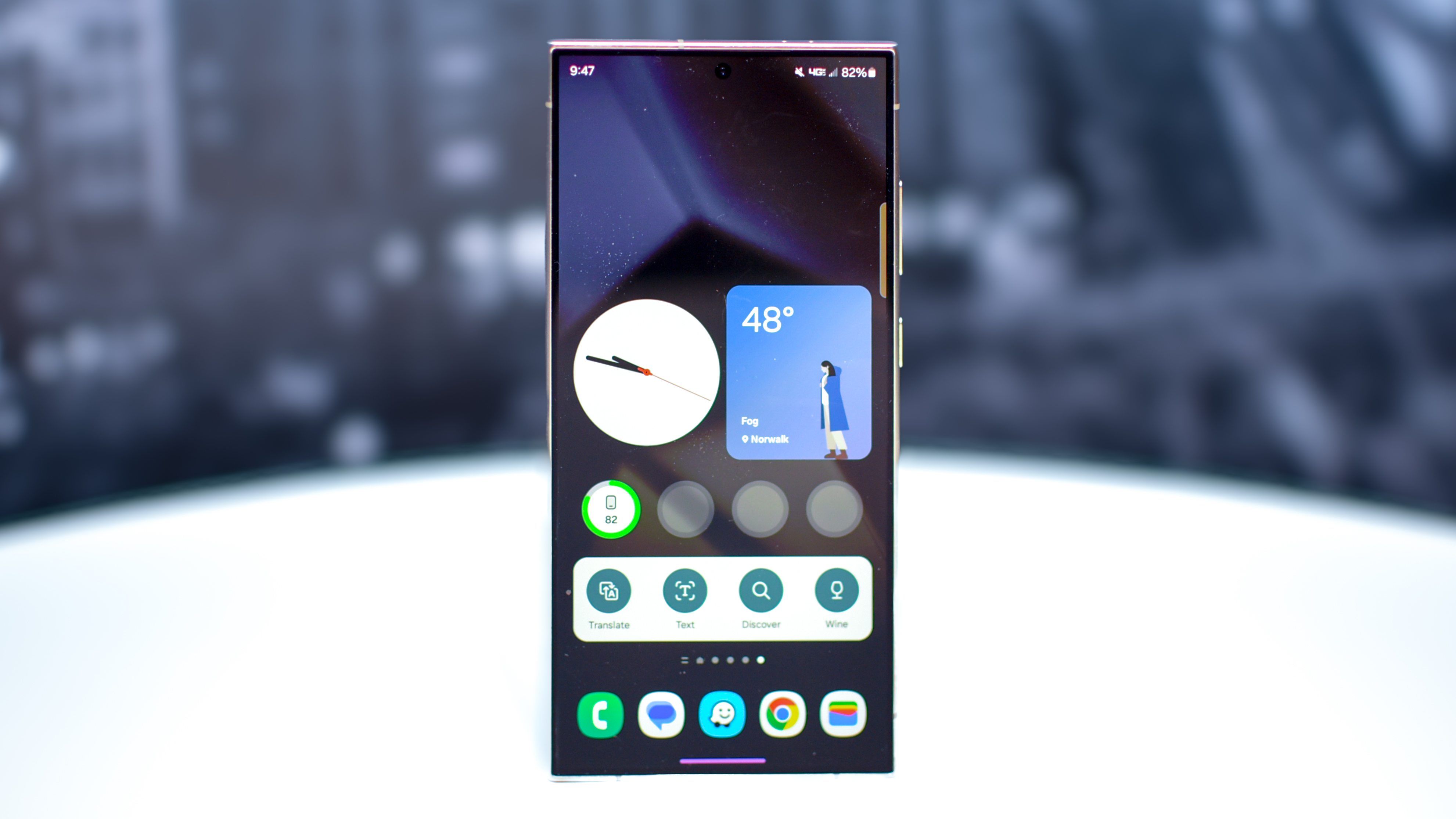
On my Samsung Galaxy S24, I swipe down from the top of the screen, and I get six Quick Settings buttons, as well as a litany of notifications. To find all of Quick Settings, I need to swipe again. That's the difference between Apple and Samsung. Too many tasks require an extra step on my Samsung phone.
Even the faster way is slower
Samsung fans are screaming at me, because you really only need to swipe once to see all the Quick Settings buttons, but that’s a Setting you need to enable. Where do you enable this option? After you swipe down twice, you’ll notice a tiny little ‘customization’ pencil icon. If you tap that icon, you can activate a few useful features, like seeing all the Quick Settings after just one swipe.
You can also set up a hot corner to show all of the Quick Settings buttons at once, just like Apple uses. Of course, good luck finding this option, even though it should be turned on by default. Good luck finding any of these options, in fact.
See, these Settings are not actually in the Settings app. Want to see the Quick Settings buttons with a single swipe? That option is not anywhere in Settings. It’s only found under that tiny pencil menu, the one you find by swiping down twice. Suddenly my Galaxy S24 Ultra feels more like a quest through Legend of Zelda than a modern smartphone.
Putting the Settings to the real test
As for the Settings app, Apple and Samsung have very different philosophies. On your iPhone, ALL of your Settings are in the Settings app. All of them. All the settings for every app you use, as well as all of your basic phone settings, are in the same place. The Settings list is therefore very long, since it includes every app on your phone.
On my Galaxy S24, like all Android phones, there are Settings in each separate app. That would be fine if Settings were well organized. My Gmail settings are in Gmail and my Facebook settings are in Facebook, but all of the other settings on my phone should just be in Settings. Sadly, this isn’t how Samsung phones are organized, and it doesn’t seem like there is any consistent organization at all.
Sometimes settings are in the Settings app. Sometimes they are hidden under strange little icons, like the ‘pencil’ example above. If you see an enigmatic set of dots anywhere on your Galaxy phone, a cairn of pixels stacked atop each other, that is probably a hidden settings menu.
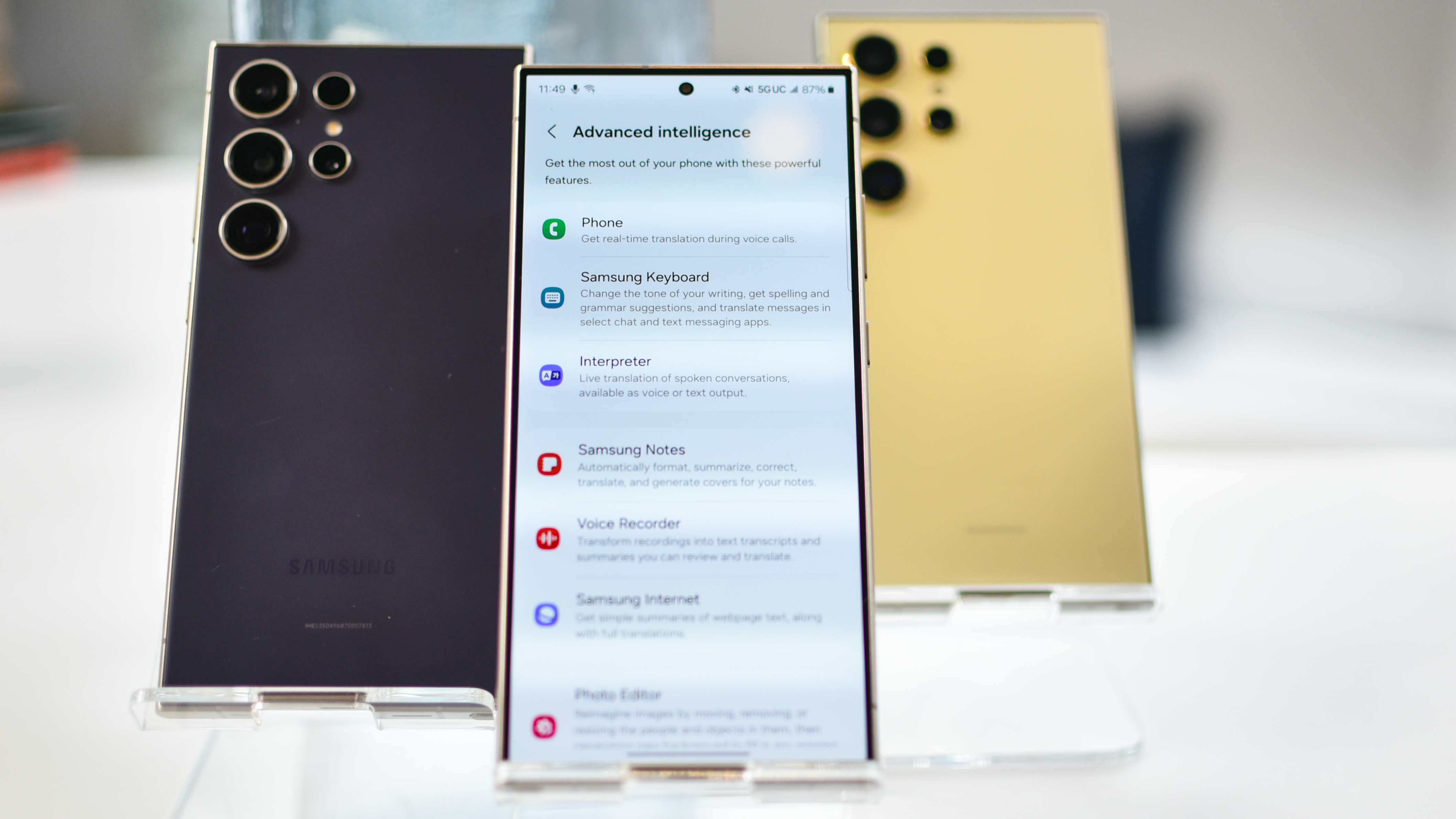
Worst of all, Samsung’s Settings app is a big mess. While Apple’s Settings is a very long list, once you start digging, there isn’t very far to go. Whatever feature you want to find, you’ll get there in one or two steps.
To test this, I chose 10 common reasons why I use the Settings menu. Without using any advanced shortcuts, like a long-press on a Quick Settings button, and without simply searching for the Settings I wanted, I mapped how many steps it took to accomplish my Settings goals on the iPhone 15 and the Galaxy S24. The results were clear.
The Galaxy phone is never faster. For half of these Settings, the iPhone took fewer steps than the Galaxy. For the other half, the Settings took the same number of steps on each phone. Nothing was ever faster on the Galaxy phone.
Samsung can have a faster processor, more megapixels, and all the specification wins that it likes. It isn’t beating Apple if the phone isn’t better to use. Here’s the proof, Samsung, that your phones are verifiably more complicated to use. More steps means slower. It’s time for Samsung to improve its software dramatically if it wants to be the best and the fastest phone around.


