Which is the best NBA jersey of all time? Which is the worst? Which jersey is slept on? Are there too many uniforms now? The Crossover staff answers.
What is the best jersey of all-time?
Mark Bechtel: Here’s a hunch: Most people are going to opt for a jersey worn by their favorite team, probably from their childhood. I know I am. The Cavaliers of the late 1970s and early ’80s were horrible. But their duds were impeccable. The wine-and-gold (a truly underrated color scheme) checkerboard pattern that ran up the sides of the jerseys and shorts brought a wonderful pop of color. Seeing them evokes memories of Bingo Smith, Foots Walker and Campy Russell. Usually playing in an empty cavernous arena and losing, but still …
Chris Herring: I’m tempted to say the 1990s Hornets jerseys with teal pinstripes or the black ’90s Bulls jerseys with pinstripes. (The black Miami Vice ones made me think, too.) But instead I’m going with the Raptors’ purple jerseys with the big red dinosaur and pinstripes. So many people used to think those things were ugly, but they’ve always been eye-popping to me. They still look great, and, even back when the team was terrible, the jerseys were the one good thing the franchise had going for it.
Rob Schumacher/The Republic/USA TODAY NETWORK
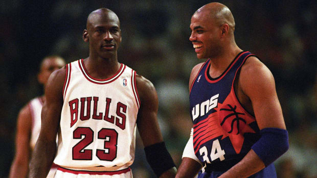
Wilton Jackson: The Suns’ home and away jerseys of the 1990s. Nothing beats the blocked-style letters, numbers and the iconic flames running through the center to connect the basketball. No matter the base color—black, purple or white—this is a must-have in your jersey collection. When I see it, I automatically think of Charles Barkley’s ’93 MVP season and Phoenix’s ’93 Finals appearance.
Robin Lundberg: The best jersey of all-time is very subjective, so I decided to go with one that has stood the test of time rather than simply a personal favorite. The three that stood out under that criteria to me were the traditional looks of the Lakers, Celtics and Bulls. But when I close my eyes and picture an NBA jersey, the first image that pops up is the red worn by Chicago ... making that the most iconic uniform I could think of.
Elizabeth Swinton: The Raptors' purple jersey from 1995–99 will always be a classic, and it lives on with each Vince Carter throwback sold today. It is bold, but its colorful palette and fun nature are what make it stand out and draw fans' attention years later.
Kyle Wood: It's hard to beat the Vancouver Grizzlies’ turquoise threads. Worn in the late 1990s to early 2000s, it's a treat that we got to see Ja Morant don this throwback to honor the previous home of the franchise, something Memphis should do more often. These jerseys are flamboyant with block-like 3-D text that looks like it got clawed by the team's namesake, and there's detail beyond the eye-popping contrast of red text on a turquoise base. The patterned trim around the neck and sleeve lines completes these jerseys, not to mention the grizzly bear that decorates the side of the shorts.
Watch the Grizzlies, Suns on Christmas Day: Full NBA Schedule Here.
What is the most underrated jersey of all-time?
Bechtel: This is a tough one, because with so many retro jerseys it’s hard to sneak one under the radar. So I’m going off script and picking an ABA jersey. The NBA’s hipper, ne’er-do-well younger cousin might have been a disaster when you looked at the bottom line, but it had some amazing uniforms. The Spirits of St. Louis, featuring an old-timey airplane spelling out the team name in a contrail, were the best, but that’s probably too well known. So I’ll take the Pittsburgh Condors, whose jerseys featured a vulture ominously clutching a basketball.
Herring: The black Suns jerseys from the 1990s were excellent. Even though the team doesn’t wear them much these days, they offer a fun, simple template to work off for alternative ones, and many of the team’s current jerseys look good, too, because of it.
Lundberg: I'm not sure what exactly qualifies as underrated, but I will show the SuperSonics some love. Since Seattle is no longer a franchise, the younger generation may not realize the cultural footprint the Sonics once had, so I will pay respect to the classic green unis that generally were seen with either Kemp or Payton across the back.
Jackson: The Pistons’ teal jersey from 1996 to 2001. Many people still don’t rock with the teal jerseys that feature the iconic horse logo and the red, yellow and black trimming. I’ll be the one to say this jersey has always been fire. Yes, we all have nostalgic memories and sentiment for the “Bad Boys” threads. But, watching Grant Hill, Jerry Stackhouse and Lindsey Hunter in this jersey does not get enough praise.
Swinton: The Washington Bullets had a good thing going on with their striped jerseys from the mid-1970s to ’80s. The red, white and blue combo has been used by many teams across all sports, but the horizontal stripes were a clean and simple staple of that era.
Wood: The early-2010s Trail Blazers’ white Rip City alternates deserve more love. Red, white and black is admittedly a difficult colorway to go wrong with, but they nailed this one. It’s all in the font and how it’s configured, though the intrigue of the iconic name bestowed upon the team decades earlier helps, too. The looping Y that comes back around to underline the moniker for Portland is visually pleasing, and the subtle trim around the neck and on the sides give these jerseys a bit more texture. The inclusion of the logo—which is also underrated—on the chest makes these stand out from other iterations of Trail Blazers uniforms.
What is your favorite current NBA jersey?
Bechtel: I love the Bucks’ look. Everyone wants their jerseys to either pop with color or be overly black, but Milwaukee is the rare team that embraces earth tones. The deep green is great, but what really sets the Bucks apart is the warm cream in the lettering. You just don’t see that color anywhere else in sports. And it’s somehow perfect for Milwaukee. It just looks like a cold-weather jersey.
Herring: I think I’d go with Golden State’s “The Town” jerseys these days. I haven’t made up my mind about whether it’s blasphemous to continue to pay respect to Oakland now that the team recently moved to San Francisco. But there’s no denying the jersey looks cool, especially considering its limited color scheme.
Vincent Carchietta/USA TODAY Sports
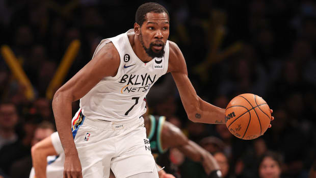
Lundberg: One thing the Nets do well is accessorize. My favorite current jerseys are some of their alternates, like this year's white Basquiat and the ABA-style look they have as well. I'll go with the latter for both modern and historical purposes but regardless, when it comes to a collection, the Nets have the best.
Jackson: The Grizzlies’ 2022-23 city edition jerseys. The details in this jersey are spectacular. The bold “Memphis” wording dating back to the iconic ’01 Grizzlies thread and the infused chrome detailing that was inspired from a local hip-album are amazing to me, music in a thread. I absolutely love the MG pattern around the neck that pulls out the diamond texture and the classic bear on the side of the shorts. They are outstanding and bring out the true Memphis culture.
Swinton: The Nets just got it right with their classic edition jerseys this season. Give me all the New Jersey/ABA Nets nostalgia; the stars-and-stripes jerseys just don't get old.
Wood: The Jazz were the only team to not release a city jersey for the 2022–23 season. Instead, they came out with a classic alternate that's essentially a modern version of the jerseys Karl Malone and John Stockton wore during their back-to-back Finals trips. Some teams either oversimplify or go completely overboard with their city alternates, but these are a nice medium that are still distinct. They pay homage to the greats, plus the purple stands out and the fade on the mountains is sleek.
What is the worst jersey ever?
USA TODAY Sports
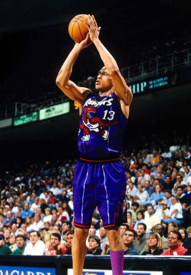
Bechtel: I’m pretty sure this will not go over well, but the Raptors’ dinosaur uniforms were terrible. Don’t be cartoonish. And it doesn’t even make sense. The NBA is all about wingspan. If an actual raptor tried to dribble a ball it would get stolen every time.
Lundberg: I'll go with the Charlotte Bobcats for worst jersey ever. There are plenty of ugly alternates but I thought I'd honor such a nondescript franchise that doesn't get much love. They wore some orange things for a while that stood out among what really has been a plethora of blah apparel.
Swinton: The Suns went from one of the best jerseys to one of the worst when they left behind their Charles Barkley–era jerseys after the 1999–2000 season. What followed paled in comparison: a solid background with the only front-facing design detail a halo around the jersey number. All good things must come to an end, but the jersey style that ran in different iterations up until ’13 left much to be desired.
Wood: This isn't a dig at any one particular team's style—just the horrible era that was the NBA's sleeved-jersey run, which was wholly unnecessary. Jerseys are jerseys, and shirts should be shirts. Thankfully, Nike stopped the madness in 2017, and the sleeves came off. The top teams that come to mind sporting these are the Cavaliers and Warriors, who, of course, met in the Finals year after year when sleeved jerseys were en vogue. That both Steph Curry and LeBron James took issue with the style is further validation that it never should have come about in the first place.
What are your thoughts on the various jerseys NBA teams wear now? Are there too many now?
Bechtel: Are there too many jerseys? As the resident old cranky man on staff, I’m going to say yes, there are too many. I have no fundamental issue with breaking out a variety of looks. The problem is that too many of them just aren’t interesting enough. I’m a sucker for the classics, like the Celtics’. But I also love when they break out the gold trim. That’s enough, though. Have a color, a white one and one for special occasions. Leave everything else in the locker. And if it has sleeves, just take it to the shredder, then burn the shreds, then flush the ashes down the toilet.
Herring: There probably are too many. At the same time, who cares? It’s a fun sport. If I was that annoyed by it, I’d have to look inward and ask myself whether I’m becoming that old, crotchety sports fan who just hates on stuff for no reason. At least having more jerseys these days gives us a chance to discover new ones that we can enjoy. Which is a welcome shift, given that most of the great ones are from the 1990s, in my opinion.
Lundberg: There are certainly too many to keep track of. But I'm not going to be the old man yelling at the cloud, because that also gives fans plenty of options and allows for teams with more mundane style to add a little flavor. Let's just hope anyone's next jersey purchase isn't of a player who then immediately asks for a trade.
Jackson: I think it's great that teams have tons of threads to choose from. The variation is great. While I do think the signature jerseys for some franchises will forever remain a classic, seeing the amount of detail, the sophistication and the storytelling in uniforms blows my mind. Keep this trend going.
