The second inaugural NBA Cup will bring our second slate of new court designs. Last season, the NBA Cup games featured colorful, bright courts special for the tournament games. Before the season, we ranked every new City Edition Jersey. This ranking will follow a similar format.
Last season, each unique court featured one main color with a solid block of a secondary color connecting the two paints. These new courts feature heat map-type circles, which I find to be much cleaner and less busy overall.
Once again, these rankings are solely based on my subjective opinion. It’s nearly impossible to quantify aesthetic preference at times, so bear with me. I’ll consider color schemes, designs and any unique elements along with the nebulous “cool” factor. Just like last time, we’ll be splitting the list into tiers.
Images of the courts come from this Sports Illustrated article.
These will hurt to look at.
- Detroit Pistons
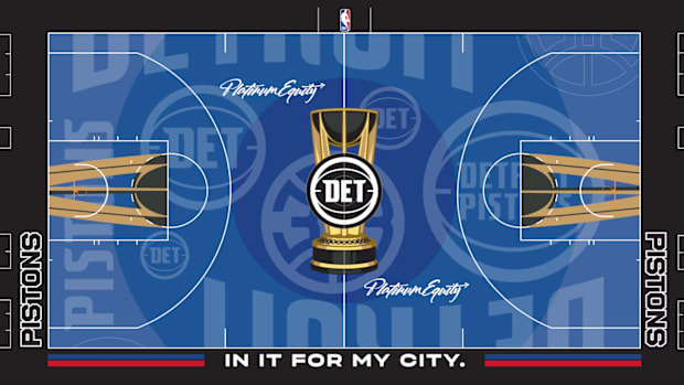
My goodness, there is so much going on here. The logos and team names look randomly plastered throughout the court. Thank god the Pistons are more fun this season because this court will be an eyesore.
- Atlanta Hawks
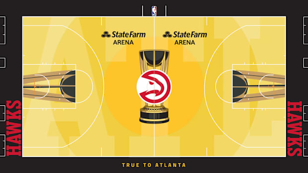
A few teams went with bright yellows for their primary colors, which are admittedly not my cup of tea. I wish Atlanta stuck with the baby blue and red as opposed to this blinding yellow gradient.
- OKC Thunder
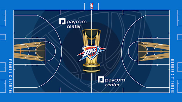
Similar to Detroit, the gigantic, misaligned OKC logo in the background is highly distracting. The court doesn’t feature orange prominently and lacks any character or flare.
- Denver Nuggets
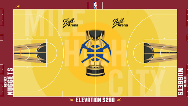
Denver does a better job than Atlanta did by contrasting the yellow with the dark red and blue center-court logo. It’s still far too bright for my liking.
- Miami Heat
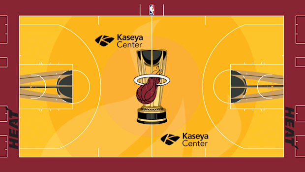
I suppose this one is an upgrade to last year’s disaster at the very least.
- New Orleans Pelicans

Once again, I’m not a fan of the deep dark blue and the oversized logo in the background. I wish the Pelicans leaned into the Mardi Gras colors instead.
Why is it so gray????
- Golden State Warriors

Last season, I thought the gray courts were generally disappointing and this year is no different. That’s especially true for teams like Golden State with so much great source material to pull from.
- Utah Jazz
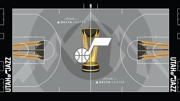
Between their purples, light blues, greens and sunset oranges, Utah has the most diverse color palette in the league. A full gray and black court, despite the mountain in the background, is a massive letdown.
- Sacramento Kings
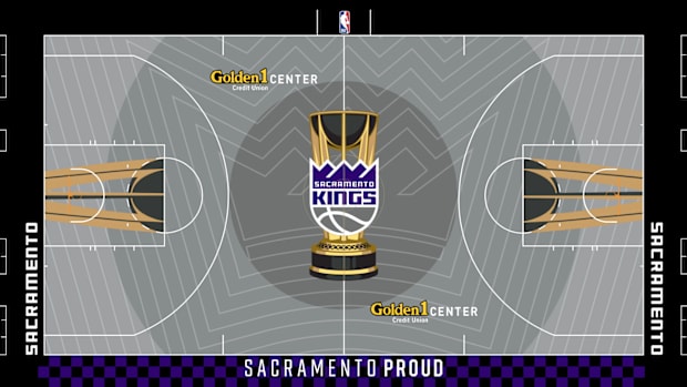
Aside from the general drab of the color scheme, this court is far too busy. The bright yellow of the Golden1 Center logo doesn’t match either.
- Memphis Grizzlies
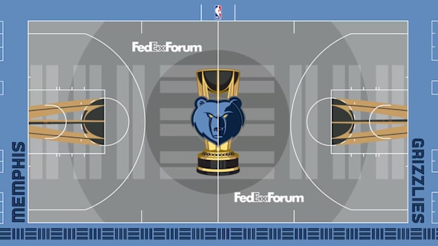
I don’t hate how the gray pairs with the light blue outside the court, but this is boring and uninspiring.
- Orlando Magic
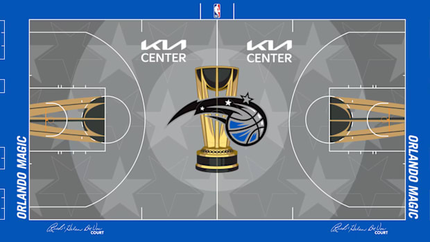
Similar to Memphis’s court, the dark blue and gray pair well and the stars throughout the background look nice. It’s till too gray for my tastes, though.
Inoffensive and maybe could be better.
- Brooklyn Nets
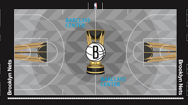
I included the Nets and one more gray court in this tier given it fits their brands better. The patterning, subway-inspired font and blue Barclays logos all give this gray court a bit more flare and intrigue.
- San Antonio Spurs
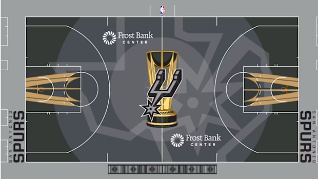
I honestly don’t have much of an issue with this court. Not utilizing any of the fiesta colors was a poor choice, though.
- Houston Rockets
Classic Houston red with some white lines drawn on the background make for a solid court.
- Phoenix Suns
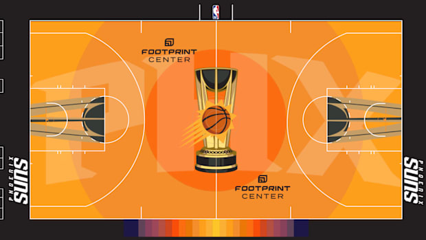
The bright orange and black mesh well together. I would have hoped for some purple accenting, but this court should look solid.
- Indiana Pacers
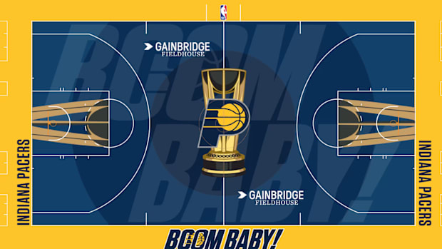
I love the Pacers paying homage to Slick Leonard with the “Boom Baby” throughout the court. It’s a nice nod to team history, even if I’d hoped the Pacers would attempt to build off of last year’s lovable eyesore.
- Minnesota Timberwolves

I’m not sure how I feel about the lime green but I appreciate the Wolves for doing something unique. The tree line on the bottom of the court is a great touch.
- LA Clippers
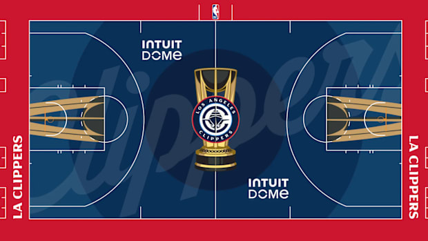
The Clippers kept it simple with their classic red and blue. Not much to criticize here.
- Washington Wizards
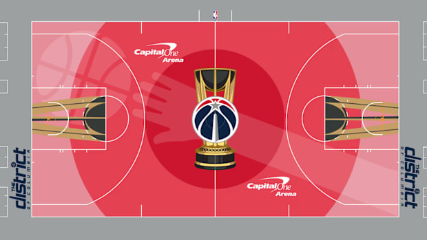
I appreciate the addition of the Washington Bullets logo in the background here. This should be a pleasant, basic court to watch.
These will be a nice change of pace.
- Chicago Bulls

It’s hard to complain about Chicago red and black. Despite my criticism of blown-up background logos, this one works best of them all.
- Cleveland Cavaliers

This court is the perfect example of a team leaning into their base color scheme and executing. Let ‘em know, Cleveland!
- Boston Celtics
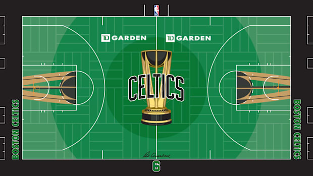
Boston’s green is as vibrant and eye-catching as always. The texturing on the court adds much-needed detail without doing too much.
- Philadelphia 76ers
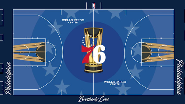
Lining the second circle with stars to pay homage to Philly’s logo and the original American flag was a great choice.
- LA Lakers

The Lakers are the only team who can get away with the bright yellow. It meshes perfectly with the purple and the stars and skyline make this feel like the court of Los Angeles.
- New York Knicks
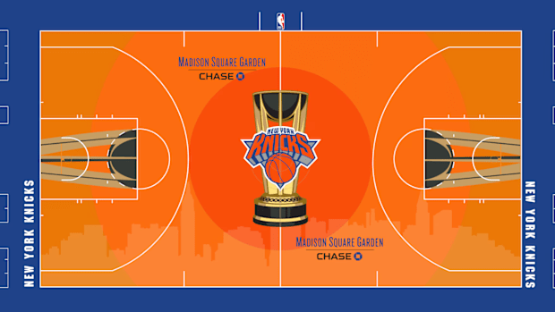
Something about the orange gradient here, especially complementing the blue outer court, works for me. The skyline on the bottom is a winner once again.
- Milwaukee Bucks
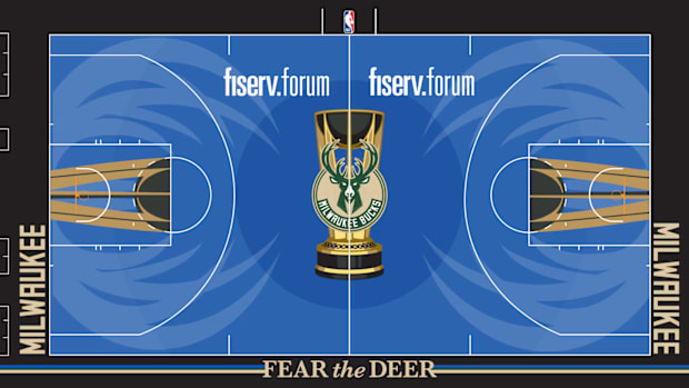
If you read the City Jersey ranking, you know I’m a sucker for Milwaukee’s blue changeup. The antlers work especially well with the circular theming.
Let’s make these the default courts.
- Portland Trail Blazers
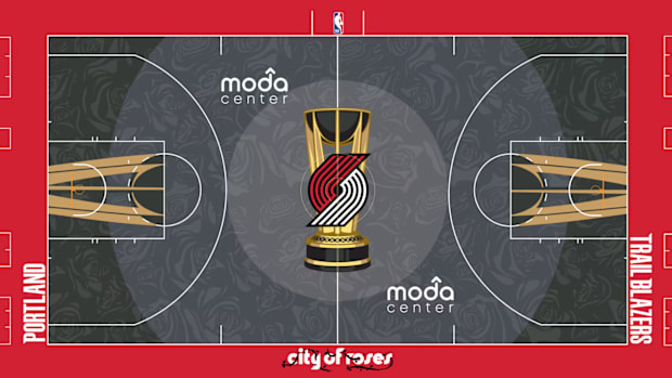
All the teams that tried (and mostly failed) to make gray work should have copied Portland. The deep, dark gray pairs perfectly with the red on the baseline and the roses covering the court look fantastic.
- Toronto Raptors
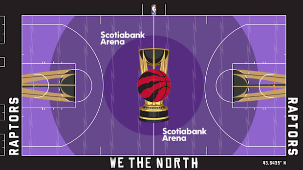
It’s tough to go wrong with Toronto purple. The detailing on the court looks excellent and the gradient is the perfect balance of bright yet not too much. It’s a classic color for a reason.
- Dallas Mavericks

Dallas’s court features my favorite shade of blue of all courts, not too bright yet just vibrant enough. The skyline on the bottom of the court looks excellent. This one is easy to look at and should be awesome to watch live.
- Charlotte Hornets
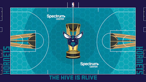
The honeycomb texturing vaults this Hornets court over the top. Charlotte’s teal blue is as beautiful as always. It’s a sublime basketball court.
