It's Typography Week here at Creative Bloq, and we've been catching up with graphic designers around the world to talk all things type. Every designer has a favourite font or typeface (although let's be honest, it's likely to keep changing). For more typographical inspiration, take a look at our guide to the best free fonts.
Lucy Eden is a branding specialist and educator who builds bold and individual brand identities for clients around the world while using her content creation on social media to inspire and educate fellow creatives in the field.
What's your favourite typeface?
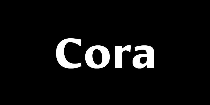
I always love a wide variety of fonts based on different personalities and use cases however lately I have loved Cora.
Can you tell us about a project you've used it for?
Recently, as I worked through a bit of a rebrand, I used this in my own brand identity for headings. I loved the style of this typeface because of the subtle elegance while also modernity and playfulness it provides. I wanted a direction that would have some personality rather than just a very basic sans serif but for my brand in particular, I didn’t want anything too crazy. Cora has had a very nice balance in that and a unique presence overall.
What makes this typeface unique?
I find the very subtle intentional curves in the design as well as the slight contrast in the letters really makes it stand out. I fee like each letter has a little bit of personality beyond the expected and it gives a very calming yet interesting and sophisticated look all at the same time. I enjoy the way it very subtly toes the line between serif and sans serif with some letters reflecting one style and some the other.
How would you describe its personality?
It has a softness, friendliness yet stability to it all at the same time. There is definitely sophistication coming through in the slight contrast variations in the letter forms however using the bold styling of it gives it the perfect dose of playfulness at the same time. To me it feels like a well-rounded, balanced typeface with just a hint of whimsy.
What kind of response do you think it elicits from the viewer?
This font has a good and positive aura. It lets the viewer understand from the first moment that the brand or the asset they’re being exposed to is friendly and approachable, but it makes it clear that it's one-of-a-kind and not like anything else they’re used to seeing. I think Freitag leaves the viewer with a smile on their face and a curiosity to learn more. Since it’s very versatile, the viewers also feel very safe and like they can trust it.