BlackBerry (née Research In Motion aka RIM) will forever be remembered for its addictive QWERTY-equipped smartphones and BBM, and how it lost everything to Apple and the iPhone. But there was one BlackBerry device I loved (and almost everyone hated) that deserves a better remembrance.
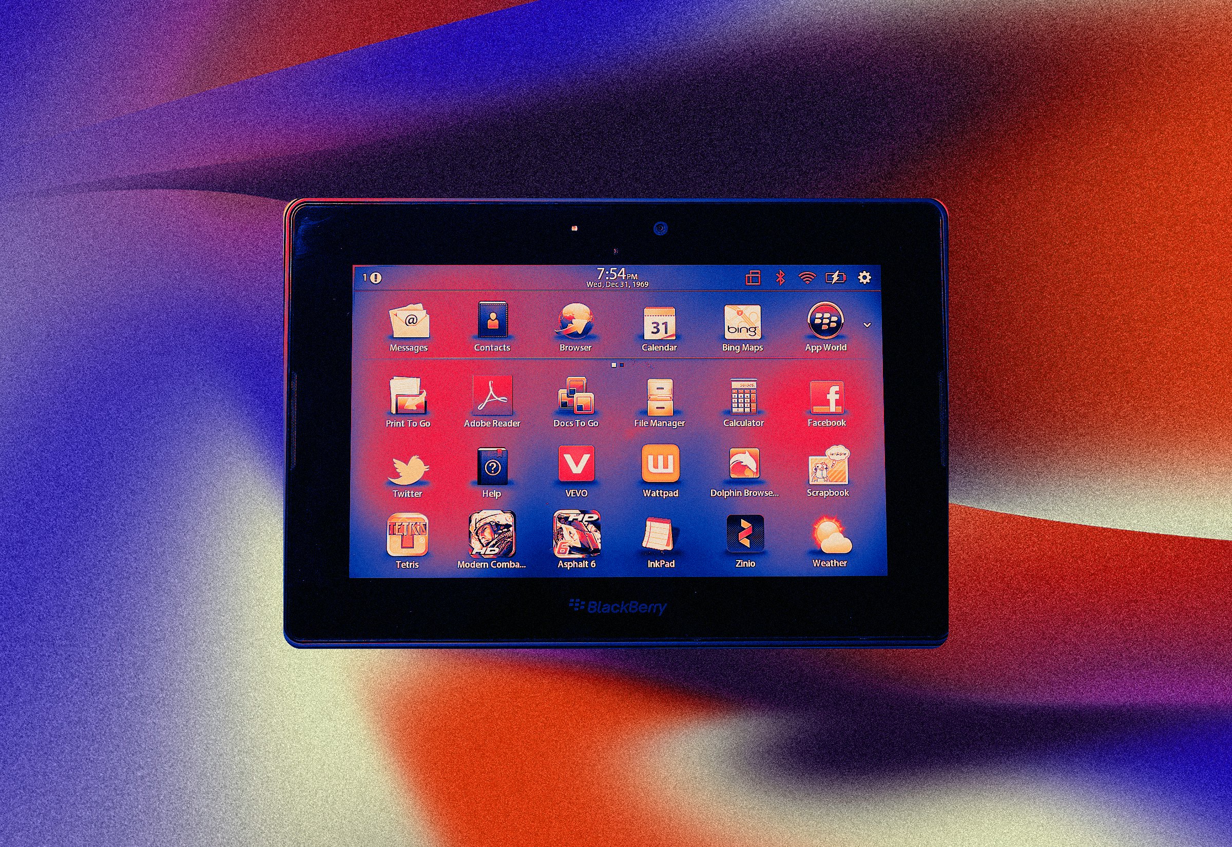
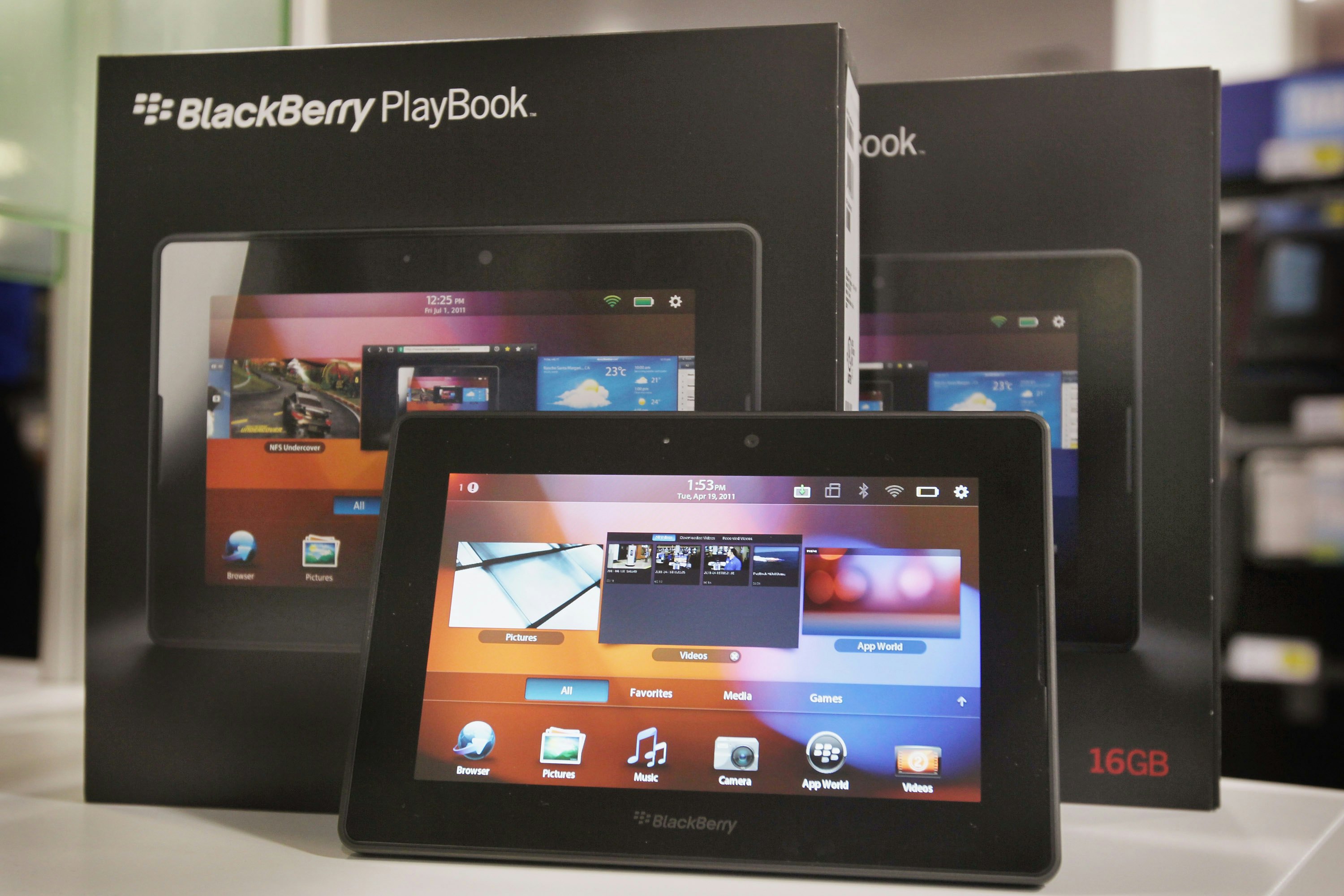
I'm, of course, talking about BlackBerry's first and last tablet, the PlayBook. Mini-sized tablets are commonplace today, but in 2011, only a year after Steve Jobs unveiled the original iPad, they were a gamble and a threat.
Jobs did not hold back from sharing his feelings on tablets that were smaller than the 9.7-inch iPad. “The 7-inch tablets are tweeners, too big to compete with a smartphone and too small to compete with an iPad,” he told investors during Apple's Q4 2010 earnings call.
The late Apple CEO had other reasons for dismissing 7-inch tablets, beyond the fact that he felt they were ripoffs of the iPad. He argued the smaller screens (measured diagonally) were only 45 percent as large and didn't offer 70 percent of the benefits of a 10-inch screen, and famously said that they would need to include sandpaper "so that the user can sand down their fingers" in order to properly use a touch interface.
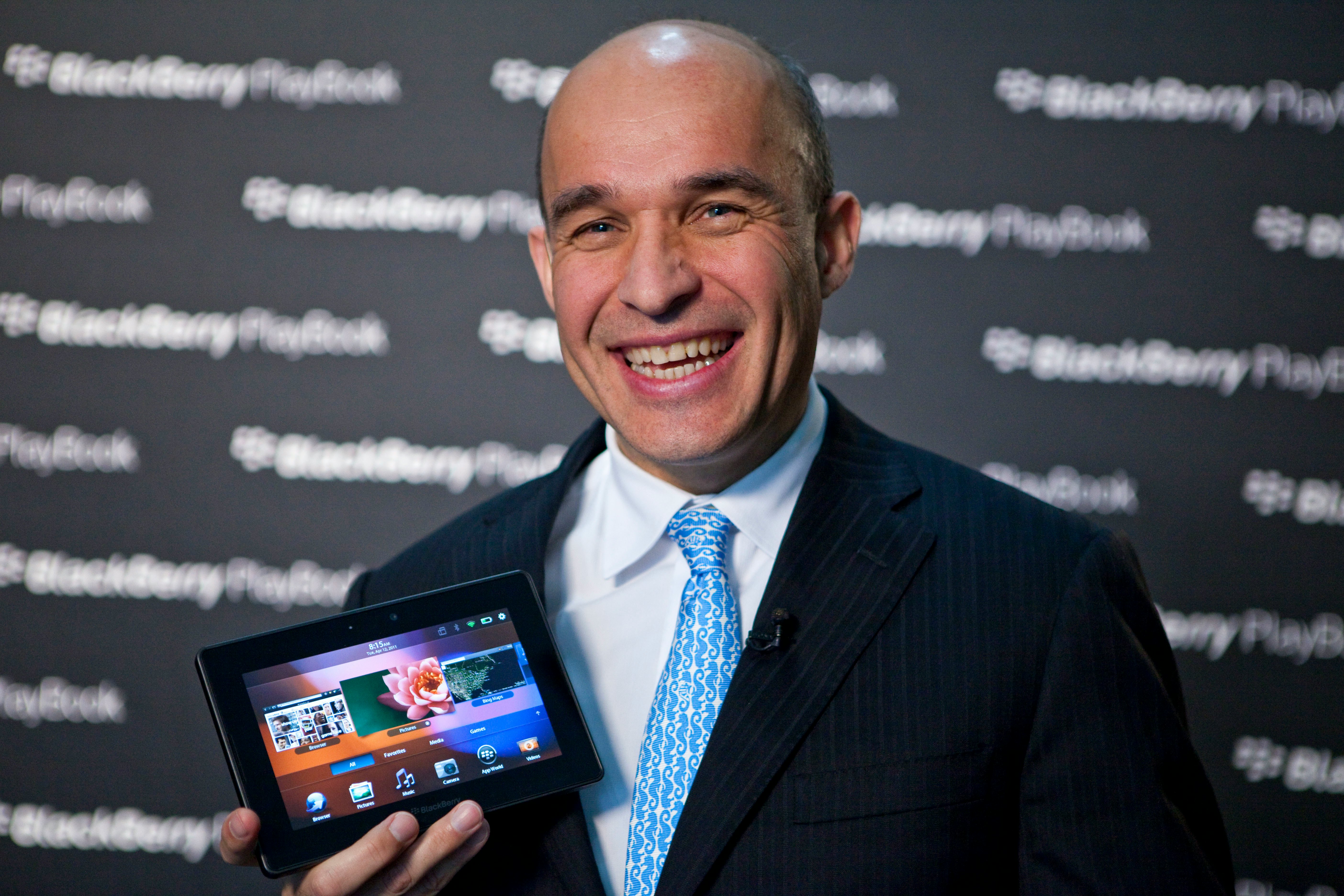
Then BlackBerry co-CEOs Jim Balsillie and Mike Lazardis were unperturbed, moving forward with the 7-inch PlayBook. In anticipation of Matt Johnson’s BlackBerry movie hitting theaters on May 12, I dug up my original PlayBook to transport me back in time. With over a decade of tablet hindsight, it's apparent to me that BlackBerry got a lot of things right with its tablet. The timing of the PlayBook was unfortunate, and many considered it a major distraction that led to the eventual fall of BlackBerry, but the ideas it introduced live on in iPads and smaller tablets to this day.
So Many Good Ideas
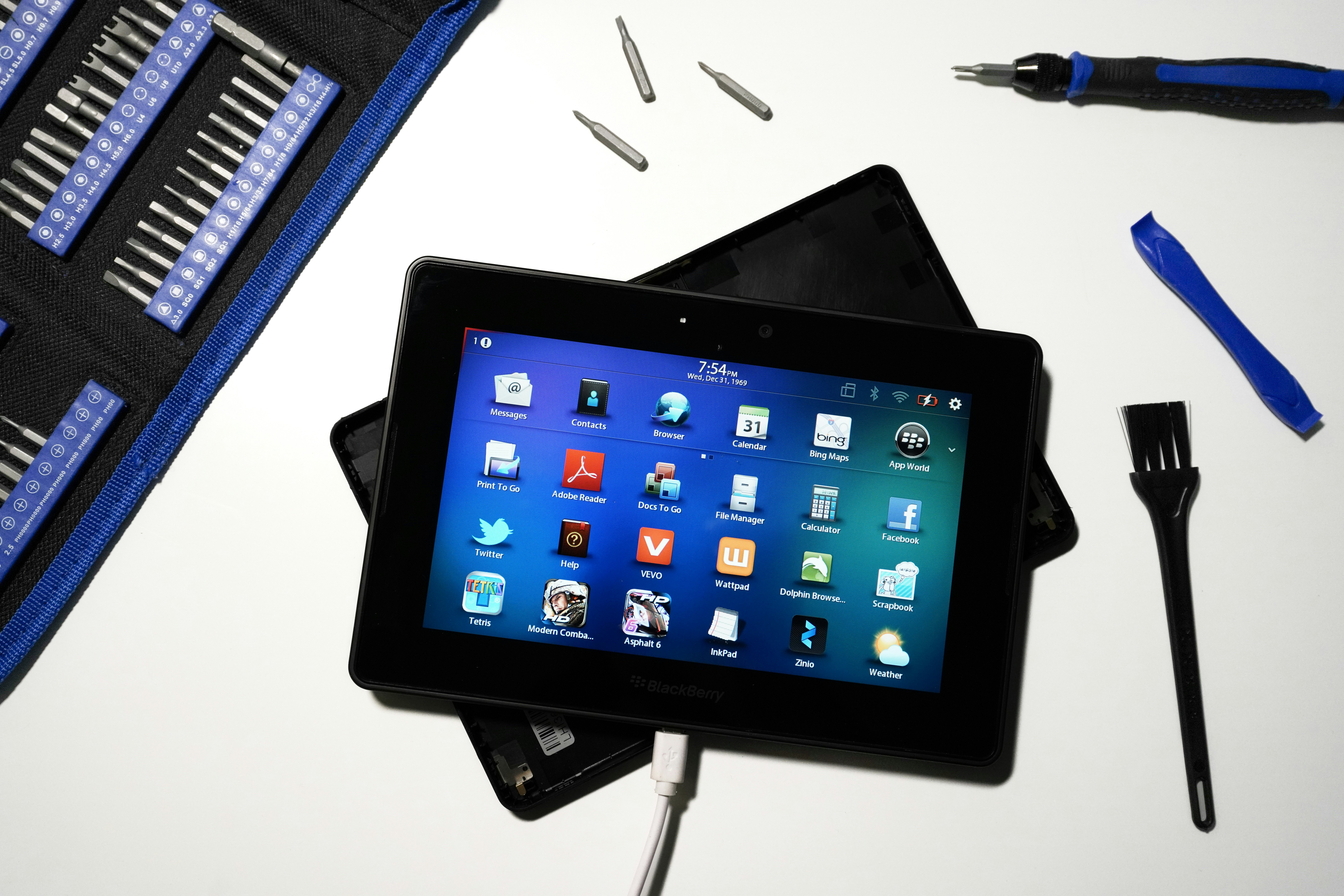
I found my original PlayBook exactly where I expected it to be: at the bottom of a storage box buried deep in my closet. Naturally, after a decade of sleep, the tablet wouldn’t charge up. A YouTube tutorial later and I had the PlayBook cracked open and powered on. A wave of nostalgia smacked me as it hummed to life. I connected it to my Wi-Fi but the web browser wouldn't load up any pages and the apps no longer pulled content from their respective servers. Turns out I was a year too late and BlackBerry turned off services support in January 2022.
Still, poking around my nearly defunct PlayBook, the appreciation I had for it over a decade ago returned. As would be proven with the iPad mini launched after Jobs' death, small tablets don't need to come with sandpaper included in the box, and the PlayBook paved the road for that.
My god, the hardware was great. The soft-touch rubberized rear was classic BlackBerry, providing just enough grip so that you wouldn't need a bulky case. The front-facing camera sat along the long side of the tablet — a location that Microsoft got right on the original Surface tablet and Apple recently adopted for the 10th-gen iPad. And the two front-facing stereo speakers: *chef's kiss*, I can’t name a single modern tablet with such a design.

The form factor was perfect for watching anime or movies on long bus rides or flights, though ripping and converting DVDs into playable video formats was not as easy as hitting play on a streaming service. Why I have a copy of Cruel Intentions on the PlayBook is beyond me, but sure thing, 2011 Raymond Wong! Being both lighter and smaller than the original iPad (a chonker compared to the svelte slates we now have), the PlayBook was a joy to use for reading. It's no wonder Amazon cloned the PlayBook design for its first Kindle Fire tablet later that same year.
But really, it was the software — BlackBerry's own QNX, which would go on to become the foundation for BlackBerry 10 — that was underrated. From a design perspective, QNX was ahead of its time. Even today, the skeuomorphic iconography holds up compared to the minimalist and flat UIs almost every device maker has adopted. The home screen can be swiped up or from the right — not exactly the same as modern Android, but really very similar. There's a dock for your most-used apps, now a staple on any tablet. More than anything else, BlackBerry understood the need to design for multitasking.

Before Apple added the robust card-based app switcher to iPadOS, the PlayBook asked what if swiping on the bezels performed different actions? For example, swiping on the left or right bezels moved you between apps. It was a fast and intuitive way to navigate the PlayBook and clearly a precursor to the gesture bar on iPads and Android tablets. Similarly, pulling down from the top bezel brought up different menus and buttons that slid out of sight when not needed. In the PlayBook's web browser, swiping down brought up your tabs and downloads and settings; it was a clever way to maximize space on the 7-inch screen without overwhelming the user with controls.
Joanna Stern, then at The Verge, described the brilliance of “The Astonishing Tribe” aka TAT that created QNX:
On the plus side, the OS shows tremendous promise, and some of the UI touches that TAT has brought to the table are really charming, like the history of your calculator functions which you can virtually rip off to discard. Other places you see the TAT brilliance poking through are in the photo browser, where pictures don’t just scroll left to right, but overlap each other, shadows and all. It’s those kinds of details that breathe life into this device, and show a path to a brighter future for RIM…
It's rare to find these design flourishes in software these days. Former Apple chief design officer Jony Ive really set us all back with iOS 7, trading depth for negative space. Companies like The Browser Company are trying to bring back the joy of textures and materials to software, but it's an uphill battle.
Doomed From the Start

I stand with very few who liked the PlayBook. All of the right ideas and most of the features were there from the start. I see the bits and pieces of QNX in so many tablets today, and keep wondering about what could have been.
What doomed the PlayBook wasn't the lack of innovation or inventiveness, but prioritization. The lack of a native email, calendar, and contacts app at launch was a truly baffling decision and, ultimately, a big mistake. How did BlackBerry, a company that was synonymous with business and email and enterprise, not include those three core apps? How did Balsillie and Lazaradis not see the urgency to court third-party developers to create apps for its barren App World store?
The PlayBook could have stopped or, at the very least, slowed the iPad's steamroll on the entire tablet market. Instead, BlackBerry blew it out of the gate. As I swiped around my PlayBook a few more times before unplugging it, I felt sad looking at all of its wasted potential, but glad device makers haven't forgotten about the mark (the very tiny one) it had on the tablet world.


