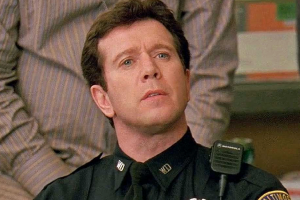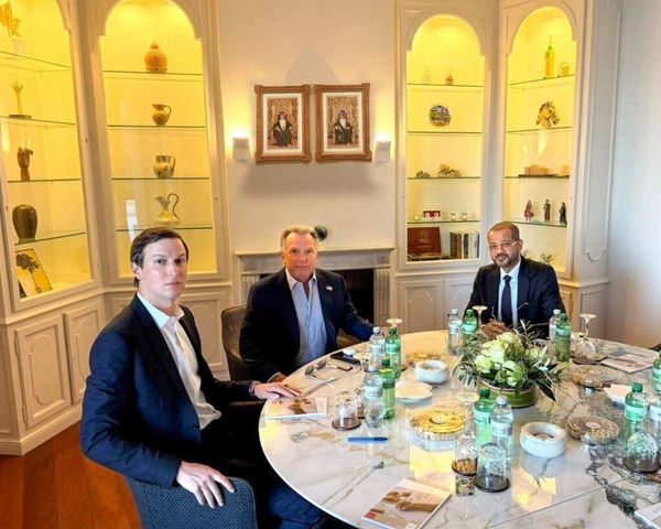
Ideogram is making version 2 of its popular AI image model available just a year after the company first launched onto the AI scene. This is more customizable, photorealistic and design-orientated than the previous generation.
As well as an entirely new model generation, Ideogram has also added a raft of new features to its web UI including the ability to set a custom color scheme and greater degrees of control over the type and style of image produced by the model from your text prompt.
I’ve been playing with the new Ideogram model for a few days and one of the most impressive features is prompt adherence. I asked it to generate a t-shirt design for “Cats on the Moon” and it did, so I then asked it to use a gothic font with blue and yellow colors and it rendered it exactly.
Competition is tough in the AI image space with dozens of companies and as many AAA models vying for attention. With its v2 upgrade, Ideogram cements its place in that list.
What’s new with Ideogram 2?
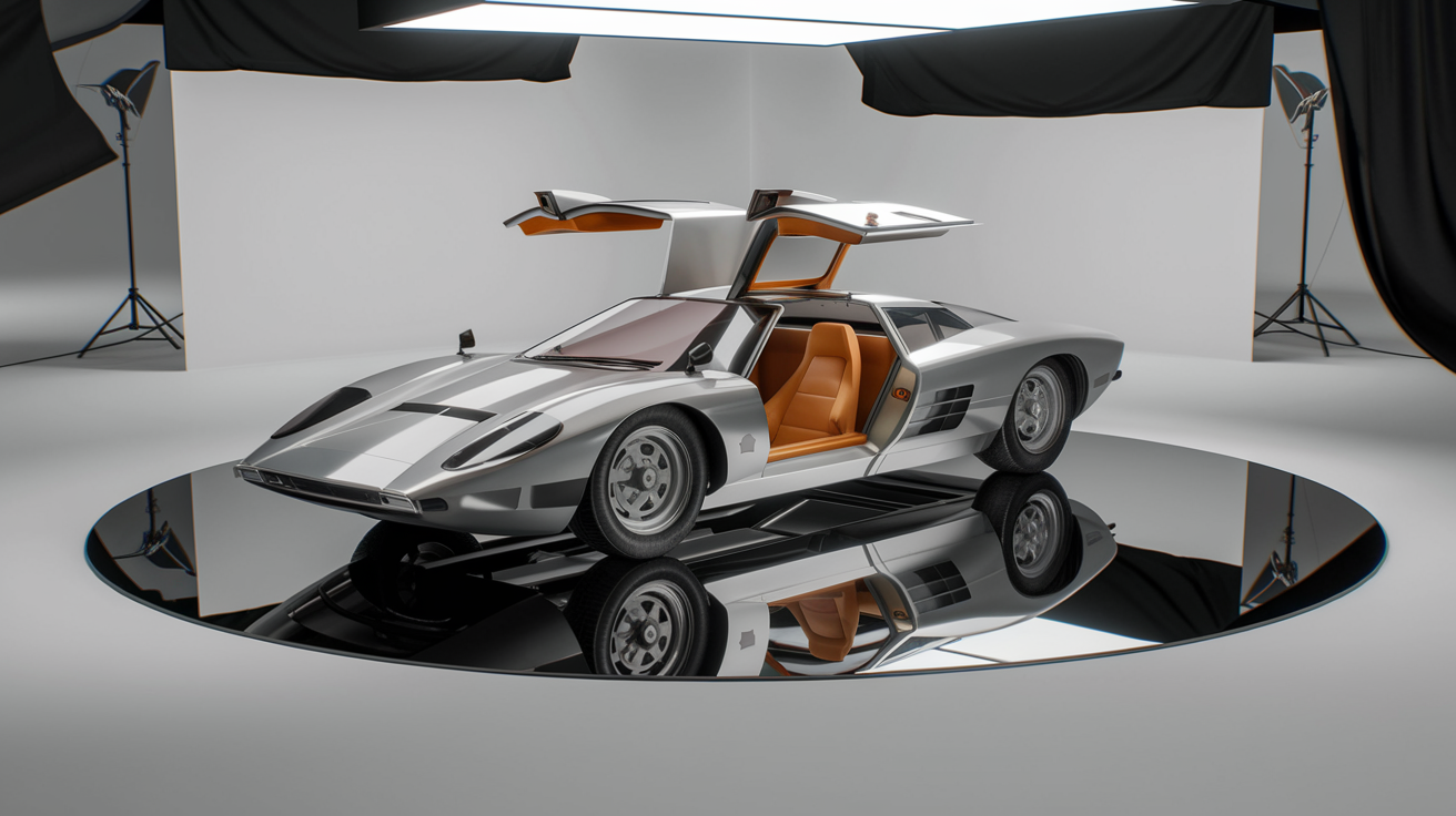
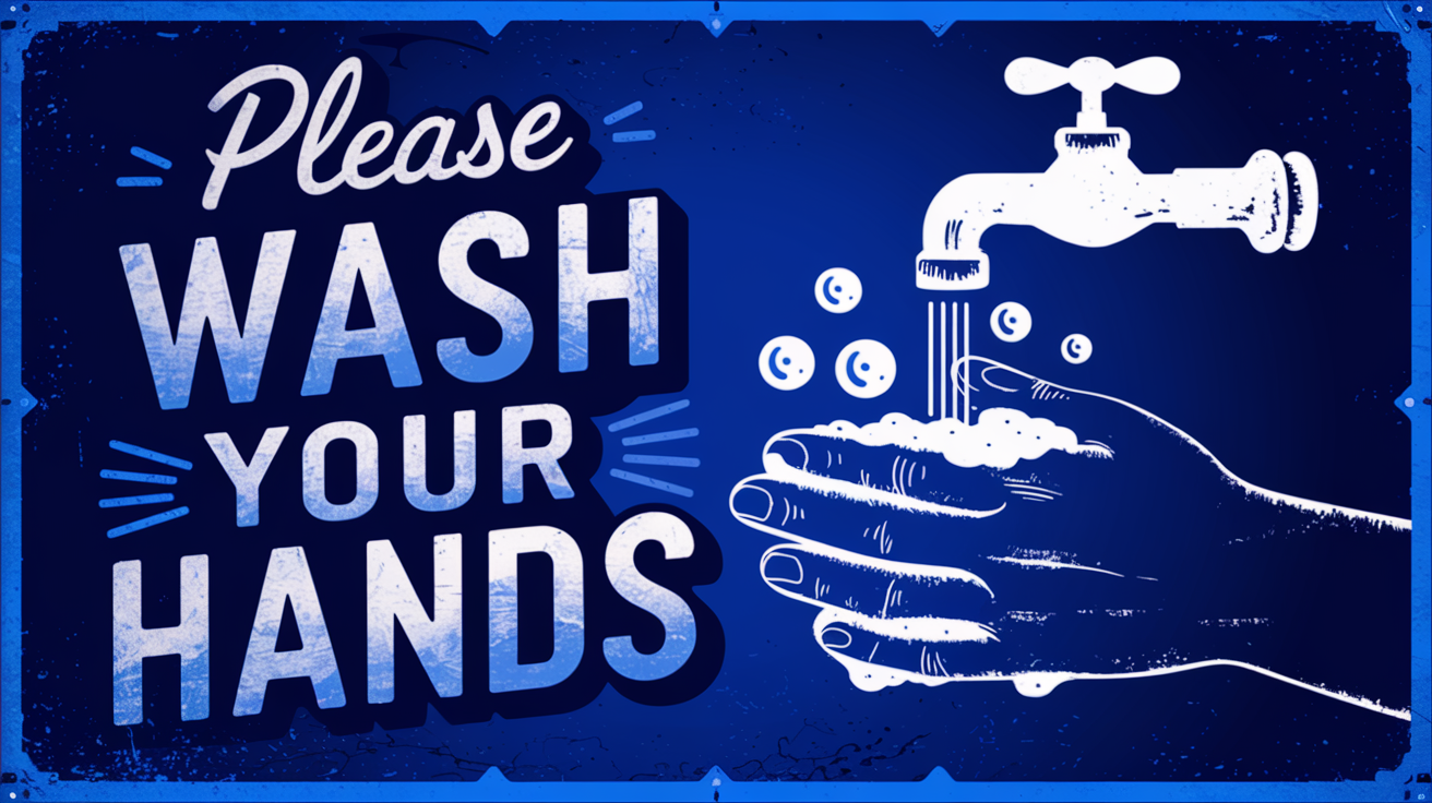
The upgrade to version 2 is significant, with many new features and capabilities including a more accurate text rendering engine. Not only can you specify the words but it is also now possible to give it a font or font family and have it accurately render the design.
Previous features such as Magic Prompt which lets you take a simple request and refine the prompt using AI as well as switching to fast or quality renders are still in place.
Even before the upgrade, with v1, Ideogram’s biggest strength was always in design over photorealism but with the v2 model it has also upped the ante on realistic images. Not just of people, where Midjourney and Flux still reign, but in places and objects.
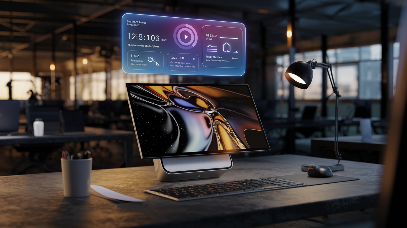
I asked it to render a picture of an influencer sitting in a cafe and it was close to a candid smartphone picture. I then had it render an image of a fictional product called the OmniDock Pro and show our influencer using it and once again it worked perfectly.
Ideogram 2 is great for design
One of the best new features of Ideogram 2, outside of the general model upgrades, is the ability to define a style in advance of generating the image and my favorite new style is ‘design’. This essentially creates a flat-style image that is drawn rather than photographic.
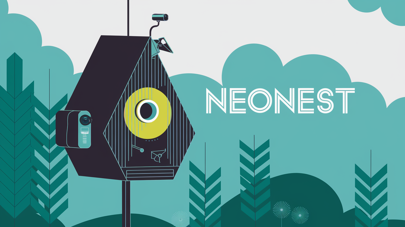
I used this to design the “Cats on the Moon” t-shirt, as well as multiple fictional product ideas. My favorite creation was a blueprint-style design for a smart bird feeder. If you combine ‘design’ with the color pallet feature and accurate text rendering, you can create some stunning works.
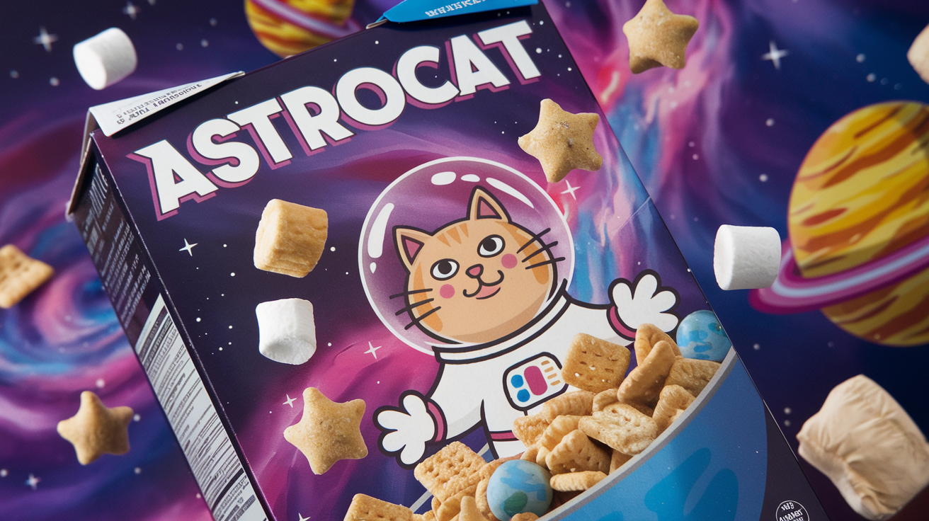
In one experiment I created a fictional cereal called AstroCat, giving Ideogram a mixture of short and well-described prompts. It handles both well, but if you already have a descriptive prompt it is better to switch off Magic Prompt as it will more closely reflect your description.
With the AstroCat cereal, it was able to generate accurate text, create a box, and even related marketing design work that reflected the name perfectly. Switching between 3D and design gave a wider variety of styles than just putting it on default.
Final thoughts

Ideogram 2 is a huge upgrade, a significant step up in creativity and controllability over AI-generated images. Its ability to accurately follow a prompt, including over-placement of elements, fonts and colors is a game changer for AI design.
It accurately rendered text in full every time I tried, reflected any changes I asked for and I also noticed major improvements in its image-to-image remix function.
There is still some work to be done around facial rendering, especially if you want true realism. This works greater for younger faces but a handful of tests with older faces resulted in some odd results including overly plastic-looking skin.
Overall, Ideogram just booked its spot in the top AI image generator list, competing head-on with Midjourney in multiple areas and offering design creation capabilities on par with more manual tools like Canva and Illustrator.
