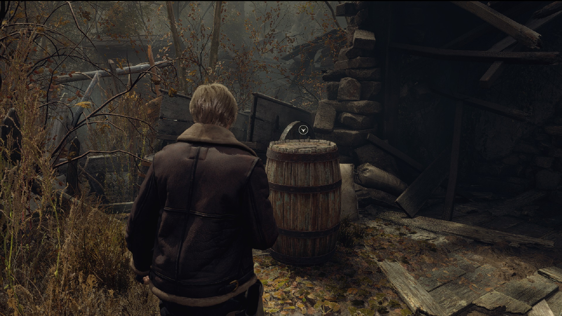
The release of the Resident Evil 4 Remake demo ignited debate over whether it's too obvious, if not a copout, to use yellow paint to highlight breakable or interactable objects in a game, as Capcom has done for RE4's return. Some players rather dramatically argued that this plague upon modern gaming needs to end, and some devs joined in to say this kind of signposting is good, actually.
With the game properly out now, modders have taken it upon themselves to right this perceived wrong and remove the yellow paint entirely. Exhibit A: the No Yellow Paint mod by BonusJZ. But these immersion-hungry gamers know not what they ask. The yellow paint might be dumb, but it's essential, because games and humans are also dumb.
For the most part, this mod does what it says on the tin: remove the yellow paint from RE4's boxes and most environmental features, purportedly to make the game more "immersive." But BonusJZ acknowledges that you might want something to highlight these objects, so the mod also adds blood splatters and cult insignias as optional stand-ins for the divisive yellow paint. It's an effective mod and I sincerely hope people enjoy it, plus the insignia is actually a pretty cool alternative which suits the themes of the world, though it may clash with some puzzles. But I'm still here to argue that sacrificing visual clarity for imagined immersion is foolhardy.
Trust me, Leon needs this

Why did Capcom decide that the Resident Evil 4 Remake needed this yellow paint when the original didn't? I can't speak for the devs, but I'd argue there are two main benefits to the paint. Firstly, the 2005 original didn't really have enough detail, or good enough lighting, to accidentally hide important barrels and crates in cluttered environments. In fact, its lootables popped out because they were rendered differently out of necessity. But games have been marching toward photorealism for the past 18 years, and the closer you get to reality, the more you have to stipulate. You can't make everything lootable, and sometimes that means you just paint the important stuff yellow.
Secondly, marking things this way saves time, which is the important part. I think a lot of people are going to be in for a rude awakening after modding out the yellow paint. It won't significantly affect how immersive the game is – because it's not a game about breaking containers, therefore the containers aren't the immersive part – but it will make you spend a lot more time searching for loot and inevitably running into items that look breakable but are actually just set dressing. This is precisely why the important things are painted; you can tell at a glance what matters and what doesn't. That's the power of visual language. Is yellow paint the most elegant solution? Arguably not. You could make the breakables out of a lighter color of wood that stands out, for example, but the yellow paint works just fine and may have been the simplest solution on a technical level.
This is not more immersive; it's more annoying.
Ironically, the RE4 Remake already contains the perfect counterarguments to removing the yellow paint: bear traps and dressers. I don't care how good your Gamer Eyes are; you are gonna step on some freakin' bear traps in this game. They are borderline invisible, especially when you're running around in a panic, and that's largely due to the smokescreen of HD detail discussed earlier. The traps blend in with the grass and rain and debris, so your eyes go right over them. Why do you think there's already a mod that makes the bear traps easier to see?
This brings us to the dressers, which RE4 is also full of. Dressers, cupboards, closets, lockers – lots of lootable containers actually aren't painted yellow, and guess what? They're harder to see! I always know exactly which boxes and barrels to check, but I'm disappointed by false dressers all the time because they look the same as the ones you can actually interact with. This is not more immersive; it's more annoying. If anything, arbitrary loot prompts that only appear when you get close are going to break your flow more than a visual marker you can instantly intuit.
Yet instead of improving the clarity of bear traps and dressers, some players apparently want the well-marked boxes and barrels to have the same visual problems. Quite frankly, these heathens deserve the frustration that's coming to them. If you need me, I'll be over here, perfectly immersed, and not spending minutes of my life chasing barrels that don't exist.
Check out our Resident Evil 4 Remake review for a full rundown of what makes this classic's return so great.


